Understanding the CSS display property
If you've ever packed a suitcase then you can easily understand the CSS display property; here's how to make sense of it all.

Sign up to Creative Bloq's daily newsletter, which brings you the latest news and inspiration from the worlds of art, design and technology.
You are now subscribed
Your newsletter sign-up was successful
Want to add more newsletters?
It's midnight, and that one div on your site still looks like a child's toy chest. All the elements are a jumbled mess, and every time you play with CSS's display property, they rearrange themselves into an entirely different bit of nonsense.
If you're like me, you'll probably solve this by muttering under your breath and becoming consistently more aggressive with your keyboard. And although that strategy has worked for me before, I recently set out to find a better way to understand the display property.
It turns out the basics of display are much simpler than I originally thought. In fact, they use the same principles as packing a suitcase. I'm going to cover display:block, inline-block and inline. If you've arranged a suitcase in an orderly way before, you will see the parallel. If you're the sort of person that rams all your clothing in in a haphazard manner – well, there's only so much I can do for you.
Article continues belowOur suitcase will contain three types of clothing:
- Delicates, like a collared shirt
- T-shirts that can be rolled up
- Socks or underwear that can be stuffed into gaps
For reference, if we modelled the suitcase in HTML, it would look like this:
<div class='suitcase'>
    <div class='delicate'></div>
    <div class='tshirt'></div>
    <div class='tshirt'></div>
    <div class='tshirt'></div>
    <div class='tshirt'></div>
    <div class='socks'></div>
    <div class='tshirt'></div>
    <div class='tshirt'></div>
    <div class='tshirt'></div>
    <div class='tshirt'></div>
</div>
The delicate items on top

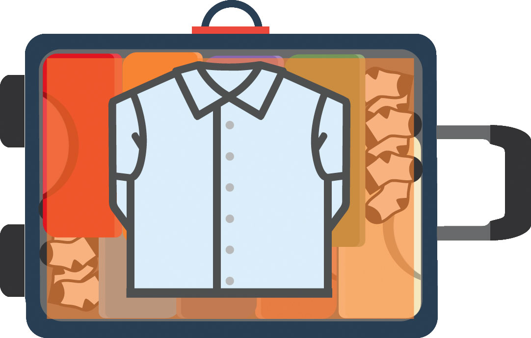
Display:block is the default for most HTML elements. That means the element occupies the entire horizontal space within its container div. If it is next to other sibling elements, it will start a new line, and not allow other elements on its line. It is similar to the delicate items you put at the top of your suitcase. These are delicate or smart articles such as collared shirts. You don't want them to get wrinkled, so you make sure they are not pushed up against other pieces of clothing.
This brings up one of the toughest parts of display:block. Notice how the collared shirt does not occupy the entire width of the suitcase? That does not mean other items will jump up to its level. Let's say this shirt is 60 per cent of the width of the suitcase; it would still block other elements from joining it on the top level.
Sign up to Creative Bloq's daily newsletter, which brings you the latest news and inspiration from the worlds of art, design and technology.
That is why there is an orange border in the picture. A display:block element will automatically add a margin around it if it does not occupy the entire horizontal space.
Neatly packed T-shirts

Most of your suitcase is probably full of the rest of your clothing for your trip. For the sake of simplicity, we are going to cut this down to just T-shirts. There is a big debate on the internet as to whether folding or rolling is more efficient. I'm a folding kind of person.
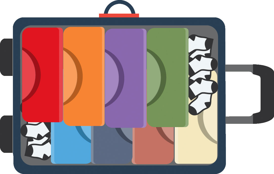
Anyway, in order to fit the most items, you line up your T-shirts side by side. This is exactly what display:inline-block is meant for. These elements can sit next to one another on the same line, as well as next to display:inline elements.
Unlike display:inline elements, an inline-block element will move to the next line if it does not fit in its containing div alongside the other inline-block elements. In order to have a T-shirt spill onto the next row, you would need to cut it in half and use the remaining half to start a new row. Inline-block elements are not allowed to split in half if they do not fit on a line.
The socks that fill in the gaps

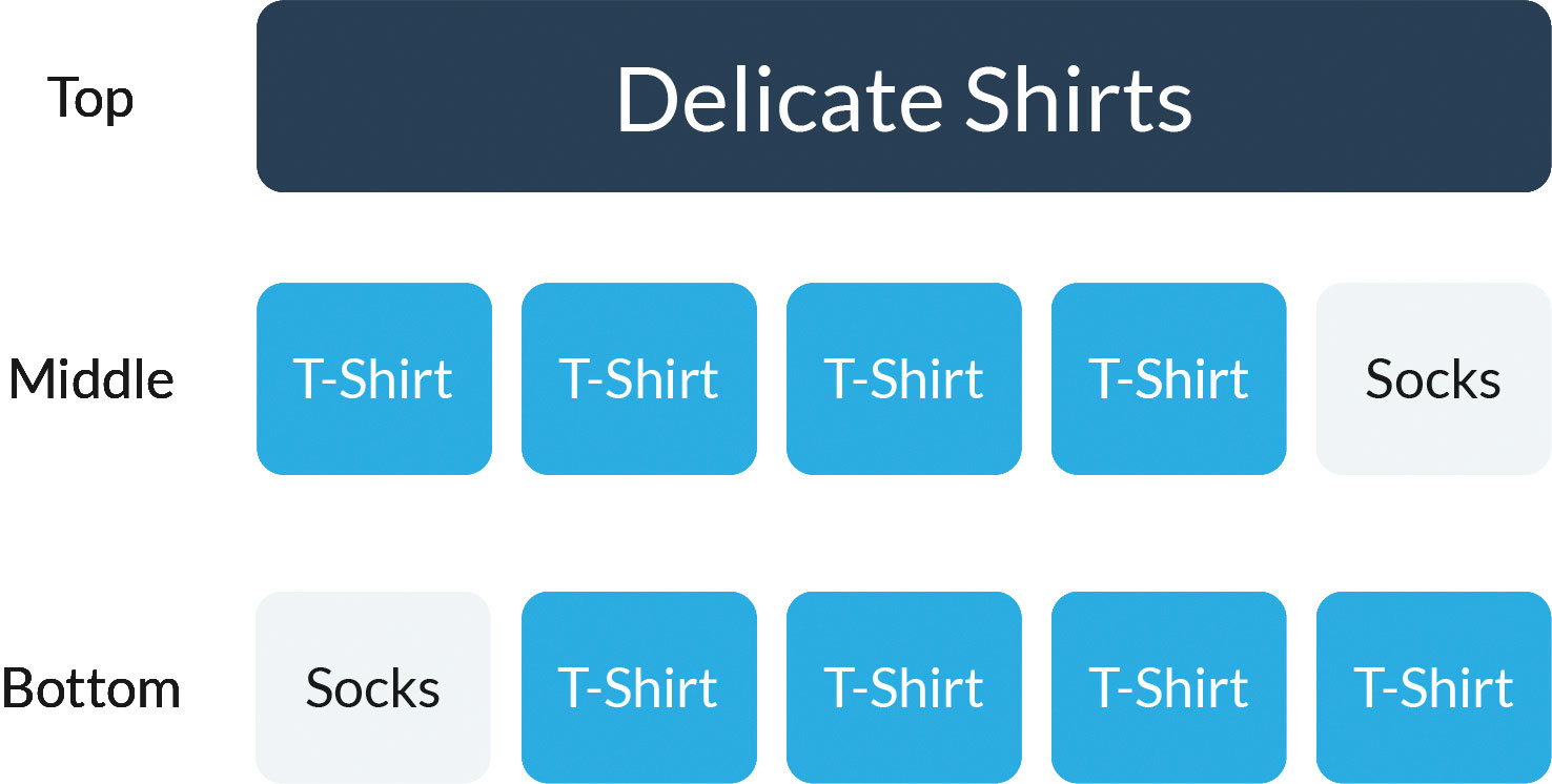
Check back to the original HTML and you'll note that there is one socks <div> between the eight T-shirts. But take a look at the horizontal view of the suitcase on the right. If there is one socks <div>, how can it end the middle row and begin the bottom row? This is the purpose of display:inline!
An inline element will spill over to the next line if it exceeds the width of the div (in this way it is different from inline-block or block). Since our socks div is full of socks that are haphazardly stuffed into gaps, it can easily start filling the gap on the right side of the middle row and spill over to begin the bottom row.
No socks will need to be cut in half for this to happen. This is why they can become inline, while T-shirts can only be inline-block. If the T-shirts on the middle row only took up 60 per cent of the width, the socks <div> would move up to fill the entire space on the rest of the row.
Bon voyage
This is the final CSS for our suitcase:
.delicate {
    display:block;
    width:60%;
}

.tshirt{
    display:inline-block;
    width:20%;
}

.socks{
    display:inline;
}
Here are a couple alternate scenarios to illustrate the different uses of display. If the delicates on top had display:inline-block, they would fit in right alongside the T-shirts. Some of the T-shirts would move up to the top line, and the rest would adjust accordingly. There would be no comfortable buffer to the left and right of the collared shirt.
If each T-shirt had display-block, you would have a massive stack of T-shirts on top of each other, one per line. If the socks had display:inline-block, they would all sit on the bottom row rather than flowing between the two rows. Some T-shirts would be pushed onto another row, forming a fourth line. There would be a gap on the right of the middle row of T-shirts.
With the method I've outlined here, we end up with a neatly packed suitcase that makes best use of the available space.
This article originally appeared in net magazine issue 289; buy it here!
Related articles:
