"Make something people want to steal," 7 tips for better menu design
How to make your menu more enticing, plus why your menu needs to work on mobile.
Sign up to Creative Bloq's daily newsletter, which brings you the latest news and inspiration from the worlds of art, design and technology.
You are now subscribed
Your newsletter sign-up was successful
Want to add more newsletters?
Menu design is an often overlooked area of design, but as Liz Henderson, partner at Wunder Werkz, points out, "menus are the only piece of collateral that are required at most restaurants."
"Before anyone puts your food in their mouth they touch and interact with your menu. It’s more than a utility, it is your first course and should be treated as a special moment to connect with guests in a meaningful way," she says.
"From a purely technical perspective, the menu and its usability and navigability are critical, not only to customer experience but it also directly impacts sales. Beyond this, the menu is another avenue in which to engage, connect and further your brand story," explains Liz. What makes good menu design? It needs to be utilitarian, "allowing the customer to clearly understand and explore their choices," and endearing, "captivating the customer beyond just the factual information presented and imprinting a positive brand experience."
Article continues belowHere are Liz's top tips for getting menu design right:

With a background in advertising and over a decade of experience in the development world, Liz considers herself the missing link between vision and execution. At the end of the day, she’s a problem solver and she loves puzzling things out. As a partner at Wunder Werkz, she leads the digital team in pushing the limits of web-based experiences and digital interactions for our clients.
01. Be incredibly clear
"For anything falling in the fast-casual space the menu should leave the customer with no questions," says Liz. "Sweetgreen gets a lot right, it is modular, readable and very clean but still on brand."
02. Take the user on a journey
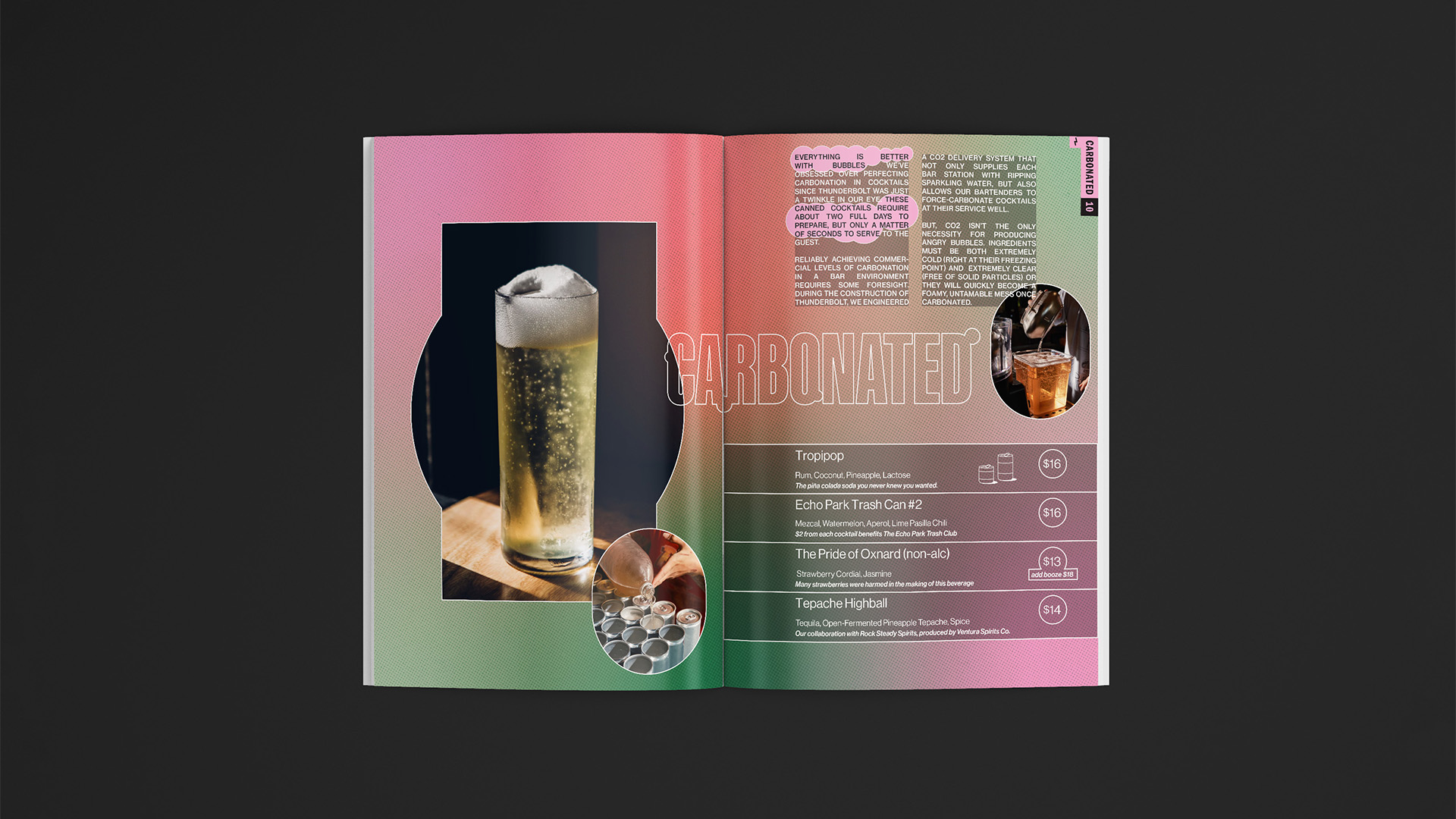
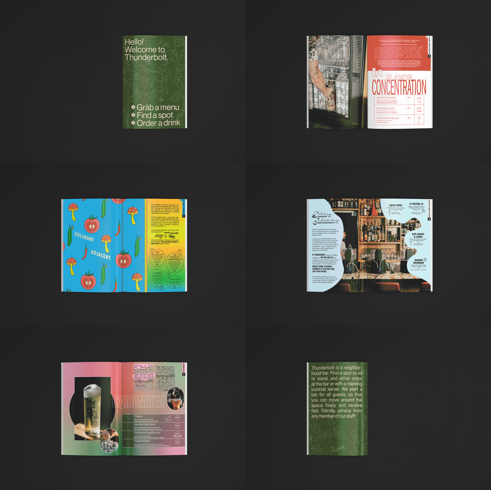
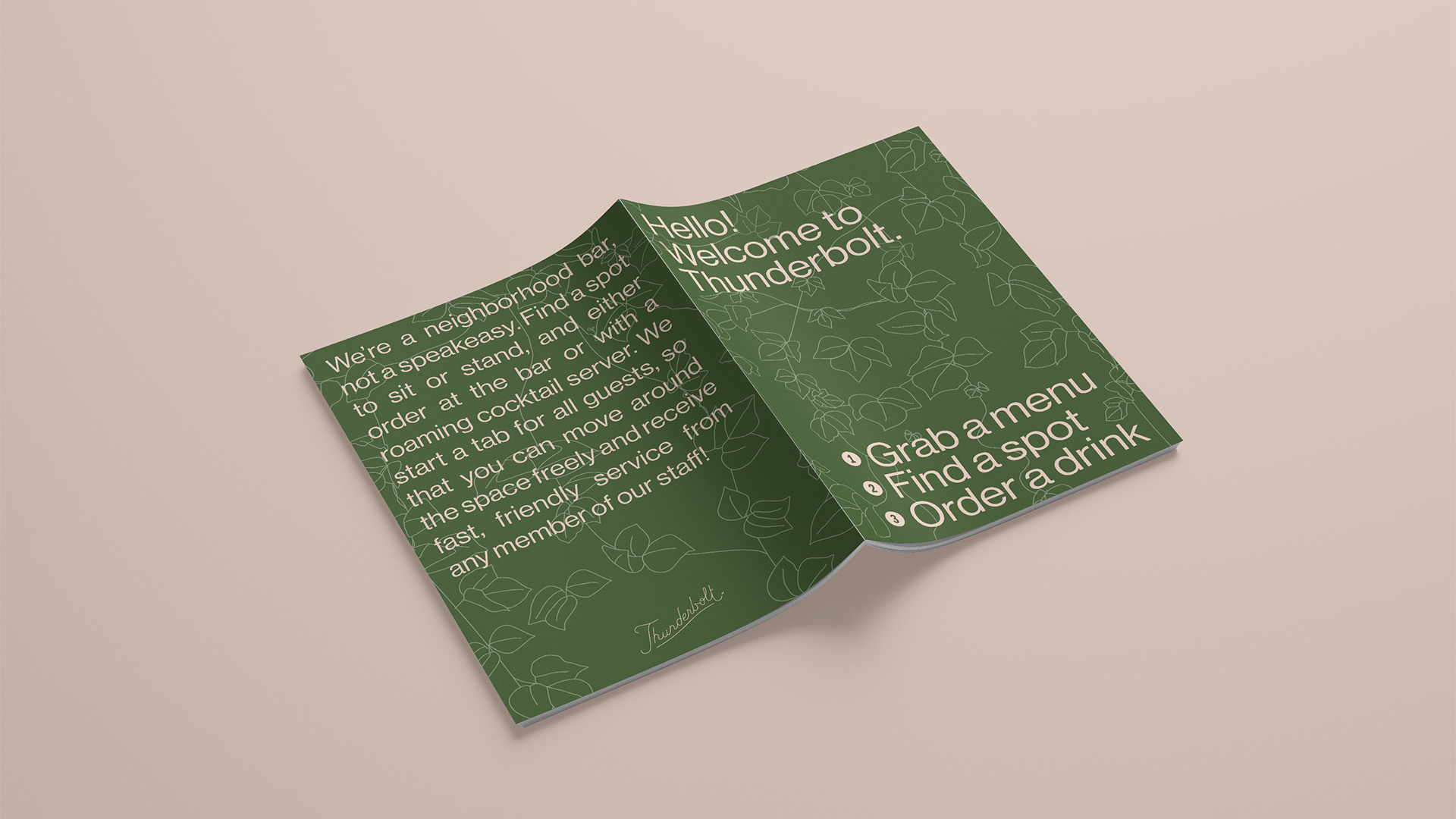
If you don't go down the clarity route, another option is to take customers on a journey. "I love the menu we did for Thunderbolt, in LA," says Liz. "It’s basically a zine, designed to be very engaging, educational and takes the user on a real journey. I also love Allegory’s menu in Washington, DC. It’s inspired by Alice in Wonderland that takes you through the looking glass on a trip through the menu."
03. Consider the context
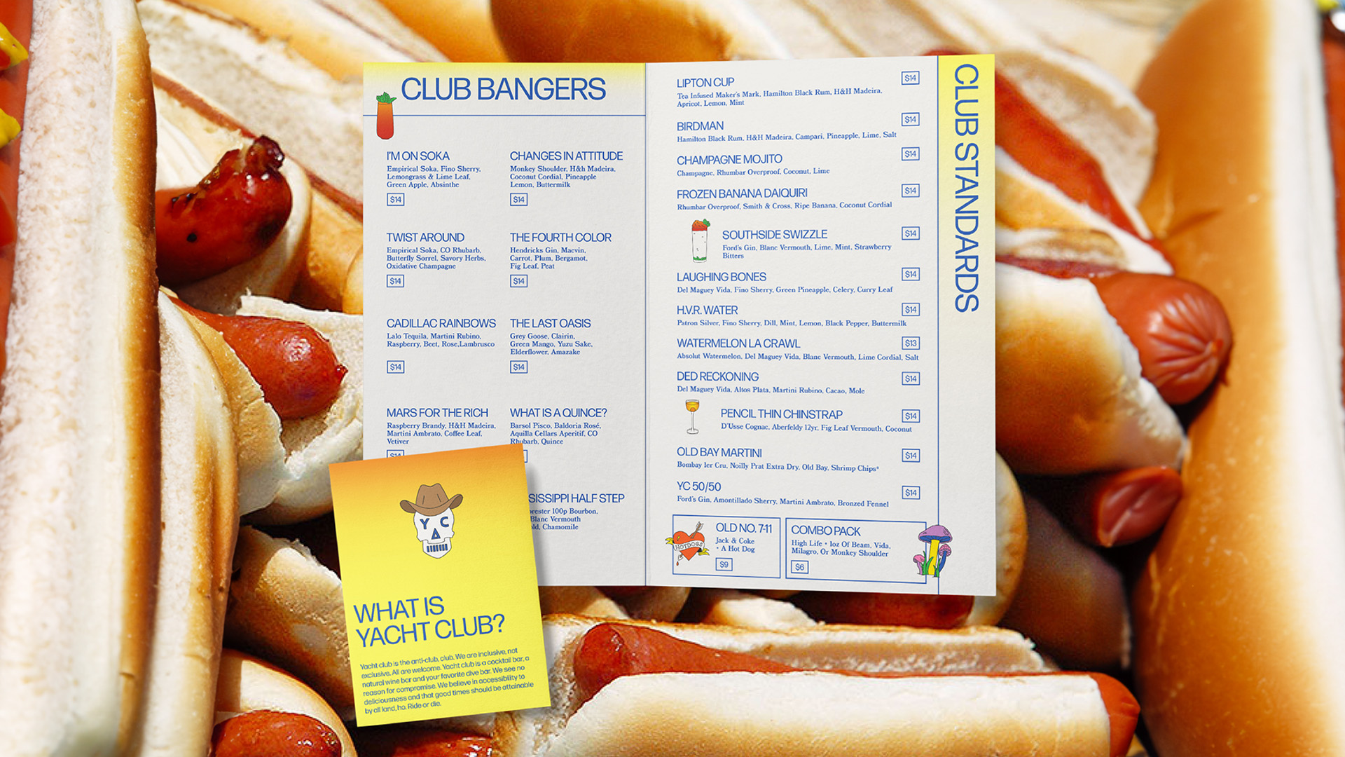
"Be conscious of how and where your menu will be consumed," explains Liz. "If it's on a phone, design to the phone. If it's in a dimly lit bar, make sure you can read it in dim lighting. If it's in a fast casual, make sure it's clear and easy for the customer to make informed decisions without assistance."
Sign up to Creative Bloq's daily newsletter, which brings you the latest news and inspiration from the worlds of art, design and technology.
There are plenty of ways you can make use of a restaurant or bar's setting. "Bar Nouveau in Paris has a bar menu which is the same upstairs and downstairs except downstairs they utilise a black light so what you see on the menu actually changes," says Liz.
04. Think mobile
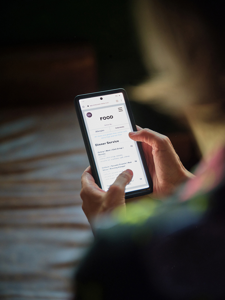
There are various potential problems when designing menus for use on a phone, with readability being a particular issue. As well as making sure any PDF menus are properly optimised for mobile, Liz suggests that restaurants should make the most of mobile technology. "Restaurants should use the power of the technology that is literally in hand to make the menu filterable: by category, allergy and ingredient," she says. "This type of filtering was central to our work for Everyvore. As a bare minimum, make it readable on a phone."
05. Go really out there
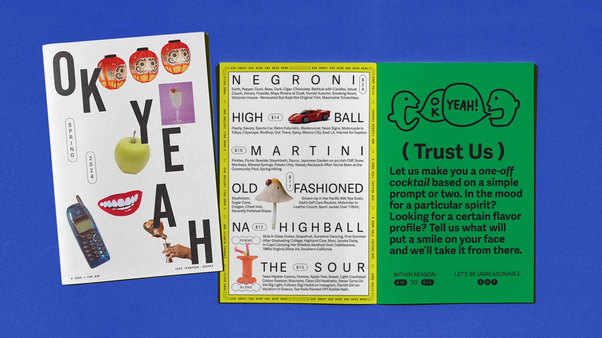
If you want to really surprise people, try doing away with ingredients altogether, suggests Liz. "The menu I’m dying over right now is the menu that our team recently created in collaboration with the folks at Ok Yeah. This menu is a total journey unlike anything I've seen. The space is a tiny bar where you are encouraged to have in-depth interaction with the staff. So, while there are cocktails on the menu, the descriptions aren't ingredients, they are poetic tasting notes. It is meant to force a more meaningful conversation with the staff to learn about the drinks and also to just be super-fun to navigate."
06. Add extras
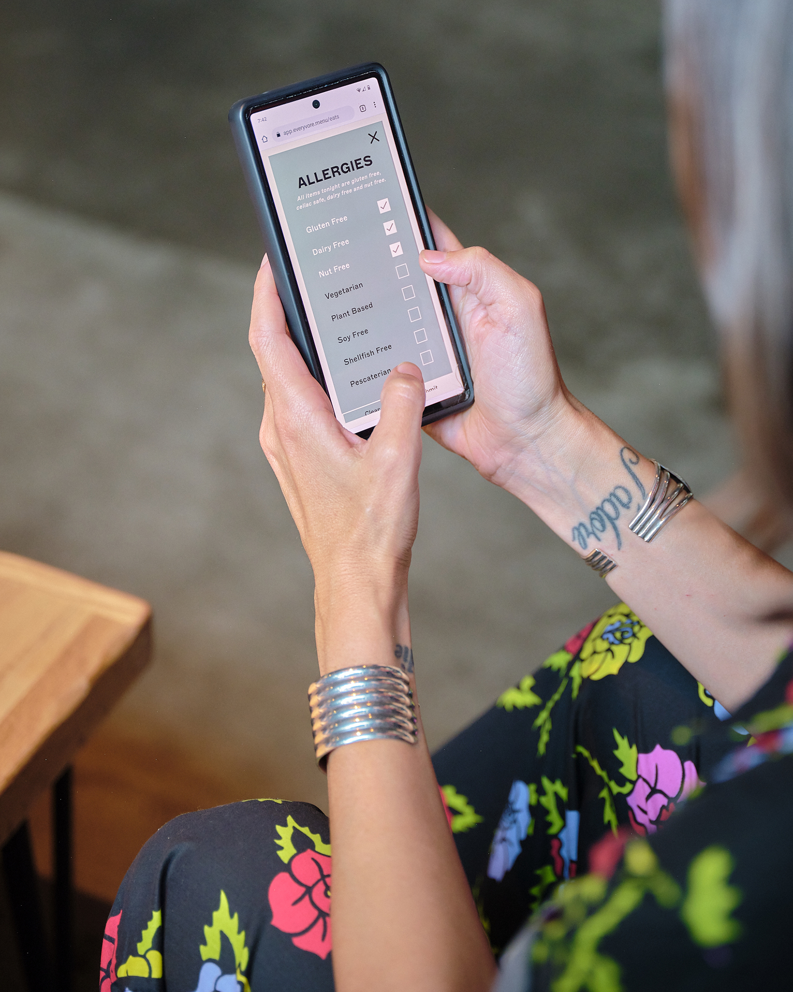
Ideally, menus should be optimised for SEO and accessible to users who use screen readers, notes Liz. "That includes further functionality by adding images of menu items that appear on hover or click to further inform ordering."
Again, you probably need to have mobile in mind. "We live in the 21st century. Viewing a menu on a phone isn’t going away, so we need to make better solutions more available."
07. Make it shareable
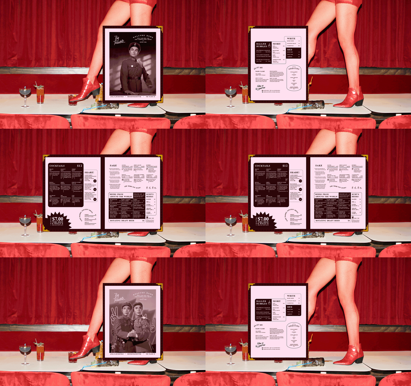
"Lastly, make something people want to steal (or in the case of digital, share)," says Liz. "I'm not ashamed to say that I've pocketed a few of my favourite menus because I wanted them as a keepsake. This is the holy grail of menu making."
For more restaurant inspo, see our favourite restaurant menu fonts.
Find out more about Wunder Werkz.

Rosie Hilder is Creative Bloq's Deputy Editor. After beginning her career in journalism in Argentina – where she worked as Deputy Editor of Time Out Buenos Aires – she moved back to the UK and joined Future Plc in 2016. Since then, she's worked as Operations Editor on magazines including Computer Arts, 3D World and Paint & Draw and Mac|Life. In 2018, she joined Creative Bloq, where she now assists with the daily management of the site, including growing the site's reach, getting involved in events, such as judging the Brand Impact Awards, and helping make sure our content serves the reader as best it can.
