'How do we keep the Britishness?' Pentagram explains how it rebranded The Conran Shop
I sat down with Pentagram's Sascha Lobe and Kimberly Lloyd to chat about The Conran Shop's branding, Britishness and The Modulor Man in the bathroom.
Sign up to Creative Bloq's daily newsletter, which brings you the latest news and inspiration from the worlds of art, design and technology.
You are now subscribed
Your newsletter sign-up was successful
Want to add more newsletters?
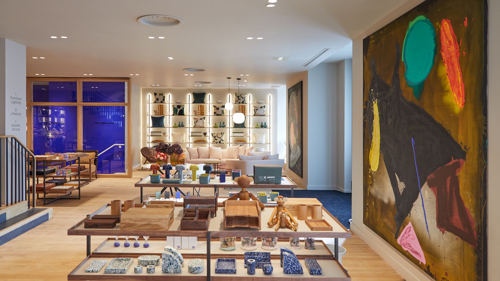
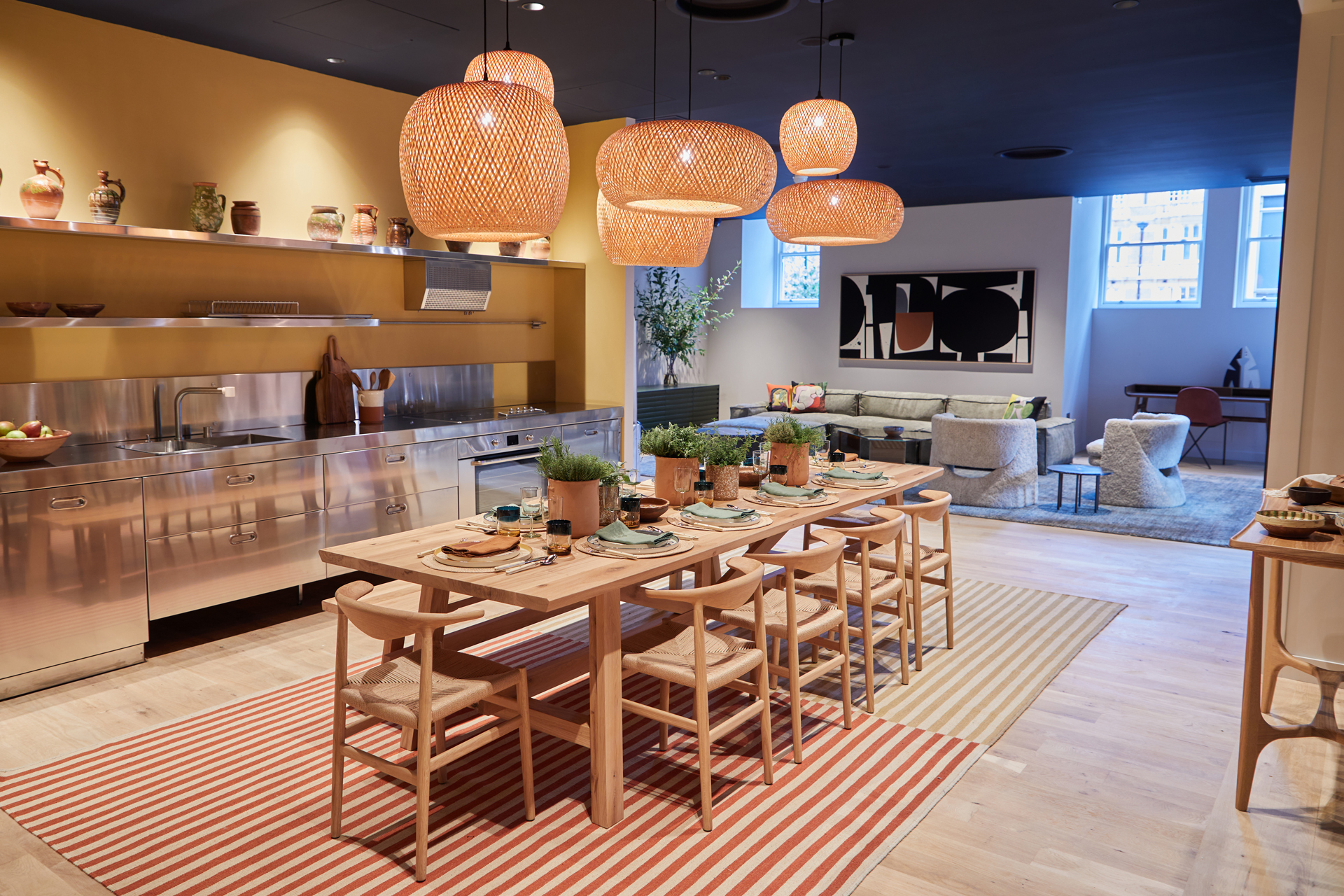
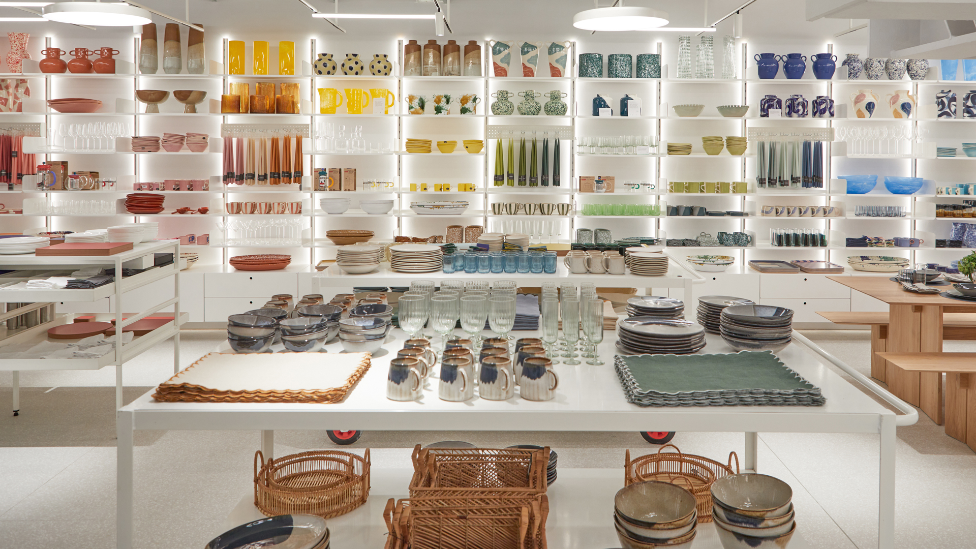
On Thursday I attended the press preview of The Conran Shop's new flagship store in London. The new shop was always going to be sophisticated – it's on Sloane Square after all – and The Conran Shop, founded by Sir Terence Conran, is known for its carefully considered upmarket homeware. But the flagship store has a few surprises up its sleeve, setting it apart from its competitors.
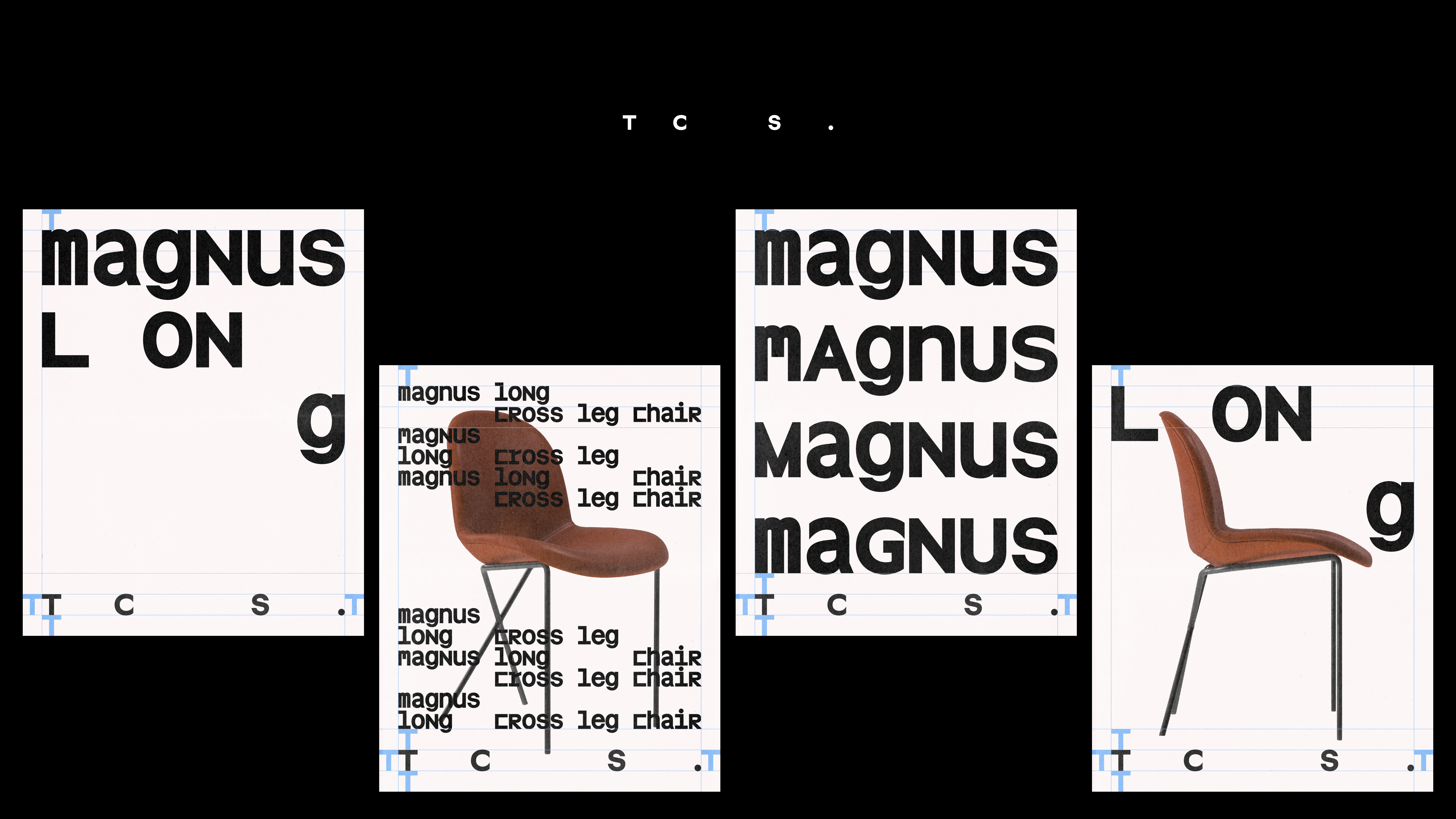
First of all, it's fresh from a rebrand by Pentagram's Sascha Lobe and Kimberly Lloyd, which was launched a few months ago and has been universally adopted and loved by all at the store. The rebrand includes a bespoke typeface, The Conran Shop Legacy Typeface Collection, which forms a brand architecture system, and pays homage to the spirit of the late Sir Conran.
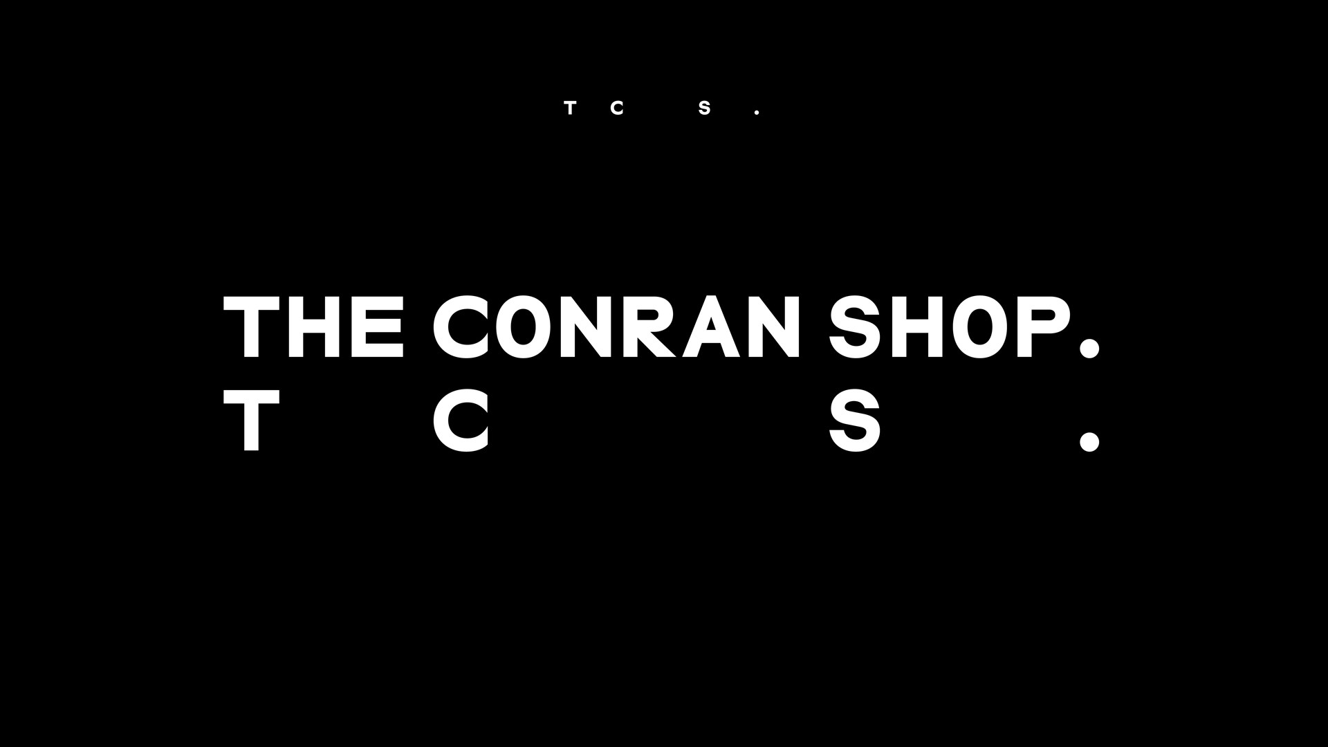
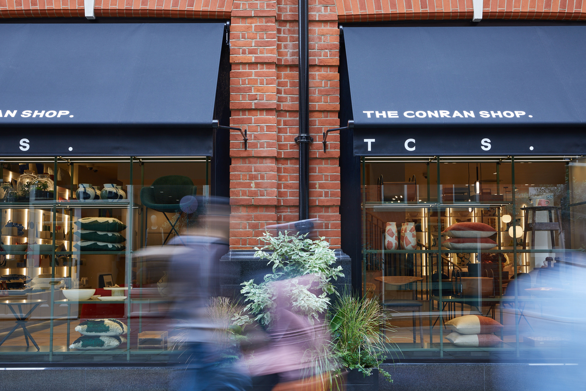
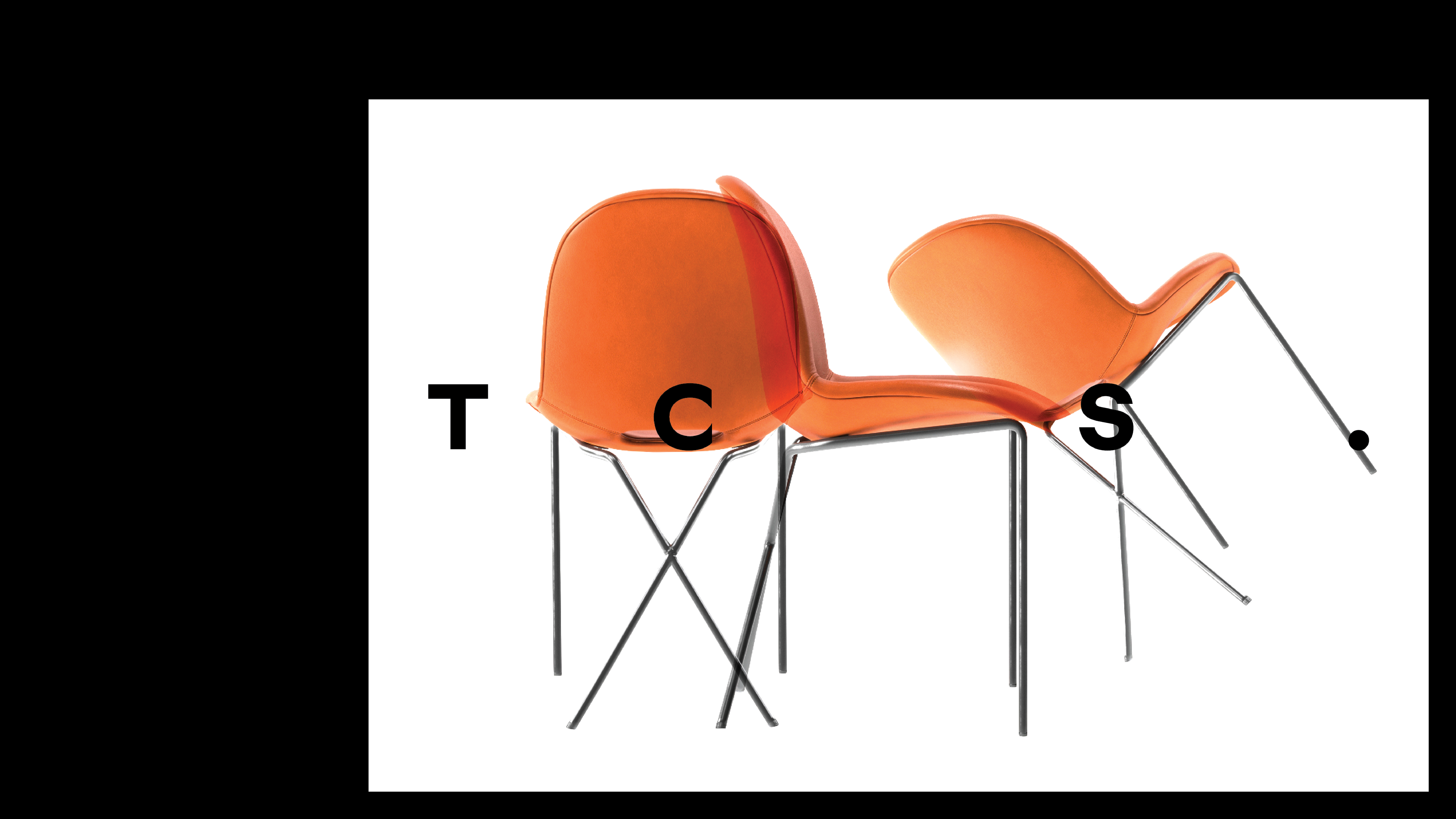
Lloyd tells me how they initially asked if they were able to shorten the brand name, but they were told they could not, "legally", so they had to find ways to work with what they had. And so they decided to turn it into a bold statement by incorporating the full-stop into the identity. The result is 'The Conran Shop.', which serves as a spine, and can be shortened to 'TCS.'. Naturally, 'TCS.' is spaced out in an elegant and dynamic way, allowing the logo to flex across touchpoints and even across markets – The Conran Shop has stores in Japan and South Korea and is soon expanding into the Middle East.
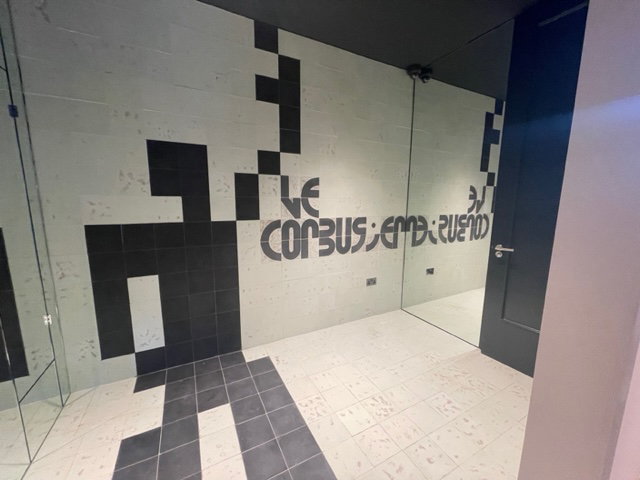
The flagship store is spaced across three floors, and next to the achingly cool, luxury furniture adorning the first floor, is a very special bathroom, designed by Lobe. It's inspired by Swiss-French architect and designer Le Corbusier and is titled Modulor Man. At first, you see a beautifully designed bathroom, there's an image of Le Corbusier's Modulor Man stretching from floor to wall, and the tiles form a pleasing spiral. But scan a QR code, and you get a unique AR experience, where the tiles (and the man) seemingly come to life.
I sat down with Lobe and Lloyd to find out more about the branding project (and the bathroom)...
How do you start a project like this?
KL: Sascha and myself follow a paradigm where whoever approaches us to work on their new logo, we really study the brand. We do an audit and try to find out if a complete rebranding is necessary and if it is, then why? And for whom are we doing this? We did the same audit for the current shop as well.
We did an anonymous survey with all the employees and we asked them all kinds of crazy and difficult questions and easy questions and stuff, 'what would you change?', etc. The essence was one thing, 'we definitely want to keep our roots. We don't want to change our Britishness'. And that was clear for us. It's not about changing the DNA, the history, the heritage, but a refreshment was needed to undust and contemporise the brand after 50 years. So that was basically our briefing to ourselves.
And from there we studied also. We studied Conran's work, Conran's books, read from his perspective, that's how we found that he's a big fan of The Modulor Man, or he's using The Modulor Man. We also studied the City of London. It might sound a bit stupid, but if you go around and take pictures of all the numbers and all the letters [in London]... when you take a look at them, you will find traces of them in our typeface.
SL: It's not about copying something and just taking it and putting it into your typeface. It's of course, the sentiment and the impression and the feeling around it.
KL: There was one wish [from the survey] that we didn't want to forget about. It was, 'we want to stay British. We want to have our Englishness'. And we were like, okay, this is important. We are not making an American brand, we are not making an European brand. And we are not just simply contemporising it with some sans serif. The question for us was, 'how do we keep the Britishness – the sophisticated touch?'

Which part of the brand reflects that Britishness?
KL: It's a very long story short, but if you take a look at the logo, you'll see a very explicit 'C'.
SL: That's a significant letter in that sense, because 'C' is important for Conran, of course. But it's the Gill 'C' more or less. The way the 'C' is formed, you only find that in an English typeface, in an English modernist typeface. So that was kind of clear to make that connection and to use that.
Did you do another survey after the rebrand?
KL: No, the love was so big there was no survey necessary.
SL: That's probably one of the biggest surprises. Normally if you rebrand and restructure a company, people need time to understand or say, 'Well, yes, that's us'. But here, it actually was like, everyone was waiting for that, and was thirsty for that sparkling water. It was pretty quickly adapted and everything we hear and the feedback we get is very positive.
KL: They're also very open-minded because a rebrand doesn't come with just with a logo and a typeface. Rebranding is bringing the essence, bringing the DNA, the visual identity... it's the photography that we are working on, it's how the narrative is presented to the public..., some aspects of how certain things are in the store. And that's where we come back to The Modulor Man. That's also a part of the bigger scheme of visual identity. How do we convey our design DNA to the public? Of course, we can show all sorts of furniture. But the mastermind, the prototype, the blueprint is with The Modulor Man and with Le Corbusier himself.
Tell me more about The Modulor Man
The funny thing was, with The Modulor Man, is that we had a man before. We had the Michelin man in Chelsea... and he's part of the identity in a way. Like, if you think about The Conran Shop, most people still have the Chelsea store in mind. And we kind of love the idea that The Modulor Man is a new Michelin man, and even the gesture is similar.
How easy is it to apply Le Corbusier's theories in modern design?
SL: I think one important point with the Le Corbusier idea is that there is a beauty that is connected to the Golden Ratio and the Divine Number that you can find in nature first. Corbusier took it to a more mechanical level and applied it to space.
So for me, I don't think there can be a fixed formula for beauty, but a formula can help you to achieve beauty. The Modulor Man would be like a formula, but you still have to feel it. And you have to forget about it for a moment. That's a great thing about the Golden Ratio, you don't think about it, but if you measure it, it's there.
If you're looking at the history of architecture, there's even a discussion about how real the Fibonacci numbers, and the Golden Ratio actually are. You can take a pyramid, you can take the Parthenon in Athens, and if you take the golden section, then you will find it matches. But probably they didn't use that system. It's just a natural way of feeling proportions, of making them harmonic and beautiful. So you can't really say if the golden section was the tool, or the proof. I have to say, I don't think about it when I design; I never calculate in that sense.
KL: Some people are very talented, or have that very special eye to have a balanced visual sense for the Golden Ratio. And, I don't know, there's so many studies about this, even on Instagram memes... where human eyes are trained over the time of evolution to look for the Golden Ratio, and they like certain proportions that fit into that golden number.
Which element of the bathroom are you most proud of?
SL: Oh, that's a hard question. I love The Modulor Man. I love the spiral. I love the Divine Number and the alphabet and those modules that we used, but I really love the pixel man.
What about the branding?
KL: I love that if you take a look at the logo for one second, you go like, 'Oh, it's a logo. It's a very simple logo.' But the more you look at it, you see that each letter has something very specific. The 'C' is beautiful. No, I'm not gonna get a 'C' tattoo, but it's absolutely beautiful. And I love how it can be slapped on anything. It still looks amazing, sexy, cool, authoritative. And it's not in your face. It's subtle. So that's what I love about the logo and the typeface.
Do you think every element in the home should be beautiful as well as functional?
KL: Ideally, we should try to achieve both, but probably it's kind of a Venn diagram.
SL: Well I think you have to define function. I mean, do you need the flower in your room? Functionally, probably not, but maybe it gives you peace of mind or you just love it... If the room and everything that's in your room doesn't feel your home, then the room's kind of failed.
I think it's really a question about how you define function. It's interesting, because if you were talking about typography, you would not say function, you would say, legibility. Would you say that's all? Probably not. It's more there are different layers to it. And that defines quality.
To find out more, visit The Conran Shop.
Sign up to Creative Bloq's daily newsletter, which brings you the latest news and inspiration from the worlds of art, design and technology.

Rosie Hilder is Creative Bloq's Deputy Editor. After beginning her career in journalism in Argentina – where she worked as Deputy Editor of Time Out Buenos Aires – she moved back to the UK and joined Future Plc in 2016. Since then, she's worked as Operations Editor on magazines including Computer Arts, 3D World and Paint & Draw and Mac|Life. In 2018, she joined Creative Bloq, where she now assists with the daily management of the site, including growing the site's reach, getting involved in events, such as judging the Brand Impact Awards, and helping make sure our content serves the reader as best it can.
