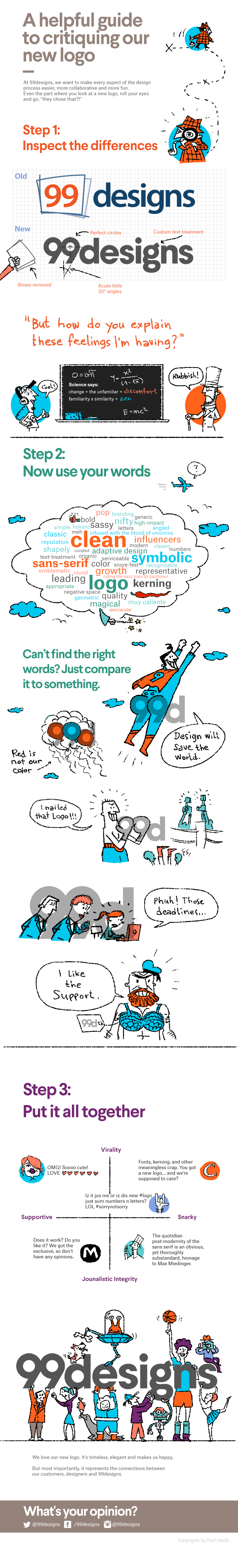
This week, crowdsourcing website 99designs released a new logo design which caused some controversy in the creative community – as we reported – for its "generic" appearance and "boring" design, as well as laying bare the flaws of the crowdsourcing model.
But 99designs hasn't taken the criticism lying down; in fact, it seems like the company expected the backlash… The infographic above has been posted on the site's blog, and it is an interesting mix of defending the logo design while also taking a hearty, passive-aggressive swipe at its detractors.
As for the logo itself – the debate will rage on…
Liked this? Read these!
- Read our selection of the finest free ebooks for designers
- What does an art director actually do?
- Be inspired by these creative resumes
- We reveal where to find logo design inspiration
- Can you guess the logo in this design quiz?

LATEST ARTICLES
