Design crowdsourcing website gets the logo it deserves
Crowdsourcing website 99designs let its online community create their new logo, with a predictable result.
Sign up to Creative Bloq's daily newsletter, which brings you the latest news and inspiration from the worlds of art, design and technology.
You are now subscribed
Your newsletter sign-up was successful
Want to add more newsletters?

"A camel looks like a horse that was planned by a committee," said Sir Alec Issigonis, designer of the original Mini, and the creative community has something similar to say about controversial 'spec work' site 99designs' new logo design.
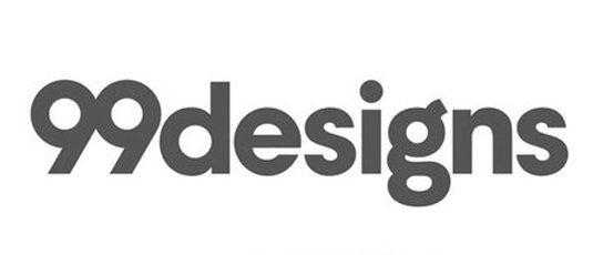
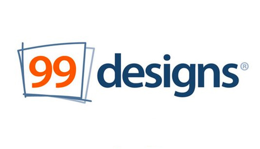
Created – unsurprisingly – by crowdsourcing work from its online community, the new logo is a grey, flat design that has already drawn criticism.
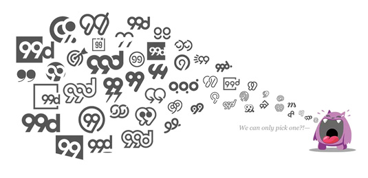
CEO of 99designs, Patrick Llewellyn, says that the new aesthetic took two years to create, with 556 designers contributing over 4,000 possible entries. "The new wordmark is intended to showcase a more stripped-back version of the website, prioritizing its community over the company itself," he explains. But let's take a look at what pro designers are saying…
Article continues belowDespite admiring how the company has stuck to its principles, designer Andy Hau isn't overwhelmed by the results. "It looks…fine. Not amazing, not awful, it's bland and easily consumable, kind of like tofu but with none the health benefits," he says.
"Actually in some ways, it's a complete success as it represents 99Designs' modus operandi and product perfectly: generic but OK," Andy adds.

However illustrator Ben O'Brien is more scathing of both the company and the redesign. "I think it's boring! To my untrained eye I'd say it looks like someone typed the name and quickly played with the kerning," he says. "I don't like what 99designs is, as a company, down with that kind of thing!
"But I have an idea for them, and they can have this one for free... since they have this mass global community, and they have 4000 possible logos in-hand, why not turn branding on it's head and have a neverending animated logo, like some kind of gif that constantly flicks through every possible '99' that they have, 5-10 frames/logos per second, it could look ace, even the dodgy designed ones that would be in there," he adds.
Sign up to Creative Bloq's daily newsletter, which brings you the latest news and inspiration from the worlds of art, design and technology.

In fact 99designs have come close to O'Brien's idea of creating a logo made up of unused ideas, however it can only be found on the error page. Compared to the concept of an animated logo, this makes the potential designs feel like mistakes rather than carefully constructed possibilities.
Between Hau's ambivalence and O'Brien's anger, Jonty Sharples tries to see 99designs for what it really is. "I think 99designs have done the right thing. They’ve stuck to their guns and (oh my goodness) Dogfooded. And it appears to have worked. I don't love the new mark, but then again I have a hunch that it's not designed to appeal to me," he reveals.
"I'm sure many people will want to throw everything including the kitchen, bathroom, and any other sinks they might have to hand at the folk from 99designs; but they're a successful service platform, and now more than ever this kind of thing should be a wake up call.
"There are super-talented folk all over the world who are more than happy to get paid $100 for a logo, and they'll work for it – they'll do the grunt work to get in the door, even if it's just to be on the receiving end of a rejection.
"Just look at the folio of the designer whose design won the 99designs 'competition' – it’s pretty nice stuff. A bit homogenous, but then that seems to be what people are buying these days. If anything this is the perfect moment to reassess what we do, how much we charge for it, and what value we actually add."
While Sharples's reasoned answer picks apart the state of modern design, a quick sweep through Twitter reveals that artists still have some way to go in terms of being won over by 99designs.
#99designs launches their new #logo which is an exact copy of an Advertising agency #copyright #counterfeiter #dumb pic.twitter.com/ryMSWcCHeyMarch 8, 2016
99 Designs crowd-sourced their new logo. I wonder how many valuable hours of design time were wasted by entrants https://t.co/2eJvOQSOQMMarch 9, 2016
As you can see, the logo has caused as much derision for its bland design as the method of its selection, so you could say that 99designs has ended up with the logo that it deserves.
Liked this? Read these!
- Read our selection of the finest free ebooks for designers
- What does an art director actually do?
- Be inspired by these creative resumes
- We reveal where to find logo design inspiration
- Can you guess the logo in this design quiz?

Dom Carter is a freelance writer who specialises in art and design. Formerly a staff writer for Creative Bloq, his work has also appeared on Creative Boom and in the pages of ImagineFX, Computer Arts, 3D World, and .net. He has been a D&AD New Blood judge, and has a particular interest in picture books.
