Google Maps design secrets revealed
Learn some of the design foundations that fuelled Maps’ latest evolution with Patrick Hofmann, senior user experience designer at Google.
Sign up to Creative Bloq's daily newsletter, which brings you the latest news and inspiration from the worlds of art, design and technology.
You are now subscribed
Your newsletter sign-up was successful
Want to add more newsletters?
Google Maps launched in 2005 and it was a revolution: you could go to your desktop browser, click and drag a map with a mouse and watch it render smoothly and quickly. Before then, you usually had to click arrows at the edge of a map in order to pan it, and wait for it to load.
Google Maps' 'fishbone' zoom controls predominated the map; after all, screen resolutions were small, and double-clicking the map would re-centre it rather than zoom into it. Beside the map, a column of suggested searches and instructions took over one third of the screen's width. Oh, and it only worked in Firefox and Explorer browsers.
Only eight years later, Google Maps spans multiple browsers and operating systems on desktop, mobile, tablet, and wearable devices. But how did its latest reincarnation come into play?
Article continues below 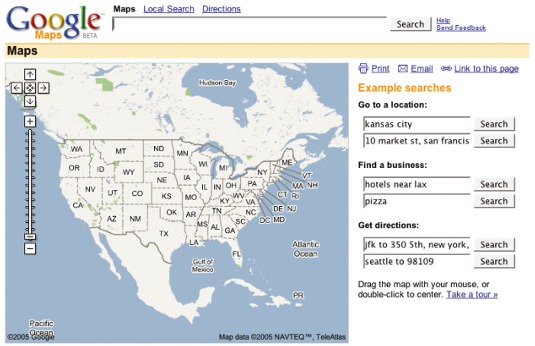
When I was briefly involved in the early days of rethinking and redesigning maps in 2010, our lead designer Jonah Jones inspired us to think far beyond the traditional static map of tasks and algorithmically placed data, and imagine more audaciously of multiple, customised, infinite variations of maps that didn't just change with every zoom level, but with every click.
However, as we weren't working from any declared, detailed design mantras at that point, we each had favourite doctrines or personal inspirations that fuelled our designs.
For me, one of my favourites stemmed from my early days as a technical writer, illustrator, and usability consultant. The book was Robin Williams' The Non-Designer's Design Book (by Peachpit Press), which originally outlined four key foundations for laying out typography on a page. But to me, these principles worked admirably for any type of information design, and in particular, for map design.
A load of CRAP
The design principles were subtly, cheekily, and ironically, referred to as CRAP, which stands for Contrast, Repetition, Alignment and Proximity. Building contrast into a map is about making the different information types distinctly different.
Sign up to Creative Bloq's daily newsletter, which brings you the latest news and inspiration from the worlds of art, design and technology.
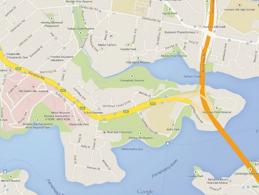
On our base maps, thick orange motorways stand out effectively against lesser yellow secondary roads and stand out further from thin white footpaths. These differences help users recognise patterns, and help build a mental model of how the maps are built.
It's important to use contrast typographically as well; city labels are distinguishable from road labels, which are distinguishable from landmark labels, and so on.
Points of interest
In the early days of Google Maps, the maps themselves had plenty of labelled roads, political names and geographical features, but few, if any, points of interest.
Over the years, we added helpful points of interest, landmarks, neighbourhood names, building footprints, transit stops, and so much more. To make things more helpful, we also added new layers, like traffic, biking, and terrain.
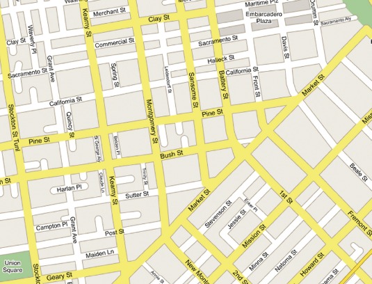
Unfortunately, this meant adding too many information types and elements to the map as we tried to add more and more contrast between all the competing elements.
Our lead product manager Bernhard Seefeld memorably referred to it as a "Christmas tree with so many ornaments on it, it's going to weigh down the branches and fall over."
Nowadays, we've been able to reduce this contrast by aiming to show information when it feels right. If you click on a place, we drop many of the minor street names and show only the important ones that are in close proximity to your click. Every click creates a different map that dynamically includes and excludes the appropriate information.
Consistent relationships
Repetition is closely associated with contrast. After all, if you establish a unique visual style for each information type, you're establishing a universal style guide that governs the representation of any village or city on the entire planet.
For example, a motorway in Sydney looks like a motorway in San Diego. The careful and consistent repetition of these unique styles reinforces a seemingly invisible style guide. This helps users to build their mental model of the map, and enables them to scan the map far more effectively.
Back when I started on Maps, Google had many different designs. We launched so many services with different design patterns that they all began to feel at odds, such that a user could move from one Google service to another without a consistent expectation or experience.
In 2011, Larry Page set a challenge to create one "beautiful, simple and intuitive experience" regardless of device. It was a vehicle for establishing consistency and repetition, not just within our Google Maps services, but across the entire organisation, improving user experience.
Provide clear paths
Physical makeups and spatial relationships of our natural and urban worlds are totally unpredictable and often naturally unaligned. On a page, as a general layout rule, alignment is fundamental for a user to scan it effectively, to recognise a page's visual anchor, and to make a page feel unified.
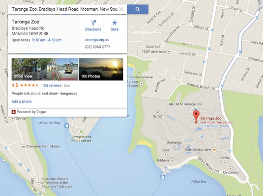
On a map, the individual labels of landmarks, points of interest and search results require consistent and careful alignment rules. There has to be flexibility for the label placement, but also predictability for the user. So, to label such points on a map, we vertically centre-align the label with the marker, and allow the label to jet out from the left or right of the marker.
In some cases where labels are too dense or conflict with more important labels, we may position the label above or below the marker, but try to retain its left or right alignment line with the perimeter of the marker.
Group information types
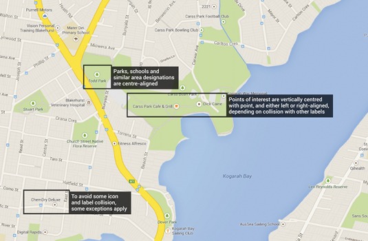
Proximity may be one of my favourite foundations. Simply put, things that are visually close together imply some sort of relationship. On a map, the label that accompanies its marker better be closer to that marker than to any other object on the map.
This method for grouping similar information types and distancing dissimilar ones instantly organises a page. This is most evident off the map, where multiple information types and calls to action need to be organised for effective scanning and consuming.
Amplify the map's message
Canadian philosopher Marshall McLuhan cited famously that "The medium is the message". If the map is the medium, and the map is the message, why do so many maps seem to lack one?
Far too often, maps contain so much detailed data that their spatially-oriented base is indiscernible. As eager designers and engineers, we're often so keen to share that data that it sometimes overwhelms the user and occludes other important information on the map.
This is why the latest map design involved so much effort to determine what every click meant for a user. Every click of the map dramatically transformed what was shown, and how.
Empowering users
Since the birth of Google Maps, there's been a strong history of empowering users to harness the power of Google Maps into their own custom creations and data visualisation.
Whether you're creating a custom map, whether a collection of your favourite cafes in Cambridge or a spatial visualisation of the coffee consumption in Oxford, that message should be the most prominent and arresting thing on the map.
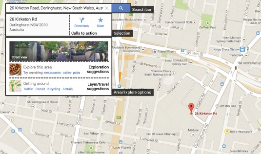
To do this, employ the principle of contrast to make the locations (visualised with coffee cups, no less) the most prominent thing on the map. Distinguish the 'thesis' of the map from the base of the map. Mute or subdue the components of the map that are less important or unnecessary.
Be judicious about what data you want to show: just because you have a lot of data doesn't mean you have to show it all at once.
Visual traffic
If the message of the map is apparent, it will almost naturally be optimal for scanning. The less 'visual traffic' there is on a map, the easier people will be able to consume and digest it.
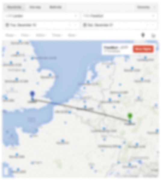
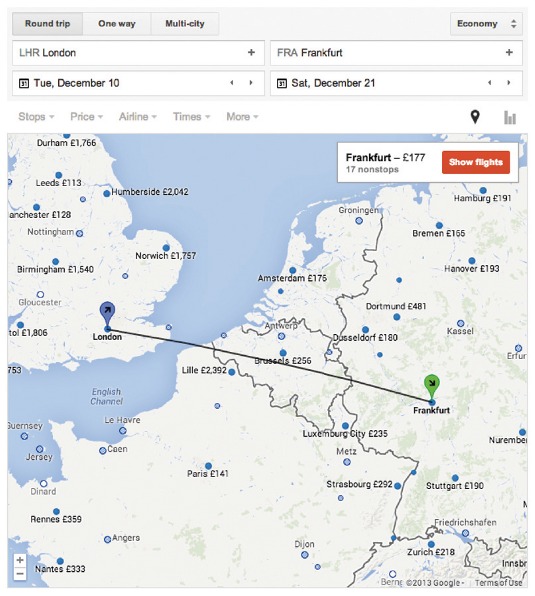
For example, if you see the map at Google's flight search tool, the default map is significantly simplified to express nothing but your current location, national borders within your continent, and the flight prices of some destination cities.
Since people scan maps rather than read them, how can you tell if these design foundations and principles are working? First, do a simple 'blur' test. Take your map or your page and squint so you can barely see it. What stands out the most? The least?
Is the message of your map appearing prominently enough? Is its 'thesis' the visual focus of your attention? If not, then you need to adjust the design decisions of the map.
Also do a simple 'vocalisation' test: in order of prominence, if every element could speak to identify themselves, what would the map say? How "loud" would the map be? Vocalising the flight map below would begin with "London, flying to Frankfurt" , followed by a secondary dictation of flight prices to nearby cities.
Ultimately, these foundations, principles and exercises force us to ask, "What's this map supposed to say? How will people use it? What's the ultimate outcome of using this map?"
Amid the evolution of Google Maps in the last eight years, these questions will continue to excite and challenge us.
Words: Patrick Hofmann Illustration: James Oconnell
Patrick is a senior user experience designer at Google in Sydney, Australia. He started working on Google Maps in 2007. This article originally appeared in net magazine issue 251.

The Creative Bloq team is made up of a group of art and design enthusiasts, and has changed and evolved since Creative Bloq began back in 2012. The current website team consists of eight full-time members of staff: Editor Georgia Coggan, Deputy Editor Rosie Hilder, Ecommerce Editor Beren Neale, Senior News Editor Daniel Piper, Editor, Digital Art and 3D Ian Dean, Tech Reviews Editor Erlingur Einarsson, Ecommerce Writer Beth Nicholls and Staff Writer Natalie Fear, as well as a roster of freelancers from around the world. The ImagineFX magazine team also pitch in, ensuring that content from leading digital art publication ImagineFX is represented on Creative Bloq.
