Some iconic logos have been around for years and people see them every day without giving much thought to what they represent. Inevitably, that leads to minds being blown when people discover the meaning behind the design, and that's what's happening in Australia with the national post service's logo.
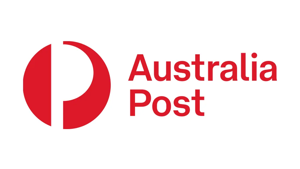
The Australia Post logo has been around since the 1970s. It most obviously incorporates a letter 'P' for post, but people have been stunned to learn from TikTok that there's more to design (for tips on how to create an iconic symbol see our guide to how to design a logo).
@julianoshea Ever wondered what’s going on with the Australia Post logo? No? Well now you don’t need to. 📯
♬ original sound - Julian O'Shea
And people thought TikTok would only ever serve to watch videos of people's dance steps. It's through the popular social media platform that Aussies are now learning that the iconic, decades-old Australia Post logo has a meaning they never imagined.
Melbourne-based engineer Julian O'Shea often discusses the history of designs and building on TikTok, and now he's posted a video revealing the meaning of the logo. He points out that as well as representing the letter 'P', the logo design incorporates the shape of a mail horn, an instrument used by the guards on mail coaches in 18th and 19th centuries and a symbol that's still used in the logos of many postal services around the world, from Argentina to Iceland.

"Ever wondered what's going on with the Australia Post logo?" O'Shea asks stood in front of a post box that displays the design. Indicating the half-circle on the right of the logo, he says: "This shape is based on the postal horn and this was an actual instrument that would be blown to let people know that the mailman was here to come down and bring your packages." "So you might think letters and mail are out of date, but the logos they use are even more so," he notes.


Judging from the comments on the video, a lot of people never realised the logo had this meaning. "OK, this is something they should teach us in Primary school," one person wrote. "I’ve always thought it was a P inside an O that was just kinda stylised," someone else commented. Someone else suggested that the design depicts "a pirate on his side".
The commenters have some interesting bits of trivia of their own too. According to one person, a design inspired by the Australia Post logo was used in Star Wars on a set of Clone Trooper armour as a tribute to Sydney, where it was filmed. But what about the shape on the other side of the logo? "The half moon on the left is symbolic of your mail taking a full lunar cycle to be delivered," one person suggested.
The original version of the Australia Post logo was designed by Dutch graphic designer Pieter Huveneers in 1975 (To learn about more inspiring designers, see our piece on famous graphic designers). Huveneers created logo designs for Telecom Australia, Westpac, Colonial Mutual Life, the department store chain Myer and the airline TAA after relocating to Australia. The Australia Post logo has undergone several iterations over the years, but the mark itself has remained.
Read more:

