The biggest Super Bowl design controversies ever

The Super Bowl is the most watched event in the US sporting calendar, and the upcoming Super Bowl LVII will surely be no exception. With less than two weeks to go until the Chiefs take on the Eagles in Arizona, the pre-game build up has begun. But as well as the sporting action and the epic halftime shows, the final playoff in the National Football League also has a tendency to serve up plenty of design debates.
No, wardrobe malfunctions aren't the only controversies the Super Bowl has seen, there have also been plenty of branding debacles, from logo designs that range from bland to bloody, hugely expensive advertising campaigns and dubious NFTs. As we look forward to the event, here's our pick of the biggest Super Bowl design controversies so far (want to join those who are offering their own takes on the Super Bowl logo? Make sure you've got the best graphic design software).
Super Bowl logo designs lose their creativity
The laziness sets in at Super Bowl XLV. https://t.co/Olc4BOgnDBFebruary 9, 2022
Perhaps the biggest Super Bowl design controversy was the decision to do away with the tradition of creating a new logo each year in favour of standardised designs. Up until Super Bowl XLV in 2010, each year saw a unique logo design inspired by the location that would host the playoff. But in 2010, suddenly someone created a style guide.
The standardisation was the work of Landor Associates together with the NFL’s own in-house design team, and it was carried on into a wider graphic system that included divisional rounds of the playoffs, the AFC and NFC championships and the Pro Bowl. Super Bowls XLV to XLIX used pretty much the same logo featuring the Vince Lombardi trophy. The design was tweaked in 2015 for Super Bowl 50, leading to another series of very similar logos for the next five years.
Man, I wish Super Bowl logos were creative again.Here's what I think Super Bowl LVIII's logo should look like next season if the NFL still used creative logos, based on the fabulous Las Vegas sign: https://t.co/2ugZeyVmQU pic.twitter.com/Jr6iBlcPfUJanuary 28, 2023
We can see why the NFL would have wanted to create a more consistent recognisable identity for a game of such stature, but by Super Bowl LV the designs had become downright boring. "Everything past XLV is dull, uninspired, typical corporate crap," one person complained on Twitter. The NFL seemed to recognise that by the time we got to last year's Super Bowl LVI. It injected some creativity again, but that caused a whole different issue...
That gory Super Bowl logo
What’s up with the blood-drenched super Bowl logo this year? Freddy Krueger flips the coin? pic.twitter.com/HYRBXQPPDLJanuary 23, 2022
For the Super Bowl LVI, the NFL decided it was time to bring back some of the old originality to the logo. It didn't quite go back to the anything-goes days of pre-2010, but it made 2022 event's logo more unique by referencing the host state of California in the design through the incorporation of palm trees in the letters. It was a nice move, maintaining consistency while making the logo more interesting and relevant to the specific event. There was just one problem. A lot of people thought it looked like a bloodbath.
Indeed, the tree trunks did look somewhat streaky, and the leaves somewhat... splattery, and it was one of those examples of 'once you've seen it, you can't unsee it'. As far as Twitter was concerned, it was a massacre.
Sign up to Creative Bloq's daily newsletter, which brings you the latest news and inspiration from the worlds of art, design and technology.
The 2023 Super Bowl logo predicts who will play
I mean come on, the colors of this year’s Super Bowl logo are Eagles and Chiefs colors. The script was already written. #SuperBowlLVII pic.twitter.com/6GD9YVwBYXJanuary 30, 2023
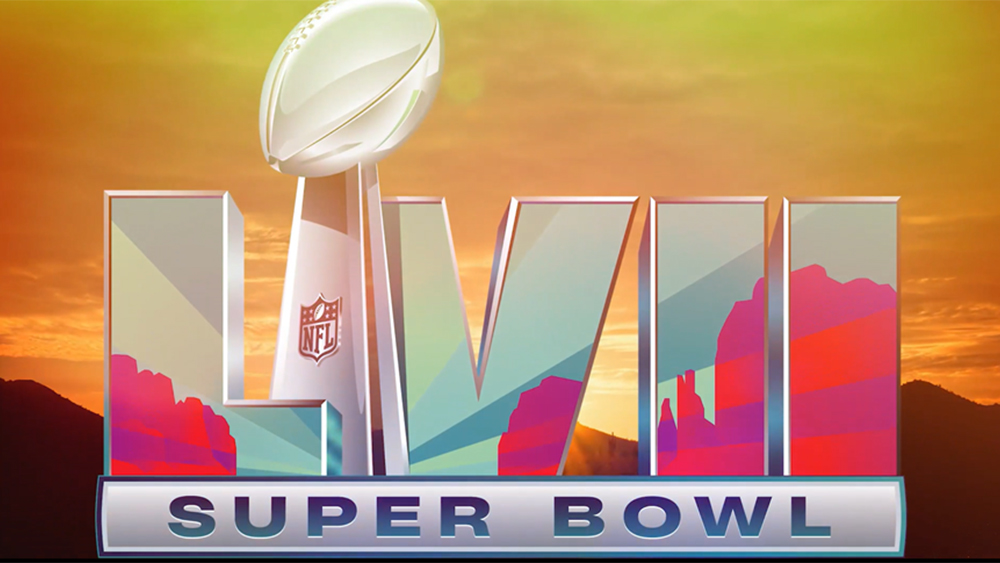
Despite the unfortunately bloody look of the Super Bowl LVI logo, the NFL decided to stick with the idea of referencing the game's host state for the upcoming Super Bowl LVII. This time it delivered a winner. With the big game to be played at Arizona’s State Farm Stadium in Glendale on 12 February, the design incorporates the state’s emblematic desert landscape along with beams of light shining from the horizon to reference the Arizona State Flag.
But some people later wondered if something uncanny was going on with the choice of colours. The Super Bowl LVII will be contested by The Kansas City Chiefs (red) and Philadelphia Eagles (teal). Did the NFL predict who would be competing in the game? We suspect not, but there always needs to be some kind of controversy.
Super Bowl LVIII logo is apparently leaked
Is this our first glimpse of what NEXT YEAR’S #SuperBowl logo will look like? This sketch from a source suggests the Las Vegas skyline will be incorporated & that the Roman numerals (purple this time!) will be curved. Per @sportslogosnet. #SBLVIII #NFL https://t.co/F13oX7tTCR pic.twitter.com/Y9J5yu1faKJanuary 30, 2023
Is this next year's SuperBowl logo? We don't know, but people seem to like it. The sketch doing the rounds on Twitter is said to be based on a glimpse of a finished version of the logo for next year's game in Las Vegas. The Vegas skyline is featured, following the style of the last couple of logos, but the Roman numerals this time are curved on either end, which seems like a nice further variation on the flat logo after so many years.
The most controversial Super Bowl ads
The Super Bowl is the most watched television event in the US, and that means brands tend to get a little carried away in their attempts to get noticed in the commercial breaks. An advertising slot during the game is so expensive, you want to make sure you really get viewers' attention, and that's often meant going way over the top.
Sometimes viewers have been terribly upset about seemingly minor controversies, like a kiss in a GoDaddy ad (so it was a long, sloppy close-up kiss, but come on, it was just a kiss). But perhaps one of the most controversial ads in branding circles was the cheeky Scarlett Johansson Soda Stream ad from 2014 (above) due to the direct challenge 'Sorry Coke and Pepsi' (the line was cut from the final version, avoiding causing offence to two major advertisers, but Johansson lost her role as an Oxfam ambassador because of Soda Stream's presence in occupied Palestinian territories).
Perhaps one of the hardest hitting Super Bowls ads was produced by Pittsburgh's 84 Lumber Company in 2017. The piece, which had to be heavily edited after footage in the full version was deemed too political for broadcast by Fox, depicts a mother and daughter's journey to become legal American citizens.
The shortest Super Bowl ad in history
Like we said, advertising during the Super Bowl is an expensive business. According to Variety, 30 seconds costs $5.5M. So back in 2021, Reddit decided to make do with what it could afford, which was five seconds. And it made them count with the shortest Super Bowl ad in history. The ad looked like an accident, but it was wonderfully creative.
"Big game spots are expensive, so we couldn't buy a full one," the message read. "But we were inspired and decided to spend our entire marketing budget on 5 seconds of airtime." It certainly got people talking.
M&M's rebrand revealed to be Super Bowl stunt
Yum 😉 pic.twitter.com/51nh9Ql0WfJanuary 25, 2023
Here's a Super Bowl controversy in the making. The internet had a minor meltdown last week when M&M’s declared that it was retiring its famous 'spokescandies' after the controversy caused by the Green M&M's redesign last year. The move disappointed many, who accused the brand of bowing down to pressure from right-wing critics. But it's starting to look like the whole thing is a joke, with the spokescandies expected to make some form of triumphant return for this year's big game.
This might take some getting used to… for the both of us. Excited to welcome Yellow from M&M’S as the new SNICKERS spokescandy. pic.twitter.com/stPVRDxodYJanuary 25, 2023
Maya Rudolph was announced as a replacement for the brand’s mascots, and she's been shown making changes to the brand, adding a picture of her face to the M&M’s and changing the brand name to Ma & Ya’s. Meanwhile, there have been teasers as to the whereabouts of the spokescandies. We'll have to wait to see how things are resolved during the Super Bowl, but chances are it might rile M&M's critics even more.
Super Bowl NFTs

NFTs were suddenly everywhere last year and Super Bowl was no exception. The crypto exchange FTX made its first Super Bowl ad (and its last; it went bust in November) and even the NFL itself was offering ticket stubs as NFTs. But with the match being dubbed the 'Crypto Bowl', some Super Bowl NFT initiatives were dubious to say the least.
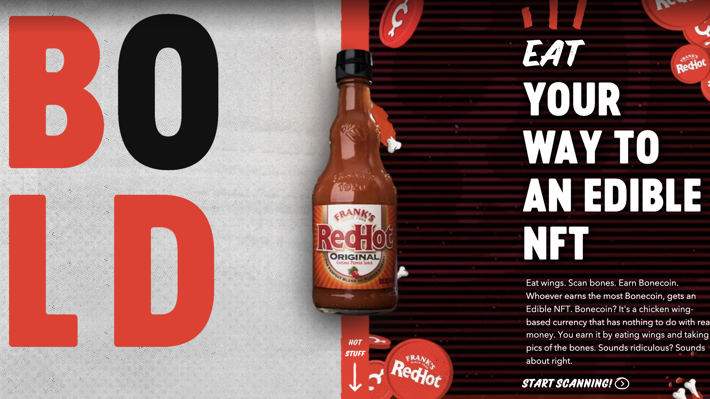
Frank's RedHot declared it was offering the world's first 'edible NFT' or eNFT. Customers could eat chicken wings to earn Bonecoin and the fan with the most would win an NFT. So, no, not really an edible NFT at all. It felt more like a desperate attempt to get some coverage. (read our What Are NFTs? guide for more on the rise of non-fungible tokens).
Read more:
- The most unbelievable logo fails of 2022
- Why the Pink Floyd logo drama is ridiculous
- AI Bill Gates presenting the first iPhone is as weird as it sounds

Joe is a regular freelance journalist and editor at Creative Bloq. He writes news, features and buying guides and keeps track of the best equipment and software for creatives, from video editing programs to monitors and accessories. A veteran news writer and photographer, he now works as a project manager at the London and Buenos Aires-based design, production and branding agency Hermana Creatives. There he manages a team of designers, photographers and video editors who specialise in producing visual content and design assets for the hospitality sector. He also dances Argentine tango.


