New Super Bowl LV logo leaked, and it's not good
Did somebody say 'horribly underwhelming'?

Sign up to Creative Bloq's daily newsletter, which brings you the latest news and inspiration from the worlds of art, design and technology.
You are now subscribed
Your newsletter sign-up was successful
Want to add more newsletters?
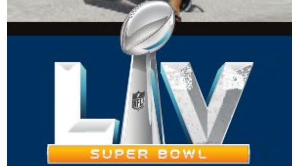
The Super Bowl is a big deal for lots of reasons, so you'd be forgiven for thinking that there'd be a huge budget to create an incredible brand identity. Not so, it seems. The latest logo for next year's Super Bowl LV in Tampa, Florida has just been leaked, and as logos go, it's pretty underwhelming (and that's us being nice).
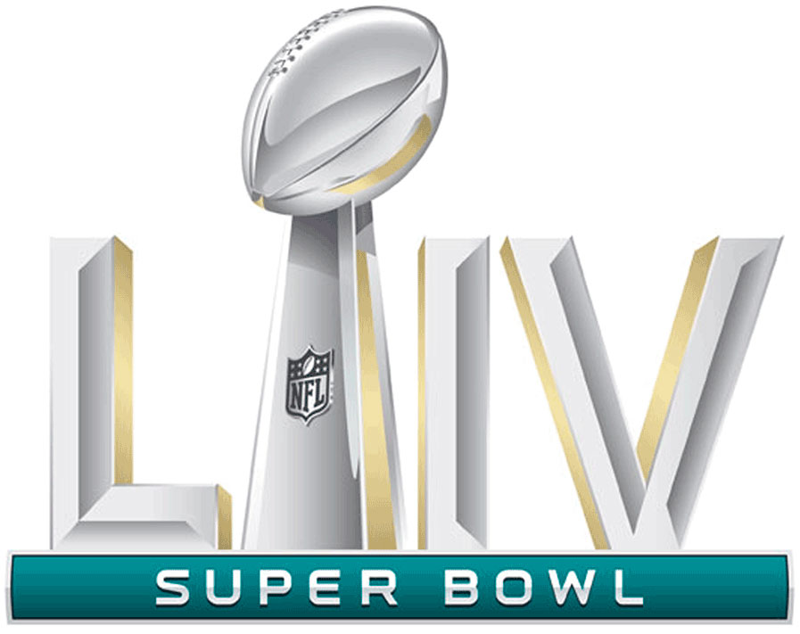
The new Super Bowl 2021 logo (above) looks almost exactly like the logo for this year (below). Neither is very exciting. And as Brits who haven't grown up watching the games, we have to admit that it took us a while to decipher it, and figure out that it says LV, not LIV (which is this year's Super Bowl).
If you're not in the US and do want to get involved, see our guide to how to live stream the Super Bowl for free.
Article continues belowAs we detailed in our logo design guide, a good logo should be legible and understandable for those who don't know much about the brand. It doesn't look like this new logo will be making it into our list of best logos anytime soon.

What's different between this logo and the current one? Well... there's no extra 'I', so it doesn't read LIIV, just LIV (to the untrained eye). And the colour of the banner below the letters is now orange, instead of green. Wonderful. We can only assume this is supposed to represent something about the location of the event, but it's not immediately obvious what. Is it supposed to represent Florida's oranges, perhaps?
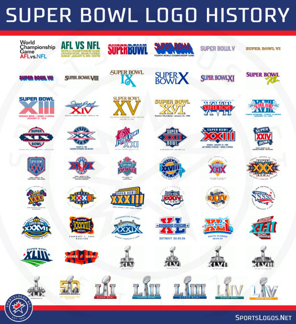
Anyway, the logo follows the template for other Super Bowl logos, as you can see by looking at them in all their marvellous glory below. And while you could argue that this is similar to the PS5 logo debate, in which designers complained that Sony had just used the same logo as always but added a different number, at least the PlayStation logo is actually good in the first place. (Too harsh?)

People on social media were quick to point out their disappointment.
Sign up to Creative Bloq's daily newsletter, which brings you the latest news and inspiration from the worlds of art, design and technology.
Bring back the game-specific logos.January 22, 2020
It's almost like they stopped caring after XLIVJanuary 22, 2020
Others are still hung up on the 'LIV' thing from this year's logo.
yeah the Aaron Hernandez doc was crazy, but I want a look into the mind of the designer who didn’t use the trophy as the “I” in the Super Bowl LIV logo pic.twitter.com/LLiS04kYwgJanuary 22, 2020
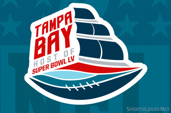
On the sort of bright side, there is also this host committee logo, which at least looks like it makes some sort of nod to the setting.

Overall, we've got our fingers crossed for 2022. But we won't be holding our breath.
Read more:

Rosie Hilder is Creative Bloq's Deputy Editor. After beginning her career in journalism in Argentina – where she worked as Deputy Editor of Time Out Buenos Aires – she moved back to the UK and joined Future Plc in 2016. Since then, she's worked as Operations Editor on magazines including Computer Arts, 3D World and Paint & Draw and Mac|Life. In 2018, she joined Creative Bloq, where she now assists with the daily management of the site, including growing the site's reach, getting involved in events, such as judging the Brand Impact Awards, and helping make sure our content serves the reader as best it can.
