Why the Pink Floyd logo drama is ridiculous
The rainbow has brought out the Dark Side of Twitter.

Sign up to Creative Bloq's daily newsletter, which brings you the latest news and inspiration from the worlds of art, design and technology.
You are now subscribed
Your newsletter sign-up was successful
Want to add more newsletters?
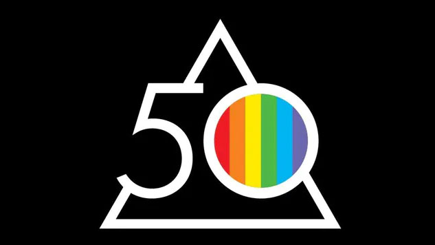
Pink Floyd has released a new version of its iconic pyramid logo to celebrate the 50th anniversary of the classic album The Dark Side of the Moon. And the irate folk on social media are cross about one 'change' that's actually been part of the logo all along.
Yup, when Pink Floyd tweeted the new, temporary logo (which, frankly, could be on our best logos list), many voices chimed in complaining about the "addition" of a rainbow, claiming the band had become too 'woke'. Seriously. That's despite the fact it references the rainbow used in the original Dark Side of the Moon cover art way back in 1973.

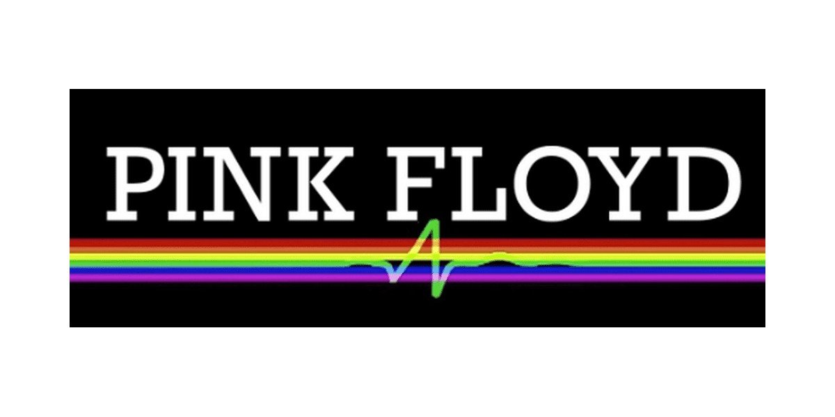
While the rainbow has been used as a symbol for support for the LGBTQI+ community for decades, Pink Floyd used it on its Dark Side of the Moon cover art back in 1973 to to symbolise the band's dazzling live light shows. The design originally showed a beam of light refracted by a prism into six colours rather than the seven colour rainbow. The design was later modified and has been used under the band's name in a logo that has existed since 2011 (below).

As you can see above, the new logo has compressed the rainbow into the centre of the '0', a change that's making some disgruntled fans feel as if it had never been there before.
"Lose the rainbow, you're making yourself look stupid!", one commenter advised "Are you going woke with rainbows"? another asked, continuing "is there a straight flag, I want equal representation, don't get me wrong. We should all be true to who we are".
Pink Floyd updated their profile picture to celebrate the 50th anniversary of the Dark Side of the Moon, and the replies are… something. pic.twitter.com/e4zNZ2KGOSJanuary 20, 2023
Other Twitter dwellers have been remarkably quick to take down the confused fans, with some witty memes 'cancelling' other brands that use rainbows in their advertising, and even referencing Isaac Newton. We've popped a couple of our favourites below.
Ever look to the sky and see a Rainbow. They have been around forever.. ps they will be going after Lucky Charms next LoL pic.twitter.com/eztOkoFN2WJanuary 21, 2023
So the MAGA crowd is pissed with Pink Floyd because of the rainbow. Have they started boycotting Lucky Charms yet? pic.twitter.com/1QjalmYNa6January 21, 2023
All this confusion shows the multitude of impacts a single symbol can have. If a consumer believes a symbol has a certain meaning, they're likely to ascribe it to what they see in front of them, no matter the context – an important takeaway when considering branding and design.
Sign up to Creative Bloq's daily newsletter, which brings you the latest news and inspiration from the worlds of art, design and technology.
Got a new project to work on? Find out what monotype's top trends of the year are set to be.
Read more:

Georgia has worked on Creative Bloq since 2018, and has been the site's Editor since 2023. With a specialism in branding and design, Georgia is also Programme Director of CB's award scheme – the Brand Impact Awards. As well as immersing herself with the industry through attending events like Adobe Max and the D&AD Awards and steering the site's content streams, Georgia has an eye on new commercial opportunities and ensuring they reflect the needs and interests of creatives.
