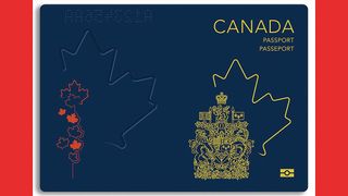
Passport designs often attract a lot of opinion, after all they're the document that represents us and our county when we travel abroad. And while they tend to look fairly standard on the outside, some countries have found ways to be highly creative inside, both for practical purposes to make forgery more difficult, but also to create beautiful documents.
Immigration, Refugees and Citizenship Canada (IRCC) has revealed a new Canadian passport design created by the Canadian Bank Note Company, and it's a passport for all seasons, with designs that change under ultraviolet light (see our pick of the best logos for more design inspiration).


The new Canadian passport features maple leaves on the cover – a large yellow maple leaf on the front and a combination of smaller red leaves inside an engraved outline on the back. Inside on the visa pages, there are illustrations representing the four seasons, with an emphasis on nature. The autumn scene shows children holding pumpkins, while spring features a bear with her cubs. And in an added touch, the colours of the illustrations become more vivid when exposed to ultraviolet light.
However, in Canada itself, the new passport design is proving to be highly controversial and has not been universally welcomed. The previous passport design featured images of historic sites and people, including Vimey Ridge, the athlete Terry Fox and HMCS Sackville. Canada’s immigration and citizenship minister Sean Fraser has had to defend the designs, saying “I don’t think it’s woke to celebrate Canada’s national environment, I don’t think it’s woke to include indigenous people."
The new passport is one of the first travel documents from a Commonwealth country to make reference King Charles III, but it features Queen Elizabeth II's Coat of Arms since King Charles III didn't approve the new royal emblem in time.
For more design news see how an agency fixed the Warner Bros logo and the big reveal of Wonder Woman's daughter.
Get the Creative Bloq Newsletter
Daily design news, reviews, how-tos and more, as picked by the editors.

Thank you for reading 5 articles this month* Join now for unlimited access
Enjoy your first month for just £1 / $1 / €1
*Read 5 free articles per month without a subscription

Join now for unlimited access
Try first month for just £1 / $1 / €1
Joe is a regular freelance journalist and editor at Creative Bloq. He writes news, features and buying guides and keeps track of the best equipment and software for creatives, from video editing programs to monitors and accessories. A veteran news writer and photographer, he now works as a project manager at the London and Buenos Aires-based design, production and branding agency Hermana Creatives. There he manages a team of designers, photographers and video editors who specialise in producing visual content and design assets for the hospitality sector. He also dances Argentine tango.


