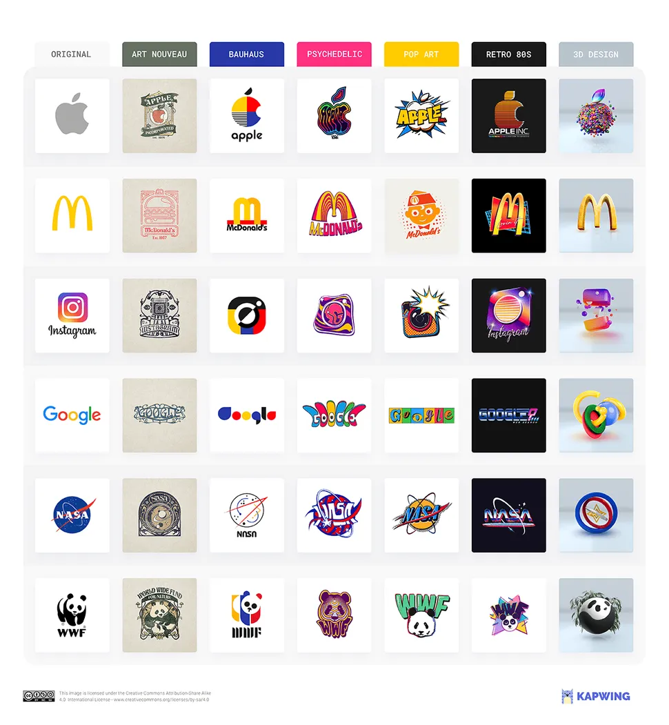
How much can you tweak a logo before it stops being recognisable? That's the question we've been pondering today, and we'll be honest, many days before that. And it seems we're not alone. Reddit has been going wild for a graphic by video editing company Kapwing, showing what some of the world's most iconic logos would look like in a variety of different styles, including Art Nouveau, psychedelia and pop art.
The post (see below) features the Apple, McDonald's, Instagram, Nasa, Google and WWF logos, and the people of r/DesignPorn are busy delighting, despairing and comparing the designs (what's new?). If you think you could do better, but aren't sure which tools you need, then our best graphic design software post might help.
Our favourites of the redesigns (see the full post by Kapwing here), are probably Nasa's characterful and fun psychedelic new look, and Google, Bauhaus style – we could imagine the latter on lots of Google tech. However, we're not sure sure about the garish colours and slightly tacky sparkles of the '80s era. But then again, it is the '80s.
As usual on the Reddit Design Porn channel, opposing arguments are a-flying. "I love all the logos in the Bauhaus column", says one user, while another says, "I feel like I’m missing something because, oh my god, I hate Bauhaus." Each to their own.
Do we wish famous brands would adopt these designs? Well, not really. But it does remind us of the core principles of logo design – when a logo really works, you can switch up the elements and it'll still remain instantly recognisable.
If anyone wants to redesign the Creative Bloq logo in the Bauhaus style or otherwise, our inbox is open (contact@creativebloq.com).
Read More:
Get the Creative Bloq Newsletter
Daily design news, reviews, how-tos and more, as picked by the editors.
Amelia is Creative Bloq’s Staff Writer. After completing a degree in Popular Music and a Master’s in Song Writing, Amelia began designing posters, logos, album covers and websites for musicians. She now enjoys covering a range of topics on Creative Bloq, including posters, optical illusions, logos (she's a particular fan of logo Easter eggs), gaming and illustration. In her free time, she relishes in the likes of art (especially the Pre-Raphaelites), photography and literature. Amelia prides herself on her unorthodox creative methods, her Animal Crossing island and her extensive music library.