New FedEx logo design concept gets roasted online
But who's trolling who?

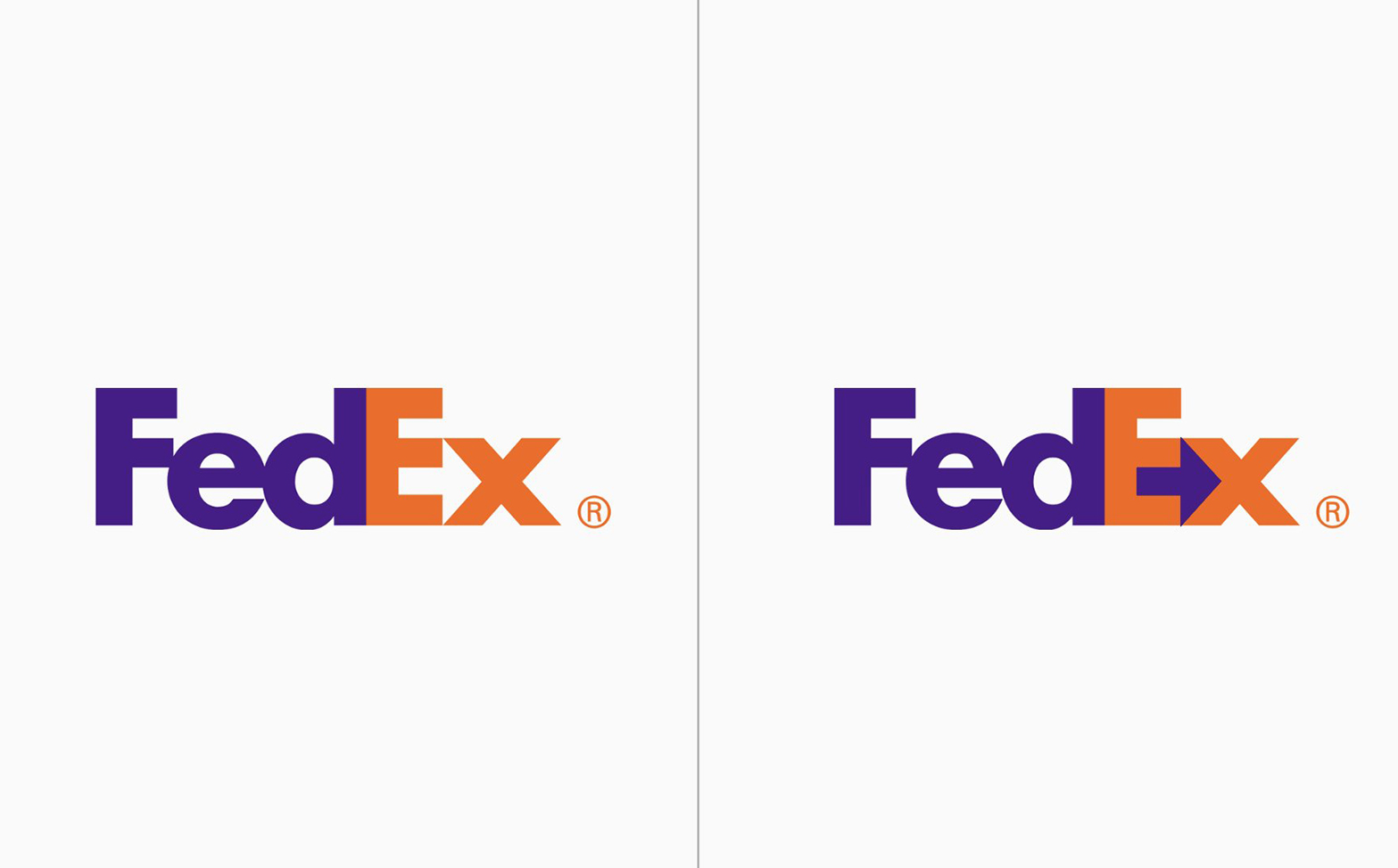
It's one of the most instantly recognisable logos of all time and, at first glance, appears deceptively simple. Indeed, we can all remember where we were when we realised that there's a secret arrow hiding inside the FedEx logo. But what if it was a little easier to spot?
One Twitter user has proposed a simple adjustment to the iconic design which sees the negative space between the final 'e' and 'x' recoloured in the company's signature purple. It of course stands out a hell of a lot more – but without that 'hiding in plain sight' subtlety, is it still one of the best logos of all time?
Self-initiated redesign of the FedEx logo. Always bugged me that the arrow was so hard to see. What do you think tweeps! pic.twitter.com/JCBCBA4YtLJanuary 3, 2022
Designer Dan Cassaro shared the 'self-initiated' redesign (above) this week, suggesting that the arrow (arguably one of the best uses of negative space ever) is currently too hard to see. Cassaro asked for feedback on the design – and Design Twitter has responded vehemently, with many (admittedly pretty funny) responses pointing out that the new design is far too on-the-nose. But are they the ones really being trolled?
Article continues belowIf we're honest, there's nothing that wrong with Cassaro's concept. It looks nice and clean, and it certainly makes that arrow a lot easier to see – all without sacrificing FedEx's aesthetic. But it seems to have drawn the ire of the unsuspecting internet, resulting in a pretty hilarious comment thread – with many suggesting how the arrow could be made even more obvious.


"You got so roasted, dude listen to design peeps out there, it's negative space for a reason, that's what makes it cool," one user comments, while another adds, "respectfully, this is not an improvement. Contrast/legibility of the text is sacrificed to over-emphasize the Easter egg."
But it's not all bad news. The thread has clearly provided plenty of amusement for observers – and it's genuinely difficult to tell who's being ironic in their furious response, and who's simply fiercely committed to the greater good that is Design Twitter.
And based on Cassaro's Twitter account, we have a feeling the whole thing was probably a joke from the start. Not only is that 'hidden' arrow one of the most famous design Easter eggs around, but the guy runs The Young Jerks, an "Independent Brand and Packaging Studio Run By Hyper-Intelligent Golden Retrievers". So, yeah. Probably a joke.
Sign up to Creative Bloq's daily newsletter, which brings you the latest news and inspiration from the worlds of art, design and technology.
the replies are hilarious and really make me hate insufferable designers. =P+ you can hate me too. join the club. =) https://t.co/NVJguXxuM7January 5, 2022
Funniest thing in a while. The comments are gold. 🤣 https://t.co/R5l3fKw84EJanuary 5, 2022
Well, if all of that hasn't entirely put you off embarking on your own project, be sure to take a look at our guide to logo design – lest you risk incurring the wrath of Design Twitter.
Read more:

Daniel John is Design Editor at Creative Bloq. He reports on the worlds of design, branding and lifestyle tech, and has covered several industry events including Milan Design Week, OFFF Barcelona and Adobe Max in Los Angeles. He has interviewed leaders and designers at brands including Apple, Microsoft and Adobe. Daniel's debut book of short stories and poems was published in 2018, and his comedy newsletter is a Substack Bestseller.
