Home to the remains of over six million people, the Catacombes de Paris date back hundreds of years. Originally created to solve the problem of the city's overflowing cemeteries, this ossuary has been transformed and renovated over the decades, with visitors now popping in en masse to take a look at the skulls it contains. And recently the site's branding received an update that evokes its vast underground galleries.
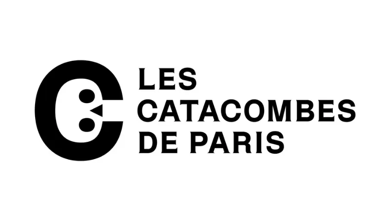
At the heart of this rebrand is a logo design that makes clever use of typography and negative space. Taking advantage of the open counter in the letter 'c', this logo (above) turns the space into a skull with the help of a couple of circles and a triangle. It's a neat way of tying together the Catacombs with a brand identity, with this logo design-cum-monogram providing a shorthand for the attraction.

Designed by studio Mo-To, this identity is the first time the ossuary has been given such a conscious piece of branding. Previously, it made do with a more severe sign featuring the sort of serifed lettering you'd expect to see chiselled into a headstone. But given that it's now something of a popular institution, it makes sense to brand the Catacombs accordingly.
Accompanying the skull logo is a custom typeface designed by Thomas Bouville called Dédale. Made up of three styles, including a light one for tilting, a regular style for ordinary text, and a bold style for impactful elements, this design takes its inspiration from the lettering that adorns the walls of the Catacombs' underground passages.
According to the Mo-To design team, the various categories of weights and styles found in the lettering pay homage to the ossuary. The typography also acts as an analogy for the human body, which itself, of course, contains a skeleton. "In this way, the family symbolises a transition from one state to another, a transition from life to death," M-To explains on its site.

As you can see in the posters above, this typeface is used to great effect on promotional materials. By burying the lettering behind the winding curves of the passages, the viewer is given a sense of what to expect by visiting the ossuary.
Both the typeface and logo are well executed pieces of design, but are they right for the Catacombs? The playful design encapsulates what the tunnels contain, however we're not sure if it's all just a little too... playful? Perhaps this is our stiff upper lip English sensibilities bubbling to the surface. We just can't help but think that it looks more like a well designed app icon than a respectful piece of branding for the home of millions of Parisians.
Related articles:

