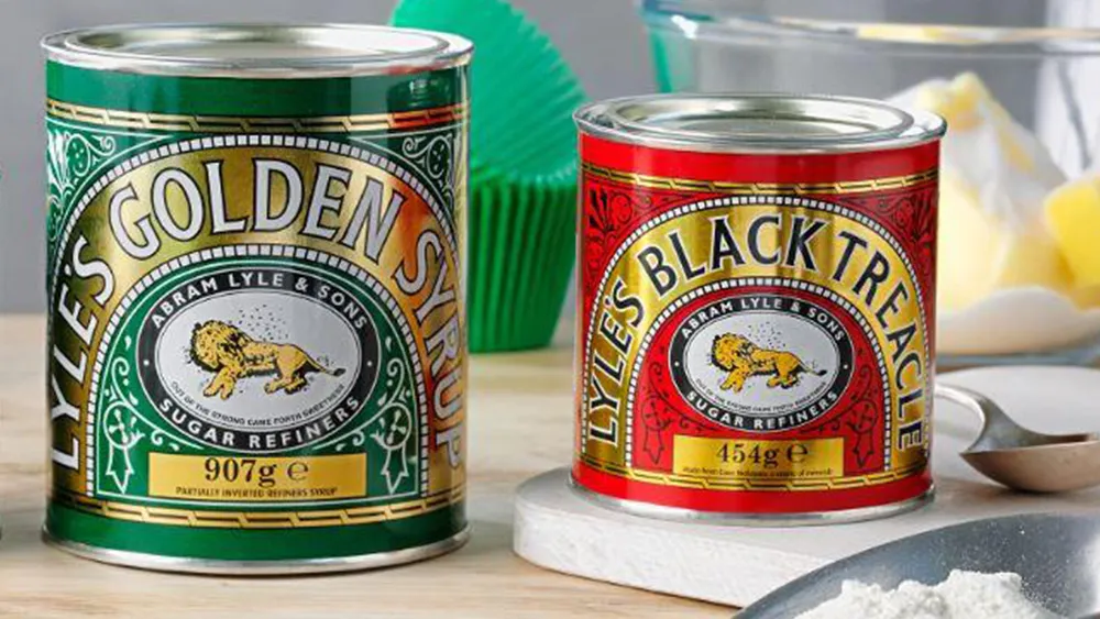
There are some logos that we see all our lives perhaps without giving them the attention they deserve. Anyone in the UK who's been cracking on with some Christmas baking recently will surely have levered open a tin of Lyle's Golden Syrup or Black Treacle. But take a closer look at that iconic logo on the front of the tin.
It's one of those classic heritage designs that's always been there, resisting changing trends for an incredible 138 years. But it's kind of amazing that it's stood the test of time when you consider what it actually shows. No, the poor lion isn't taking a nap (for more logos designed to last, see our pick of the best logos of all time).

Christmas baking has suddenly got a bit grimmer. Lyle's Golden Syrup and Black Treacle in their traditional metal tins have long been essential staples in British kitchens, even if they're only brought out for the curious tradition of quietly making pancakes while much of the rest of the Western world is celebrating Carnival with extravagant street parties.
Created in 1883, Golden Syrup sustained Captain Scott on his voyage to the Antarctic and, along with its darker, richer sibling, is still used today for baking everything from flapjacks and spice cakes to Christmas puddings – some even swear by pouring Black Treacle over sausages. But despite coming in pretty much the same packaging for over 100 years, it seems many people are only just realising that the Abram Lyle & Sons logo is kind of tragic.
The lion isn't taking a siesta in the sweltering heat of the African savanna. It's been slaughtered and left to rot, and its decomposing carcass has attracted a swarm of bees. I'm sorry.
Tell me I’m not the only one who didn’t realise the lion on Lyle’s Golden Syrup packaging is depicted dead?! pic.twitter.com/2gON035xDrDecember 11, 2022
Users on social media have been stunned by the discovery, wondering how they never realised. "Bloody hell that's a bit morbid, isn't it?" was how one person summed up feelings on Twitter. Of course, plenty of people have already made the realisation, but it seems it always has a similar impact when the penny drops. Twitter reveals a catalogue of distraught posts over the years. It seems nobody forgets the day they learned the truth.
It always amazes me that Lyle’s treacle/syrup has excellent brand recognition and yet relatively few people realise that the logo is the decaying corpse of a big cat. https://t.co/8ny9RTyzNZMay 20, 2021
Had to check for myself to see if legit.......and yes, yes it is.Logo on Lyle's Golden Syrup, that old family favourite, is a logo of a Dead Lion with Bees coming out of its carcass...⤵️ pic.twitter.com/HbWifE00ZLNovember 30, 2022
Wait till you find out that Lyle's Golden Syrup's logo is a rotting fly-infested animal carcass pic.twitter.com/dCHa3YBAsKNovember 22, 2022
Why would a sugar refiner adopt such a macabre logo? The key is in the tagline below it. The phrase comes from the Biblical tale of Samson. The story goes that Samson killed a young lion with his bare hands. When he goes back a few days later, he finds bees have made a hive in the carcass, so he helps himself to some honey. Asked by his parents where the bounty came from, he gives the kind of elusive reply you'd expect from a wayward son who's been up to mischief: "Out of the eater, something to eat; out of the strong, something sweet."
A logo linking sugary syrup to honey stolen from the carcass of an animal that's critically endangered in some areas might seem a little appropriate, but this is one of those logos that simply can't be changed. The Lyle's brand is all about tradition and heritage. Imagine Golden Syrup with a minimalist flat logo that can be easily reproduced as an app icon. Just no.
These are products from a time when baking involved an absurdly complex arcane system of measurements (apologies to readers in the US) and when nobody gave a hoot about calorie counting or cross-channel marketing. I guess I'll just have to stomach it to finish my Christmas baking.
Read more:

