Behold, the dreadful new Twitter Blue logo
It's almost as chaotic as Twitter itself.

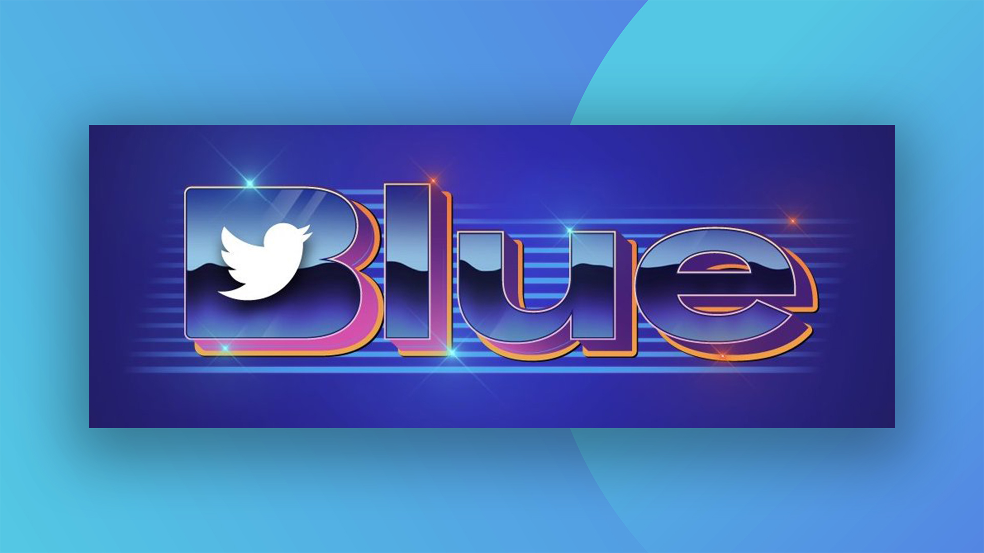
Unless you've been living under a rock (and after the last few years, I wouldn't blame you), you're probably aware of the controversy surrounding Elon Musk's Twitter takeover – and verification chaos that ensued. The platform was forced to pause its new anyone-can-buy-a-blue-badge-for-$8 policy a few weeks ago – but it's back, with an appropriately chaotic new logo.
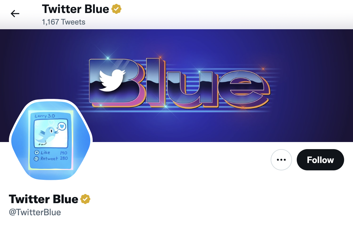
The official Twitter Blue account (which features a yellow verification badge, lol) has updated its header photo to the new logo, which can only be described as 1980s meets Microsoft Word Art, plus bad kerning. Yep, like Twitter itself right now, it's just a bit of a mess. (Need a palette cleanser? Check out the best logos of all time.)

Where to start? From the clashing blue/orange/pink colour scheme to the random slapping of a white Twitter bird over the 'B', it's not the nicest thing to look at. Yep, it seems the entire design team must have been victims of Musk's aggressive laying off policy – and whoever was left didn't bother to read our guide on how to design a logo.
So what does Twitter think of Twitter's new Twitter logo? Let's ask Twitter:
The new Twitter Blue logoGenerative Image AI: “logo with word ‘blue’, the Twitter Bird logo, 80s porn production company, CorelDRAW clipart CD, LOL” pic.twitter.com/1yRgjCBhPODecember 13, 2022
Twitter Blue logo is literally 2000s Wordart #allthedesignerswerefired pic.twitter.com/BMt1nTKkh8December 14, 2022
Take the #TwitterBlueChallenge! Can you make a worse #TwitterBlue logo than @elonmusk? pic.twitter.com/rQWuBOJUepDecember 14, 2022
@elonmusk I want to congratulate you on the new #TwitterBlue logo. It perfectly captures the tacky 80’s dodgy porn look. Don’t know how much it cost but it’s worth every penny fella. pic.twitter.com/HCwXx1heh6December 13, 2022
So there we have it, two weeks until the end of 2022 and we have a late contender for worst logo of the year. That said, this one might be bad, but it possibly isn't quite Barnstaple bad. Or, heaven forbid, official county seal of St Francis County, Missouri bad.
Read more:
- New NBC logo is a subtle but brilliant update
- TikTok still can't get over that terrible Hershey's logo redesign
- World's oldest logo infographic baffles the internet
Sign up to Creative Bloq's daily newsletter, which brings you the latest news and inspiration from the worlds of art, design and technology.

Daniel John is Design Editor at Creative Bloq. He reports on the worlds of design, branding and lifestyle tech, and has covered several industry events including Milan Design Week, OFFF Barcelona and Adobe Max in Los Angeles. He has interviewed leaders and designers at brands including Apple, Microsoft and Adobe. Daniel's debut book of short stories and poems was published in 2018, and his comedy newsletter is a Substack Bestseller.

