
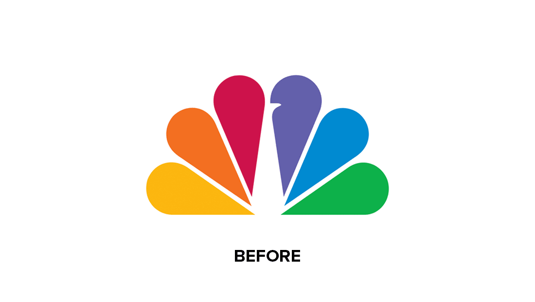
We're big fans of the NBC logo, thanks to its clever (yet not overly obvious) use of negative space. At first glance it looks like a simple coloured fan, but factor in that white centre and it becomes clear that you're looking at a peacock. And a subtle redesign has just made the effect even clearer.
Viewers have noticed the TV channel quietly rolling out an updated logo design, giving the peacock brighter feathers and a more prominent beak. It's a subtle tweak, but not only is it cleaner, but it makes the animal itself that little bit more obvious. (Looking for inspiration? Check out the best logos of all time.)
“The NBC brand refresh is a love letter to audiences everywhere, driven by NBC’s innovative spirit while celebrating the network’s powerful legacy,” Juliet Garrett, senior vice president, NBC Creative Design, NBCUniversal Television and Streaming, told NewscastStudio. "In modernising the brand with quickly recognisable iconography and rich colours that reflect the spirit of our shows, we are enhancing versatility, allowing scalability and building consistency."
While the new NBC logo builds upon its already brilliant use of negative space, not every subtle rebrand has been a success this year – Audi recently joined the flat design party, much to the chagrin of car design traditionalists.
Read more:

