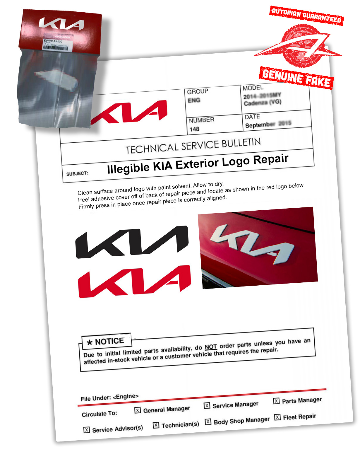
This is the best response yet to Kia's logo design fail
A quick and easy fix.
Sign up to Creative Bloq's daily newsletter, which brings you the latest news and inspiration from the worlds of art, design and technology.
You are now subscribed
Your newsletter sign-up was successful
Want to add more newsletters?
Last month we brought you the news that the new Kia logo has led to an inordinate spike in Google searches for 'KN' cars. Yep, it turns out the rebranded symbol, unveiled last year, is somewhat illegible – and the story has been pretty unavoidable in graphic design circles over the last few weeks.
Around 30,000 people a month are Googling 'KN cars', presumably after misreading the logo on the road. And this might be the most hilarious (not to mention helpful) response we've seen to the debacle. (Looking for design inspiration? Check out the best logos of all time).
The Autopian has taken it upon itself to not only propose a fix but also mock up a hilarious service repair part. The idea is to stick a simple crossbar onto the 'A' of the logo. Sure, the sawtooth design would lose a little of its symmetry, but at least it would clearly read 'KIA'. We have a feeling these things would actually sell pretty well.
Article continues below 
It's certainly been an interesting few weeks in the world of car branding, and it isn't just Kia that's been giving drivers road rage. The subtly rebranded Audi logo recently upset traditionalists, and the less said about Volkswagen Italy's Instagram bio, the better. Oh, and for good measure, Lamborghini just dropped the worst car ad we've ever seen.
Read more:
- Um, apparently car logo bruises are a thing
- People think the new Buick logo looks like, er, lots of things
- People drew car logos from memory and the results are hilarious
Sign up to Creative Bloq's daily newsletter, which brings you the latest news and inspiration from the worlds of art, design and technology.

Daniel John is Design Editor at Creative Bloq. He reports on the worlds of design, branding and lifestyle tech, and has covered several industry events including Milan Design Week, OFFF Barcelona and Adobe Max in Los Angeles. He has interviewed leaders and designers at brands including Apple, Microsoft and Adobe. Daniel's debut book of short stories and poems was published in 2018, and his comedy newsletter is a Substack Bestseller.
