It's one of the most recognisable logos in the world, and one of the easiest to draw from memory. And even after its latest 'redesign', it seems safe to say the above statements both still apply to those four Audi rings. But while it might be similar to the old one, it seems fans aren't thrilled over the freshly tweaked logo.
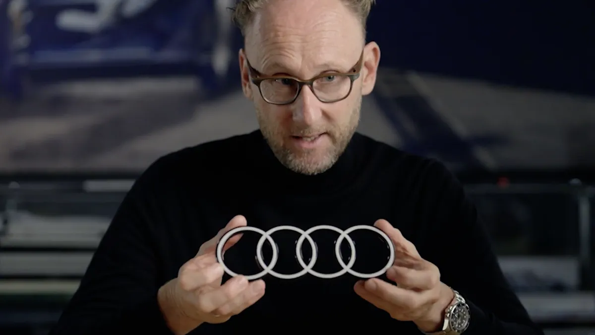
The car manufacturer has unveiled a new look for its iconic logo, and yep, it's finally joined the flat design party. The new monochrome symbol features those same four rings, but gone is the shiny bevelled appearance. (Looking for inspiration? Check out the best logos of all time)
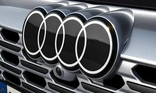
The new logo has already appeared on recent Audi vehicles, but the company is only just highlighting the redesign on its website, describing it as "More purity, more reduction, more consistency." Audi brand strategist Frederik Kalisch calls the design "on one hand, loud and very bold, and on the other, the restrained, pure, and clean," while André Georgi says, "The new two-dimensional look gives our rings a significantly more modern and even more graphic makeover, although their geometry is almost identical to the former ones."
But not identical enough for some Audi fans, it seems. Over on the Audi Reddit page, users are bemoaning the simplification of the design. "Going the VW route I see. Shame," one comments, while another adds, "It really does look cheap. Looks just pasted on, as an afterthought." "What a disappointment. One of the things I liked about Audi is that they still used physical badges that you can feel and run your hand across," another user complains.
But while fans aren't happy with how the 2D logo looks on the cars themselves, that isn't, of course, the only application the company had in mind when creating the logo. "We want the four rings to look the same everywhere in the future: Whether in a magazine, on your smartphone, or a billboard – and on or inside the car," Audi says.
While not all fans are happy, at least the logo remains easy to draw from memory. That said, this isn't always a given – as these car logos drawn from memory hilariously prove.
Read more:

