Did Stellantis just reveal the worst car logo of 2020?
It had no shortage of inspiration.
Sign up to Creative Bloq's daily newsletter, which brings you the latest news and inspiration from the worlds of art, design and technology.
You are now subscribed
Your newsletter sign-up was successful
Want to add more newsletters?
From BMW to Nissan, via Kia, Roll-Royce and many more, 2020 has seen countless car manufacturers reveal new or updated logos. With car logos so instantly recognisable, creating a new one will always present a challenge to designers – but one new iteration has managed to leave us seriously underwhelmed.
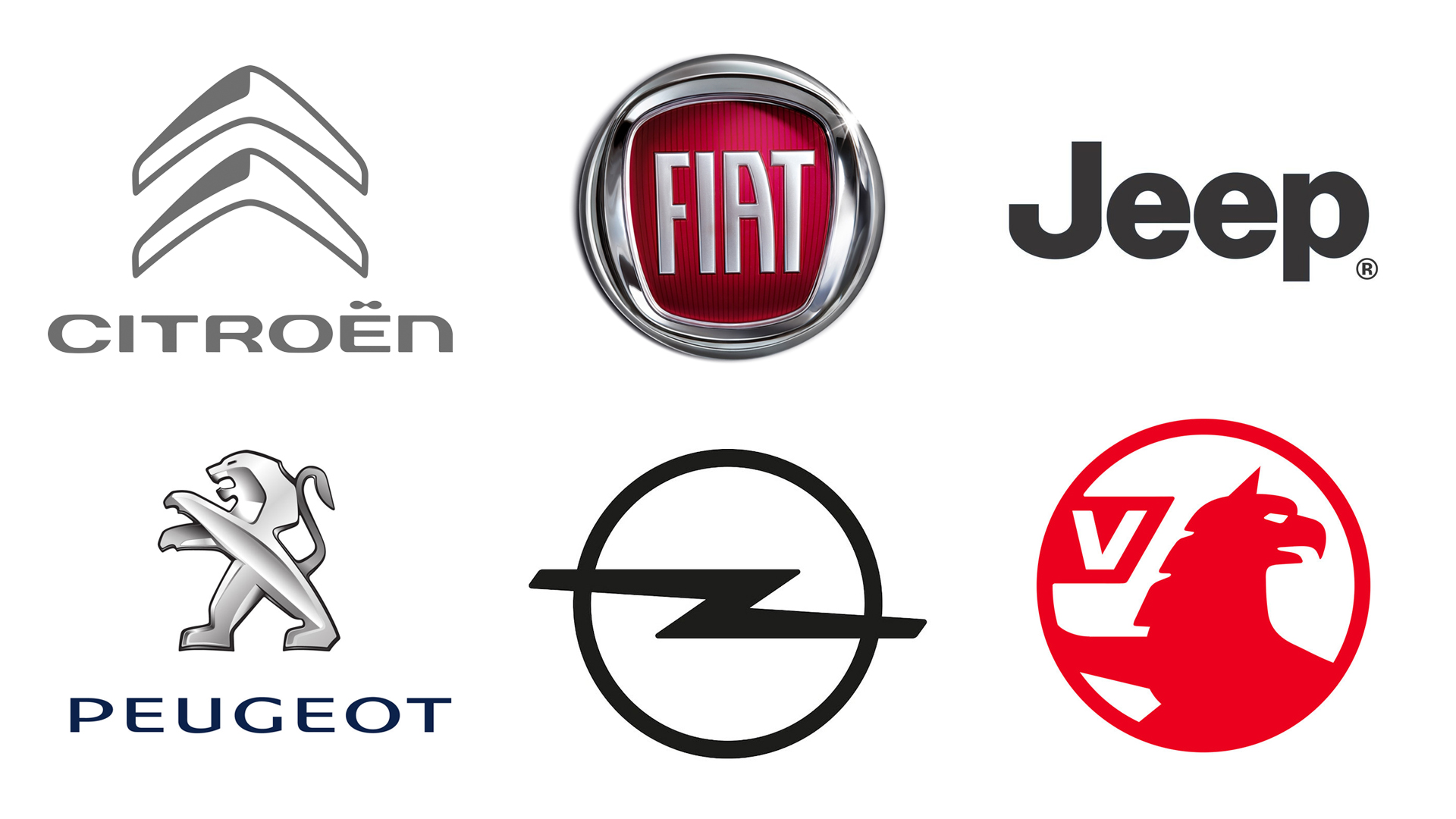
Fiat Chrysler's merger with PSA this year means that 14 different car brands, including Peugeot, Vauxhall, Alfa Romeo and Fiat, are now all owned by a single company: Stellantis. Surely a supergroup of 14 famous car brands deserves one of the best logos ever? Alas, it seems it wasn't to be.

Now, we wouldn't for a moment expect the design team to attempt to incorporate 14 logos into one (not even the best logos with hidden messages contain that many Easter eggs), but with such a plethora of iconic car brands under its (seat)belt, we'd have hoped the Stellantis logo would be somewhat exciting – or, at the very least, vehicular. But the new company's logo (below) is anything but.
Article continues below 
While Stellantis says in a press release that the new logo symbolises the "rich heritage" and "combined strengths" of the new group’s 14 brands, we're struggling to find a hint of heritage – or even strength – in the new design. Sure, the 'A' has had its crossbar removed, and there are a few decorative dots present (not 14, though – missing a trick there), but otherwise it's just a sans-serif typeface on a plain background. If you told us this was a financial services logo, we'd believe you.
And it seems we're not the only ones who don't feel like we're looking at a car logo. Users have taken to Twitter (below) to liken Stellantis to everything from a pharmaceutical company to a spaceship.
This feels like the evil corporation in any number of sci-fi films. https://t.co/CsZX51HRXVNovember 9, 2020
Well I for one am very excited to see the first feature length animation from Stellantis Studios. https://t.co/Uub3z9MI7ENovember 9, 2020
When can I hop aboard Starship Stellantis?November 9, 2020
Looking like the conclusion of a commercial for some resort in the Bahamas. This will definitely help sell more cars. https://t.co/DCgyFahuDPNovember 9, 2020
I dunno, with that logo I'm leaning towards "utopian sea or space habitation that's going to wind up full of flickering lights and mysterious blood smears in a few months"November 9, 2020
Perhaps it's a little unfair to compare Stellantis's logo with those of the car logos under its umbrella. Unlike those, the parent company's design is unlikely ever to grace a car bonnet – we won't be seeing a Stellantis Corsa any time soon.
That said, we'd have much preferred to see something a little more inspired, like BMW's brilliant new take on its famous logo, or even Kia's sleek new look. If Stellantis does decide to rebrand any time soon, the designers would do well to check out our guide to finding logo inspiration.
Sign up to Creative Bloq's daily newsletter, which brings you the latest news and inspiration from the worlds of art, design and technology.
Read more:

Daniel John is Design Editor at Creative Bloq. He reports on the worlds of design, branding and lifestyle tech, and has covered several industry events including Milan Design Week, OFFF Barcelona and Adobe Max in Los Angeles. He has interviewed leaders and designers at brands including Apple, Microsoft and Adobe. Daniel's debut book of short stories and poems was published in 2018, and his comedy newsletter is a Substack Bestseller.
