Is this really the most offensive logo of 2021?
Not every logo gets a police complaint.

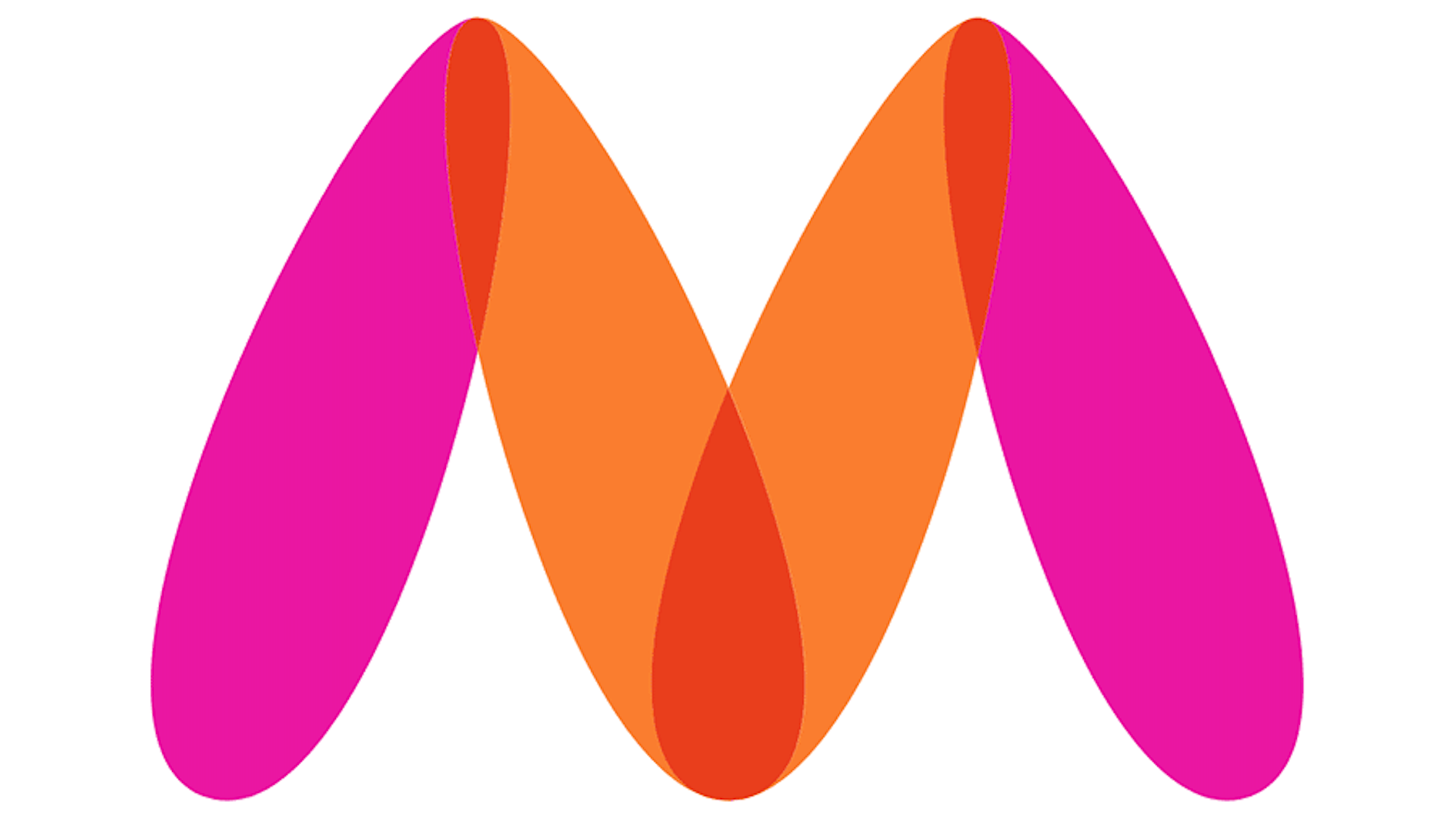
We saw a ton of new logos in 2021, and plenty that offended our design sensibilities. But when it comes to "offensive" logos, perhaps the worst of the year was the only design to receive a police complaint. Yes, you read that right.
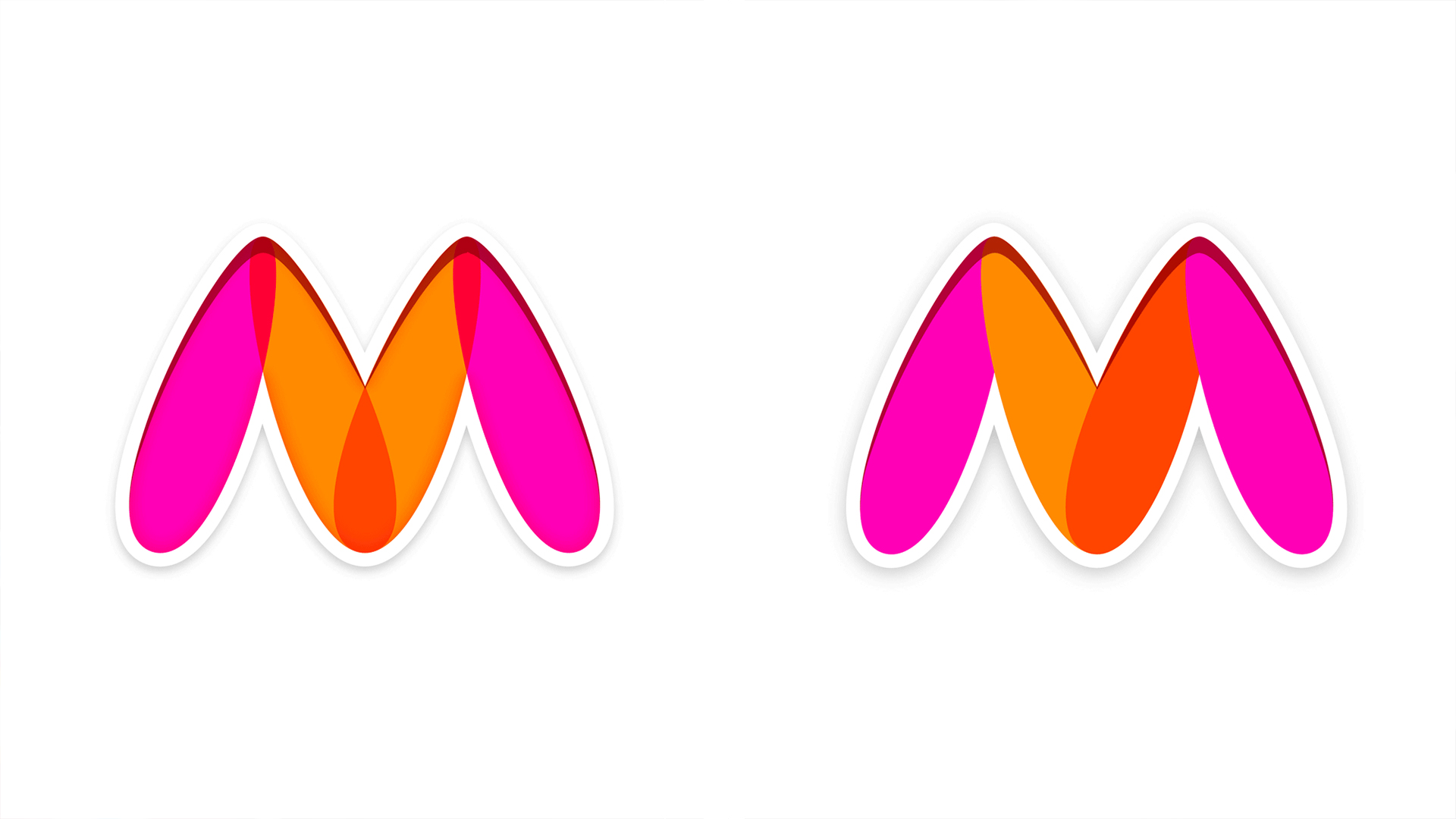
Indian fashion website Myntra was forced to replace its symbol with a subtly tweaked (but not altogether different) design after a complaint was filed with Mumbai Police’s cybercrime department. Apparently the design "resembled a naked woman" – now, we don't know about you, but our minds never went there in the first place. But once it's been pointed out, erm, we guess, okay, maybe. Many of the best logos of all time feature secret messages, but none quite as provocative (and, we hope unintentional) as this one.

The logo was described as "insulting and offensive towards women" according to Indian Express. To be fair to Myrtna, the company changed it within just one month, with a few subtle tweaks de-emphasizing the supposedly NSFW resemblance.
Impressively, it only took a few subtle changes to reduce the effect. The orange and purple elements no longer overlap to create a red centre, and the colours are no longer symmetrical.
Twitter did, as Twitter does, make light of the debacle, with many suggesting other logos based on the letter 'M' ought to be worried about the potential connotations (more bad news for Google's ill-received new Gmail logo?). Others, meanwhile, likened the original design to other famous logo fails:
after Myntra's logo controversy"other companies with perfectly innocent logos - pic.twitter.com/SwtLl0uME7January 30, 2021
Still, Myntra can at least take some comfort from the fact that it's by no means alone in the logo fail stakes. Companies have released logos resembling everything from toilet bowls to Hitler in 2021. Seriously. And hey, we'll always have room in our lives for a good old design blunder – check out these 12 design fails that were so bad they were actually good for our hall of shame.
Read more:
Sign up to Creative Bloq's daily newsletter, which brings you the latest news and inspiration from the worlds of art, design and technology.

Daniel John is Design Editor at Creative Bloq. He reports on the worlds of design, branding and lifestyle tech, and has covered several industry events including Milan Design Week, OFFF Barcelona and Adobe Max in Los Angeles. He has interviewed leaders and designers at brands including Apple, Microsoft and Adobe. Daniel's debut book of short stories and poems was published in 2018, and his comedy newsletter is a Substack Bestseller.

