Fans are just realising there's an optical illusion in this NHL logo
Designers can sometimes pack a lot into a logo design: historic symbolism, local geographical references... even the occasional optical illusion. The Minnesota Wild logo manages to fit in all three.
The team's been playing in the US and Canada's National Hockey League (NHL) for over a decade now, and its logo has become a familiar sight. But some fans are only just noticing that the design features an optical illusion that's as wild as the team's name – and they can't decide what it shows (see our pick of the best optical illusions for more visual wonders).

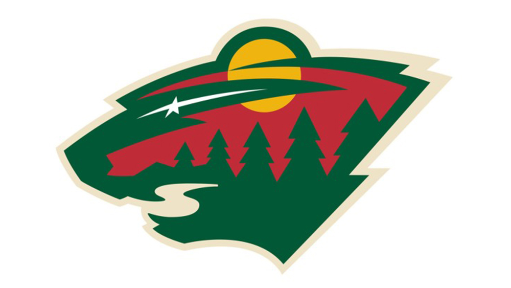
The Minnesota Wild logo is the work of graphic designer Stephen O'Laughlin, who was contracted ahead of the team's first season back in the year 2000. His design tells several stories. At the most superficial level, it shows a forest scene at dusk, with the sun setting over a lake and a star in the sky.
The scene alludes to the state's geography and its nickname as the Land of 10,000 Lakes. But the design is also loaded with historic symbolism because the star is intended as a tribute to the former NHL team and Wild predecessors the Minnesota North Stars. But step back, and you might notice that there's also something else going on in the logo.
A rather literal optical illusion makes the whole design look like the head of a wild animal – a clever reference to the team's name. The lake forms the animal's mouth, and the North Star becomes its eye. According to some fans, there might be even more to it.
The club itself has said that the optical illusion logo depicts a non-specific 'wild animal,' and that's left fans divided over what animal it is: some say a bear, others a cat. Some have even attempted to prove their theory over the years by "uncropping" the design Since we first published this article, a fan has written to us to point out that the 'mouth' of the river also looks like a loon, which is Minnesota's state bird.
PSA: Minnesota Wild logo is a bear pic.twitter.com/JQUcZeUmWlApril 26, 2018
Minnesota Wild logo looks like a flipped powercat pic.twitter.com/NNZi4da2LOApril 22, 2023
Been watching hockey my entire life and I JUST realized the Minnesota Wild logo is a bear head… 🤦🏻♂️May 31, 2023
It took me almost 15 years to realize that the Minnesota Wild logo is in the shape of an animal's head.May 18, 2023
The amount of people I meet who have never noticed the animal outline of the Minnesota Wild logo is shocking. It's the first thing I see, but I've talked to 3 people in the last month who had no idea.May 25, 2023
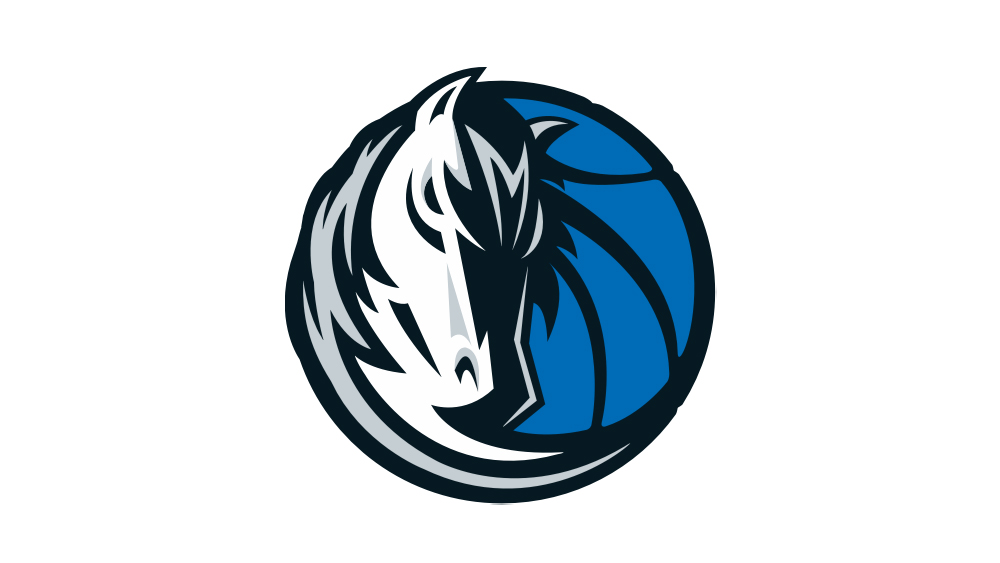
People have been seeing optical illusions all over the place in US sports team logos in recent years. Some appear to be intentional, such as the Atlanta Falcons logo, while others appear to be entirely accidental, such as the 'E' in the Philadelphia Eagles logo – and the 'hidden M' that some people have managed to find in the Dallas Mavericks logo (see below).
Sign up to Creative Bloq's daily newsletter, which brings you the latest news and inspiration from the worlds of art, design and technology.
It wasn’t until high school that I realized the Minnesota Wild logo is a bear. It wasn’t until TODAY that I realized the Atlanta Falcons logo is an “F”. pic.twitter.com/0sI6DriZz1April 17, 2020
I always wondered why the Philadelphia Eagles logo faces left, when the rest of the team logos face right. TIL that it's this way because there's a hidden 'E' in the logo. pic.twitter.com/ySFIcrcCznJanuary 21, 2023

It just goes to show that a logo design can say a lot more than what first meets the eye. See our pick of the best animated logos and the best circular logos for more inspiration.

Joe is a regular freelance journalist and editor at Creative Bloq. He writes news, features and buying guides and keeps track of the best equipment and software for creatives, from video editing programs to monitors and accessories. A veteran news writer and photographer, he now works as a project manager at the London and Buenos Aires-based design, production and branding agency Hermana Creatives. There he manages a team of designers, photographers and video editors who specialise in producing visual content and design assets for the hospitality sector. He also dances Argentine tango.
