Radical new logos almost always divide opinion, and media companies, along with sports teams, seem to be particularly liable to suffer a backlash when they reveal new designs. The UK's Independent Television News, better known as ITN, had a logo that was widely recognised across Britain and that lasted the company for an incredible 50 years. Until now.
The production company, which produces ITV News, Channel 4 News and 5 News, has revealed a new logo and, predictably, a lot of people familiar with the old design are confused. If the logo's recognised by everyone and it's been doing the job for over 50 years, why change now? (For tips for your own designs, see our guide to how to design a logo).

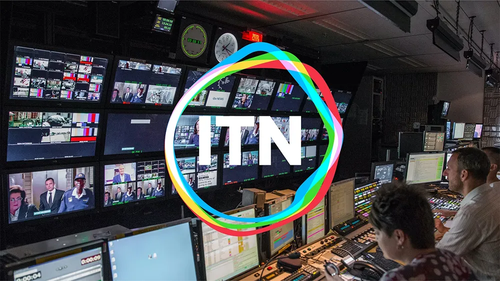
ITN was founded in 1955 by a consortium of independent television broadcasters that became ITV. Its well-known logo with linked letter forms has seen a few minor tweaks over the years, but has kept the same overall design since 1969, becoming one of the most enduring logos in British broadcasting.
But it's decided it's finally time for a change. Rudd Studio and Undivided were brought in to replace the long-standing existing static logo with a new animated mark that dynamically responds to its environment. According to Rudd Studio founder, Matthew Rudd, it was decided "to build the new logo around the original, simple ITN letterforms to signal a continued dedication to accuracy and impartiality. But this time we set free the rigid, angular line around the letters so that it can move and respond to stimulus like a living cell.
But the new ITN logo hasn't been so warmly received. People note that the old design was simple but distinct and immediately recognisable with its blocky outlined letters. It also felt solid and authoritative, which is kind of what you want from television news.
On Twitter, some people suggest the new logo could have worked if they'd simply put the new ring device around the old logo, keeping the unique typeface. While others think the new logo looks like that of the telephone company BT. "The old logo was instantly recognisable. This just looks like any generic logo," one person wrote. "Dear ITN, why" someone else asked simply, and that's a question that's been coming up a lot.
All I see is a knock-off BT logo. Sorry ITN. I respect you but this was not it, sorry 🤷♂️November 30, 2022
Can't say I'm a fan from (strictly) a branding POV - there was a heritage aura with the numerous versions of the previous logo.Especially when the ITN brand was front and centre on ITV's bulletins pre-1999.*zips anorak up*November 30, 2022
Needless change. ITN is already loosing brand recognition, but the old logo was instantly recognisable. This just looks like any generic logo.November 30, 2022
It's poor because it removes the blocked edging around the three letters that's been an intrinsic part of the @itn brand identity since the 1970s. Without it the letters look insignificant, and the animated hoops don't add anything. pic.twitter.com/FrVJLxq6IpNovember 30, 2022
We're not saying that this is one of the worst logos of 2022, but it does seem to abandon the recognition what brand recognition ITN had, at least in the UK. When the BBC rebranded its logo (which was also hugely controversial, but more because of the amount of money it cost), it sought to highlight its legacy, while this seems to do the opposite.
But the answer to the question 'why' is ITN's vision for its future. It's aiming to make the jump from being seen as a legacy British news organisation to become an international player, not only in news, but also in documentary, sports and branded content. The logo could certainly make more sense for those not already familiar with ITN, but this still isn't going to make it to our pick of the best logos ever.
Read more:

