The Apple logo is one of the most recognisable designs in tech thanks to its exemplary elegance and simplicity. It's so memorable, in fact, that the brand can play with references to previous iterations in a way that everyone immediately recognises.
That's the case in a new logo design revealed for the launch of the upcoming Apple store at the American Dream mall in New Jersey. The new take on the Apple logo offers both a blast from the past and a fresh contemporary feel all rolled into one (if you're looking for Apple gear, there are plenty of Apple Cyber Monday deals still available online).

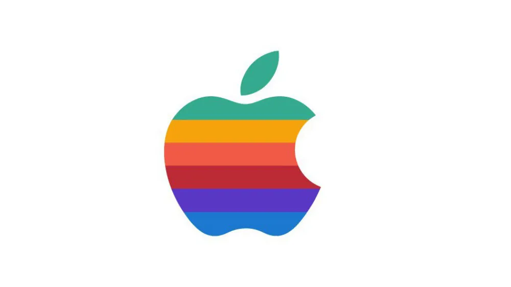
Apple is preparing to launch its Apple American Dream store at the second largest mall in the US at 11am on Saturday (3 December). The store itself is expected to have a similar layout to the latest Apple Retail Stores. So perhaps the most interesting thing about the launch is the choice of logo. Apple's plug for the launch on its website shows a new take on its classic 1997 rainbow-coloured logo.
While the design will trigger a little nostalgia for long-time Apple fans, it also feels completely fresh and contemporary, with the rainbow colours spiralling in helix that appears to wrap around the Apple shape.
So it's just a temporary logo for a single store, big deal. But let's just appreciate how much this says about the strength of the Apple logo design over the years. There really aren't that many brands around whose past logos remain so iconic that they play with references to them that everyone immediately gets.

It's also interesting that the meaning of rainbow colours has evolved since Apple's 1977 logo, which actually remained in use right up to 1997 (see our piece on the Apple logo history). The Pride Flag also uses rainbow colours, but in a different order, reflecting the actual order of the colours in a rainbow. Gilbert Baker and Lynn Segerblom's Pride flag debuted at the Gay Freedom Day Parade in San Francisco in 1978, and since then the flag has become a symbol for diversity everywhere.
Apple has mostly stopped advertising on Twitter. Do they hate free speech in America?November 28, 2022
We have no idea if the timing of the new Apple logo is intentional, but it comes just as the brand is in the middle of a row with Elon Musk, who's accused it of threatening to pull its advertising from Twitter over his relaxation of the platform's rules against hate speech.

It's not the first time that Apple has made this kind of reference to its classic coloured logo. It revived the logo with slightly different colours to promote the release of the colourful 2021 iMacs. The enduring power of those colours and their connection with evocative Apple shows just how strong the Apple logo really is – and why it deserves its place in our pick of the best logos of all time.
Read more:

