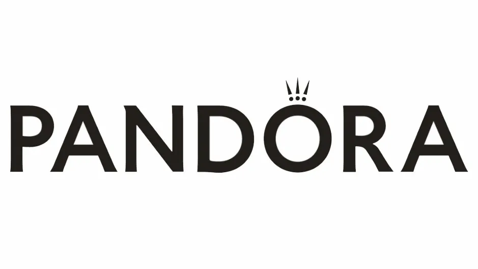
Contemporary jewellery company Pandora has revealed a new logo (above) that pushes the definition of sans serif to the absolute limit. The logo sees the trusty Optima typeface ditched in favour of a new design that contains some of the subtlest serifs we've ever seen.
The rebrand, which first started rolling out back in August, also sees Pandora adopt a bubblegum pink as its brand colour. But it's the logo's lettering that has attracted the attention of the design community, thanks to is almost imperceptible serifs. Our guide to logo design highlights the importance of typography when creating a brand identity, so has Pandora got it right?
In some ways, yes, in some ways, no. The old typeface Optima might have been a safe choice when it comes to logo lettering, having previously been used by the likes of Yahoo and Jaguar, but more and more companies are choosing to leave it behind. So at least Pandora doesn't look like it's lumbered with a font that's fallen out of favour.

And in Optima's place is a font that Brand New has described as "99% sans serif". It's a good way of summing up the typeface, which has flicks so subtle we'd forgive you for not noticing them. And while this new lettering is certainly understated, we think it's a step up from the previous iteration.
It's not all good news though. One of the signature elements of the Pandora logo, the crown that sits above the letter 'o', has had its bottom line removed. This threatens to make the imagery unclear, and means the letter looks more like a ring than anything else. Which may not be such a bad thing for a jewellery company.
In a press release from Pandora, the company said that the rebrand aims to deliver a "fresh, modern tone". This can be seen in the pink that now dominates Pandora's identity, a colour which it describes as the "new main marker and recognisable statement across all consumer touchpoints."

Speaking of recognisable statements across all consumer touchpoints, the crowned letter 'o' will be used as Pandora's social media avatar. On the face of it this might seem like a strange choice. After all, wouldn't the letter 'p' be more appropriate?
But when you consider that Pandora's jewellery is based on charms that slide onto a bracelet, the decorated 'o' is a convenient shorthand for the products it offers.
Related articles:

