New talent 2017: Best graduates outside London
Here’s our pick of the most talented graphic design, illustration and animation graduates you need to know this summer.
Sign up to Creative Bloq's daily newsletter, which brings you the latest news and inspiration from the worlds of art, design and technology.
You are now subscribed
Your newsletter sign-up was successful
Want to add more newsletters?
Perry Rowe and Steve O’Neil
- University: Arts University Bournemouth
- Course: BA (Hons) Graphic Design
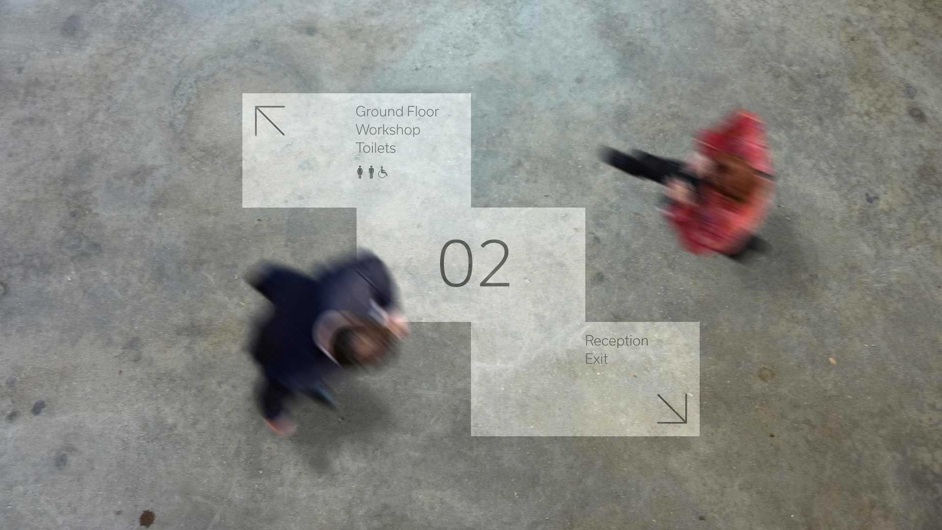
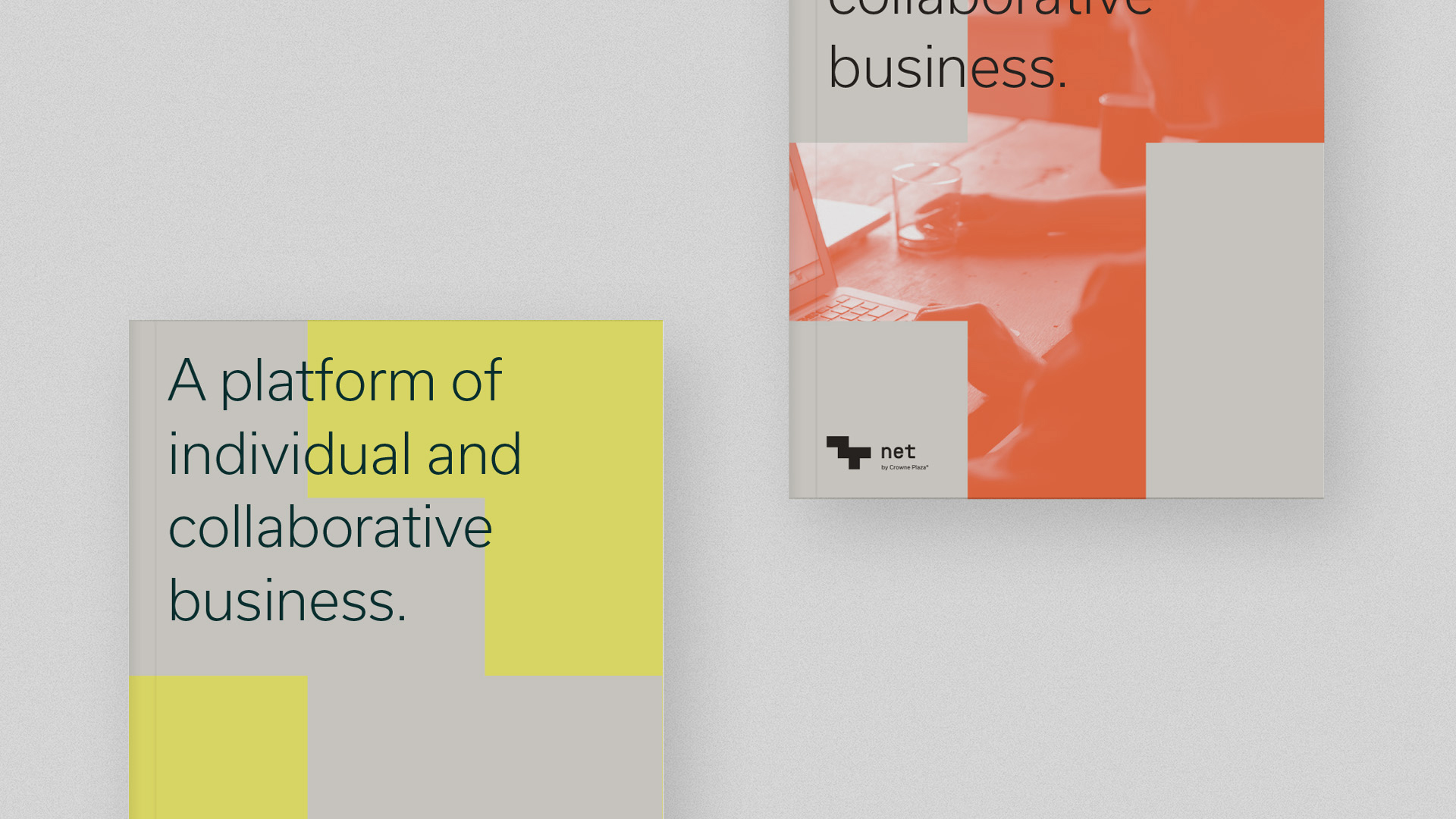
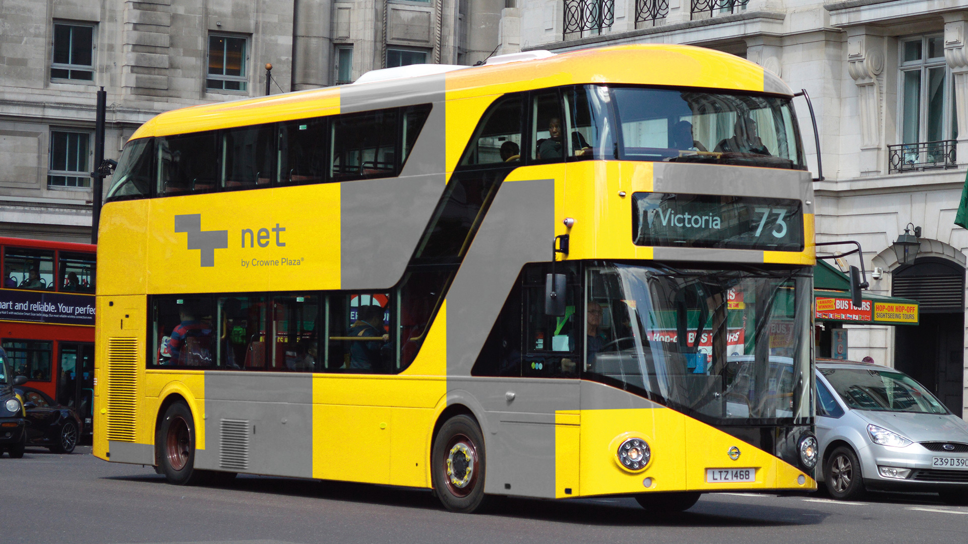
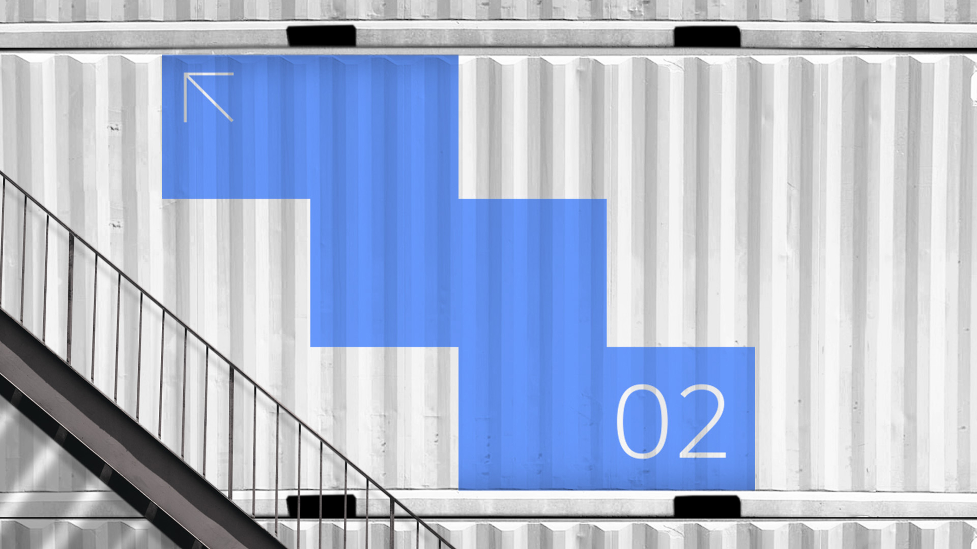
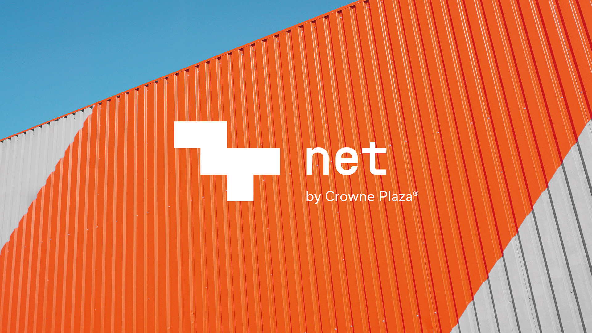
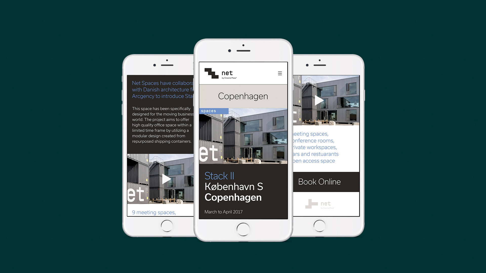
- Project: Net identity
For their final year project, graduates Perry Rowe and Steve O’Neil created a flexible identity for an innovative business idea. The concept? Just as different nets are able to define various enclosed spaces, so an experimental division of Crowne Plaza could provide different hotel experiences that could reinvigorate the brand as a whole.
Emily Regan
- University: Arts University Bournemouth
- Course: BA (Hons) Visual Communication
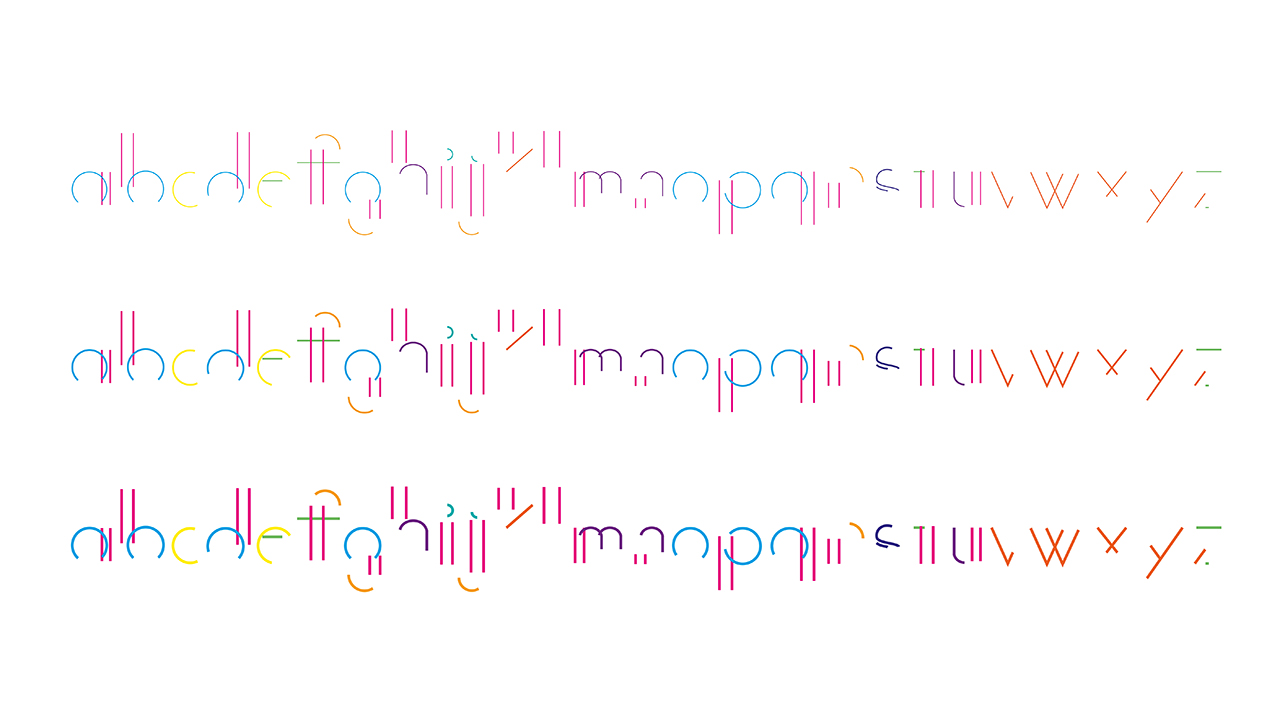
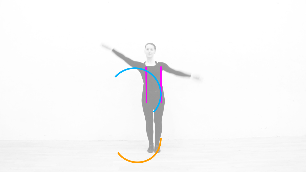
- Project: Dance Type
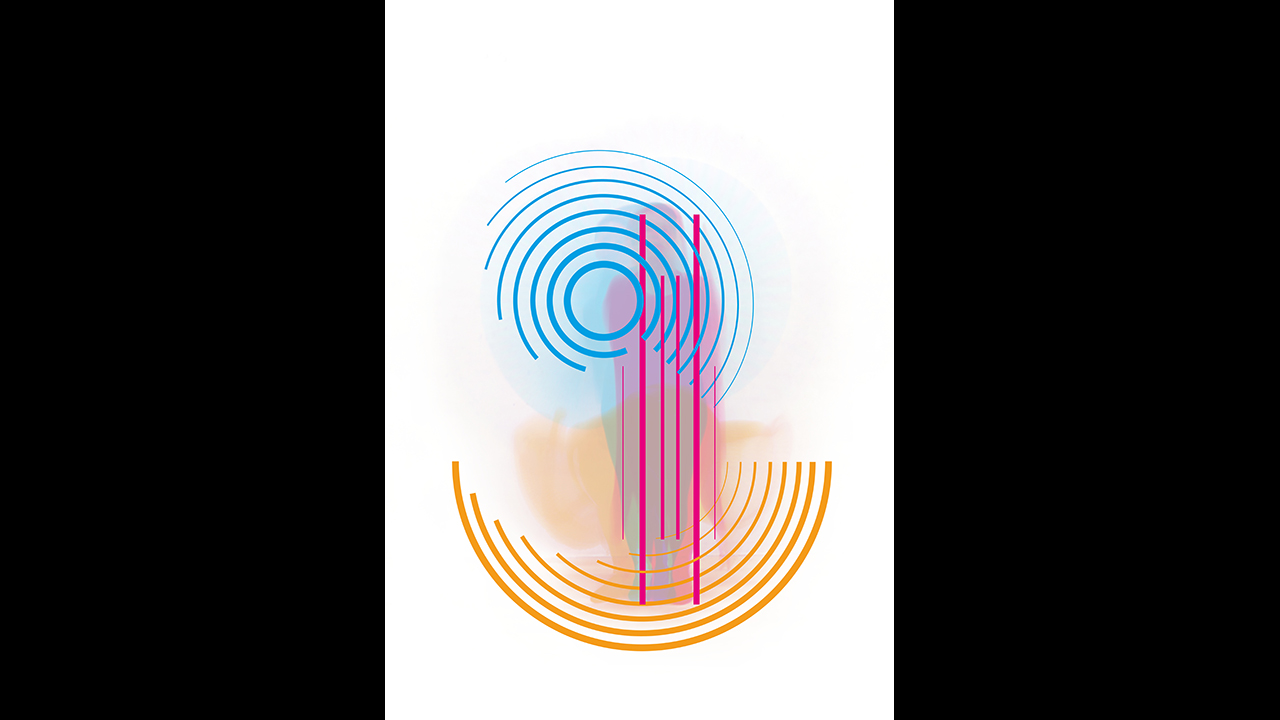
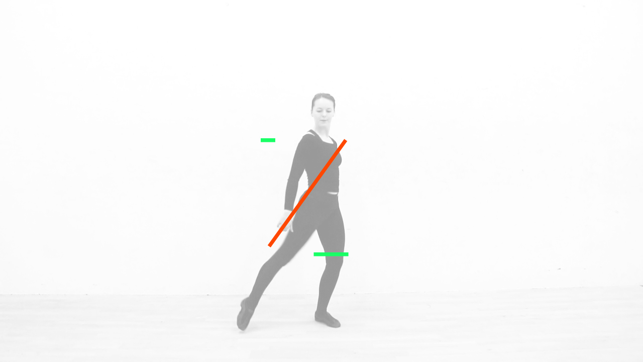
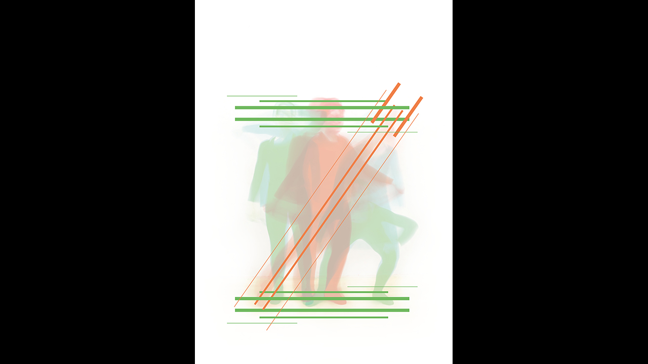
This experimental project explores the theme of collaboration through the disciplines of dance and typography, resulting in a dynamic, animated typeface. Graduate Emily Regan worked with a dancer to create a ‘dance code’, choreographing dance motifs from the breakdown of letterforms, before recreating the motifs using animated vectors and reconstructing them into final type design.
“In a year's time I hope to be working in a creative agency, constantly expanding and refining my skill set as a creative designer,” says Regan. “My ideal career path is a designer at a fashion magazine or an in-house designer at a fashion brand.”
Article continues belowSaul Kaplin
- University: Arts University Bournemouth
- Course: BA (Hons) Graphic Design
- Project: Searchlight
At a time where film audiences might be over-saturated by Hollywood’s slick, perfect CGI, graduate Saul Kaplin’s refreshing final year project revisits and celebrates the quirky qualities of analogue stop-frame methods, suggestive of early cinema. His project – a D&AD New Blood-awarded promotional video for a MUBI advertising campaign – captures the atmosphere of this era, connecting with the movie-literate MUBI audience by using elements of its logo.
Izzi Hays

- University: Arts University Bournemouth
- Course: BA (Hons) Graphic Design
- Project: Facebook Fortunes
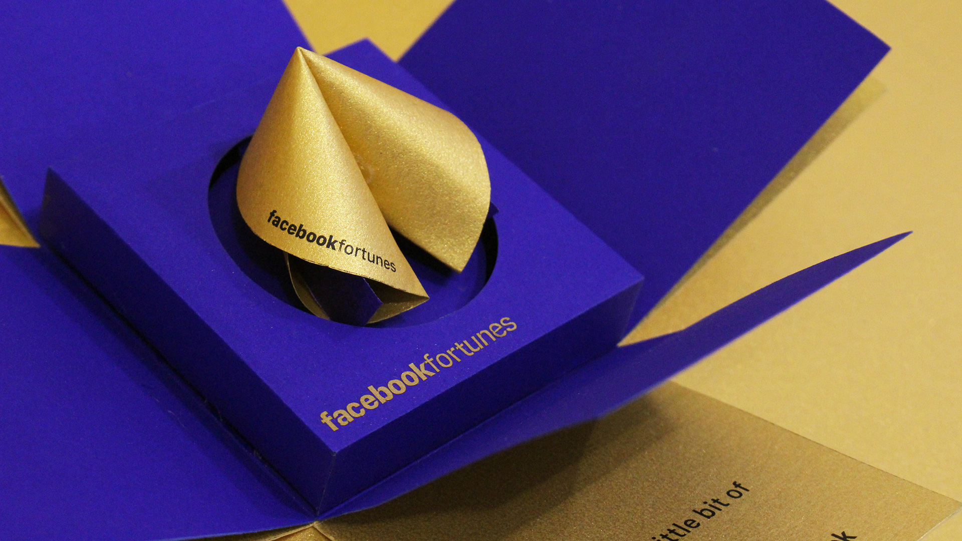
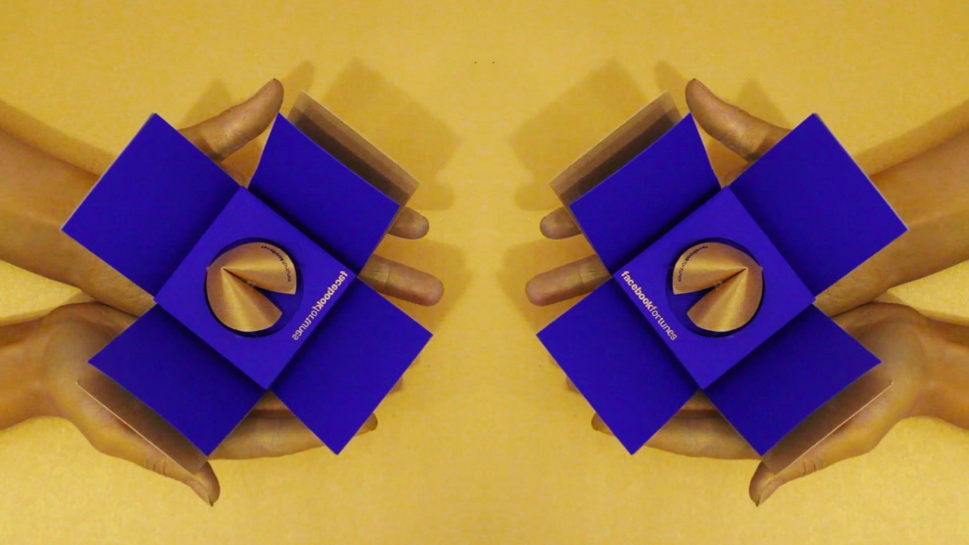
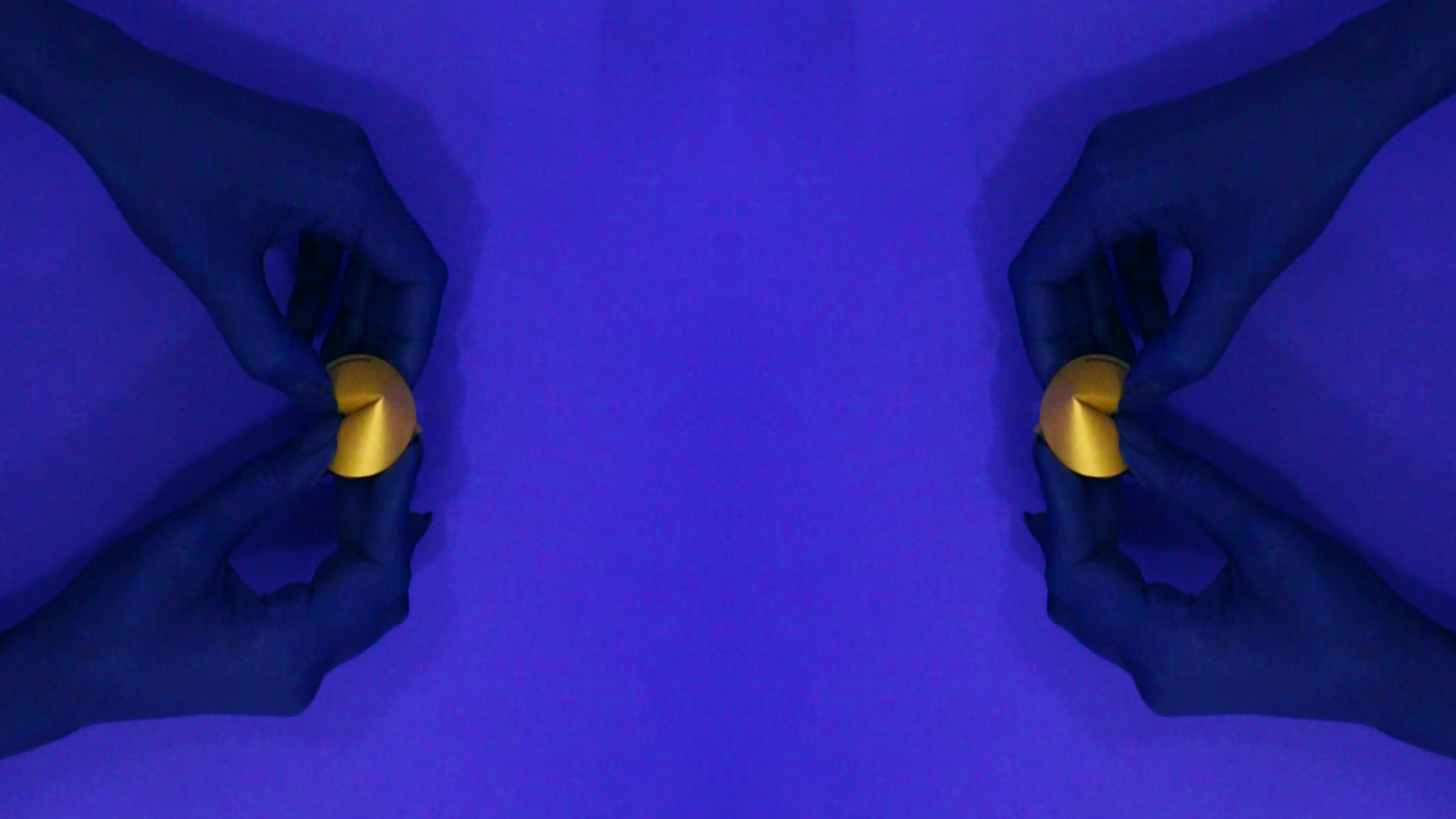
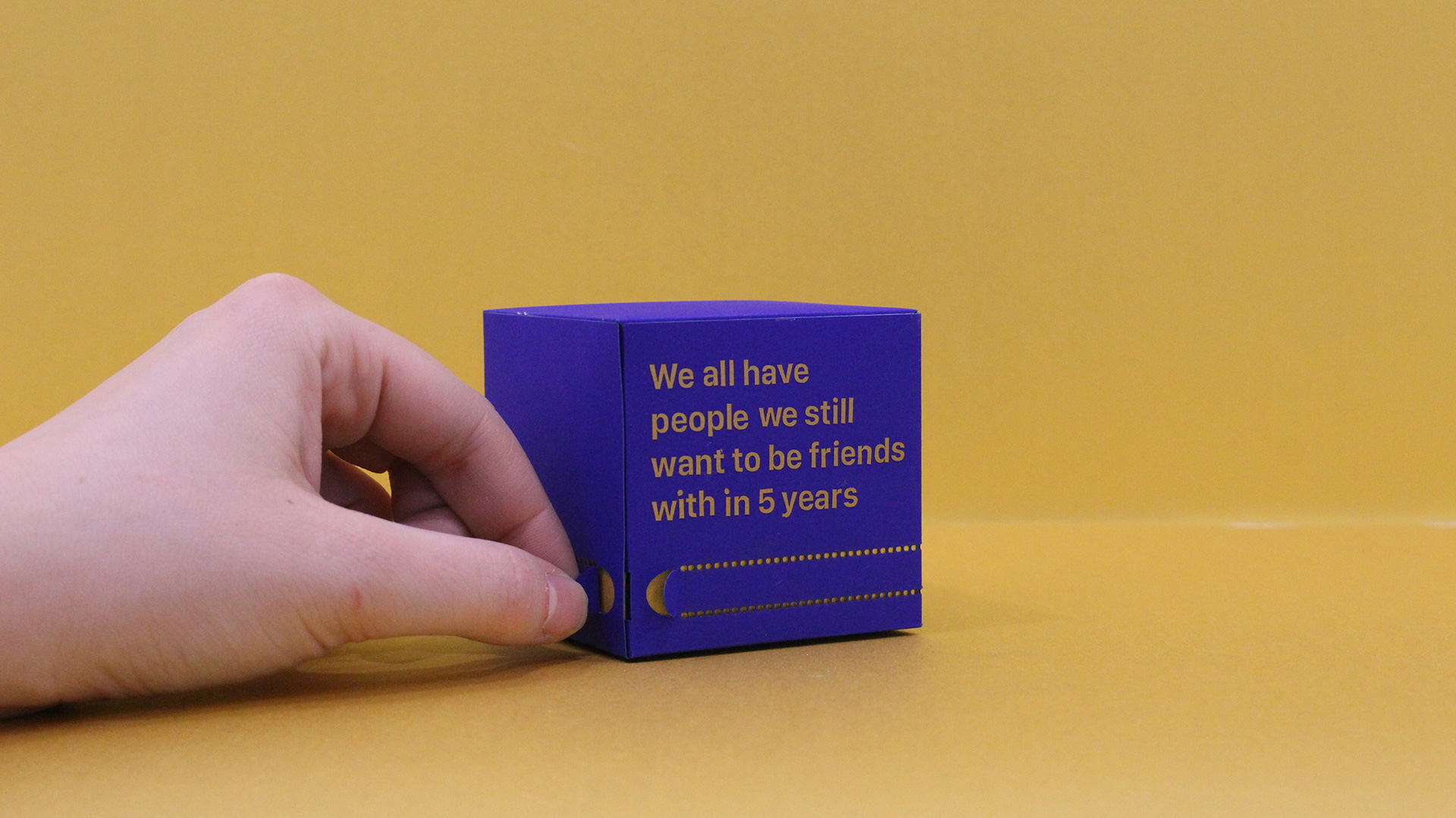
What better way to commemorate a long-term virtual relationship than with something tangible? Facebook Fortunes looks backwards at the memories shared, and forwards to those yet to come, through beautifully crafted and packaged fortune cookies.
Using Arjowiggins paper, graduate Izzy Hays transformed Facebook into a physical entity that serves as a reminder of friendship in the offline world.
“We all have people we still want to be friends with in five years’ time,” says Izzy Hays. “How can Facebook help us look towards to the future of our friendships instead of just the past and the present?”
Sign up to Creative Bloq's daily newsletter, which brings you the latest news and inspiration from the worlds of art, design and technology.
Zante Tolley
- University: Arts University Bournemouth
- Course: BA (Hons) Visual Communication
- Project: Tower typeface
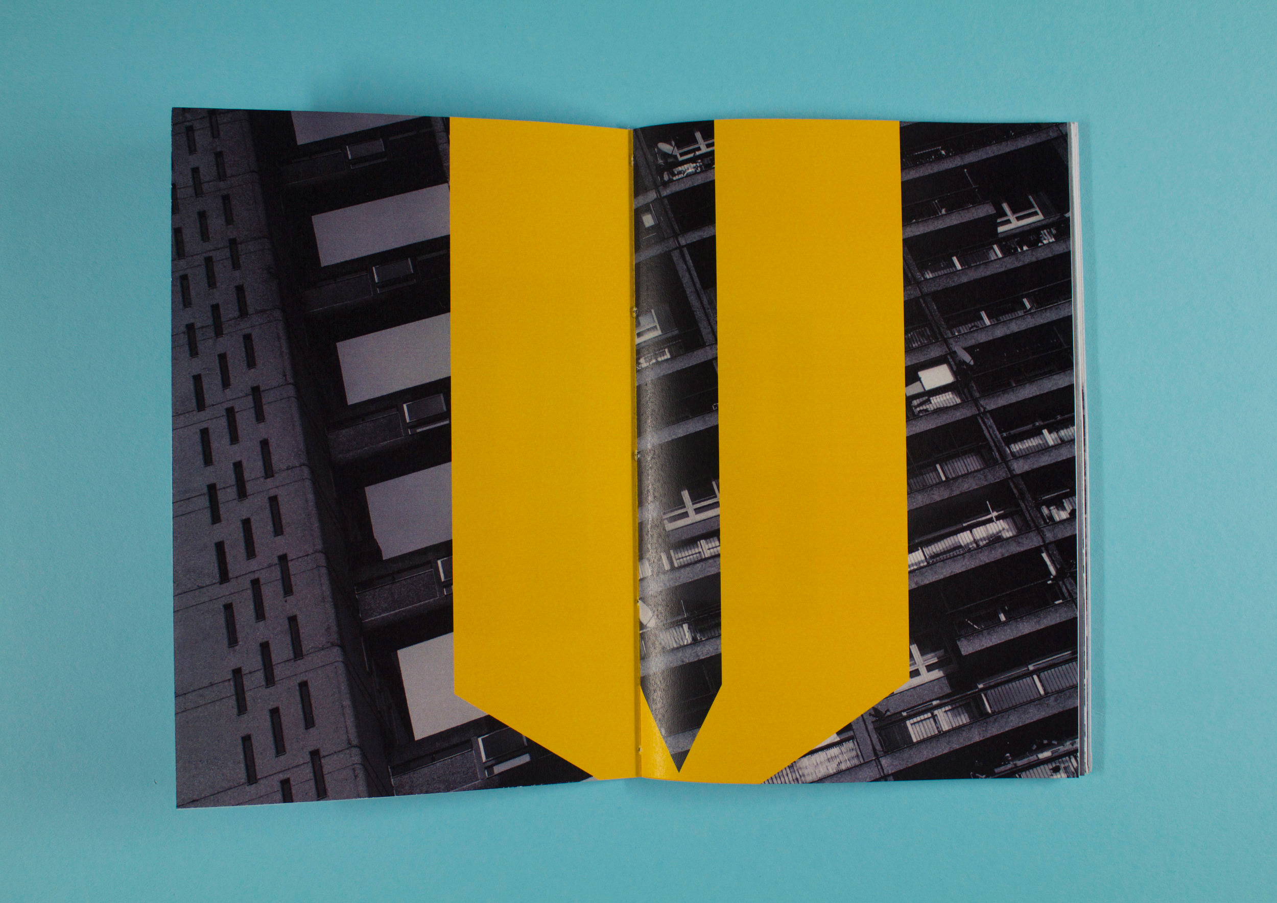
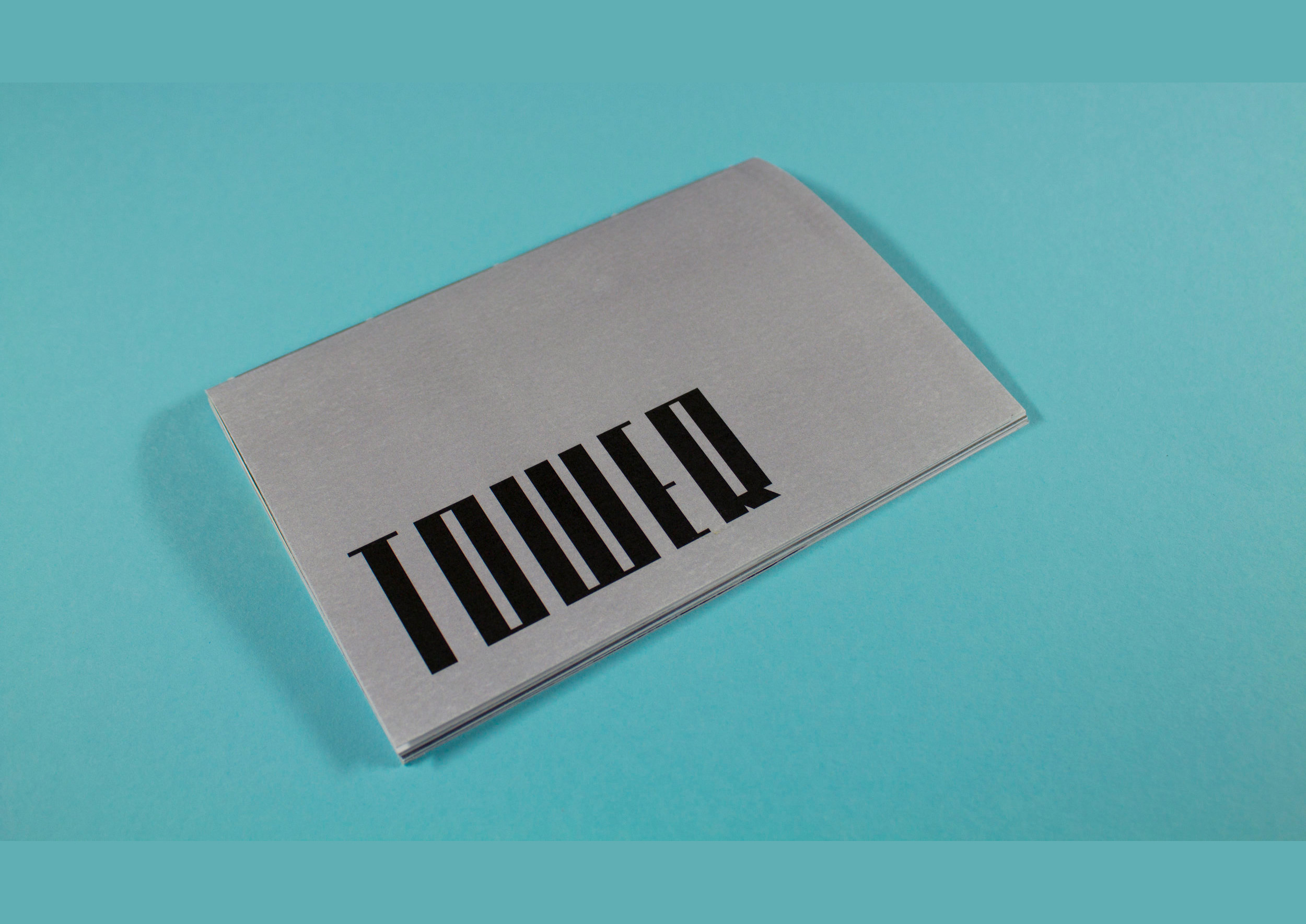
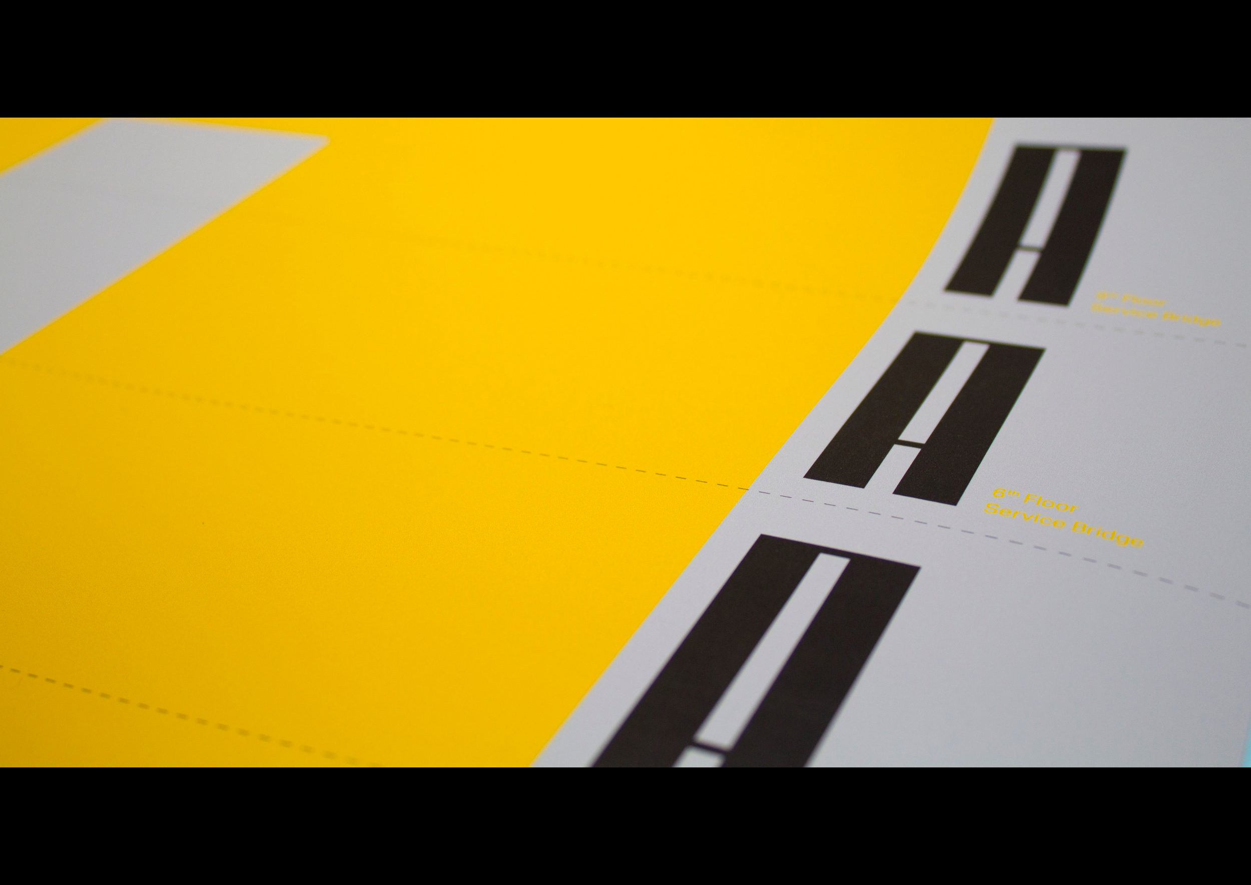
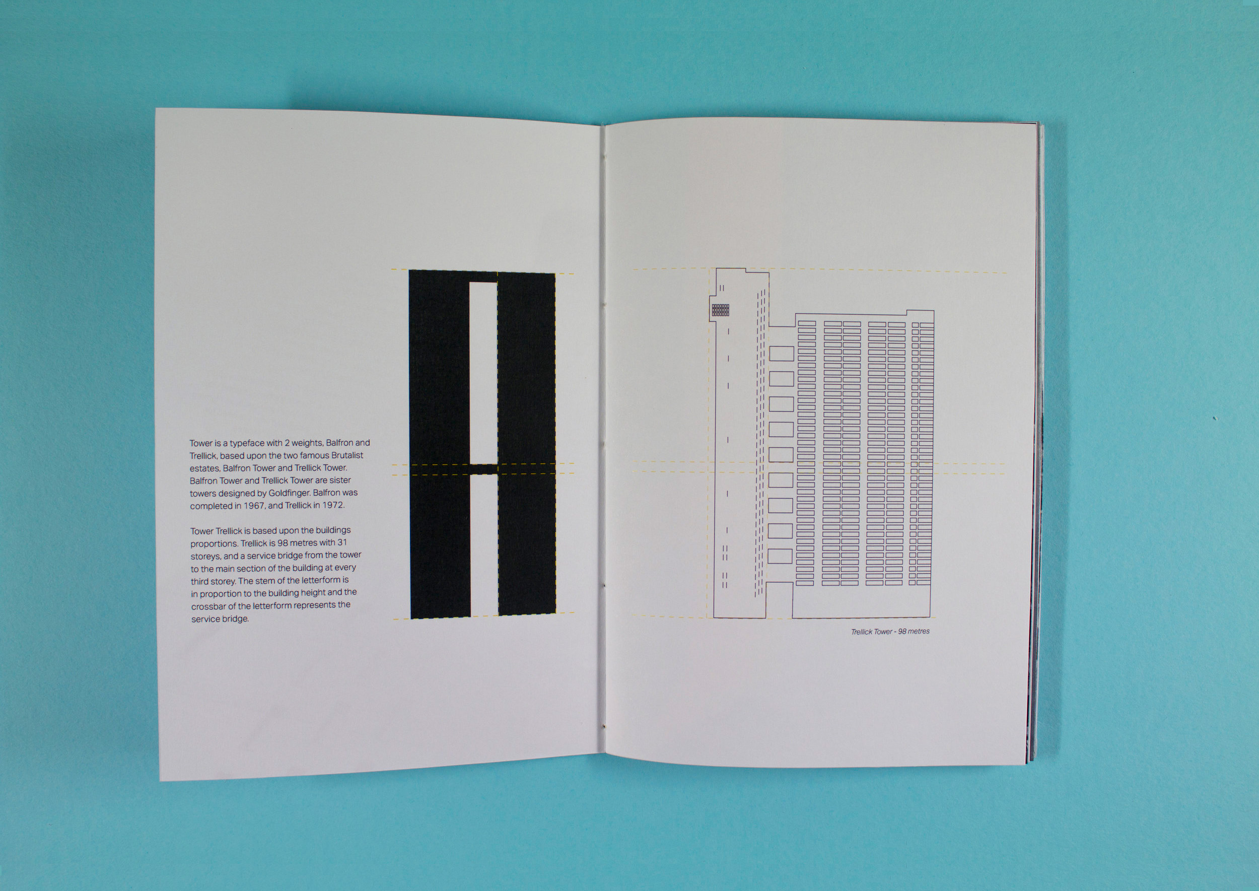
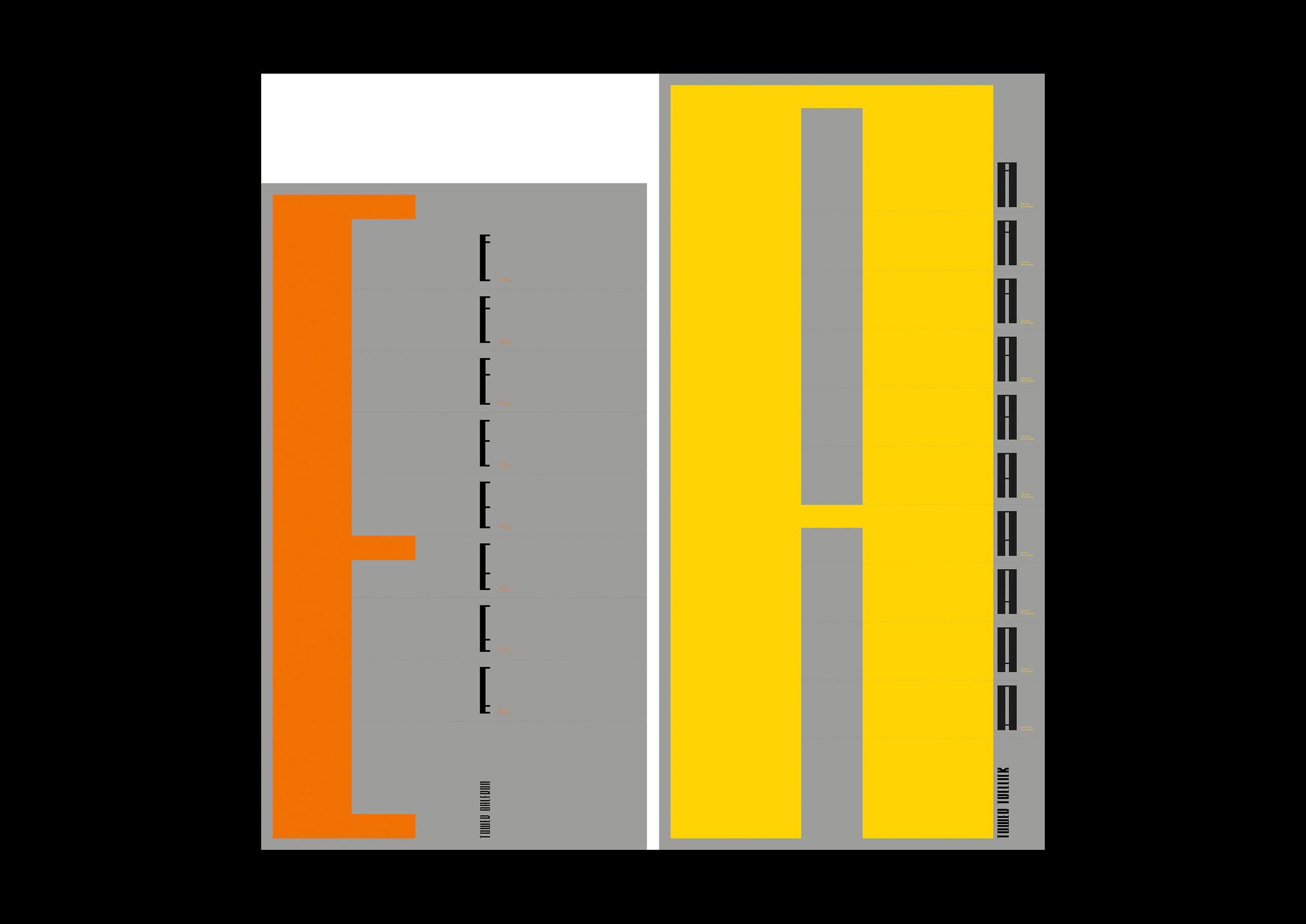
Graduate Zante Tolley’s Tower typeface takes influence from the proportions of sister brutalist buildings, Balfron and Trellick Tower, designed by Erno Goldfinger. The crossbars or terminals of the letterforms change according to the service bridge on every third floor, as shown through a slick type specimen book and type specimen posters that showcase the two weights.
“The design reflects the dynamic nature of the Brutalist movement,” she explains.
Sarah Wickings
- University: Arts University Bournemouth
- Course: BA (Hons) Graphic Design
- Project: Let’s Say What We Mean
Graduate Sarah Wickings’ typography-led video campaign attempts to capture the experience of autism by overloading our visual senses while presenting a series of everyday conversational phrases. The aim is to do more than raise awareness or even money – the project seeks to encourage people to communicate more effectively with a call to action: Say what you mean.
“Let’s Say What We Mean focuses on the abstract language we use in everyday scenarios and how people with autism struggle to understand it,” explains Wickings. “The aim of this video is to encourage people to consider their day-to-day language choice more clearly to make it easier for people with autism to take in.”
Kieran O’Sullivan
- University: Arts University Bournemouth
- Course: BA (Hons) Visual Communication
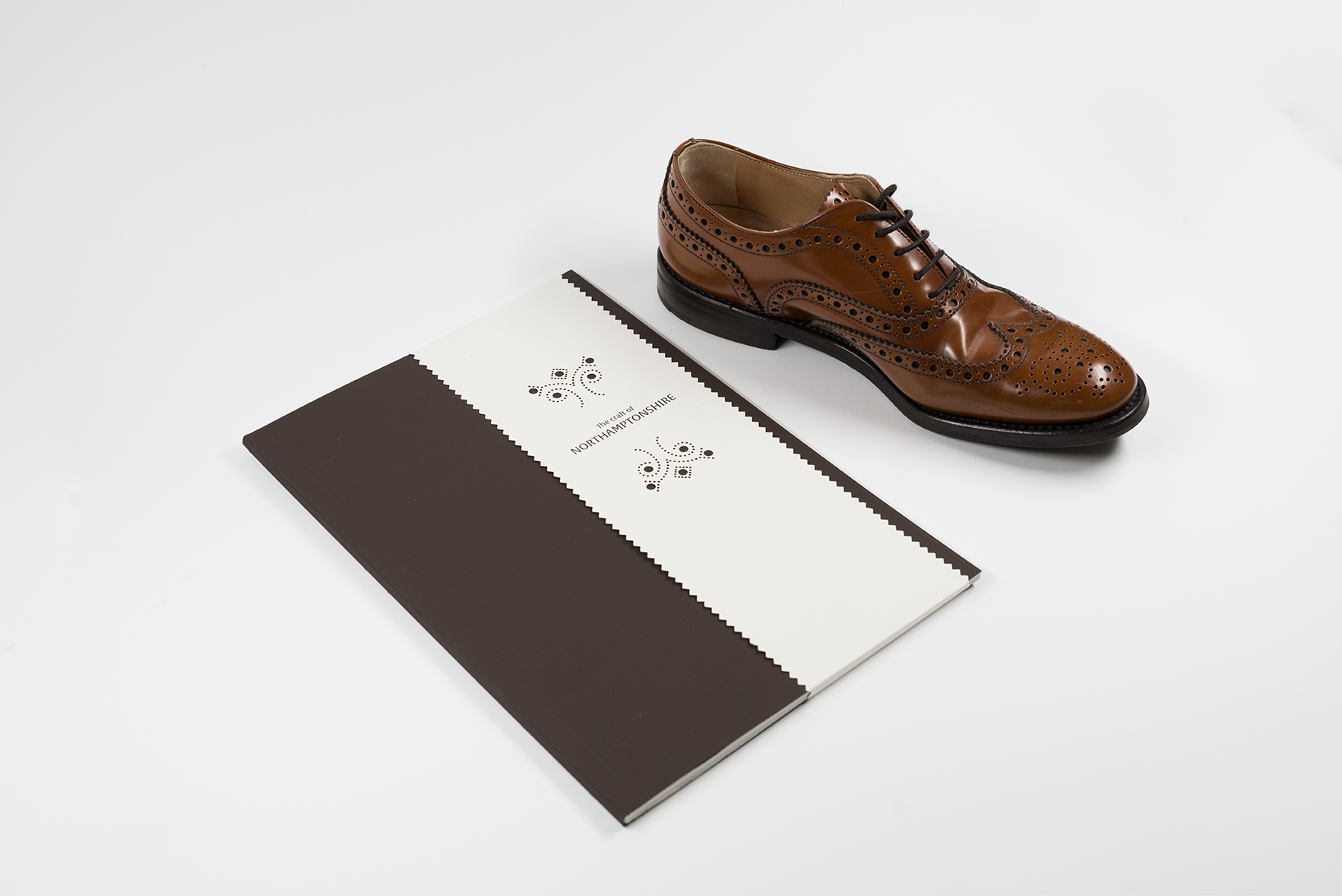
- Project: The craft of Northamptonshire
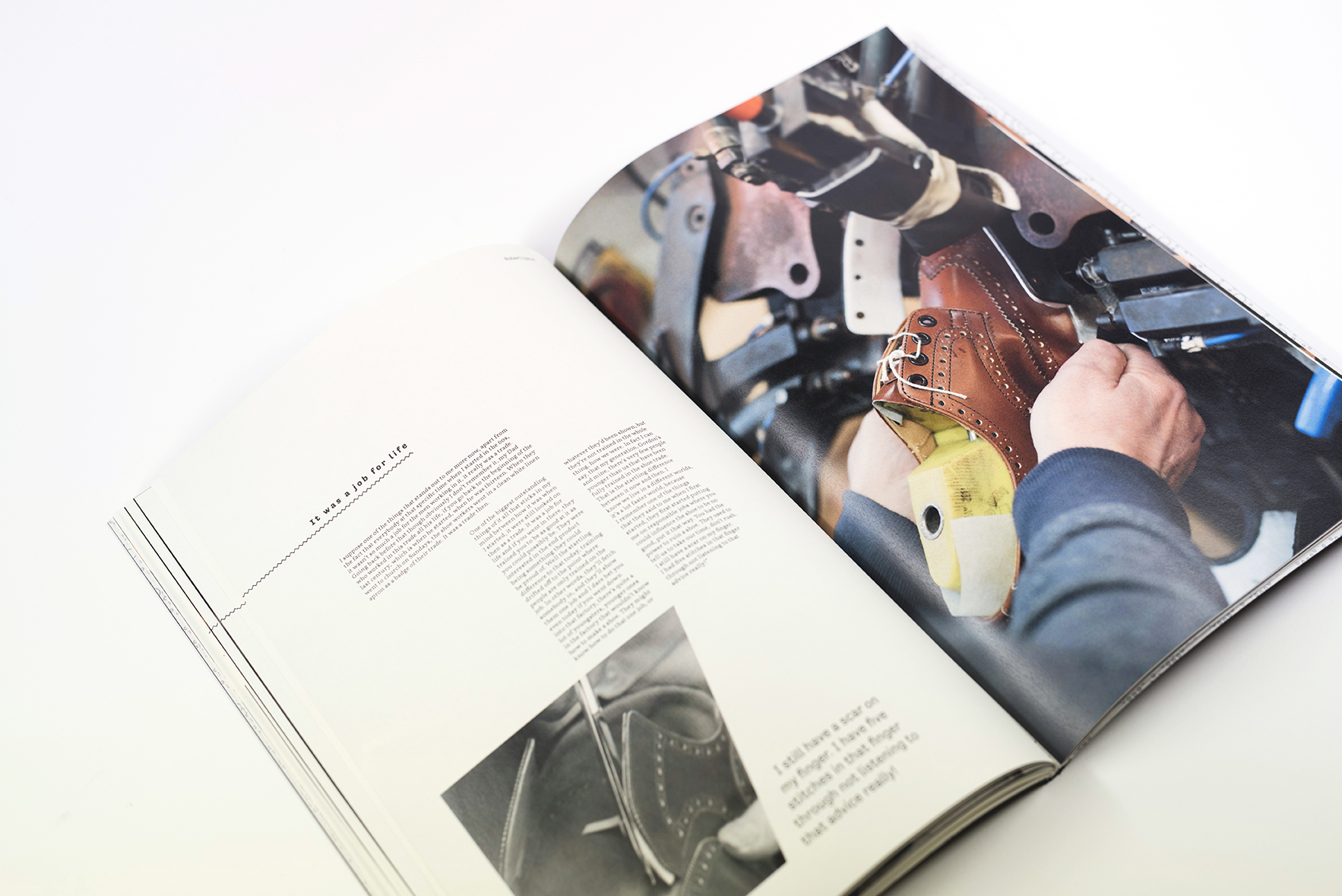
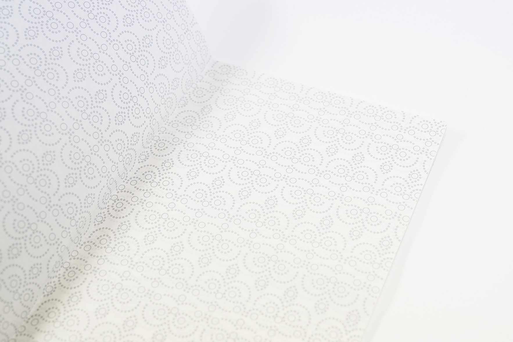
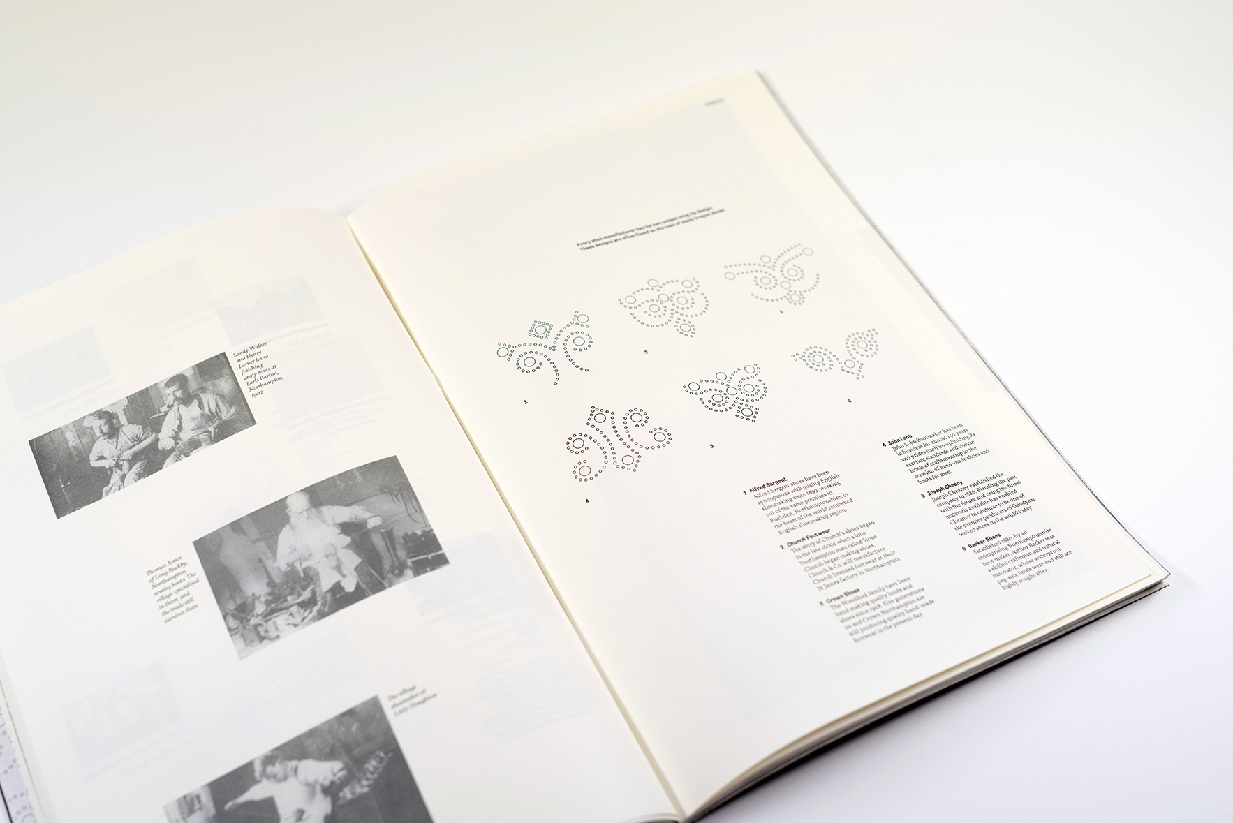
Kieran O’Sullivan’s ISTD-awarded final year project is an editorial piece exploring Northampton’s rich heritage in the shoe industry. Combining original imagery and archival content from the Northampton shoe museum, the book demonstrates several uses of pull outs, dynamic typography and photography to celebrate the history of the recent graduate’s hometown.
"In the next year I hope to take on a number of internships," he says. "Design is so broad – I want to continue learning and expanding my knowledge."
Maarit Koobas
- University: Arts University Bournemouth
- Course: BA (Hons) Visual Communication
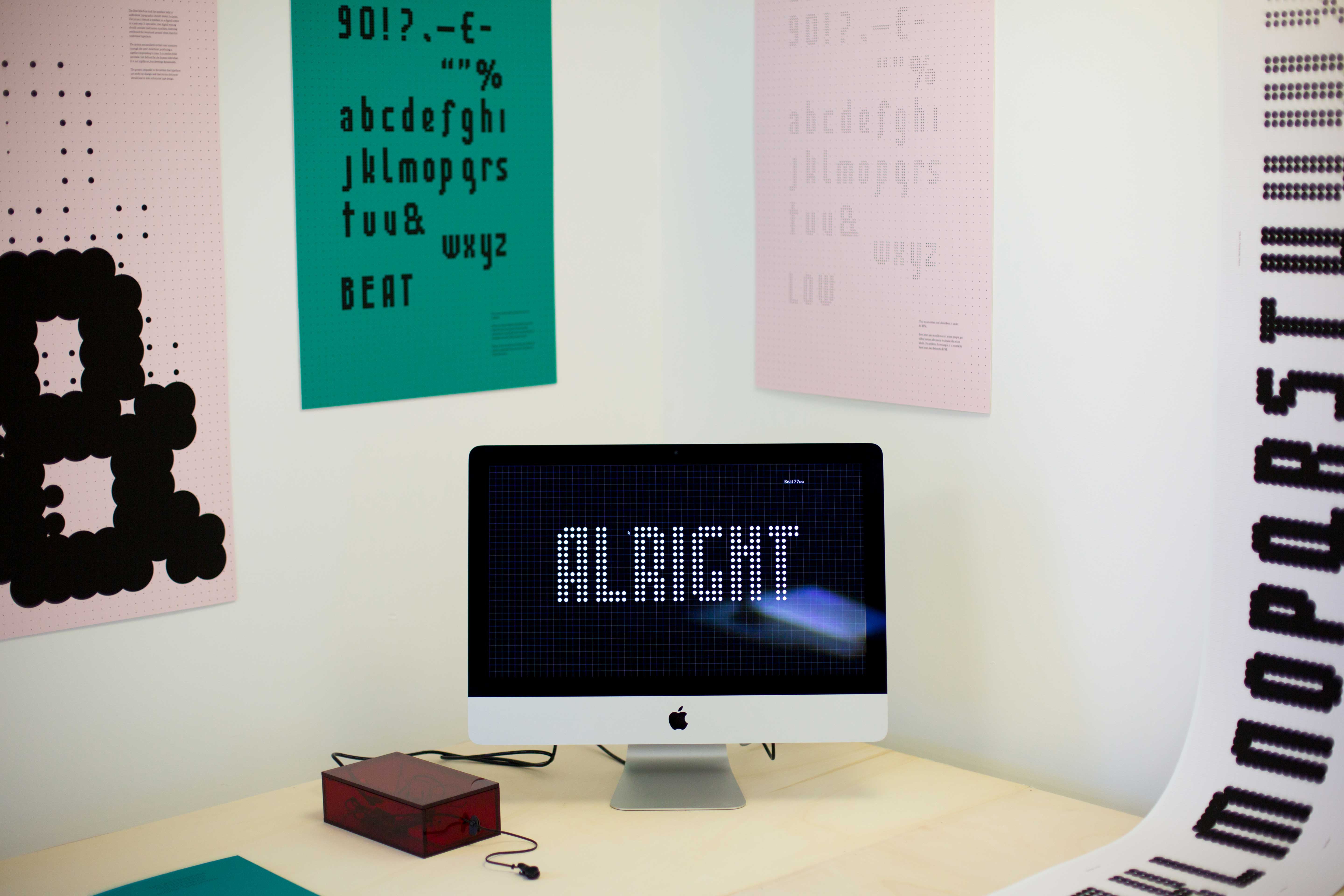
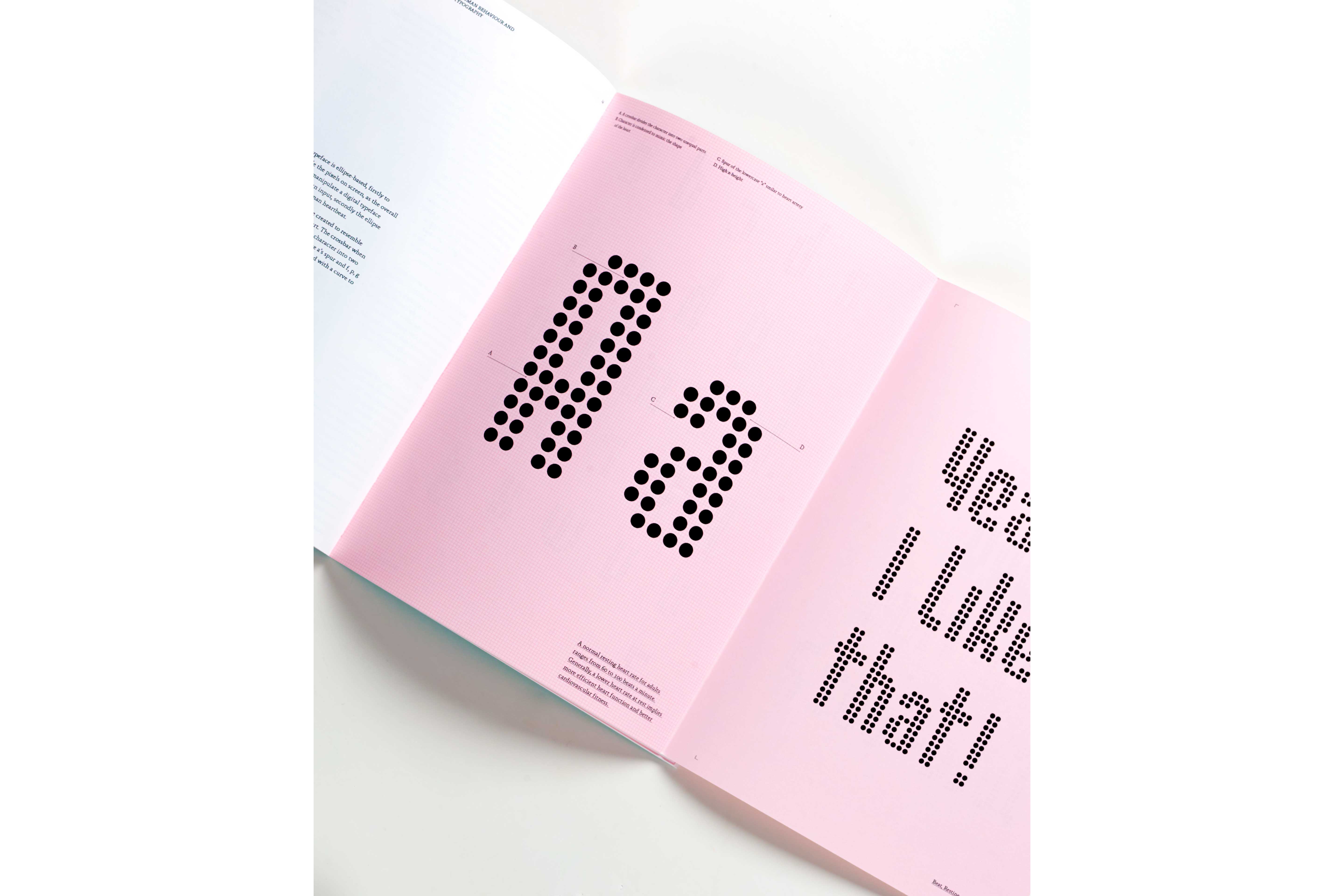
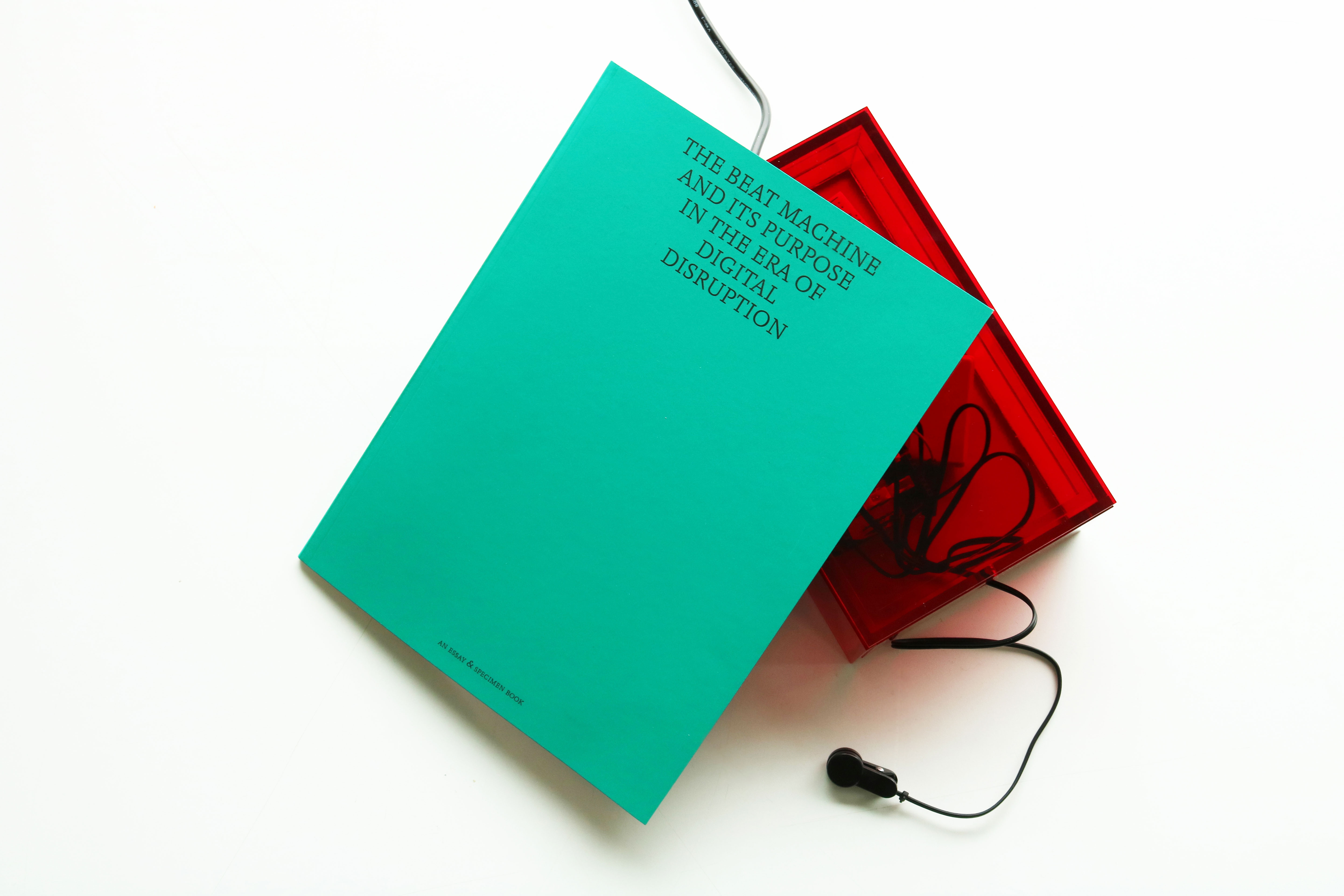
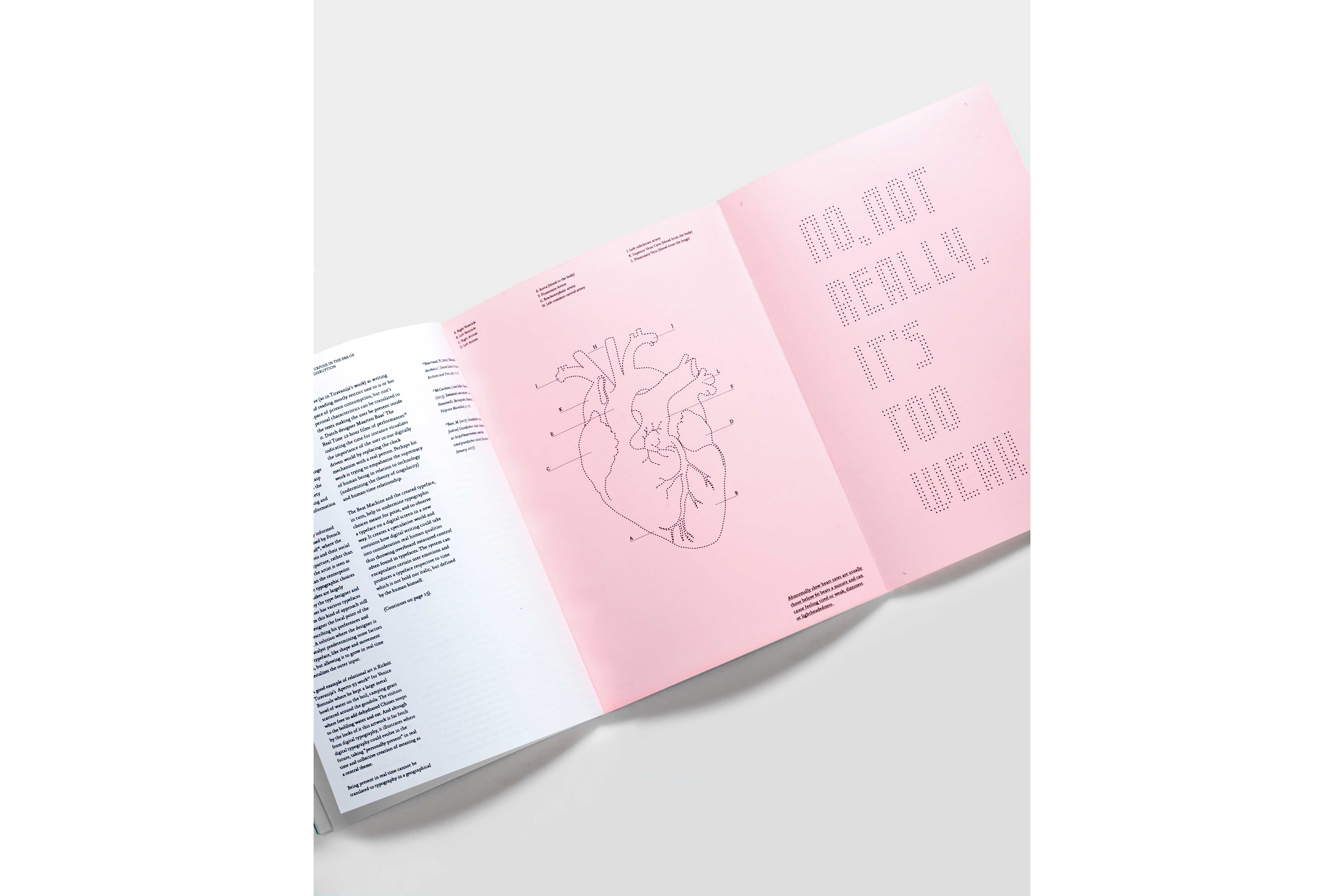
- Project: The Beat
Maarit Koobas’ project responds to the notion that typefaces are ready for change, and that future discourse should lead to non-referential type design. “How can human qualities be translated into digital textuality – something we see in handwriting and in letterpress typesetting? But, at the same time, how can we challenge typographic choices meant for print, especially the static essence of typography on screen?” asks Koobas.
Koobas’ solution was to explore how the rhythms of the heart can interplay with type on screen. “The type is therefore neither bold nor italic, but defined by the human individual. It’s not rigidly set, but develops dynamically.”
In a year’s time Koobas intends to be continuing to develop in the field of experimental typography. “I’m also keen to secure my first internship.”
Next page: Our pick of the graduates from Glasgow School of Art
Current page: Arts University Bournemouth
Prev Page Manchester School of Art Next Page Glasgow School of Art
Julia is editor-in-chief, retail at Future Ltd, where she works in e-commerce across a number of consumer lifestyle brands. A former editor of design website Creative Bloq, she’s also worked on a variety of print titles, and was part of the team that launched consumer tech website TechRadar. She's been writing about art, design and technology for over 15 years.
