It took a while for fans of top-flight Argentine football club Racing to notice that something was off with the team's logo. But once they did, the discovery began to prompt questions and concerns.
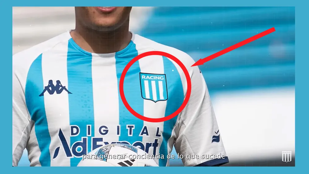
Initially, you had to look very closely to spot the error. But eagle-eyed fans started to point out on social media that something was awry with the rendering of the club badge on players' shirts. The logo features three straight white lines on a blue background, but one of the lines appeared to have become misshapen – and the lump seemed to get bigger each week like a strange optical illusion.
On social media, fans chided the club over what they assumed to be a mistake. "What an embarrassment, just search on Google and you can find good quality image files of the logo," one person wrote on Twitter.
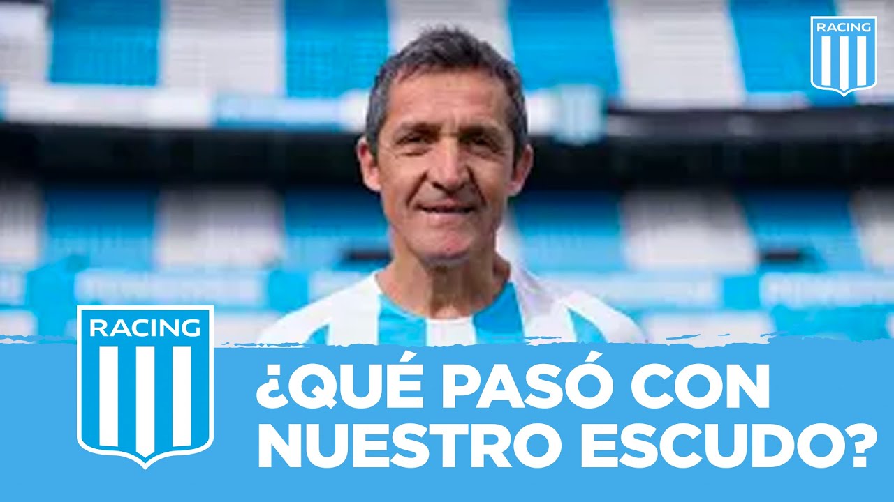
But Racing Club has finally explained all in an emotive video featuring the former player and coach Juan Ramón Fleita. The video reveals that, far from being a mistake, the logo intervention was intended to raise awareness of testicular cancer.
"Testicular cancer can develop in four weeks. That's why we made a campaign that lasted four weeks," the Avellaneda-based club said. And like with testicular cancer, many people didn't notice the change to the logo at all, or at least until it was well advanced in the final week.
"There is nothing more sacred than our shield... And nothing more important than taking care of ourselves," the team says in the video entitled, "What happened to our shield?"
"What happened to our shield can happen to your body," Fleita adds. "Although for weeks no one noticed, in the last few days some saw it. They got worried and they told us to sort it out, and it's right not to let it pass: early detection of testicular cancer saves lives." The video encourages fans visit a testicular cancer charity's website to learn how to check.

Fans have been surprised by the clever campaign, which was all the more relevant and effective because of the way it passed under the radar for a time before anyone noticed. "As a survivor of this cancer, I'm very proud of my club for this," one person wrote on Instagram. "This is a very clever idea. Catch stuff before it becomes too noticeable and you'll have better chances," someone else wrote.
The campaign shows that clever logo applications can communicate a whole different level of brand identity, becoming billboards for messages that resonate with the brand's community. For more design inspiration see the new Android rebrand and our pick of the best new logos of the year.

