The new Nokia logo: our readers' verdict
The controversial rebrand got social media talking this week.

Sign up to Creative Bloq's daily newsletter, which brings you the latest news and inspiration from the worlds of art, design and technology.
You are now subscribed
Your newsletter sign-up was successful
Want to add more newsletters?
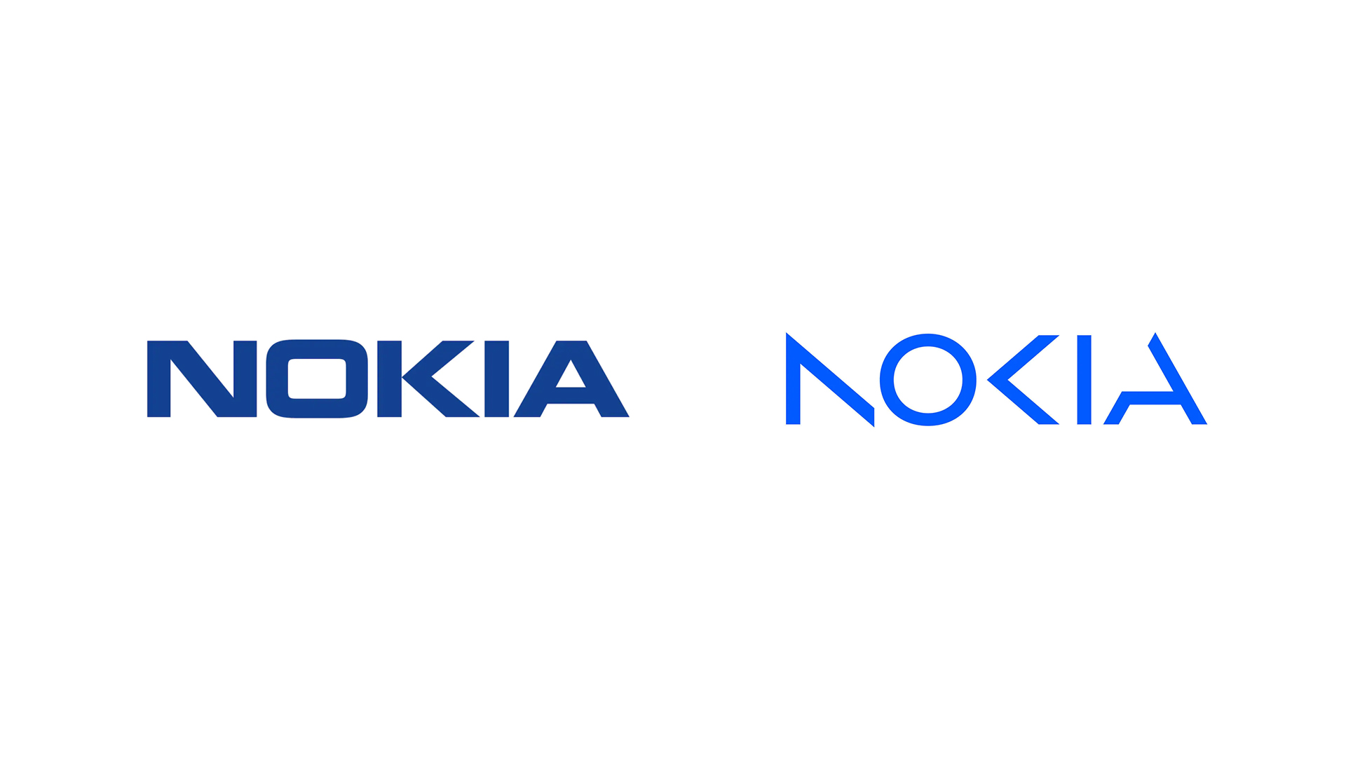
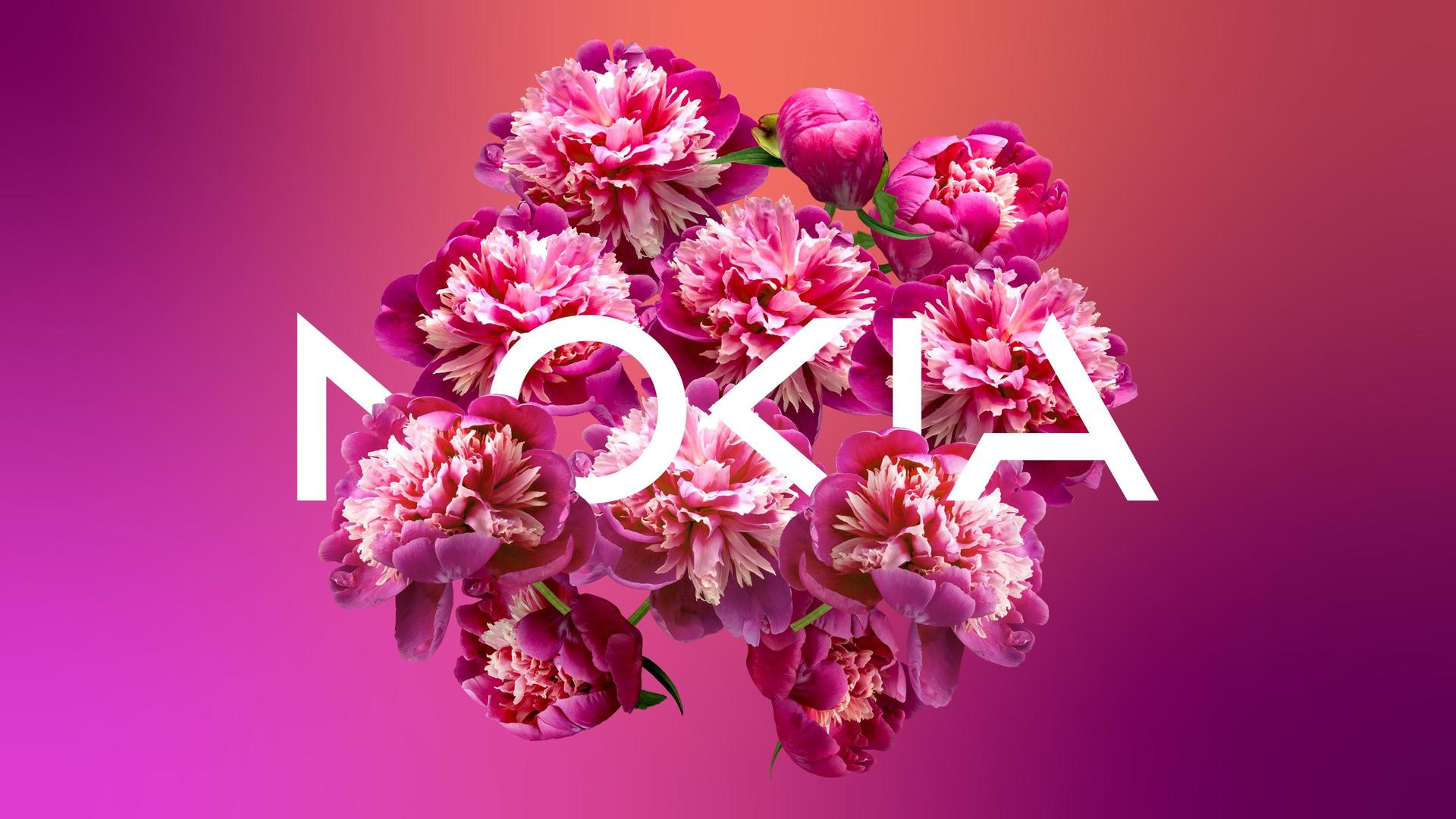
The big graphic news of the week has been, without question, the new Nokia logo. In an attempt to move away from its reputation as a mobile phone brand and towards that of "a B2B technology innovation leader pioneering the future where networks meet cloud" (catchy), the company unveiled a new wordmark that jumps on a controversial recent logo trend.
Potentially at the expense of legibility, Nokia has slashed glyphs from its letterforms to create something much more minimal and angular. It's a similar approach to recent rebrands from The Verge and Kia, and it's receiving similar complaints. We took to social media to ask our readers for their verdict on the new look. To let us know what you think, head to our Facebook and Twitter pages.

“I am a fan of the disjointed type treatments. I believe they are effective ways to create interesting display type in layouts. With that being said… this appeals to me, but I don’t think it will age well. As the tread wanes it will need to be revisited again for another update too soon. Great treatment for a magazine or poster. Wrong application for a logo, IMO.” John Yokeley, Facebook
Article continues below“I like it a lot. It’s edgy, sharp, precise. Cuts all ties to the previous branding, which is exactly what is needed.” Bert van den Bosch, Facebook
“The idea that because a brand identity/mark is hard to read it is therefore a bad design is a bit dated to say the least, and dare I say it ‘small brand thinking’. Both this and Kia’s rebrand caused a lot of press and social talk about them, that’s already a win. But beyond that if a logo is quick and simple to digest then physiologically it does very little… it’s magnolia… but if it makes us stop, examine, work that little but harder, then in that very act it is forming a greater bond with the person viewing it. Another win. People might say they don’t like it because they can’t read it, but “like” is a bit of a nonsense emotion when it comes to branding (just ask London 2012 or AirBnB). For me this Nokia rebrand ticks all the boxes - it feels forward-thinking, tech, progressive, precision and detail focussed - and as a visual piece it has great flexibility.” Adie Flute, Facebook
“Not sure about this trend of losing elements of a letter. As an icon it works, but when it’s a logo type, it can make the word hard to read.” Michael Chapman, Facebook
“I love this new logo and the all-new rebranding strategy! A new fresh direction for Nokia, leaving behind the old logo tied to the Nokia phone's past strategy. A new chapter has begun!” Miguel Oliveira, Twitter
Sign up to Creative Bloq's daily newsletter, which brings you the latest news and inspiration from the worlds of art, design and technology.
“If the design can't communicate the brand, it isn't a good design. The only reason I read NOKIA and not AOCIA is that I'm familiar with NOKIA and I read that this is NOKIA's rebrand first. If I have seen this randomly, I wouldn't recognise the brand.” Το 3ο του Καράμπελα, Twitter
“Decent, I like it. The weight's nice, it's balanced and there's just enough there - good mix of legibility and abstraction. Old school sci-fi vibe too.” Ed Tucker, Twitter
“Even beginners on fivver or 99designs would never come up with such a ridiculous "A" shape. It is against any typographical design rule. Completely pointless in itself, and even more compared to the other reduced characters.” Maik Kaune, Twitter
Read more:

Daniel John is Design Editor at Creative Bloq. He reports on the worlds of design, branding and lifestyle tech, and has covered several industry events including Milan Design Week, OFFF Barcelona and Adobe Max in Los Angeles. He has interviewed leaders and designers at brands including Apple, Microsoft and Adobe. Daniel's debut book of short stories and poems was published in 2018, and his comedy newsletter is a Substack Bestseller.
