Turns out the new Buick logo design happened by accident
It has a sketchy background.

Sign up to Creative Bloq's daily newsletter, which brings you the latest news and inspiration from the worlds of art, design and technology.
You are now subscribed
Your newsletter sign-up was successful
Want to add more newsletters?
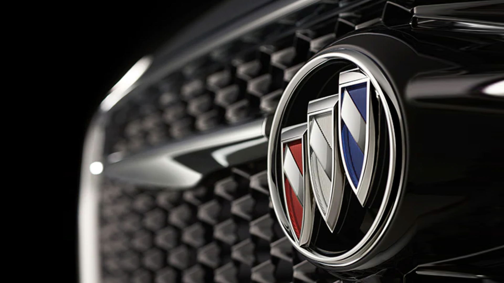
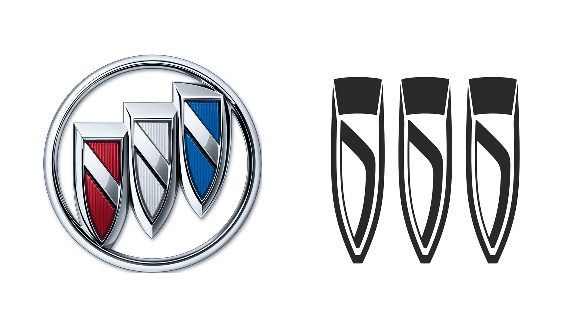
When car-maker Buick unveiled a new logo last spring, it was met with some bafflement. Fans were a little confused by the updated design, with some likening the tri-shield logo to teeth, claws and, er, a beard trimmer. And now it turns out the rebrand pretty much happened by mistake.
Buick's design manager has told Automotive News that the new logo was a "happy accident." The sketch was an early concept featuring rough lines designed to be filled in later to more closely resemble the old design with its circular border. But General Motors President Mark Reuss spotted it, and "was intriguied." (Looking for design inspiration? Check out the best logos of all time.)

According to Automotive News, the early sketch by artist Geoffrey Richmond "was an early iteration that, like other sketches, featured only rough lines. The traditional Buick badge had not yet been placed on it, as was intended, and instead, it only had a few swooping slash marks on the hood. Reuss apparently saw the design, though, and liked it."
It certainly ended up a much bolder and more minimal take on the previous logo. Gone is the ring around the three shields, and the diagonal line through each has been replaced with a curved line. As is the trend for new car logos right now (looking at you, BMW and Nissan), Buick went for a minimal, flat refresh.
But when the design first leaked last year, Twitter users were a little confused. From vampire fangs to superhero claws, plenty of car fans felt the new design resembled, well, lots of things. "Call me when Buick changes its name to Wolverine or All Day Nail Spa," one Twitter user commented, while another added, "Bullets? Vampire teeth? Icicles? What is it?"
Still, it's arguably a sleek update, and by no means the most confusing car logo we've seen over the last few months. Nope, that dubious honour still very much goes to Kia.
Read more:
Sign up to Creative Bloq's daily newsletter, which brings you the latest news and inspiration from the worlds of art, design and technology.

Daniel John is Design Editor at Creative Bloq. He reports on the worlds of design, branding and lifestyle tech, and has covered several industry events including Milan Design Week, OFFF Barcelona and Adobe Max in Los Angeles. He has interviewed leaders and designers at brands including Apple, Microsoft and Adobe. Daniel's debut book of short stories and poems was published in 2018, and his comedy newsletter is a Substack Bestseller.
