New Prime Video branding makes clever use of the Amazon logo
Dimple pleasures.

Sign up to Creative Bloq's daily newsletter, which brings you the latest news and inspiration from the worlds of art, design and technology.
You are now subscribed
Your newsletter sign-up was successful
Want to add more newsletters?
The Amazon logo is one of the most recognisable around, and possibly one of the cleverest. Most people can tell that the curved arrow also represents a smile, but the fact that it points from A to Z on the wordmark is an inspired touch. So it's little wonder Pentagram's new visual identity leans into the 'smile' asset.
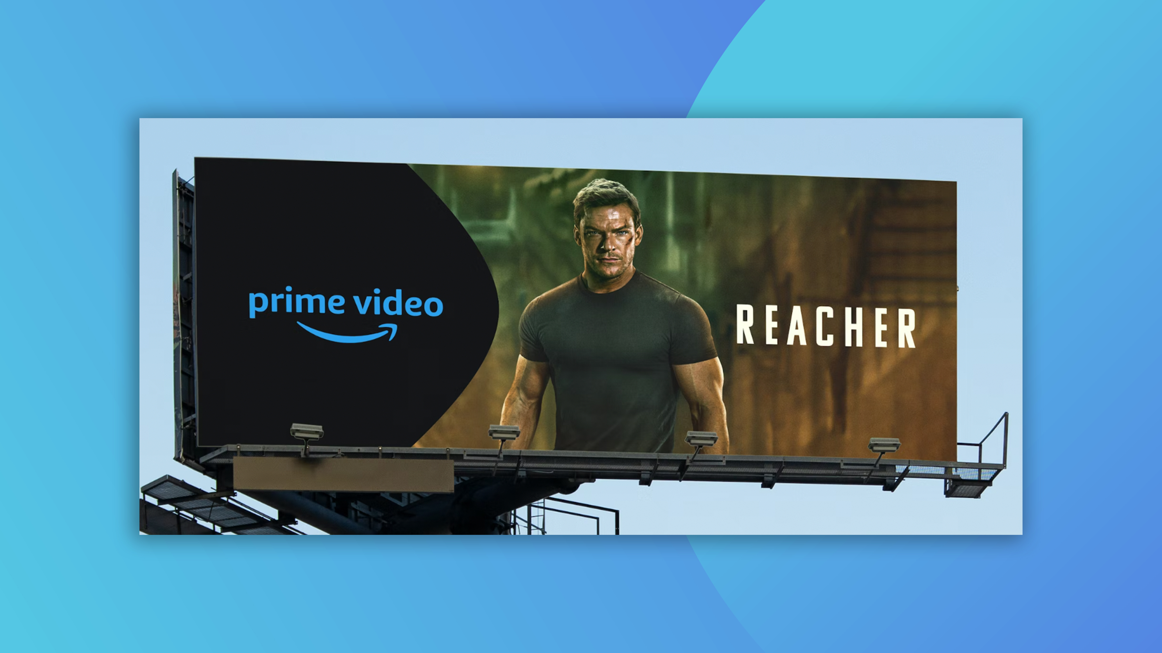
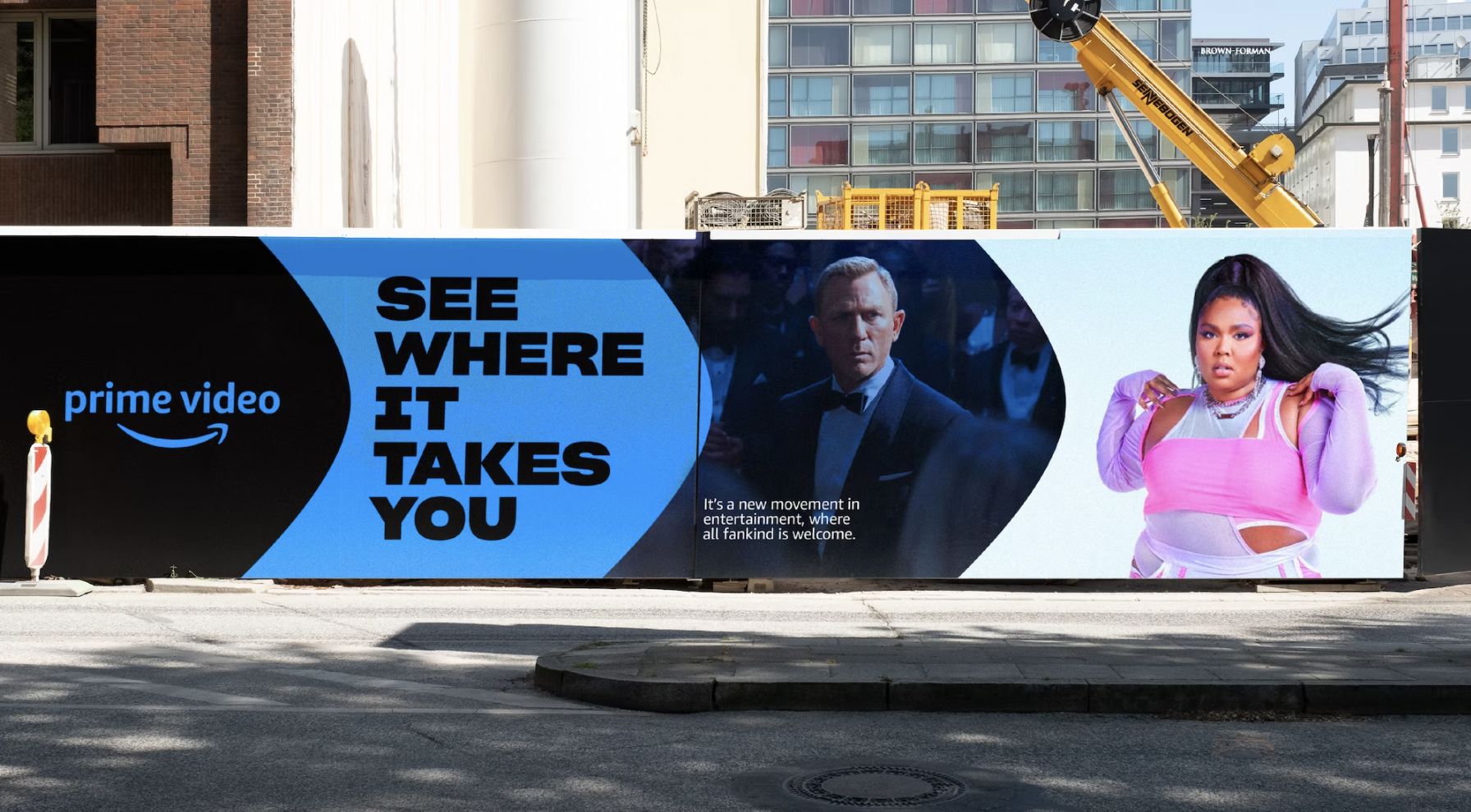
Designed to "move viewers through an infinite ripple of their favourite content," the new look lets the smile's 'dimple' take the lead as a clever and energetic framing device. (Looking for more awesome branding? Check out the best print ads ever.)
The identity launched alongside a redesigned experience within the Prime Video app and was designed "to build excitement and awareness about the sheer depth of variety showcased on Prime Video," envisioning the platform as a "rabbit hole".

As well as making bold use of the Amazon's palette's "Prime Blue," the visual identity recastings the dimple-arrow of the Amazon smile logo into a distinct shape that "conveys movement, momentum and energy as it points the way into the Prime Video rabbit hole". The dimple is used as a frame for imagery, which often bursts out to break the fourth wall (much like the visuals in the new Warner Bros anniversary logos).

While it's a subtle effect (this one of those if-you-know-you-know visual flourishes), it's certainly a creative use of the 'dimple', and one that maintains the arrow's sense of movement too.
The new identity also includes a bold new typeface in collaboration Sharp Type called Prime Video Sharp (below), which Pentagram describes as "strong and friendly," with multiple weights that fit in with the Prime family and "support the exuberant tone of the messaging."
It's only February, but we've already seen some striking new visual identities (if not complete rebrands) from various brands. Just this month, we saw some awesome new illustrations from Netflix (which finally let go of big tech's obsession with gangly cartoon people).
Read more:
Sign up to Creative Bloq's daily newsletter, which brings you the latest news and inspiration from the worlds of art, design and technology.

Daniel John is Design Editor at Creative Bloq. He reports on the worlds of design, branding and lifestyle tech, and has covered several industry events including Milan Design Week, OFFF Barcelona and Adobe Max in Los Angeles. He has interviewed leaders and designers at brands including Apple, Microsoft and Adobe. Daniel's debut book of short stories and poems was published in 2018, and his comedy newsletter is a Substack Bestseller.
