Netflix has a new look (and it's delightfully different)
Leaning into the language of cinema.
Sign up to Creative Bloq's daily newsletter, which brings you the latest news and inspiration from the worlds of art, design and technology.
You are now subscribed
Your newsletter sign-up was successful
Want to add more newsletters?
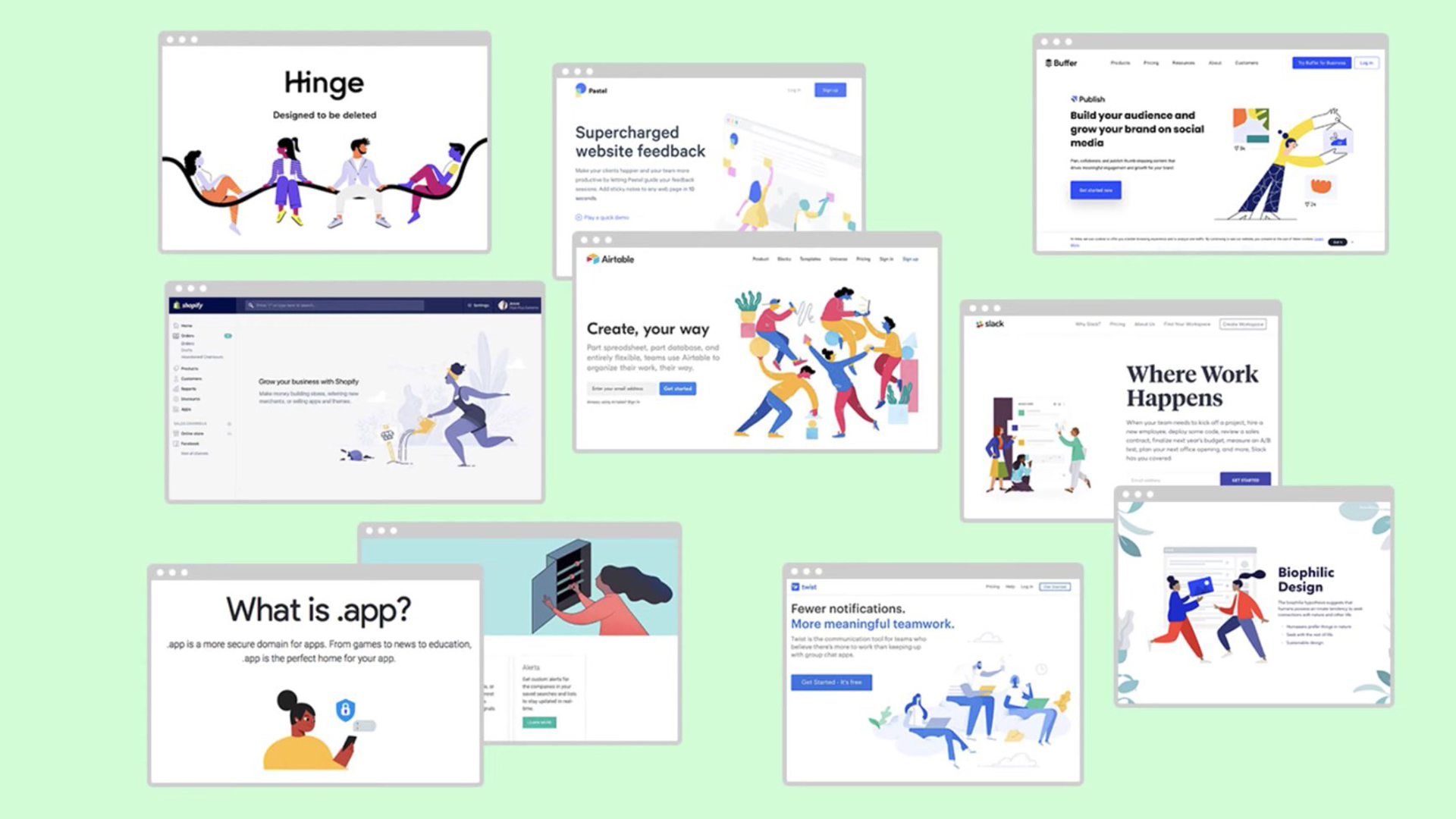
It can sometimes feel like big brands all are all working from the same design playbook. There was a time not so long ago when pretty much every brand used the same gangly-armed cartoon people (a style officially known as 'Corporate Memphis'). So it's refreshing that Netflix's latest visual identity steers clear of tech's obsession with one-dimensional vectors in favour of something much more cinematic.
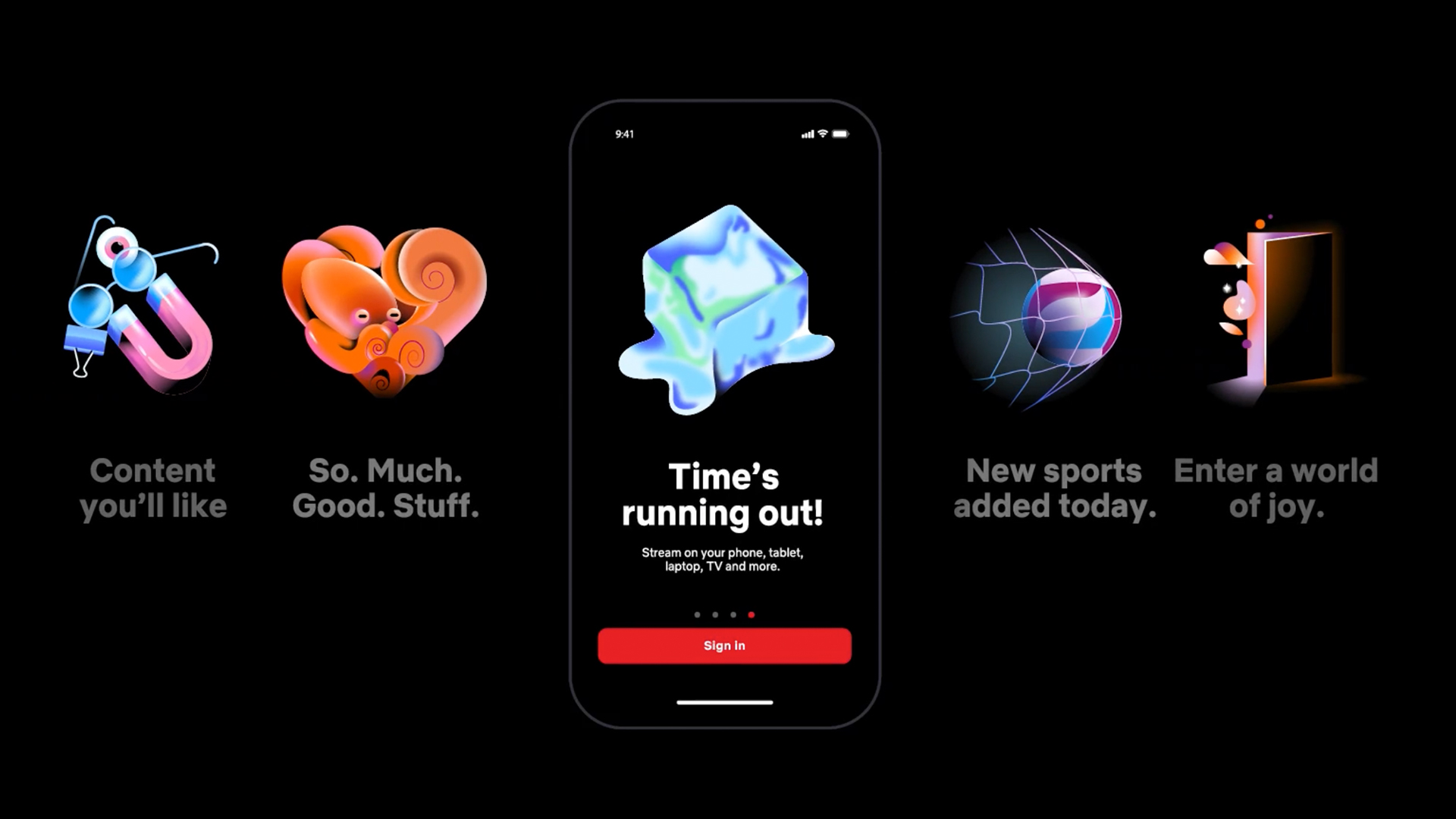
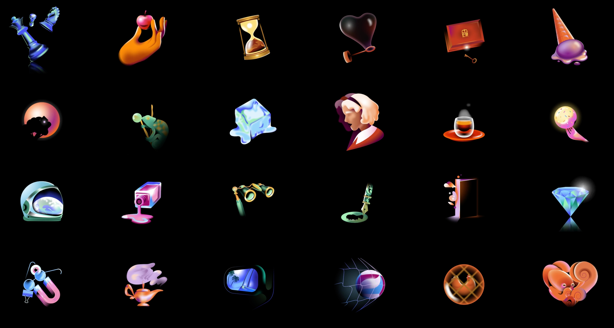
The brand has unveiled a set of new iconography designed by Koto Studios, and not only does it lean in to the brand's existing colour scheme, but it's also just plain fun. (Looking for more design inspiration? Check out our roundup of the best logos of all time.)

Koto says it was tasked to inject the language of cinema into the Netflix product experience. "We evolved their previous system by connecting iconography, typography, and illustration to roots within the cinematic universe, referencing effects and techniques reminiscent of the film-making process—in a way that feels immediately Netflix."

At the centre of the new visual language is a series of illustrations by Gica Tam and Michael William Lester at @beginners. Depicting (often surreal) objects in a delightfully vapour wave palette of purples and reds, it looks cutting edge compared with all that Corporate Memphis out there, even though the aesthetic is deliberately retro.
"We steered clear of the over-saturated, over-done, one-dimensional approach to graphic language typical of the tech and streaming worlds," Koto says, "by defining a style that speaks to film enthusiasts, and feels inherently Netflix while remaining true to their core values: pioneering, welcoming, and always stimulating."

Along with the illustrations, the new visual identity includes more varied sizes and weights of the company's Netflix Sans typeface, designed to "remain legible in functional applications, and flex to bold, cinematic title cards, genre-specific, or thematic comms."
It's certainly refreshing to see a big tech brand opt for a different visual style. Much like Burberry's latest rebrand, Netflix's new look is both retro and futuristic at the same time.
Sign up to Creative Bloq's daily newsletter, which brings you the latest news and inspiration from the worlds of art, design and technology.
Read more:

Daniel John is Design Editor at Creative Bloq. He reports on the worlds of design, branding and lifestyle tech, and has covered several industry events including Milan Design Week, OFFF Barcelona and Adobe Max in Los Angeles. He has interviewed leaders and designers at brands including Apple, Microsoft and Adobe. Daniel's debut book of short stories and poems was published in 2018, and his comedy newsletter is a Substack Bestseller.
