
White background: check. Large titles: check. Flat, colourful, unusually proportioned cartoon people: check. That's right, we're describing every website homepage you've visited in the last two years. We exaggerate, of course – but as a viral Twitter thread has revealed, it's certainly a very (very) popular web design trend right now.
From Slack to Hinge, countless digital brands have opted for the aesthetic, and now it's been pointed out to us, we simply can't stop seeing it. But it seems users are finally beginning to tire of the design trope. Fancy creating something a little more original? Check out our best website builders.
why does every website landing page look like this now? pic.twitter.com/V4id2BwQcoFebruary 15, 2021
The style is an offshoot of flat design that's particularly prevalent on tech service landing pages. And it seems Twitter users have a few theories as to why, with some believing it to be a simple case of designers following the crowd, and others suspecting the style is easy (and cheap) to mimic using stock imagery. One thing's for sure – we've all seen a web page that looks like this.
It's a cheaper alternative to creating a unique visual identity for your startup, but it's getting played out now. https://t.co/uvgD9TimPaFebruary 17, 2021
Because it's a design trend? https://t.co/BtQS8sPbNmFebruary 17, 2021
Because why hire a graphic designer and develop an original concept when you can just use free stock imagery? https://t.co/ho1Qzo69iEFebruary 17, 2021
lmao so true https://t.co/TZXul01rG6February 17, 2021
Fun fact: this illustration style is called Alegria, it became popular sa big tech companies because of its flat minimalistic design that shows positivity and connectedness sa motion ng characters. Also, they are ethnically non-specific, shows diversity. https://t.co/PwnJjSvcEyFebruary 17, 2021
Flat illustrations became easily accessible. There are sites you can download them from so it really reduced the stress of creating something original, it was a trend, right now it’s the 3D hands and faces that are trending, you will see more of that soon. https://t.co/pteH0SZnumFebruary 17, 2021

But many of the replies point to a recent YouTube video (below) by Solar Sands, which explains how the bright, vector-based style came about. According to this, Facebook might be to blame (of course!).
The art style, named Alegria, was allegedly created for the social media giant's illustration ecosystem by creative agency Buck in 2017. "There’s many imitators," the agency says, no doubt referring to the litany of noodle-limbed characters inhabiting the internet now. "But there’s only one Alegria."
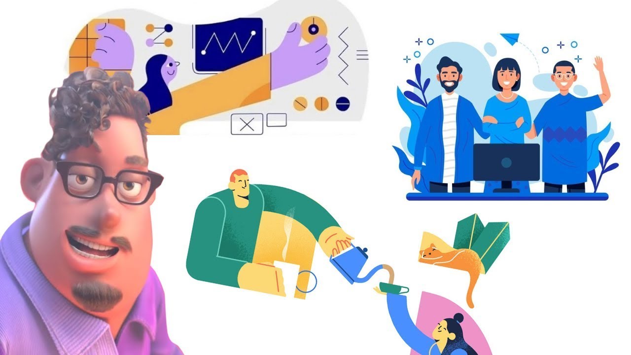
Indeed, there's nothing particularly wrong with Alegria as an aesthetic – it's a pretty attractive design style, and there's a pleasingly inclusive element to the characters. "The figures are abstracted — oversized limbs and non-representational skin colours help them instantly achieve a universal feel," Buck explains on its website.
But the look has certainly become rather ubiquitous, and the internet clearly has little patience for design styles it deems to have outstayed their welcome. Flat design as a whole has come under fire recently, and not even individual shapes are safe – the poor circle is apparently being overused right now. That said, with examples like Burger King's sizzling new rebrand emerging this very year, flat design hasn't yet fallen completely, well, flat.
Read more:

