Is this the most overused shape in graphic design?
Designers seem to be going round in circles.
We have nothing against circles – let's get that straight. There's something irresistible about a perfect circle, and humans have been fixated on the shape for a long time (unsurprising really, seeing as our entire solar system is based on the things).
But from illustration to logo design, it can feel like designers are relying on circles a little too much right now. We first raised the question last year, after a particularly circular Instagram post inspired a heated discussion on Reddit (below). But with new examples still popping up left, right and centre (such as Google's controversial new rounded icon set), it seems circular design isn't going anywhere.
A photo posted by @g.designthings on Oct 7, 2018 at 10:39am PDT
The offending (to some) Instagram post is, arguably, a lovely little piece of art – good use of negative space, and composed entirely using circles. However when the image turned up on Reddit it attracted a fair few negative responses:
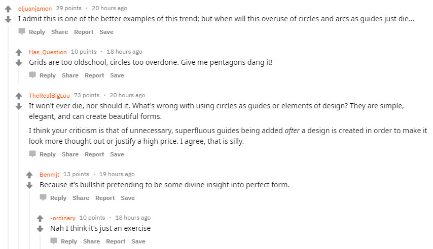
There are some good points raised here; you can't escape the fact that circles are a basic element of design, but sometimes people can take them a little too far. Circles, and other elements such as the golden ratio, are a pretty easy design fundamental to grasp. That said, it can be easy to get carried way – with examples like Uber's now-abandoned (and much-maligned) 2016 logo (below).

And often designers will abuse the humble circle to make a design look just that little more impressive to civilians, explaining their latest designs by superimposing a bunch of circles – and maybe a few parallel lines for good measure – on one page of the PowerPoint deck at presentation time.
Always felt like a trope, a way to wow clients and make the logo look betterApril 25, 2019
The overlaying circles are just the thing you do once the actual design is finished to have something to put in the handover/explanatory documentApril 25, 2019
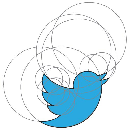
The Twitter logo, we're told, is constructed using 13 circles, which may or may not be strictly true. Does this really matter, though? Being constructed that way doesn't make the logo any better or worse; at most it makes for a good pub fact.
And it's often claimed that the iconic Apple logo was designed along the same sort of lines, using circles and the good old golden ratio. This seems to be more of an urban myth, though. Designer Rob Janoff based his work on actual apples; he sliced them into cross sections and built his designs around the curves supplied by nature.
Sign up to Creative Bloq's daily newsletter, which brings you the latest news and inspiration from the worlds of art, design and technology.
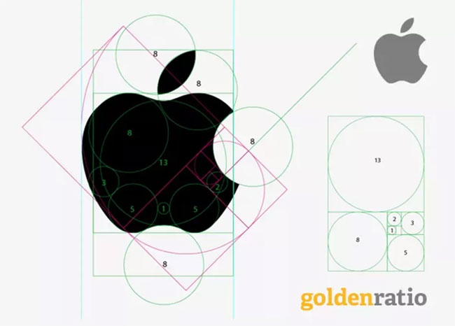
Basically any design that features curves can be reinterpreted as a demonstration of some fundamental circular design truth in action, but it often just turns out to be wishful thinking on the part of the observer. Just as we're genetically programmed to see faces in random patterns, we're similarly inclined to mentally break complex shapes down into a collection of primitives.
There's no escaping the circle, but sometimes it can feel like too many creators have focused a little too hard on it as the be all and end all of design, rather than a useful part of the larger design toolset. So go ahead and use it when appropriate, but remember: other shapes – and design rules – are available. If you're looking for inspiration, here are 8 huge graphic design trends for 2021 – none of which mention circles.
Read more:
Jim McCauley is a writer, performer and cat-wrangler who started writing professionally way back in 1995 on PC Format magazine, and has been covering technology-related subjects ever since, whether it's hardware, software or videogames. A chance call in 2005 led to Jim taking charge of Computer Arts' website and developing an interest in the world of graphic design, and eventually led to a move over to the freshly-launched Creative Bloq in 2012. Jim now works as a freelance writer for sites including Creative Bloq, T3 and PetsRadar, specialising in design, technology, wellness and cats, while doing the occasional pantomime and street performance in Bath and designing posters for a local drama group on the side.

