12 time-saving Photoshop tips
Speed up your workflow with these handy Photoshop tips.
07. Value check
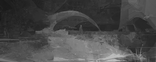
I'm sure you've heard it from a dozen different artists: value is king, check your values! Let's use the image from tip 5 to talk about value and how to check it accurately in Photoshop. The most common methods I see use desaturation to translate a colour's value, but unfortunately this ignores the inherent value differences between the hues, and will give you poor results.
A greyscale version of the image is what we really need, but instead of the cumbersome process of converting it to greyscale there's an elegant method of achieving a more accurate value analysis with Photoshop's Proof Colors function (Ctrl+Y).
If you've tried it, chances are that your image just shifted into the default CMYK colour space – and if you're like me, you may have accidentally activated this shortcut in the past instead of Ctrl+T (Transform) and understandably been annoyed at the result.
Article continues belowBut you can turn what was an annoying slip into a new, if possibly unexpected, ally: go to View>Proof Setup>Custom, set Device to Simulate to Working Gray and click OK. The keyboard shortcut Ctrl+Y will now give you a useful, more accurate Value Check preview.
08. Lighting round

Some sketches may have just one or two elements worth exploring, and aren't worth the investment to take to final. Yet rather than toss these away I try to extract the interesting elements whenever possible and combine them with previous and more stable results.
In this example I've introduced a more successful final painting on a Lighten layer over my sketch and have Color Balanced the original painting to suit the mood of the concept.
I wanted to see what I could still do to introduce some dynamism by way of simple graphic lighting. With the use of a few gradients, layer modes and some polish, I do feel that the composition was made a bit more successful.
Sign up to Creative Bloq's daily newsletter, which brings you the latest news and inspiration from the worlds of art, design and technology.
09. Pigment to pixel
Although I love the Clone Stamp, there are plenty of tasks that only a paintbrush can perform. I recommend using Color Dynamics to introduce a healthy variety to brush strokes by utilising the Hue, Saturation and Brightness Jitter sliders.
Go easiest on the Brightness setting: too much and it'll be impossible to control. Keep in mind we want just enough variety to create interest, not distractions! Most of all, make sure you untick the Apply Per Tip box at the top so that each Brush Stroke rather than each Brush Tip is altered.
10. In all things, variety!
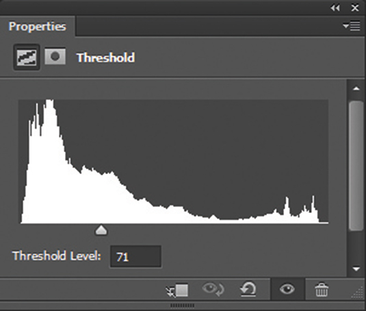
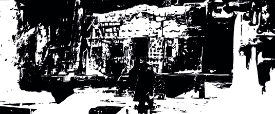
Let's use one of my favourite Photoshop tools, Threshold; this tool enables you to reduce an image to black and white, and adjust the position of the midpoint.
This legibility of light and dark is as important to an image as it is to human vision. Our eyes are much more concerned with the quantity of light they receive (value) rather than the dominant wavelength of the visible spectrum (hue) and purity thereof (saturation). Make this light and shadow pattern legible and the shapes interesting, and you almost can’t fail to make an interesting image.
11. Changing hats
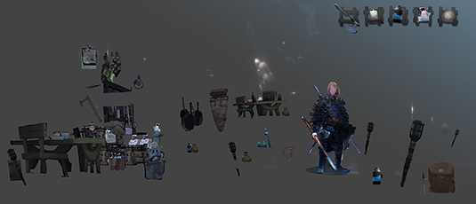
The props in this scene could have been recreated and re-rendered from scratch, but having them on hand means I can work differently, think differently and find different solutions. I can become a set dresser or scene decorator and let the paintbrush rest.
What's more, in reusing props I'm often able to pick them back up where I left off and enjoy the opportunity to take them either further or in a new direction. Even those I've left untouched this time give me the benefit of additional time and energy to spend elsewhere in the image.
12. Get messy
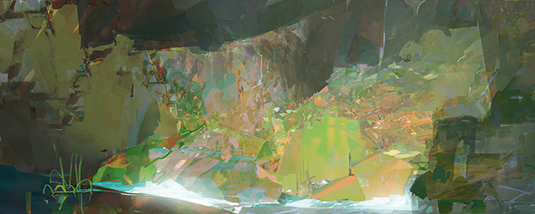
Even the most out-of-control mess may have potential if you spend some time with it. This image is layering at least half a dozen images selected at near random and was done as pure exploration; if an element helped create visual interest, abstract or otherwise, it stayed.
Once there was enough abstract potential built up, I aimed towards crafting a more tangible space. Some quick edits and lighting created a scene that has been a crucial catalyst for many paintings, both personal and professional, one of which you saw in tip 5. Don't be afraid to relax, control less and play more.
Words: Thomas Scholes
These tips originally featured in ImagineFX issue 130.
