Build a basic responsive site with CSS
Responsive design is much misunderstood. Jason Michael lays to rest some myths, and then walks us through building a simple responsive website.
Sign up to Creative Bloq's daily newsletter, which brings you the latest news and inspiration from the worlds of art, design and technology.
You are now subscribed
Your newsletter sign-up was successful
Want to add more newsletters?
- Knowledge needed: Basic CSS and HTML
- Requires: Text editor
- Project Time: 1-2 hours
Everyone’s talking about responsive web design. But does everyone understand what it’s for? I’m not sure. Many web designers and developers seem to me to have misunderstood the problem it’s trying to solve.
Put simply, it’s not about making sites for mobile devices, it’s about adapting layouts to viewport sizes.
In this tutorial I’ll look at the principles behind responsive web design in detail, so we’re sure to understand the concepts correctly. Once we’ve got that out of the way, I’ll walk you through building a website that scales perfectly on both large and small screens.
Responsive web design has mainly become a hot topic because more and more people are using mobile devices such as iPhones, iPads, and BlackBerrys to access the internet.
So it’s becoming increasingly important to understand that a website should not be specifically about either the desktop or the mobile device, but about building in such a way that its layout adapts to varying viewport sizes.
If you think about the new inventions we will inevitably see in the future, then an adaptive layout that can automatically respond to the users’ preference becomes an indispensable and highly valuable commodity.
One of the main reasons media queries have become more popular is the fact that websites are unusable on devices they weren’t considered for during design and build phases. They become fiddly to navigate around – or maybe the fixed width is wider than the user’s viewport, making it difficult to zoom in, pan, zoom out and find what they are looking for.
Frustrating? For sure. But more frustrating as a developer is that these websites should have been built in such a fashion that they scale down to fit any viewport size.
Many sites using media queries strip out information, hiding certain aspects of the site that they deem less important. So the user with a smaller device gets an easier to use website, but with stripped-down content.
But why should I, on a mobile device, not get the same benefits from a website as a desktop user?
With the help of media queries we can completely customise the layout of our website dependent on screen size. Which is great, but do we really need to supply several adaptations of our site?
And why should we settle for a site that’s so badly designed or built that it can’t scale gracefully?
User frustration
Some people believe that it’s okay to cut features and eliminate content they believe is non-essential to the user. But how can you be sure that the information you are cutting or pushing to a secondary page is not the content that is most important to me? You can’t.
As an example, I was on the Nike Football website on my MacBook and reading about the football academy they are running with the Premier League, which I found really interesting – it’s one of the main features as you get to the website.
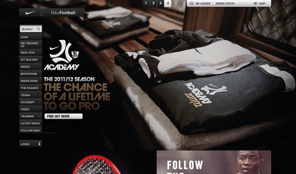
Nike Football’s full site features main navigation offering all available options – including the feature on the company’s football academy that’s visible in the image above...
However, when I tried to show a friend of mine on my iPhone, I discovered Nike has its own mobile site, and Nike Football consists of just two options: one about the latest Mercurial Vapor boots (not interested), and one about the new technology used on Nike’s football shirts (not interested).
I tried my iPad and it was completely different again – and still no sign of the academy information I was looking for.
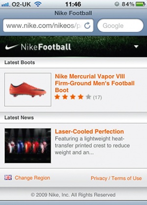
It’s not just Nike that’s guilty of this – it’s hundreds of sites. And I find it highly frustrating that I should get penalised for using a different device. I feel that if content isn’t worth showing to smaller device user, then it probably isn’t worth showing to anybody.
The first thing we need to understand is that responsive web design isn't just about mobile – it considers all viewport sizes. And secondly, developing a good responsive website requires more time and effort than just using media queries With a vast and growing number of web-enabled devices, it’s important to give your website the best possible chance to facilitate a solid user experience.
We know that by having a responsive site we can use a single codebase. This is great in that it means we needn’t adjust our content for each device. But many websites hide content deemed unnecessary to mobile users, and there are two issues with this.
Firstly, it effectively penalises mobile users browsing the website. And secondly, including a hidden style in our CSS doesn’t mean the content doesn’t get downloaded. This can massively affect performance, especially for those on poor connections.
So perhaps the best way to go about designing a website is to consider mobile, or smaller devices, first. This way you can focus on the most important information your site needs to give. And then, if necessary, you can use conditional loading techniques where your layout grid, large images and media queries are applied on top of the pre-existing small-screen design.
The real reason many full websites are unusable on mobile devices is because they are unusable on any device. If it’s designed well enough in the first place and built correctly, then it should scale up or down gracefully and effectively. A responsive site doesn’t necessarily have to be targeted at mobile devices; if it’s built correctly it doesn’t have to be targeted to any particular device. It will just work. And Ethan Marcotte sums it up well in his article “Responsive Web Design” from A List Apart: “Rather than tailoring disconnected designs to each of an ever-increasing number of web devices, we can treat them as facets of the same experience,” he writes. “We can design for an optimal viewing experience, but embed standards-based technologies into our designs to make them not only more flexible, but more adaptive to the media that renders them. In short, we need to practice responsive web design.”
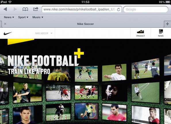
The iPad version of Nike’s site says ‘train like a pro’, but the desktop version’s football academy article can’t be found here at all
Sign up to Creative Bloq's daily newsletter, which brings you the latest news and inspiration from the worlds of art, design and technology.
With the vast evolution of devices, responsive web design won’t fully prevent us from making changes for new devices, but it should eliminate the need to make viewport related changes. We’ve all been through it – building websites that don’t quite work in IE6. It’s an issue that drove us all crazy and we spent hours applying hacks to fix it. However, there has never really been that much of an issue with IE6, it’s just we were building our sites wrong. With a vastly growing number of web-enabled devices it is important that we build our sites in a way that allows it to adapt to change
The walkthrough
For the purpose of this tutorial I have put together a website that scales beautifully between large and small screens. You keep all the content on all sizes. And with the use of media queries I have switched the navigation from a horizontal display to vertical display for smaller devices, and given the user enough padding on the realigned adaptation to work well on touch screens.
One thing that I especially like, when you view smaller-screen versions of sites where the main navigation fills the screen area, is the ability to skip to the content you really want using page anchors. Having this appear at the top of the page helps prevent mobile users from having to scroll down to get to the main body of content.
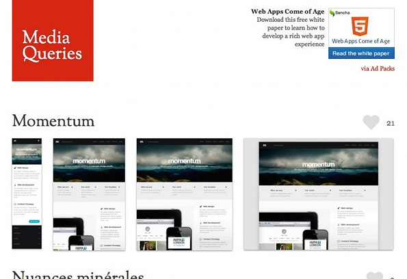
Mediaqueri.es is a nice site that is perfect for inspiration as it shows you versions of many sites degrading into smaller screensizes
The key element of flexibility in responsive design is a fluid layout width. All you need to do is create a wrapper, content, and column widths that will adapt to different device widths. It’s nothing new, but is now more important than ever. To keep things simple, I’m going to show you how to create a fluid page consisting of navigation, feature image and two-column, which takes into consideration the layout on various sized devices. You’ll notice I’ve included respond.min.js, which is a lightweight polyfill that enables media queries to work in IE6-8. Here is the basic HTML structure:
<!DOCTYPE html>
<html lang="en">
<head>
<meta charset="utf-8"/>
<title> Demo | Responsive Web</title>
<meta name="viewport" content="width=device-width, minimumscale=
1.0, maximum-scale=1.0" />
<link href="styles/main.css" type="text/css" rel="stylesheet">
<!--[if lt IE 9]>
<script src="//html5shiv.googlecode.com/svn/trunk/html5.js"></script>
<![endif]-->
<script type='text/javascript' src='scripts/respond.min.js'></script>
</head>
<body>
<div id="wrapper">
<header>
<nav id="skipTo">
<ul>
<li>
<a href="#main" title="Skip to Main Content">Skip to Main Content</a>
</li>
</ul>
</nav>
<h1>Demo</h1>
<nav>
<ul>
<li><a href="#" title="Home">Home</a></li>
<li><a href="#" title="About">About</a></li>
<li><a href="#" title="Work">Work</a></li>
<li><a href="#" title="Contact">Contact</a></li>
</ul>
</nav>
<div id="banner">
<img src="images/kaws.jpg" alt="banner" />
</div>
</header>
<section id="main">
<h1>Main section</h1>
<p>Lorem…p>
</section>
<aside>
<h1>Sub-section</h1>
<p>Lorem …p>
</aside>
</div>
</body>
</html>
When it comes to the CSS, setting a max-width is a good idea in order to stop the site scaling across enormous screens – and this won’t withhold the page from shrinking. One main issue when switching from fixed widths to fluid is images. And there is a simple fix for this in your CSS. Just set your image’s width to 100%:
float: left;
display: block;
background: url(../images/demo.gif) 0 0 no-repeat;
text-indent: -9999px;
}
/* Nav */
header nav {
float: right;
margin-top: 40px;
}
header nav li {
display: inline;
margin-left: 15px;
}
#skipTo {
display: none;
}
#skipTo li {
background: #b1fffc;
}
/* Banner */
#banner {
float: left;
margin-bottom: 15px;
width: 100%;
}
#banner img {
width: 100%;
}
Your image will now display at its parent elements full width and will contract along with it. Just be sure your image’s max-width doesn’t exceed the max-width of its container – otherwise it may pop outside. Remember to use this method effectively the image must be large enough to scale up to whatever size of your largest set viewport.

Viewing the tutorial layout on a large screen, max-width restrains it from expanding too far
Using large images can effect load time, so on smaller viewports where they are unnecessary there is a responsive image method where you would detect the users screen size and pull in smaller/larger image depending on what was necessary. There are still a few major challenges with this method but is still worth looking into. Mat Marquis, a member of the jQuery Mobile team, has written a great article on this method and he explains the pros and cons.
Main navigation switch
The main reason that you may want to switch the navigation is because the scaling down could become unreadable and hard to click. By using this method, you are enabling the user to access it more easily. You will also notice in the code that we have made some changes to the #main and aside sections to switch them to one column.
/* Structure */
#wrapper {
width: 96%;
max-width: 920px;
margin: auto;
padding: 2%;
}
#main {
width: 60%;
margin-right: 5%;
float: left;
}
/* Media Queries */
@media screen and (max-width: 480px) {
#skipTo {
display: block;
}
header nav, #main, aside {
float: left;
clear: left;
margin: 0 0 10px;
width: 100%;
}
header nav li {
margin: 0;
background: #efefef;
display: block;
margin-bottom: 3px;
}
header nav a {
display: block;
padding: 10px;
text-align: center;
}
}
You will notice on some mobile devices that your website automatically shrinks itself to fit the screen, which is where we get the issues of having to zoom in to navigate through fiddly content.
To allow your media queries to take full effect a typical mobile-optimized site contains something like the following:
<meta name="viewport" content="width=device-width, minimum-scale=1.0, maximum-scale=1.0" />
The width property controls the size of the viewport. It can be set to a specific number of pixels like width=960 or to the device-width value which is the width of the screen in pixels at a scale of 100%. The initial-scale property controls the zoom level when the page is first loaded. The maximum-scale, minimum-scale, and user-scalable properties control how users are allowed to zoom the page in or out.
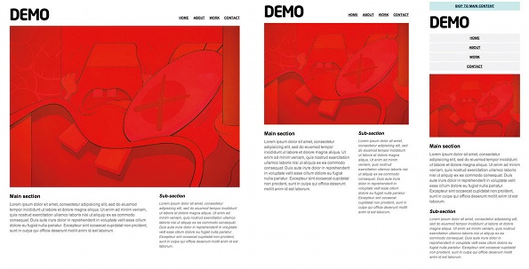
Combining a series of grabs enables the impact of transitions between screen sizes to be appreciated fully
As I said before, responsive web design has never been about making sites for mobile devices. It’s about adapting layouts to viewport sizes. Having a responsive site that adjusts to varying viewports should be the default option. If you wish to create a mobile version that looks completely different and shows only ‘important’ content then go ahead, but at least allow the user that choice to see the ‘full’ website too. We should concentrate on using the technologies sitting under the ‘responsive design’ umbrella to create a better web.
Something that will help us tremendously with fluid layout, and which I’m very excited about, is Flexible Box Layout Module. FlexBox, as it’s also known, provides a method of automatically resizing elements within their parent without having to calculate height and width values. As well as dynamically changing an element’s size, FlexBox can also apply properties to a parent that control where any empty space is distributed. If you’re not aware of FlexBox then check Peter Gasston’s articles.
Developers must consider having the same content organised in a manner that is the same for everyone. The minimum standard we should set ourselves as developers is to create websites that work for everyone, everywhere.
- This tutorial has received a technical review from Stephanie Rieger
- This article first appeared in issue 231 of .net magazine – the world's best-selling magazine for web designers and developers.

The Creative Bloq team is made up of a group of art and design enthusiasts, and has changed and evolved since Creative Bloq began back in 2012. The current website team consists of eight full-time members of staff: Editor Georgia Coggan, Deputy Editor Rosie Hilder, Ecommerce Editor Beren Neale, Senior News Editor Daniel Piper, Editor, Digital Art and 3D Ian Dean, Tech Reviews Editor Erlingur Einarsson, Ecommerce Writer Beth Nicholls and Staff Writer Natalie Fear, as well as a roster of freelancers from around the world. The ImagineFX magazine team also pitch in, ensuring that content from leading digital art publication ImagineFX is represented on Creative Bloq.
