How to create visual language through typography
Jerry Cao explains how the content and context of what you're saying affects the look of your typography.
Sign up to Creative Bloq's daily newsletter, which brings you the latest news and inspiration from the worlds of art, design and technology.
You are now subscribed
Your newsletter sign-up was successful
Want to add more newsletters?
Importance of context
At its core, typography is just another tool for communication. As such, context will play a large role in its success or failure. Typographic context is determined by two factors:
- The Readers — Who is reading your words and how are they likely to interpret different visual cues.
- The Type of Message — Distinctions between blog posts, banner ads, product descriptions, etc. will all affect interpretation, not to mention the different types and styles of each of the above.
Let's explore both below.
01. The Readers
The first concern of context in typography is who will read your message. Different people interpret the look of the text in different ways, just as they would interpret a painting in different ways.
For this, it's important to reference your user personas. We discussed user personas at length in Interaction Design Best Practices: Volume 1, but to summarize, a user persona is a character made up to represent one of your target users. When making important design decisions, personas act as another person in the room to think about. "Would Sally Perkins (a seasonal shopper) see this link in the corner?" for example.
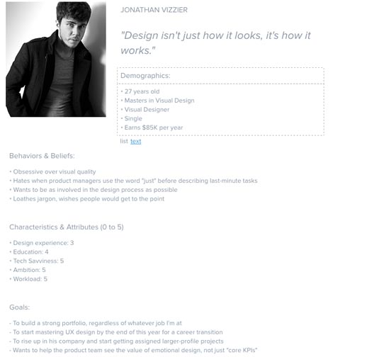
When crafting your typography, keep your user personas in mind. Will they understand the intentions behind your creative choices, or will it go over their heads? Which kind of typeface would be most effective on them? Just as other areas of design, knowing whom you're designing for will answer a lot of questions early on.
Glaser and Knight, for example, explain the use of the Old Gothic font, as in the Juicy Couture logo below. To the brand's loyal followers, this font denotes youth, a certain edginess, even unapologetic sex-appeal.
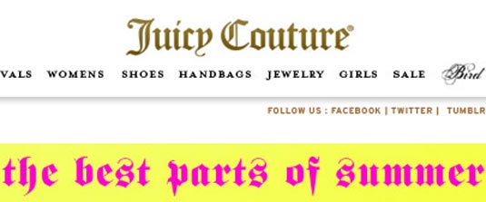
However, an older or less fashionable audience would have a completely different association. They tend to interpret the font as more sophisticated, classy, or traditional — not at all applicable on the backside of yoga pants! This audience would make more sense out of the New York Times logo below.
Sign up to Creative Bloq's daily newsletter, which brings you the latest news and inspiration from the worlds of art, design and technology.
The differences aren't always this extreme. Even within your target audience, differences in age, gender, social status, etc. will all have subtle effects on the typography's interpretation.

When it comes to judging the aesthetics of the typography, we recommend writing down (or at least reviewing in your head) the top 5 words that immediately come to mind. Make sure it correlates with your audience and design objective, otherwise keep searching.
02. The Type of Message
Are you designing typography for an advertisement or an error message? If it's for an advertisement, what kind — charity, luxury goods, candy? Is the ad funny or serious?
Just like you need to know whom you're writing for before you start, you should also know why you're writing. Like we recommended in Web UI Design for the Human Eye, you must make sure your typography syncs with your overarching message.
Let's look at TDBank and how they create different impressions with the same sans serif font.
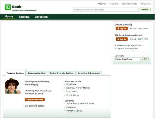
It makes sense to use a straightforward, but approachable sans-serif typeface like this for the bank homepage. The design isn't particularly innovative, but it certainly creates a basic level of trust since the typeface is crisp and the green colours suggest wealth and serenity.
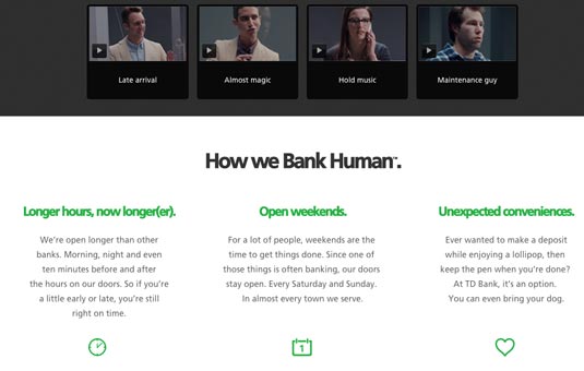
The typeface becomes much more interesting on their microsite discussing how to humanize banking. Presented in larger size and bolder weight, the font lives up to the messaging of "banking human". It's professional, tastefully modern, and feels like a friendly advisor. The green colour is also brighter and livelier than on the homepage, adding to the human feel.
The point here is that the same font serves two different purposes depending on where it's used. The bottom-line voice from the main site comes across much happier on the microsite, just as the bottom's hopeful optimism doesn't come across on the top.
You don't want to take this visual correlation to an extreme, however.
For example, let's take a look at Teen Vogue. It's safe to say their audience consists mostly of tweens, but their site design feels more aspirational than immature. The typeface strikes the perfect balance between youth and elegance.
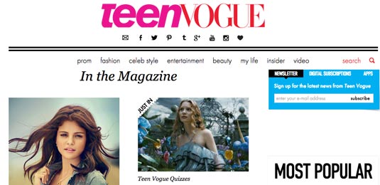
They don't make the mistake of literally matching form and function. For example, the designer could have gone with a more literal appeal with something fun and quirky like the below font, appropriately named CK Tween. But such a treatment would feel contrived and tacky, leaving a saccharine aftertaste.
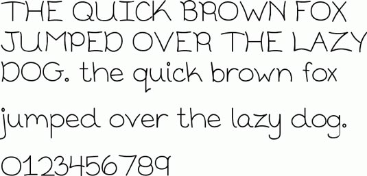
Match the typeface to the desired mood, but exercise restraint or it will feel cheesy.
Next page: combining copy and typography, legibility and readability...

The Creative Bloq team is made up of a group of art and design enthusiasts, and has changed and evolved since Creative Bloq began back in 2012. The current website team consists of eight full-time members of staff: Editor Georgia Coggan, Deputy Editor Rosie Hilder, Ecommerce Editor Beren Neale, Senior News Editor Daniel Piper, Editor, Digital Art and 3D Ian Dean, Tech Reviews Editor Erlingur Einarsson, Ecommerce Writer Beth Nicholls and Staff Writer Natalie Fear, as well as a roster of freelancers from around the world. The ImagineFX magazine team also pitch in, ensuring that content from leading digital art publication ImagineFX is represented on Creative Bloq.
