Monotype reinvented with new look and typeface
Monotype Imaging becomes Monotype as typography brand goes under the knife for a new brand identity.
Sign up to Creative Bloq's daily newsletter, which brings you the latest news and inspiration from the worlds of art, design and technology.
You are now subscribed
Your newsletter sign-up was successful
Want to add more newsletters?

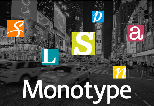
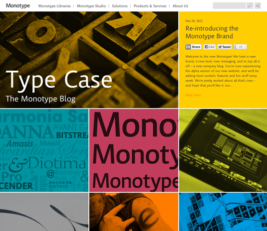
Typographic company and self-confessed "type geeks", Monotype, has had a comprehensive rebranding that has seen a new corporate logo, refreshed website, new colour palette, and a company blog.
Of most interest is the logo, which features (as you would expect) an all-new typeface, Kootenay. The font was created by type director Steve Matteson, and is a sans serif inspired by the Canadian Rockies.

The company was previously known as Monotype Imaging, but they have dropped the 'Imaging' and shall now be simply known as Monotype.
The new colour palette is derived from the best usage of colour over the years from the company's renowned typeface library brands - Monotype, Linotype, ITC, Ascender, and Bitstream. And the new HTML5-based website makes full use of web fonts, the site navigation and structure has been streamlined.
What do you think of Monotype's rebrand? Discuss it in the comments!
Now read:
- The 50 best free fonts for designers
- 20 free graffiti fonts for designers
- Download free fonts: 25 great resources
Sign up to Creative Bloq's daily newsletter, which brings you the latest news and inspiration from the worlds of art, design and technology.

The Creative Bloq team is made up of a group of art and design enthusiasts, and has changed and evolved since Creative Bloq began back in 2012. The current website team consists of eight full-time members of staff: Editor Georgia Coggan, Deputy Editor Rosie Hilder, Ecommerce Editor Beren Neale, Senior News Editor Daniel Piper, Editor, Digital Art and 3D Ian Dean, Tech Reviews Editor Erlingur Einarsson, Ecommerce Writer Beth Nicholls and Staff Writer Natalie Fear, as well as a roster of freelancers from around the world. The ImagineFX magazine team also pitch in, ensuring that content from leading digital art publication ImagineFX is represented on Creative Bloq.
