5 great examples of WebGL
Unsure about what you can achieve with WebGL? Here are five amazing sites that demonstrate just how far you can go.
Sign up to Creative Bloq's daily newsletter, which brings you the latest news and inspiration from the worlds of art, design and technology.
You are now subscribed
Your newsletter sign-up was successful
Want to add more newsletters?
In need of a little web design inspiration? Here are some of the best examples of WebGL use that we've seen over the few months.
01. Brakebills University

When NBCUniversal reached out to UNIT9 to create an interactive second screen experience for the new Syfy series The Magicians, one of the challenges they were presented with was to think of a magic lesson for every episode. The aim was to create a website that was more informative than game-like, but still offered plenty of challenges and content for the user to discover.
In close collaboration with Syfy, the team at UNIT9 created 13 games for the 'Magic lessons' part of the website. These can be played on all devices and adapt to the device in question.
Article continues below"The challenge on the technological side was building standalone games for the 13 lessons, which each required different tech – from AngularJS and WebGL to 3D animations," says UNIT9's Ligia Stan.
After each episode has aired, the user can return to the site and take a different lesson, as well as learning more about the characters. The team needed to ensure the code, copy and assets became accessible at the same time the episode aired, which meant finding a custom way to release content, beyond classical CMSs. This was the team's biggest challenge, but the result is one of the better examples of its kind.
02. A Short Journey
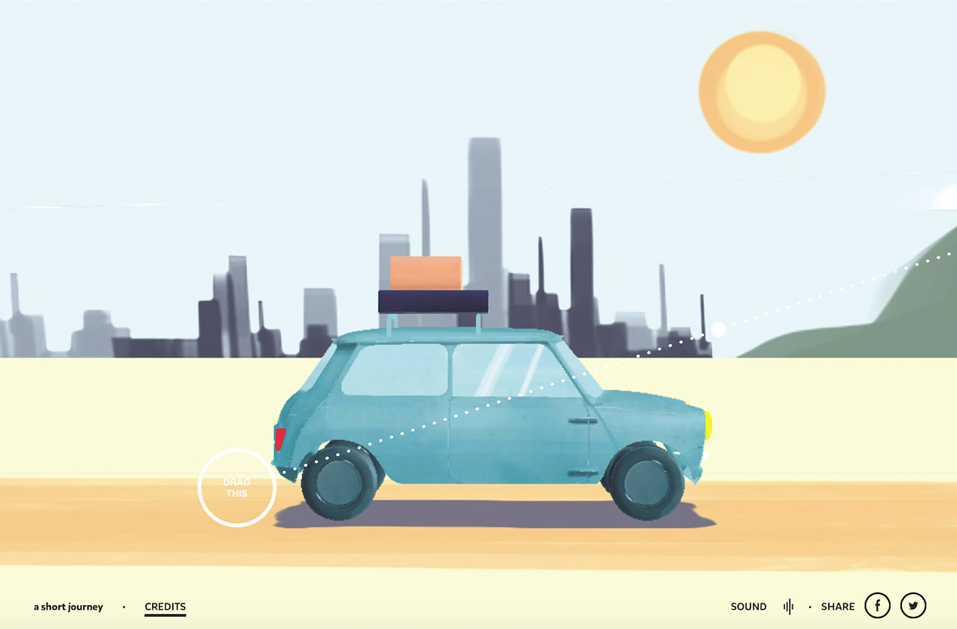
A Short Journey was born in the summer of 2015, when the team at cher ami took a break from client work to collaborate with 3D artist Benoît Challand. At first it was supposed to be a short film, but it turned into an interactive story about a journey to the sea when the team realised a website could involve the user more.
"We designed some elements in 3D with Cinema 4D and other elements in 2D with Photoshop. The idea was always to obtain a fresh design by combining modern technology and classical techniques," says founder Jean-Frédéric Passot. "We used WebGL to recreate each scene in 3D and even if there are a lot of tricky technical aspects in this website, the goal was always to offer a nice feeling of a sunny journey."
Sign up to Creative Bloq's daily newsletter, which brings you the latest news and inspiration from the worlds of art, design and technology.
The website launched as a greeting card for the new year, to warm up clients on cold winter days. A Short Journey is a simple yet lovely example of how interactivity can be used to move an experience along.
03. Histography
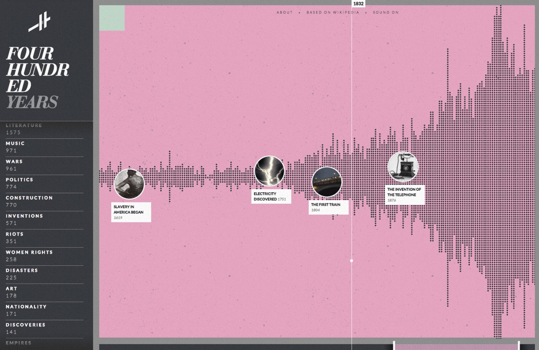
Histography – Israeli designer and developer Matan Stauber's final year project at Bezalel Academy of Arts and Design – is an interactive timeline spanning no fewer than 14 billion years, from the Big Bang to present day. Literally extending over the entire history of the known universe, it is an immense, interactive infographic that challenges our preconceptions of how to communicate complex subjects.
Covering topics ranging from literature and music to assassinations, inventions and religion, Histography's timeline invites us to explore events from our rich past, each dynamically pulled from Wikipedia and represented on screen as a small black dot. There are two modes: the horizontal, left-to-right view that allows the user to home in on a specific time period; or the helix-like time machine that presents a curated list of key events.
Stauber says he has always been fascinated by the idea of showing history unfold over time: "Timelines are the most popular way of visualising history, and yet I felt they where always very limited. From the beginning of this project I knew I wanted to create a timeline that is not limited to a year, decade or a period. I wanted a timeline that could contain all of history."
04. Deutser
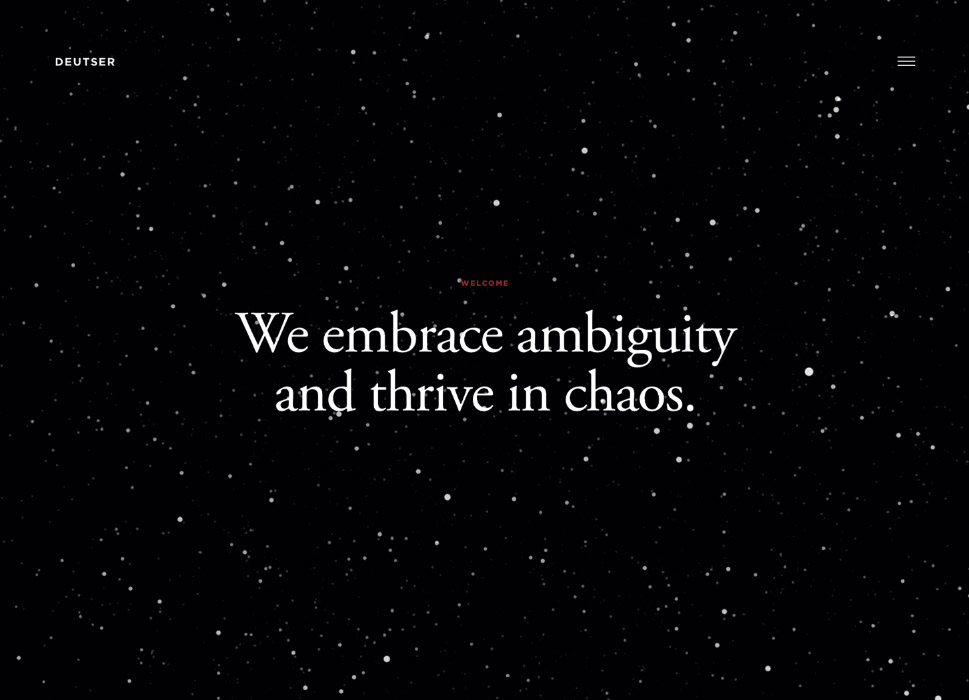
Professional services sites face a particular communications challenge: there is no tangible object to showcase. When creating a new site for consultancy Deutser, We Can't Stop Thinking needed to figure out how to distill a wide array of services into a single, core benefit.
The team decided to focus on the idea that Deutser delivers clarity in an uncertain world. "The dispersed particles represent chaos – something many companies encounter in today's world. Clarity is represented by the particles coming together to form something of meaning," explains creative director Nicholas Scimeca.
The metaphor is as clear as the message is strong. Ensuring the experience worked seamlessly across devices was another challenge. "The particles are built using WebGL canvas with the aid of three.js for simplification. We built a custom animation and queuing system, which gave us more control over animation, transitions and frames per second," adds Scimeca.
05. Halo Visualizer
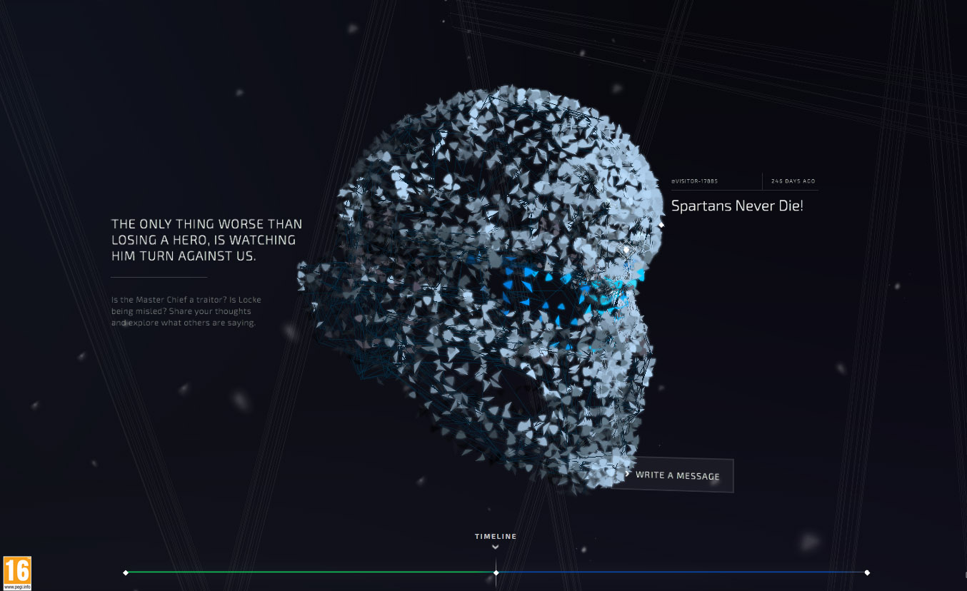
This site for video game franchise Halo has such an extraordinary navigation structure. The user moves through an intuitive, timeline-esque view, with fractured pieces of Halo helmets acting as user engagements for the game.
"We used WebGL particles that use a 3D model to form the shape of the game characters' helmets, 3D CSS to animate in the pieces of user content, and Canvas to draw and animate the timeline at the bottom," says Rachel Smith, interactive developer at Active Theory. "It's a good example of combining web technologies depending on what the interface needs."
The mysterious shattering and rebuilding of elements could be disorienting, but instead, feels completely fluid. The slight tilting of the user stories, and even elements such as contact modals, unite the design and motion across every part of the site. The spatial atmosphere becomes a language in itself.
Contributors: Espen Brunberg, Sarah Drasner
