Designing for the web: tap vs click
They may seem similar, but ignore the difference between tap and click interactions at your peril, warns Gene Crawford
Sign up to Creative Bloq's daily newsletter, which brings you the latest news and inspiration from the worlds of art, design and technology.
You are now subscribed
Your newsletter sign-up was successful
Want to add more newsletters?
From the outside, there is not much difference between a click event on a website and a touch or tap event. As a website user, if you see a link and click or tap it, you get the next page. Technically speaking though, they are quite different.
Under the hood there is a 300ms (+/-) delay between the click and touchstart events in the browser (though there are spec changes being worked up as you read this). This allows for things like pinch zoom, scrolling, the user cancelling a touch event and so on. The result of this delay is a perceived sluggish interface or website. The other difference is in the interaction of a person using a mouse on a desktop computer, compared to a person simply touching the screen of a device.
When working on the design of a site's navigation interactions, it is important to take these two things into consideration – when ignored, they can have significant ramifications. Something as simple as the size of a click target can create a negative user experience.
If the user has to zoom out to target the correct navigation link in a list, they are likely to be annoyed, or even miss their intended target completely. Then if there is a perceived delay after finally hitting the target, the user will think they have made a mistake or that the navigation is faulty.
You might not be able to escape the delay on a touch event in the browser, but you can ensure the mobile view you design can be easily traversed without a mouse.
Here are three sites with notable touch behaviour:
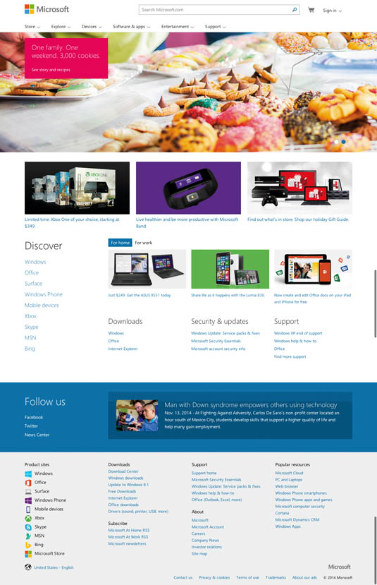
01. Microsoft

The Microsoft site has a very large, fold-out navigation design. The slight delay when 'touching' the nav items when using the site on a mobile device is quite evident here.
Sign up to Creative Bloq's daily newsletter, which brings you the latest news and inspiration from the worlds of art, design and technology.
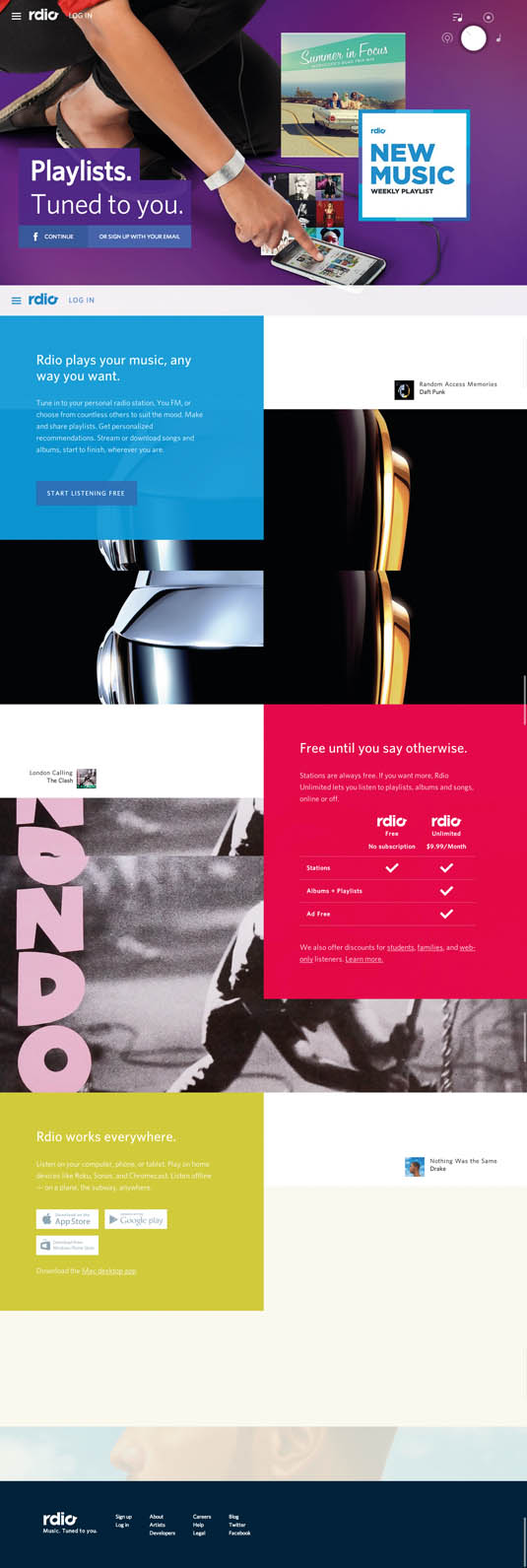
02. Rdio

The site for music streaming service Rdio utilises a slide-out navigation design and loads a semi-opaque background over the page when it loads. This works well for focusing the user on the nav layout across both mobile and desktop devices.
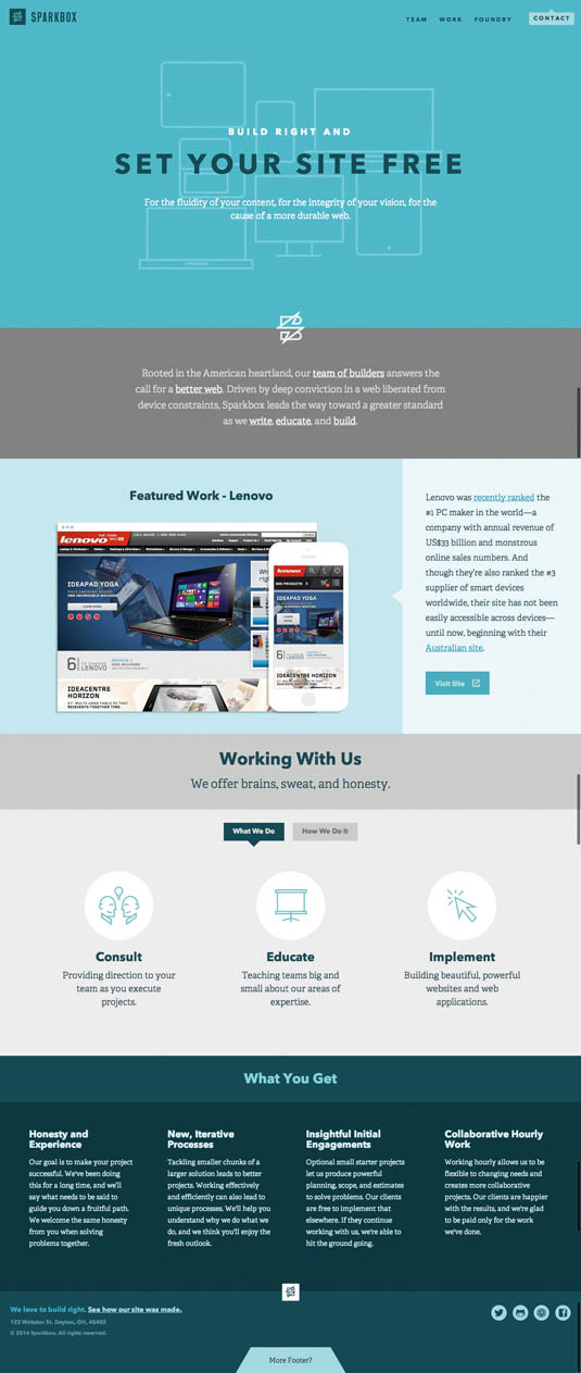
03. Sparkbox

The click targets on web design firm Sparkbox's website are all appropriately sized for people using the site on a mobile device.
Liked this? Read these!
- 3 ways touch is going to change design forever
- The best free script fonts
- Free graffiti font selection

The Creative Bloq team is made up of a group of art and design enthusiasts, and has changed and evolved since Creative Bloq began back in 2012. The current website team consists of eight full-time members of staff: Editor Georgia Coggan, Deputy Editor Rosie Hilder, Ecommerce Editor Beren Neale, Senior News Editor Daniel Piper, Editor, Digital Art and 3D Ian Dean, Tech Reviews Editor Erlingur Einarsson, Ecommerce Writer Beth Nicholls and Staff Writer Natalie Fear, as well as a roster of freelancers from around the world. The ImagineFX magazine team also pitch in, ensuring that content from leading digital art publication ImagineFX is represented on Creative Bloq.
