Find the perfect colour for your website
Cindy Li explains how to use colour to enhance the appeal and usability of your website while ensuring it remains accessible.
Sign up to Creative Bloq's daily newsletter, which brings you the latest news and inspiration from the worlds of art, design and technology.
You are now subscribed
Your newsletter sign-up was successful
Want to add more newsletters?
When I was about 10 years old, I toured the Disney MGM studios. I spotted an enormous wall of paint in jars of every colour, and in every shade. The artists used those jars to bring animation to life. I should have realised at that moment that my fate was sealed: I was a design colour geek.
I love surrounding myself with colour because it stimulates my brain. It's fascinating that colour can influence you to feel an emotion; the happiness you see on people's faces when they see blue skies, or the affection that surrounds somebody when they receive a red envelope on Valentine's Day. Be it through association or cultural influences, colour has meaning.
Thinking about colour
When I design, I take the time to think about why I'm using a certain colour. I think about the cultural influences associated with it and whether it has implications past our own society. I think about these things because I design for the web and know that my choices could be seen by thousands or millions of people. Many websites are taking the time to internationalise the language of their pages, but have they really thought about the colour? Colour communicates a meaning and our own assumptions can often be wrong.
Article continues belowTake a wedding website, for example. In western cultures, it is common to have the bride in a white dress and to incorporate that bright purity into the design of the website. In China, however, it's more appropriate to choose red because white is the colour of mourning. For Chinese cultures, red means good fortune, luck and love. Sprinkle in a splash of yellow and you're suggesting royalty and wealth.
With all the cultural differences for colour meanings, you may wonder what the Rosetta Stone of colour choices is. Generally speaking, blue and purple are the safest colours to use when you design. Blue is typically used to convey a positive message - optimism, happiness and confidence. But while this is true for the majority of cultures, countries such as India and Japan apply a very different meaning. In India, blue is the colour of mourning, whereas in Japan it means villainy.
Another colour that's considered safe is purple. Typically, purple is associated with royalty and wealth - an inheritance from the past where it was used as a symbol of status in society. History tells us this was because the purple dye harvested from the sea snail did not fade due to sunlight, but instead became brighter and more intense from weathering. Thailand, however, believes differently and instead uses purple as its colour for mourning.
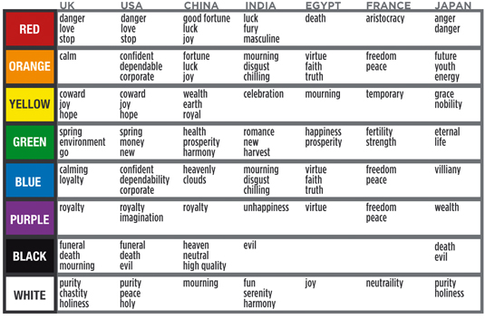
It amazes me that so many countries use different colours to represent the sadness of a loved one passing. In the US and UK it's traditionally black, but we've seen here how many variations there are around the world. I've prepared a chart that provides a handy breakdown of these differences (above).
Sign up to Creative Bloq's daily newsletter, which brings you the latest news and inspiration from the worlds of art, design and technology.
Know your audience
With all this ambiguity, you may be thinking it's safer just to avoid colour, but that's not the case. Embrace the differences and use them to promote your message. Know your target audience and tailor the site to it. If you have multiple audiences try to localise your site, either through a custom portal or some targeted CSS.
Using mixed colours comes with its own considerations, too. Take the stock market as an example. In the US, UK and Japan, a positive indicator is green or blue in colour and a negative indicator is red. In Taiwan and Korea however, it's the opposite. This isn't a design choice, but instead a cultural understanding. In these two countries, red represents prosperity and luck - both positive things. It's important to know these subtle, yet very important, details to avoid confusing your visitors, and possibly sending the wrong message.

It's also wise to remember that one in 12 people has colour blindness. So, like photos and illustrations, colour should be used to support the message, not be the message itself. A good test is to see if the same information is available when colour is removed.
A designer's toolbox contains many tools, which should be used with care and thought. I've seen websites with bright red backgrounds that you could see across the room - the kind that would make a person's eyes bleed. That type of background would be a poor choice for a health website. Its highly saturated colour would tend to stress people out and the last thing you want when you're in hospital is to be pushed over the edge. It's an extreme example, but it illustrates the point.
Next time you encounter hospital staff, take a look at what they're wearing. You'll find their uniforms tend to be more subdued pastel colours, such as mauve, green or blue. This isn't by accident: their intention is to come across as calming, reassuring and clean. The softer, pastel colours contribute to that goal. When designing a health website, use colours that calm the audience, not ones that excite them.
Simple colour changes can influence the feel of a site. Take the University College London Hospital website. I've taken the original design and created four new ones with different colour accents (below).
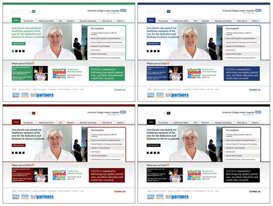
Each design has a different feel to it. The black implies professional/legal, but also suggests death. The red doesn't look too bad, but is too close to blood, and suggests personal injury, not rehabilitation. The last two examples are green and blue. I think both of these could work, but out of the two I would choose blue. The reason being that the green is quite bright and distracts from the real purpose of the site - to calm and reassure you.
Brightening up
Contrast the hospital example with sites aimed at young children. Children benefit from bright, saturated colours. These stimulate their minds and grab their attention. By using lots of colour, you keep them interested and encourage them to explore the design. In particular, a heavy dose of warm colours such as reds and yellows, along with some more cooling blue and green tones, tends to work well. If you're choosing a colour palette for a children's design, draw inspiration from their toys and observe the vibrancy the toy manufacturer chooses - they're painted with solid, bright and simple colours deliberately.
The last example I'll give is food websites. When designing for this industry, you should be using colours that encourage hunger. Since food comes in a variety of colours, a good palette can often be hard to choose. Generally speaking, colours such as red, orange, yellow and green actually trigger hunger, as well as provide a warm, homely feeling. It's no accident that Burger King, La Tasca, Sainsbury's and Waitrose use those colours in their branding or websites. Their colour palettes are there to entice you and make you as hungry as possible. Blue, on the other hand, serves to suppress your appetite.
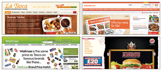
With any luck, this will aid you in choosing your future colour palettes and you've learned a bit of history about colour theory and the associations that come with it. Remember to use your power as a designer wisely and carefully.
Case study: Twitter
When you first encounter the Twitter website, you'll notice its design is mainly blue. We know that blue is a safe colour to use on the web, so it's no surprise that Twitter is using it on its site, especially since it supports languages including English, French, German, Italian, Japanese, Korean, and Spanish. Supporting that many languages means your audience consists of lots of different cultures.
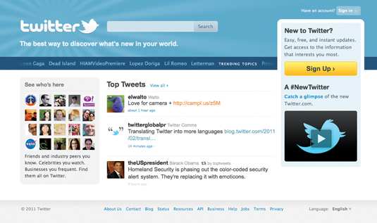
We know that one in every 12 people is colour blind, so what happens to the site if we look at it through their eyes instead?
If the contrast and colour combinations are too similar, a proportion of your audience will be unable to see the content. There are many ways to emulate the effects of colour blindness. One program I like to use is Color Oracle, a free colour blindness simulator for Windows, Mac and Linux created by Bernhard Jenny and Nathaniel Vaughn Kelso.
As web designers, we've heard of progressive enhancement, but what about graceful degradation? Graceful degradation is when a site is designed and developed using the latest and greatest features available, but then checked against old browsers to ensure when the new features are not present, the site still functions operates. This idea can be applied to colour usage. Design the site with all the colour you need and then check for colour blindness support using tools like Color Oracle or Photoshop.
Colour isn't the only tool in your toolbox. Pick colours that emphasise yet still allow users to read your content. Test the colour combination using tools like Color Oracle and make changes if you need to. Remember, you want your site to be visible to the widest possible audience so they can all enjoy your design.
Deuteranopia
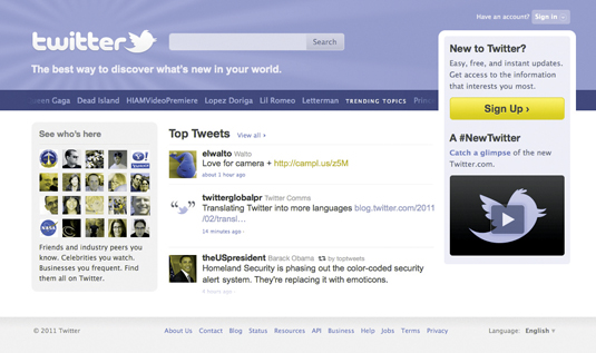
This is a type of colour blindness which affects five per cent of males and 0.35 per cent of females. It stops those affected seeing red and green.
Protanopia
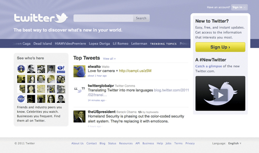
This colour vision deficiency makes reds appear very dark. It's less common, gender related and affects one per cent of males and is hereditary.
Tritanopia
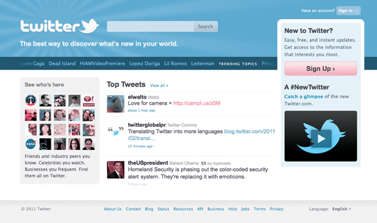
The rarest type of colour blindness, it affects less than 0.3 per cent of males and females. It's limiting your ability to see a spectrum of blue-yellow colours.
Words: Cindy Li Image: Mike Chipperfield
Cindy Li is a full-time employee at Yahoo Applications. This article originally appeared in net magazine - the world's best-selling magazine for web designers and developers.

The Creative Bloq team is made up of a group of art and design enthusiasts, and has changed and evolved since Creative Bloq began back in 2012. The current website team consists of eight full-time members of staff: Editor Georgia Coggan, Deputy Editor Rosie Hilder, Ecommerce Editor Beren Neale, Senior News Editor Daniel Piper, Editor, Digital Art and 3D Ian Dean, Tech Reviews Editor Erlingur Einarsson, Ecommerce Writer Beth Nicholls and Staff Writer Natalie Fear, as well as a roster of freelancers from around the world. The ImagineFX magazine team also pitch in, ensuring that content from leading digital art publication ImagineFX is represented on Creative Bloq.
