10 facts about the brain that will help you design better websites
Psychology provides a framework for understanding how your users think. Joe Leech explains how to use that knowledge to improve your websites.

It all started with a book I found on my mum’s bookshelf when I was 15. It was called How To Read People Like A Book. It covered the basics of body language and, for a geeky teenager, uncovered so many possibilities.
I could tell which of my friends thought I was boring, how to appear open and engaged to those around me and even to tell me if that girl I liked, liked me back. For a time, I felt like I had superpowers.
Of course, it wasn’t that simple. It just made my teenage behaviour even more awkward. I’d constantly be trying to read body language and not listening, sending out mixed messages myself by trying too hard. My first encounter with psychology taught me a lot about the application of theory and how it isn’t as easy as it might seem.
Fast forward 20 years and I’ve being working as a UX consultant for the last decade, applying psychology to my design work. When working on tricky interaction problems, challenging projects, or large ecommerce websites, I fall back on the theories I’ve learnt from my study of academic psychology, which that book on my mum’s bookshelf inspired me to pursue.
What psychology can do for you
The value of psychology for designers lies in its ability to predict how a user will interact with a design. More often than not the most successful designers achieve this through a mixture of experience and gut feelings.
Understanding a few key psychology theories can help ensure your designs are intuitive and engaging, but also allow you to be an advocate of your design decisions to your project team or client.
What psychology can't do for you
My early study of body language taught me that psychology isn’t always easy to apply. If we could guarantee success for every design we produced based purely on psychology, life would be great.
Get top Black Friday deals sent straight to your inbox: Sign up now!
We curate the best offers on creative kit and give our expert recommendations to save you time this Black Friday. Upgrade your setup for less with Creative Bloq.
Unfortunately, humans are complicated. The 86 billion nerve cells that make up our brain make it the most complex thing in the universe. Following my mixed success with body language, I persevered with psychology and studied neuroscience, which is the crossover between biology and psychology.
Here are eight things I learned that can help make your websites offer a truly great user experience...
01. What the basal ganglia does
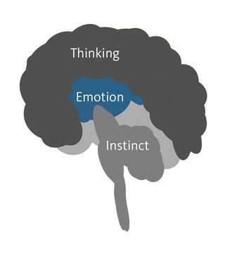
The human brain can be thought of as being split into three main parts that have evolved across all species, but are more pronounced.
The most basic part of the brain sits at the base of the brain, known as the basal ganglia. Simple survival behaviours and quick decision-making are controlled from here. Unsure if you should fight that lion or run away? This is the part of the brain that makes that choice.

We designers can use this behaviour to evaluate our designs. The famous five-second test gives the user just five seconds to identify the key focus of the page. If our user can identify, for example, the ‘buy it now’ button on an ecommerce product page in that time, it gives us confidence the design will succeed.
02. What the limbic system does
Sitting above the instinctual brain, we have the emotion centre (neuroscientists call it the limbic system). The emotional part of the brain helps us associate behaviours and memories with positive and negative experiences.
An experiment was conducted by Russian physiologist Ivan Pavlov in 1902. He rang a bell before feeding meat to dogs to research and show how this part of the brain works. The experiment shows the dogs began to salivate when the bell alone was rung. The dogs associated the positive feeling associated with eating to the sound of the bell without a need for the food to be present.
03. Emotion + memory is the key
Associating emotion with a memory is powerful. This is where the experience part of what we as designers do comes into its own. A strong, emotionally effective design can have dramatic results.
Associating our website or app with a positive experience means users will be more able to recall our product, are more likely to visit again and more inclined to recommend us to a friend. If we can provide a delightful or exciting experience, we can extend the success of our product without having to fall back on expensive advertising or PPC spend to keep our product front-of-mind.
Of course, these can work in reverse. A negative experience can mean our website is forever associated with frustration and disappointment. Good usability doesn’t engender delight, but it does prevent feelings of annoyance being associated with our website.

04. What the neocortex does
The third and most important part of the brain, and the one most developed in humans, is the neocortex or thinking brain. This is the part of the brain we are most comfortable designing for. Giving our users all the information we can, describing in detail what our website does, and long lists of product features all speak to the thinking, reasoning brain.
05. Cognitive load makes us tired
Thinking, known in the trade as cognition, is what makes us humans different. Gathering and analysing information before making a decision is a very human way of dealing with the world.
But cognition is costly. It takes large amounts of energy to think. The human brain, and specifically the neocortex, uses 15–20 per cent of the total energy we use.
A website that has large amounts of information or requires focused thinking to use, increases cognitive load. One the biggest causes of drop-out from a website is cognitive load. Making our users think too much tires them and when we humans are tired we need to stop and rest.
Indeed, UX expert Steve Krug titled his book, Don’t Make Me Think. Anything we as designers can do to prevent overloading and demanding too many decisions will help limit the cognitive load of our website.
06. We depend on mental models
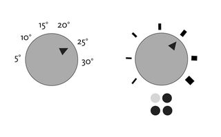
In the wet, cold UK winter, my old flatmate would come home after a long day at work and turn the thermostat that controlled our heating all the way up to the maximum 30 degrees.
“It won’t make it hotter any quicker” I’d say. “The thermostat just turns off the heating when it reaches the right temperature”. The thermostat and the mental model my flatmate had in her head of how it should work didn’t match. It’s a logical mistake to make. An almost identical interface, that of the knob to control the gas ring on a cooker, works the way my flatmate thought the thermostat worked. Similar interfaces; different models of operation.

A successful website or app will match the users’ mental model of how it works. If our user has a different mental model to the website, it won’t work well for them; it won’t feel intuitive.
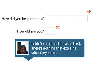
I design a lot of forms. In the user testing I do, I’m constantly surprised at how many users don’t understand the asterisk that denotes a required field on a form. This is an example of mismatch in mental models. When completing forms on paper, the convention is to mark optional fields by saying things like, “If you answered yes please explain more. If no, skip this question”.
The mental model for completing a form offline doesn’t match that of completing a form online. Mental models can adapt and change over time but it requires thought and attention because it increases cognitive load to learn a new mental model.

The easiest way of matching a mental model is watch our users completing a task. Using a technique called task analysis to map the mental model that our users follow, we can then use this mental model to base our designs on.
For example, where in our website does our user expect to sign up for an account? If we place account sign-up either too early or too late in the process, our website won’t feel intuitive. Our user will be more reluctant to sign up, or worse, leave without opening an account.
If we can match our users’ mental model of how to complete a task with the way we design our website or app, we’ll increase usability and reduce cognitive load. We’ll design a website that matches how our users think and behave.
07. Our brains are built for social interaction
The neocortex, the thinking brain, is more developed in humans than any other animal. In 1998, Robin Dunbar proposed a theory for why we have evolved such large brains. In ‘The Social Brain Hypothesis’, he links large brains with organisms that have large, often complex social groups. We use our brains to read and analyse social situations. Humans are built for social interaction.
Dunbar went further to suggest the optimal size of the social groups we can operate in based on our brain size. The social network Path based its app on this number. Dunbar’s number for humans is around 148, meaning we don’t have the mental capacity to manage more personal relationships than this.
Humans are built to interact in complex social groups. We should be designing our websites and apps to match this behaviour. Our digital products should behave like we do.
08. Empathy is the basis of social models
We develop mental models of the behaviour of others from an early age. An experiment that shows this is the ‘Smarties’ test. A box of Smarties (chocolate candy) is shown to children and the child is asked: what’s inside? The answer: Smarties.
The children are then shown that, in fact, there are coloured pencils inside. The child is then asked: if the box is shown to another person who is present, what would they think is inside? Typically kids under four say, pencils. The rest of us would say Smarties.
The kids can’t place themselves in the position of the other person. They are yet to develop the very human theory of mind, which is the scientific basis for empathy.
09. Conversation depends on mental models
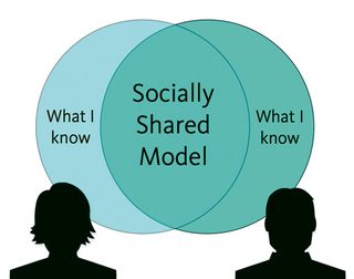
Humans build mental models of what those around us know. We then use these models to predict each other’s behaviour. We put ourselves in the position of other people and predict what they will know and what they will do. This forms the basis of all human interactions. Having a conversation relies on both parties having a shared model of what each other knows.
We take the expectation for our shared mental models with us when we interact with computers. This is especially true for voice interaction. We have an expectation of human conversation.
More often than not the technology doesn’t meet our high expectations. Apple’s Siri, voice control for the iPhone, often fails because we have an expectation of what it knows.

I listen to music on random when I’m driving. I’ll wonder what the name is of the current track that’s playing so I’ll ask Siri. Siri misunderstands and does a web search for the term, ‘What’s this playing?’. This is a breakdown in shared mental models. Annoying, to say the least.
10. Shared models require personal data
For us to build a shared model of what our users know, we need data about them. Google Now, an online personal assistant, uses all the data Google holds to build a shared mental model.
Designing a product to meet the high expectations of a personal assistant requires a large amounts of data to build the mental model of the person it’s trying to help. Indeed, the only way we as users of Google Now can make best use of the service is by granting access to the large amounts of personal data.
We must trust Google not to use the data for nefarious purposes. The temptation will always be there to use the data about a user to coerce or trick them into doing things they may not want or be ready to do. The website DarkPatterns.org highlights examples of tricks and underhand techniques designers have used to make users do the wrong thing. The site’s founder Harry Brignull campaigns to stop this behaviour in our industry.
Conclusion
Understanding how people think, their motivations, goals and expectations, and building your product to meet these needs, can ensure the success of your product.
After all, a designer who doesn’t understand psychology is going to be no more successful than an architect who doesn’t understand physics
Joe Leech is a user experience consultant working for cxpartners in Bristol. He’s been working in UX for 10 years with clients like Marriott, thetrainline.com, eBay and Disney. He’s the author of Psychology for Designers.
This article originally appeared in .net magazine issue 239.
Liked this? Read these!
- How to use the PHP command line
- 7 ways towards better APIs
- Improve your websites with microinteractions
- Our favourite web fonts - and they don't cost a penny

Thank you for reading 5 articles this month* Join now for unlimited access
Enjoy your first month for just £1 / $1 / €1
*Read 5 free articles per month without a subscription

Join now for unlimited access
Try first month for just £1 / $1 / €1
The Creative Bloq team is made up of a group of design fans, and has changed and evolved since Creative Bloq began back in 2012. The current website team consists of eight full-time members of staff: Editor Georgia Coggan, Deputy Editor Rosie Hilder, Ecommerce Editor Beren Neale, Senior News Editor Daniel Piper, Editor, Digital Art and 3D Ian Dean, Tech Reviews Editor Erlingur Einarsson and Ecommerce Writer Beth Nicholls and Staff Writer Natalie Fear, as well as a roster of freelancers from around the world. The 3D World and ImagineFX magazine teams also pitch in, ensuring that content from 3D World and ImagineFX is represented on Creative Bloq.


