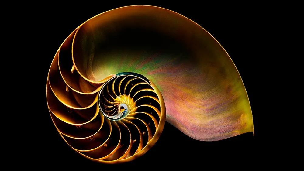
If you've studied art, design or architecture, you've probably come across the Golden Ratio: a mathematical proportion that's been shaping visual composition for thousands of years. Roughly equal to 1:1.618, it's prized by designers because it produces layouts, shapes and spacing that feel naturally balanced, without anyone quite being able to say why.
The ratio turns up everywhere once you know to look for it, from the spiral of a nautilus shell to the proportions of ancient Greek temples and the composition of Renaissance paintings. That blend of mathematical precision and organic familiarity is what makes it so useful for graphic designers, illustrators and digital artists today.
This guide breaks down what the Golden Ratio actually is, how it relates to the Fibonacci Sequence, and how you can start applying it to your own layouts, logos and compositions, along with some tools to help you put the theory into practice.
What is the Golden Ratio?
Closely related to the Fibonacci Sequence (which you may remember from either your school maths lessons or from Dan Brown's The Da Vinci Code), the Golden Ratio describes the perfectly symmetrical relationship between two proportions.
Approximately equal to a 1:1.61 ratio, the Golden Ratio can be illustrated using a Golden Rectangle. This is a rectangle where, if you cut off a square (side length equal to the shortest side of the rectangle), the rectangle that's left will have the same proportions as the original rectangle.

So if you remove the left-hand square from the rectangle above, you'll be left with another, smaller Golden Rectangle. This could continue infinitely. Similarly, adding a square equal to the length of the longest side of the rectangle gets you increasingly closer to a Golden Rectangle and the Golden Ratio.

This relates to the Fibonacci Sequence (0, 1, 1, 2, 3, 5, 8, 13, ...) , in which each term is the sum of the previous two.

Plotting the relationships in scale provides us with what's known as a Golden Spiral. This occurs organically in the natural world.
If you're still a little confused, the video below gives a good overview of the Golden Ratio in use. There's an introduction, after which the teacher shows you how to construct a Golden Ratio in Illustrator. This is used to create a Golden Spiral, followed by Golden Circles.

The Golden Ratio in use
It's believed that the Golden Ratio has been in use for at least 4,000 years in human art and design. However, it may be even longer than that – some people argue that the Ancient Egyptians used the principle to build the pyramids.
In more contemporary times, the Golden Ratio can be observed in music, art, and design all around you. By applying a similar working methodology, you can bring the same design sensibilities to your own work. Let's take a look at a couple of examples to inspire you.

Ancient Greek architecture used the Golden Ratio to determine pleasing dimensional relationships between the width of a building and its height, the size of the portico and even the position of the columns supporting the structure.
The final result is a building that feels entirely in proportion. The neo-classical architecture movement reused these principles too.

Leonardo da Vinci, like many other artists throughout the ages, made extensive use of the Golden Ratio to create pleasing compositions. In The Last Supper, the figures are arranged in the lower two thirds (the larger of the two parts of the Golden Ratio), and the position of Jesus is perfectly plotted by arranging golden rectangles across the canvas.

There are also numerous examples of the Golden Ratio in nature – you can observe it all around you. Flowers, sea shells, pineapples and even honeycombs all exhibit the same principle ratio in their makeup.
How to make a Golden Rectangle
Creating a Golden Rectangle is pretty straightforward, and starts with a basic square. Follow the steps below to create your own Golden Ratio:
01. Draw a square

Start by drawing a square of any size. The side of this will form the length of the 'short side' of the rectangle.
02. Divide the square

Next, divide your square in half with a vertical line down the centre. This will leave you with two rectangles.
03. Draw a diagonal line

In one of these rectangles, draw a straight line from one corner to the opposite corner.
04. Rotate the line

Rotate this line, pivoting from the bottom (or top) point, until it lines up with the bottom of the first rectangle.
05. Create a new rectangle

Create a rectangle using the new horizontal line and original rectangle as guides. That's your Golden Rectangle.
How to use the Golden Ratio
Using the Golden Ratio is simpler than you might think. There are a couple of quick tricks you can use to introduce an idea of it into your layouts, or you can plan a little more and fully embrace the concept.
Golden Ratio: the quick way
If you've ever come across the Rule of Thirds, you'll be familiar with the idea that by dividing an area into equal thirds both vertically and horizontally, the intersection of the lines will provide a natural focal point for the shape.
Photographers are taught to position their key subject on one of these intersecting lines to achieve a pleasing composition, and the same principle can be used in your page layouts, web mockups, and poster designs.
Although the rule of thirds can be applied to any shape, if you apply it to a rectangle with proportions approximately 1:1.6, you get very close to a Golden Rectangle, which makes the composition all the more pleasing to the eye.
Full implementation of the Golden Ratio
If you want to fully implement the Golden Ratio into your design, you can do so easily by ensuring that the relationship between your content area and sidebar (in a website design, for example) adheres to the 1:1.61 ratio.
It's okay to round this up or down by a point or two to make the numbers work with pixels or points – so if you have a content area of 640px, a sidebar of 400px will match the Golden Ratio well enough to work.

Of course, you can also sub-divide the content and sidebar areas up using the same ratio, and the relationship between a webpage's header, content area, footer and navigation can also be designed using the same basic Golden Ratio.
Golden Ratio tips and tutorials
Here are some tools and tutorials to help you use the Golden Ratio in your designs, and create pieces that work proportionally...
01. What is the Golden Ratio?

This popular video from Tipping Point Math offers a more in-depth look at the Golden Ratio. It covers its origins, and use in mathematics. Beware: sections of this are quite confusing if you're not mathematically minded!
02. Golden Ratio calipers

There are plenty of ways for you to measure ratios digitally, but here's a tool for traditional artists. Golden Ratio calipers can be used to measure the proportions of your artwork on the page. You can buy them in different sizes, depending on the scale you usually work at.
03. Logo design with the Golden Ratio in Illustrator

This video tutorial from 2024 walks through how to construct a Golden Ratio logo mark in Adobe Illustrator, using golden circles to build a balanced, proportional icon. It's a clear, practical follow-along if you want to put the theory into practice on an logo project.
04. Golden Ratio Typography Calculator

This free online calculator generates a complete type scale, from H1 down to body copy, based on the Golden Ratio. Enter a base font size and choose your preferred ratio (the calculator also supports a few alternatives if you want to experiment), and it'll produce a harmonious set of heading and text sizes, along with matching line heights. You can export the results straight to CSS, so it's a handy way to build a typographic system for a website without doing the maths by hand.
05. Golden Ratio Calculator Plus

If you want a dedicated app rather than a browser tool, Golden Ratio Calculator Plus is a well-built option for Mac and iOS. Enter any value, whether that's the total length or one of the two segments, and it'll calculate the rest, with a visual breakdown showing how the numbers converge on 1.618. It also generates the Fibonacci sequence and displays the Golden Spiral, which makes it useful for checking your working.
06. How to use the Golden Ratio in web design

This guide from Webflow, last updated in 2025, covers the practical side of applying the Golden Ratio to web layouts: setting proportions for content and sidebar widths, establishing visual hierarchy, and using the ratio to guide spacing decisions. It's a good modern companion to the earlier steps in this guide, translating the theory into something you can apply directly to a website build.