Build responsive emails
Email is a neglected area when it comes to responsive design, but it doesn’t have to be. Elliot Ross walks you through making an HTML email mobile friendly.
- Knowledge needed: HTML, CSS
- Requires: Text editor, web browser, media query capable mobile device
- Project Time: 1 hour
- Support file
In this tutorial we’ll look at bringing some of the web’s mobile techniques to HTML email. User take-up of mobile email is massive: some email campaigns get more mobile opens than desktop, yet many marketing emails render poorly on mobile devices. Mobile support on the web has never been better – so if you’re sending emails that drive customers to the web, it makes sense to design mobile friendly emails too.
The design challenges for mobile email are similar to those on the web: we have a small screen, a touch interface and (sometimes) users are out and about – so the design approach is similar. We have one extra challenge, in that many older mobile email clients lack proper support for media queries.
With this in mind, our best approach is to design a campaign that works well on both desktops and mobiles, and then use media queries where they’re supported to add an extra layer of optimisation for smartphones. So first, let’s look at how we can make a regular email campaign more mobile friendly.
- Read all our responsive web design articles here
01. Make the message clear
If there’s one trend that happens time and again in the process of making an email campaign it’s this: marketing departments love writing tons of copy, and designers hate cramming it into the layout. In the past we’ve tried breaking up copy and pulling sections out as highlights, but mobile gives us the best argument yet for short copy: people don’t have time for lots of text, and we don’t have space. Even a user sitting on a train may still have lots of emails to get through. We need to cut the waffle, and make it easy and quick to read.
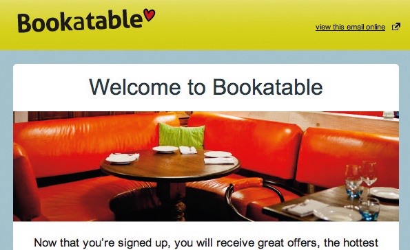
It’s possible with CSS to remove some of your desktop content on a mobile device, but we should only be using this for tweaking design elements, not editing the message. If you can’t get your message across in a 320px wide device, it’s hard to see how adding content for desktop users will solve this.
Article continues below02. Screen types and sizes
As with designing for the mobile web and for apps, we’re dealing with a touchscreen. It’s worth remembering the infamous finger measurement from Apple’s Human Interface Guidelines: the minimum size for a clickable area should be 22x44 pixels. You should make (at least) the main call to action links nice and large, and easy to select on a touchscreen. Also ensure links are spaced out so they aren’t mis-tapped: a 22-pixel minimum is again advisable.
The portrait iPhone screen size is 320 pixels wide; most desktop emails are 600px to 700px. We want something that works in both, so leaving responsive techniques aside this means reducing copy, then making the text size larger.
03. The customer journey
It’s important to get the email right, but we also need to consider where users go next. After clicking on from the email, is the landing page optimised for smaller screens? Can they perform the same call to action on a mobile device? That’s out of the scope of this tutorial, but it’s something to think about.
An easy way to make a desktop design that will also look OK on a mobile is to use a simple layout: keep everything in one column, and the content short. That gets you some of the way, and it’ll give us a decent backup where media queries aren’t supported (notably on Blackberrys and in the Android Gmail app). But let’s look at how we can use media queries to add better support.
As with all email code, there are retro things going on. If you’re used to super clean semantic web code, you may want to put your safety goggles on.
04. Let’s get started
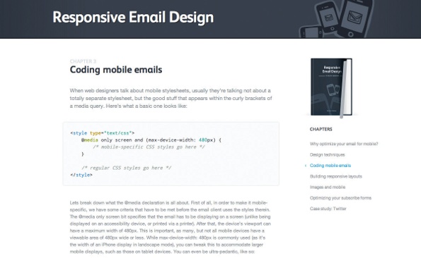
We’ll start off by setting up some of our styles and adding the viewport meta tag. As you may know, style declarations in the header are sometimes ignored by desktop email clients, and therefore you’ll see advice not to use them. We’re only using them to control our mobile formatting here, so we’re OK.
<head>
<meta name="viewport" content="width=device-width, initial-scale=1.0"/>
<style type="text/css">
@media screen and (max-width: 480px) {
table[class=emailwrapto100pc], img[class=emailwrapto100pc]
{width:100% !important; height:auto !important;}
}
</style>
</head>
<body style="padding:0; margin:0;-webkit-text-size-adjust:none;-ms-text-size-adjust:
100%; background-color:#ffffff;" bgcolor="#ffffff">
Sign up to Creative Bloq's daily newsletter, which brings you the latest news and inspiration from the worlds of art, design and technology.
You can see we’re using slightly odd CSS. We have to use attribute selectors to specify our mobile CSS, otherwise Yahoo! Mail will apply the media queries on a desktop. This means we have to separately specify each element a class might apply to. If your style isn’t applied properly, this is usually the first place to look. We’ll give the classes slightly obscure names too: some of the obvious ones are used by webmail clients, and we don’t want style conflicts with them.
On the body tag we’ve set padding and margin at 0, otherwise we’ll get a white border around the email in iOS mail. We’ve disabled automatic text size adjust: some mobile email clients automatically bump up the text size to make it more readable, but it can break the design. We still need to make sure we set the font size appropriately ourselves (above 12pt; 14pt is good).
We’ve just got one style declaration at the moment, which we can use to override a specified width and make it 100% wide instead. The height:auto bit is important to ensure that images scale in proportion.
Let’s create a 640 pixel wide table to wrap our content in.
<table width="640" border="0" cellspacing="0" cellpadding="0"
class="emailwrapto100pc">
<tr>
<td>
<!-- our content will go in here -->
<img height="200" width="640" border="0" src="hero.jpg"
style="display: block;" class="emailwrapto100pc" />
<span class="emailbodytext" style="font-size:12px; fontfamily:
Arial, Helvetica, sans-serif; line-height:18px;">Lorem ipsum dolor sit
amet, consectetur adipiscing elit.</span>
</td>
</tr>
</table>
We’ve put an image in there too. This will resize to 100% of our device width, and the height will adapt accordingly. On a portrait iPhone it’ll be 320x100px: as we’re effectively resizing the image by half, we’re making it Retina-ready.
Wherever we need to, we’ll nest tables inside this master table at 100% wide, so they’ll adapt on their own.
Text should wrap automatically, but we might want to bump up font size on mobiles, so let’s add some styles for that. <p> tags can inherit formatting in webmail clients, so we’ve used spans.
span[class=emailbodytext],a[class=emailbodytext]{font-size:16px !important; line-height:21px !important;}
So we’ve managed to control text and image formatting when email’s displayed in a mobile client – let’s try something more challenging.
05. Floating columns
In our design we may have content that’s split into two columns; say two news articles. It would work better on a mobile if we stacked these into one long column. Just as we’d do on the web, we’ll float the columns with some CSS.
td[class=emailcolsplit]{width:100%!important; float:left!important;}
With this code we’ve forced out the width to 100%, then floated the <td> that contains our content. It’s a lot easier to float a right hand column underneath a left hand one, but it is possible to do the reverse.
<table border="0" cellspacing="0" cellpadding="0" width="640"
class="emailwrapto100pc">
<tr>
<td class="emailcolsplit" align="left" valign="top" width="320"
style="padding-left:10px;padding-right:10px;">
<img height="100" width="300" border="0" src="article1.jpg"
style="display: block;" class="emailwrapto100pc" />
<span class="emailh2" style="font-size:14px; font-family:Arial,
Helvetica, sans-serif;">Headline One</span><br />
<span class="emailbodytext" style="font-size:12px; font-family:Arial,
Helvetica, sans-serif;">Lorem ipsum dolor sit amet, consectetur adipiscing
elit.</span>
</td>
<td class="emailcolsplit" align="left" valign="top" width="320"
style="padding-left:10px;padding-right:10px;">
<img height="100" width="300" border="0" src="article2.jpg"
style="display: block;" class="emailwrapto100pc" />
<span class="emailh2" style="font-size:14px; font-family:Arial,
Helvetica, sans-serif;">Headline Two</span><br />
<span class="emailbodytext" style="font-size:12px; font-family:Arial,
Helvetica, sans-serif;">Lorem ipsum dolor sit amet, consectetur adipiscing
elit.</span>
</td>
</tr>
</table>
We have two columns that now stack into one on a mobile device. If there’s a table cell between two columns you’d like to hide, you can: use display:none.
06. Hiding content
If you’ve designed with mobile in mind from the outset, you shouldn’t need to hide much content, but there may be bits of page furniture you’d like to remove. We can use display:none to do this; here’s the CSS:
table[class=emailnomob],td[class=emailnomob],img[class =emailnomob] {display:none !important;}
It’s easy enough to hide desktop content on a mobile device; less so to do the reverse: display:none is ignored by Gmail on the web, for example, so mobile content will still show on some desktop platforms. I’ve heard you can add a 1-pixel transparent GIF, expand it with a media query and whack a background image behind it, but you wouldn’t admit to that in public, would you?
07. Mobile friendly buttons
A nicer business is to make navigation links more friendly for mobile users. Many email campaigns have nav bars, which are hard to use on mobile devices but still important, so we should be careful about just taking them out. Instead, let’s change them into buttons:
<table border="0" cellspacing="0" cellpadding="0" width="100%">
<tr>
<td align="center"><a href="#" class="emailmobbutton" style="fontsize:
14px; font-family:Arial, Helvetica, sans-serif;">Our Website</a>
<span class="emailnomob"> | </span>
<a href="#" class="emailmobbutton" style="font-size:14px; font-family:Arial,
Helvetica, sans-serif;">Products</a>
<span class="emailnomob"> | </span>
<a href="#" class="emailmobbutton" style="font-size:14px; font-family:Arial,
Helvetica, sans-serif;">Contact Us</a></td>
</tr>
</table>
And our CSS:
a[class=emailmobbutton]{display:block !important;font-size:14px !important; font-weight:bold !important; padding:6px 4px 8px 4px !important; line-height: 18px !important; background:#dddddd !important; border-radius:5px !important; margin:10px auto;width:80%; text-align:center; color:#111; text-decoration: none; text-shadow:#fff 1px 0 0 ;}
We’re removing the pipes that separate the links, then applying CSS to turn them into big mobile friendly buttons. We’ve set the button at 80% wide, so it should centre align, but still expand for larger mobile screens. Applying the class to the anchor tag means we can expand the linked area, so the whole button links through. We’re using CSS3 to add the likes of border-radius and text-shadow; support is patchy in some email clients, but those that support media queries also support this, so we won’t run up against those issues here.
08. Tablets
It’s easy to assume desktop email will work fine on a tablet: most emails are designed 600-700 pixels wide, so that’ll fit on a tablet screen. But tablets have a touch interface, so there’s optimisation we can add if we have lots of users.
@media screen and (min-width: 480px) and (max-width: 1024px) {
table[class=emailwrapto100pc], img[class=emailwrapto100pc]{width:100%
!important; height:auto !important;}
span[class=emailbodytext],a[class=emailbodytext]{font-size:16px !important;
line-height:21px !important;}
a[class=emailmobbutton]{display:block !important;font-size:14px !important;
font-weight:bold !important; padding:6px 4px 8px 4px !important; lineheight:
18px !important; background:#dddddd !important; border-radius:5px
!important; margin:10px auto;width:70%; text-align:center; color:#111; textdecoration:
none; text-shadow:#fff 1px 0 0 ;}
}
In this media query, we’re still resizing some of the content, and making our links into nice big buttons, but we’ve taken out the code to stack columns, because we have more room for that on a tablet.
So we’ve looked at some of the main techniques - most of the mobile design challenges can be solved by combining these until you get the result you’re after. But what other challenges do we have?
Some email sending platforms will automatically take style information from the header and make it inline. That’s useful in the most part, but here it can break the media queries. The good platforms will give you some control over whether that happens or not, but you might want to give their support a call if you’re having problems getting it through the tool. I’ve found that as a last resort, taking the style tag out of the header and putting it between the first <table> and <tr> tags can help get around this also (yes, I know…).
09. Testing
As usual when coding emails, it’s recommended you test your campaigns thoroughly in the various clients before you do your final send. Litmus and Email On Acid are invaluable for previewing your code in different email clients, and similar functionality is available through the likes of Campaign Monitor and MailChimp. Fractal will also help you write email compatible code, and then test it. Of course, nothing beats a suite of actual devices, if you can get hold of them.
Elliot Ross runs Action Rocket, a creative agency that specialises in email development.
Liked this? Read these!
- Simple but effective email newsletter designs
- How to build an app
- Free graffiti font selection
- Illustrator tutorials: amazing ideas to try today!

The Creative Bloq team is made up of a group of art and design enthusiasts, and has changed and evolved since Creative Bloq began back in 2012. The current website team consists of eight full-time members of staff: Editor Georgia Coggan, Deputy Editor Rosie Hilder, Ecommerce Editor Beren Neale, Senior News Editor Daniel Piper, Editor, Digital Art and 3D Ian Dean, Tech Reviews Editor Erlingur Einarsson, Ecommerce Writer Beth Nicholls and Staff Writer Natalie Fear, as well as a roster of freelancers from around the world. The ImagineFX magazine team also pitch in, ensuring that content from leading digital art publication ImagineFX is represented on Creative Bloq.
