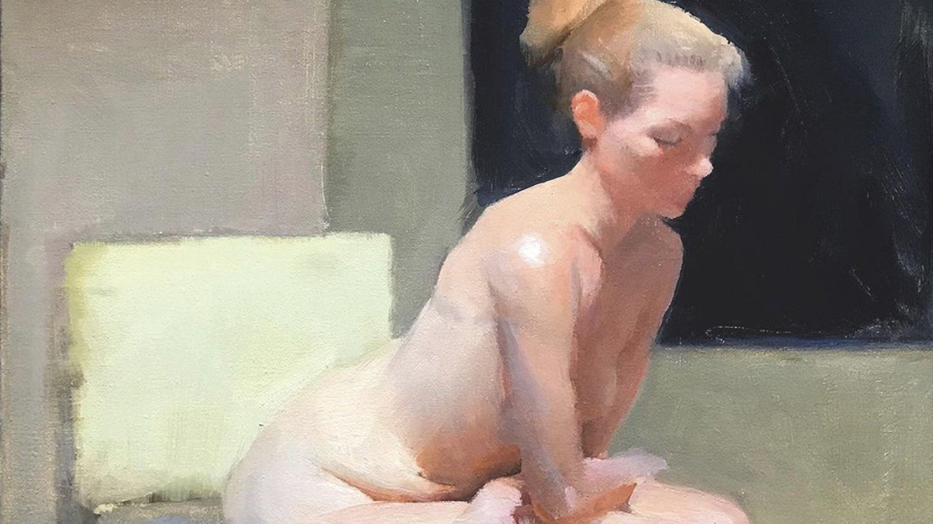
How to paint the perfect shadow
Anatomy master Charlie Pickard breaks down how to properly build powerful shadows in figure paintings with 10 expert tips.
Sign up to Creative Bloq's daily newsletter, which brings you the latest news and inspiration from the worlds of art, design and technology.
You are now subscribed
Your newsletter sign-up was successful
Want to add more newsletters?
Shadows are often the source of most of the mistakes in students’ early artworks. If we handle them properly, they can be an incredibly powerful part of our artwork, but they can be tricky. The value differences that make them up are often some of the most subtle in nature and they are easily overdone.
Shadows have the potential to add a tremendous amount of atmosphere and graphic impact to our work and this tendency to over-render them can destroy these wonderful effects, leaving us a picture that’s broken up. It’s important we understand how to approach them in a way that doesn’t destroy this overriding unity.
What I want to do today is discuss a few common mistakes that I see often in my student’s work, and put forward a few simple changes to our approach and thinking that can help make this often challenging area so much simpler. If you missed part one, check out the beginner's guide to shading theory and take a look at the best sketchbooks for artists to optimise your creative kit.
Article continues below01. Don't overdo the reflected lights
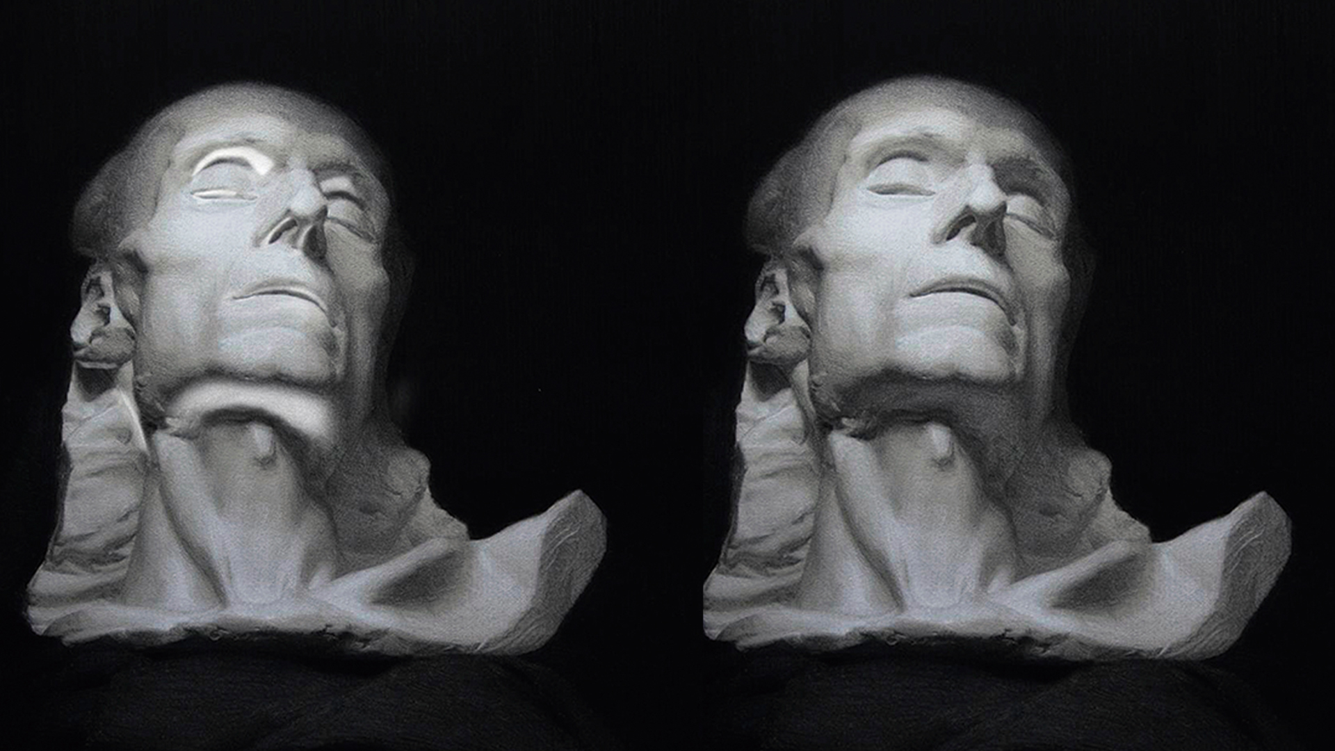
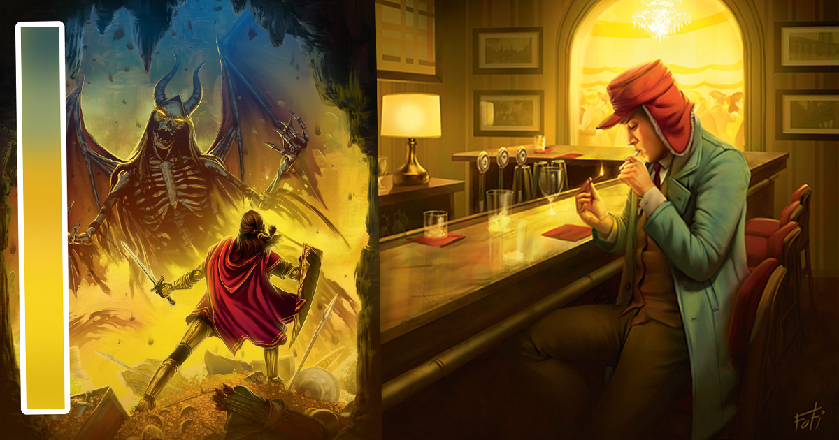
The most common early mistake all of us made at some point is to make the reflected lights far too bright. They’re never quite as bright as we think and overdoing them can lead to a broken-up look overall. Shadows will start to be confused with lights by our viewers, and at best we’ll have the sense of an extra light source shining into our shadows, which isn’t ideal.
There are quite a few reasons this mistake often happens. It can be due to illusions such as simultaneous contrast and the tendency for us to want to overexplain each detail. Reflected lights can often be completely ignored without losing much in the final art. In fact there are many artists that do exactly this, and it may leave you with a more powerful work. If we choose to include them, we have to remember to make them subtle so as not to ruin the overall effect.
02. Keep the shadow values separate
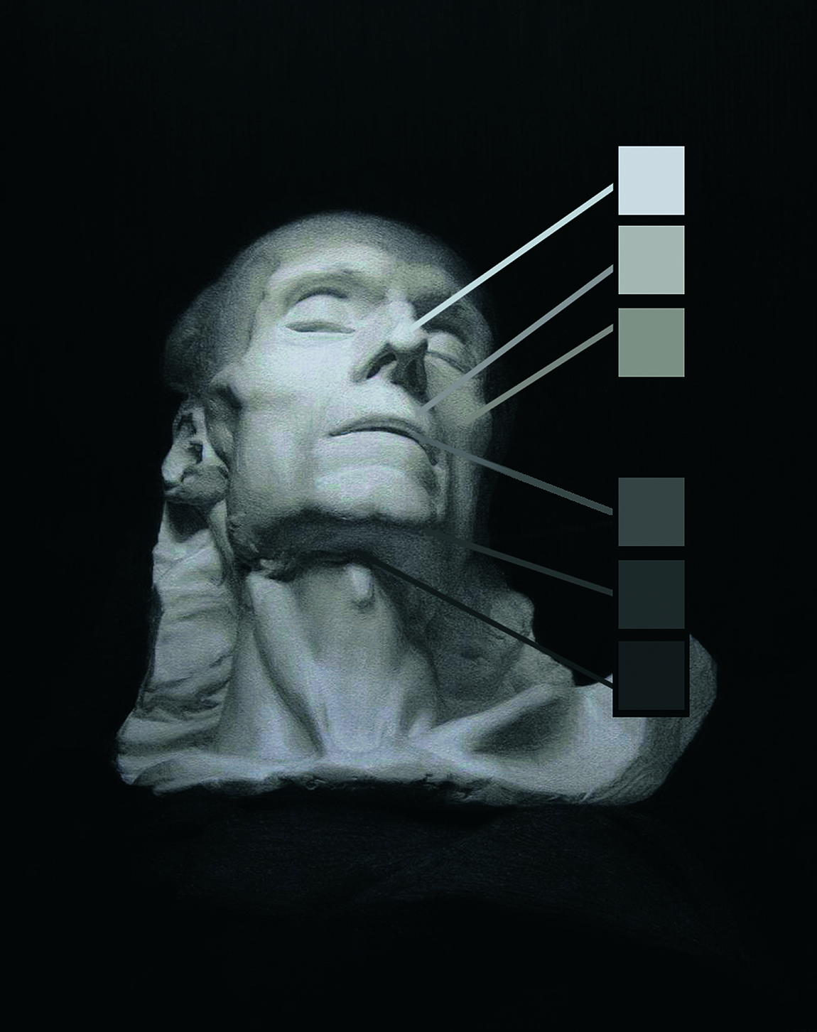
The first way we can avoid this common mistake is to enforce the absolute separation of light values from shadow values. While the reflected lights may appear bright, they can never be as bright as the primary light source. This is because it’s secondhand light that has bounced off a surface and become weaker as a result. The general rule here is that the lightest dark must be darker than the darkest light. Not respecting this separation is what ultimately leads to this broken-up effect.
03. Start out simple and graphic
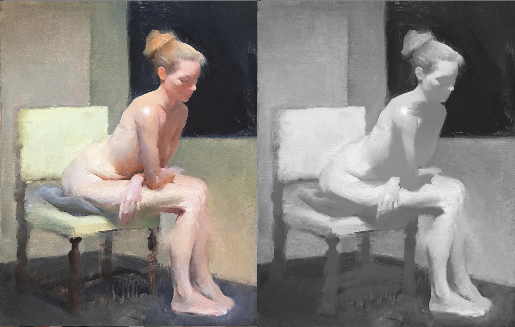
The easiest way to actually apply this strong separation of lights and darks is to start our paintings in a simple, graphic way. Think of the shadow shape in terms of a single value and ignore all of the form and details that you see within it. Treating the shadow in this way makes it much easier to focus on the large, graphic statement of the piece, and you might be surprised by just how much atmosphere comes out when you approach them with this simplified manner.
Once we have this method established, it’s much simpler to approach adding details by working into this large, simple mass. However, if we don’t solve the tendency to over-lighten the reflected lights this won’t quite solve all of our problems here.
04. Embrace direct lighting

A lot of problems are also caused by the overreliance on a simplified concept of lighting that makes us only add values to define form. One that most of us are already familiar with is the concept of direct lighting.
This form of light relies on the logic:
• As the plane turns towards the light, it gets lighter until it reaches the highlight.
• As it turns away from the light, it gets darker until lost in shadow.
We need a new way to understand defining form that can maintain the quality of separation in shadows
This understanding of light is often where we start learning and works well defining form in lights. However, with the shadows this tendency to define form by lightening is more destructive. This is the main reason students tends to break the shadow context when trying to add details.
We need a new way to understand defining form that can maintain the quality of separation in shadows. For my money, the best concept for this is ambient occlusion, though this is a slightly more complex aspect of light and will require some explanation.
05. Understand ambient lighting
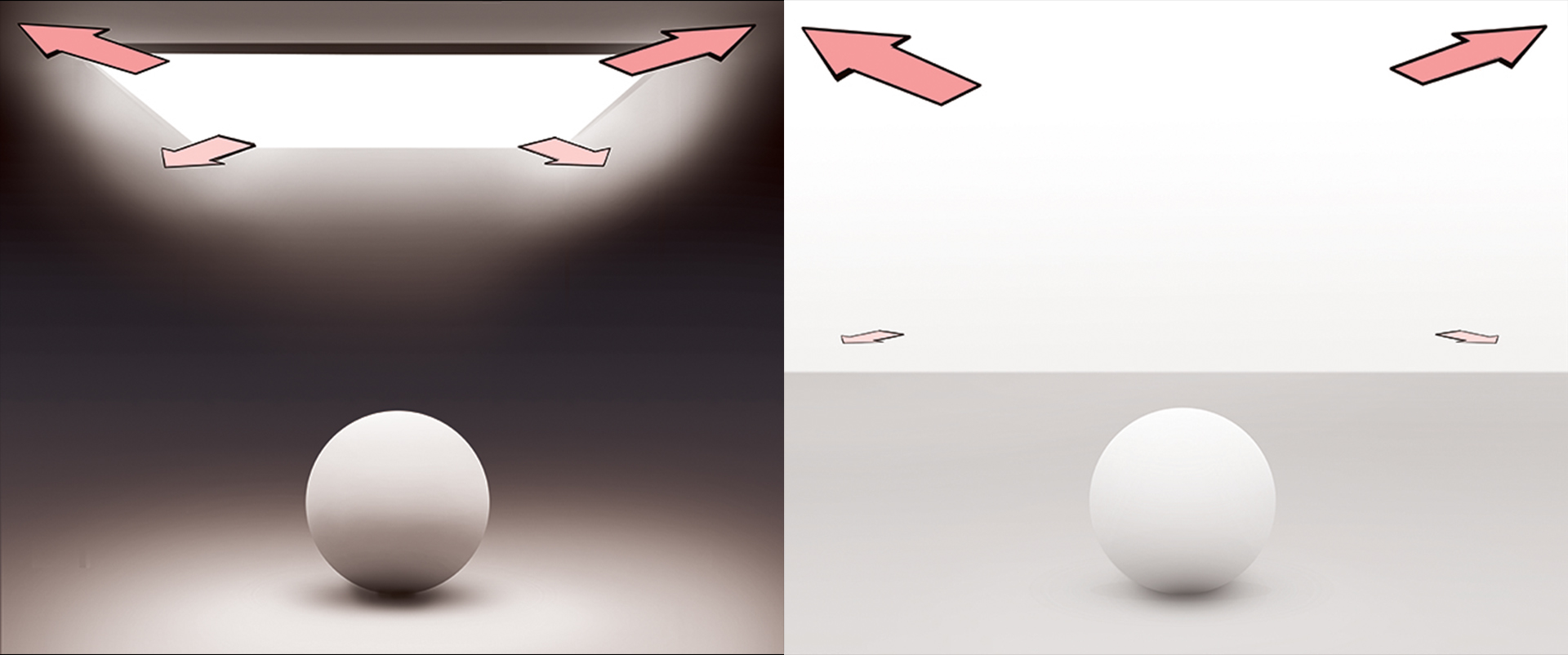
So what is ambient occlusion? How can it be useful to us in representing shadows? In order to answer this properly, we first need to explain what ambient light is. In order to understand this term, let’s examine the ‘hardness’ of this direct lighting. What exactly is hard light and what causes the softening of light?
The first thing about hard light is that it’s only possible in a true sense from a point source light, which has no width. As you can see, when we expand our light source the effect is that the shadow size shrinks and the shadows soften. This is diffuse light, and it’s intimately connected to the width of the light source. The wider the light source, the softer the light.
As a final question, what happens if the light source expands infinitely in all directions? The shadow shapes completely recede and disappear! Our conventional ideas of lighting fall away, so all we have is this general darkening as the sphere turns to the floor. This type of light is called ambient light and is what we often associate with overcast days, as the entire sky is the light source. Take a look next time it’s overcast, there are no shadows to be found.
06. Apply ambient occlusion logic
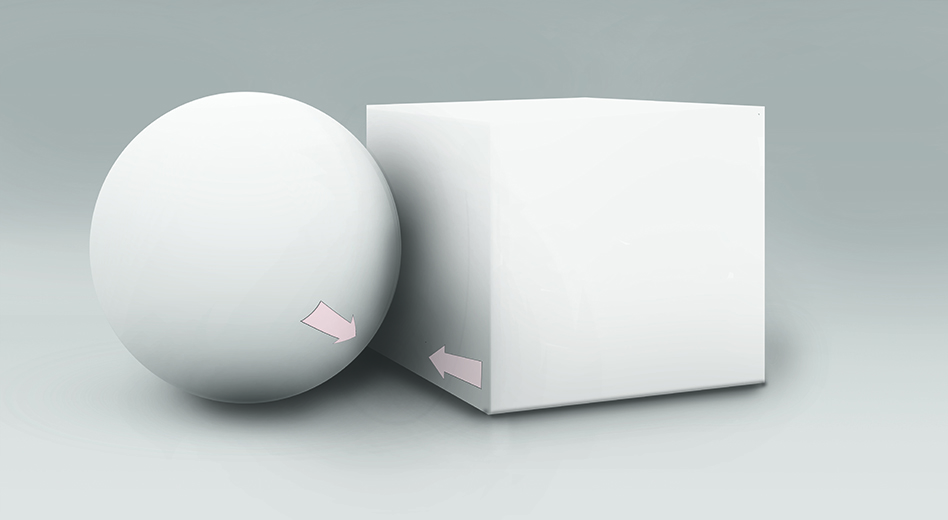
As direct lighting logic won’t work for non-direct ambient lighting, where does that leave us? There’s a simple approach here: ambient occlusion. To occlude something is the opposite of including it, so this refers to the darkening of ambient light. With light bouncing in all directions over the form, there aren’t many places for this occlusion of light to occur. The only places it does occur are where the forms come close enough together that they cast soft shadows onto each other. As the forms come closer they darken, and lighten as they move further apart.
• Direct light: Turning towards light = lighter. Turning away from light = darker.
• Ambient light: Forms far apart = lighter. Forms close together = darker.
07. Learn why we should care
You might also be asking why you need to know all this. Sure it’s true, but only happens in weird lighting situations. How is it helpful for describing shadows in more normal light?
To answer this it’s helpful to realise that, while living on Earth, there are extremely few true shadows anywhere. One of the only true shadows that we can actually see from the Earth is the Moon. If you look up at it you won’t see anything, only black, the reason being that space itself is black as there’s no reflected light to speak of, so all we can see is black. In order for us to see any colour in a shadow at all, there must be something there to be lighting it up.
So if there’s only one light in a room, what’s lighting the shadows? The answer is that the environment itself is a light source. We know this because we can see the environment, and for us to see it, it must be sending out a form of light. This realisation is important. There are no shadows on earth, really, only differing strengths of light. One of these is always the average of the environment itself, which is the ambient light. However, it’s a weak effect and easily overpowered. Due to this, we only see it’s effect in the shadows.
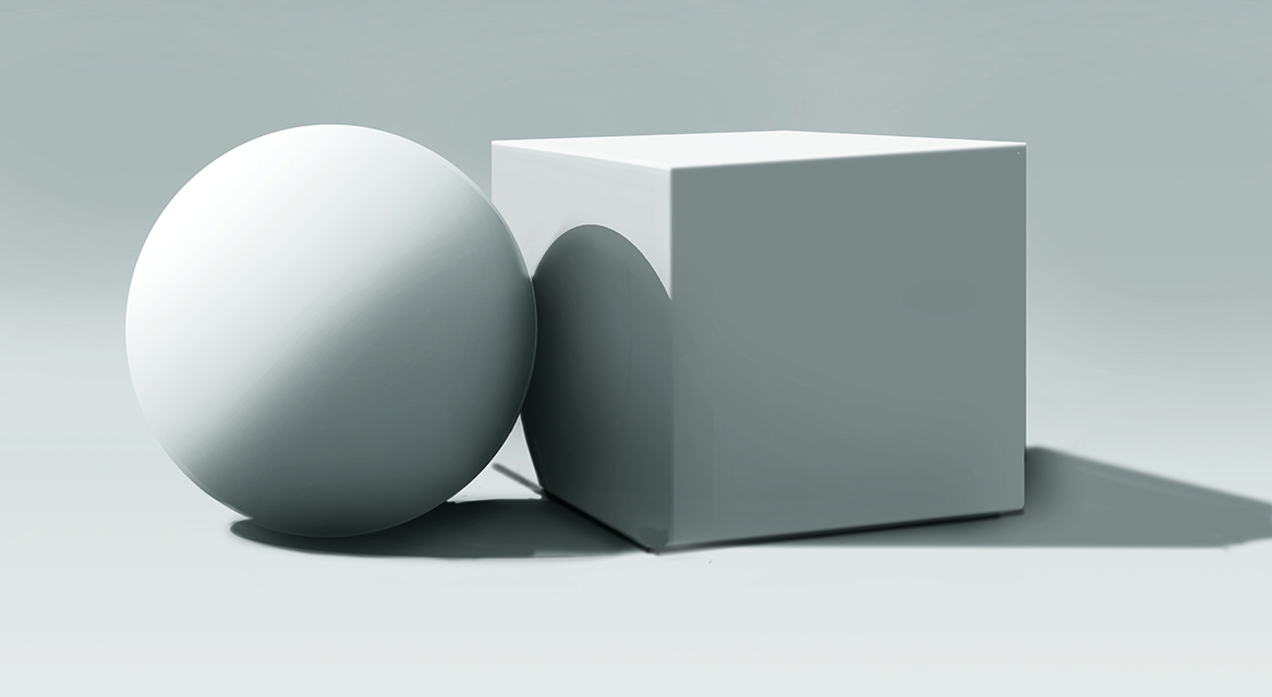
On the left, you can see a simple direct lighting setup with flat shadows. Although it looks understandable, it’s not particularly realistic. This is the initial graphic stage that I’m encouraging. Next to this you can see the added level of reality we can achieve by bringing in the ambient occlusion as a subtle darkening effect to the shadows, with no reflected light needed.
This effect is where much of the reality of shadows in an image truly comes from. We even get a sense of the reflected light effect here, even though all we’ve actually done is darken our image.
08. Take a general approach

This would be the main approach that I’d advocate you use in order to maintain the strength of this graphic statement and separation of the shadows, while still being able to create a sense for the details and movements of the forms in the shadows. Due to the fact that by using this method we’re only ever darkening the shadow values, nothing we can do has any chance of crossing over into the territory of the values of the lights, which means the separation of the values is maintained.
The general approach here would be:
A: Apply the graphic shadow: One value for all of the shadows. Make sure that this is the lighter average of your shadows.
B: Apply darker values into this larger average: Use purely darker values to express the various forms within the shadows.
09. Use ambient occlusion to add dark accents
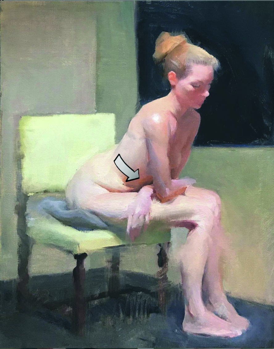
As you’re placing in these darker values, make sure to use the concept of ambient occlusion to guide you if you ever find yourself confused. Look for places in your subject’s shadows where the forms come closer together, as well as for darker notes around these sections.
This was the main strategy I used when developing this painting. The most obvious place you can see this effect here is in the darker note as the person’s belly comes closer and closer to their legs. Painters often refer to these darker notes as the dark accents
of the painting, and they’re the true anchors for the information in your shadows, so be sure to look out for them.
10. Look for colour
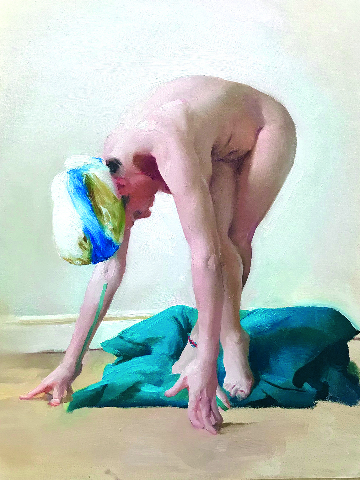
One fun, final bonus idea that’s worth talking about is how this effect works in relation to the colour of the skin. Given that only some light is able to penetrate into the deeper crevices of form, the light that enters does so at an extremely shallow angle and will bounce around a lot.
Because of this and another effect, subsurface scattering, these dark accents tend to be some of our best opportunities for powerful, chromatic colours. Ambient occlusion darks tend to be the strongest and most chromatic colours for the skin. Including this powerful colour in the deep darks is one of the best ways that you can communicate the translucency of skin, and is an extremely effective and exciting effect to explore when you’re painting figures.
Something I like to do is try to keep these dark accents painted with an absolutely pure mixture of paint for as long as I can throughout the painting process. Try to look out for their colour, and I think you’ll be pleasantly surprised by the effects it creates. Happy painting everyone!
This content originally appeared in ImagineFX magazine, the world's leading digital art and fantasy art magazine. ImagineFX is on sale in the UK, Europe, United States, Canada, Australia and more. Limited numbers of ImagineFX print editions are available for delivery from our online store (the shipping costs are included in all prices).
Sign up to Creative Bloq's daily newsletter, which brings you the latest news and inspiration from the worlds of art, design and technology.

Charlie Pickard is a classically trained fine artist and illustrator. Recently awarded the Philip de László Award for Excellence, Charlie continues to work, exhibit and teach out of his studio based in London.
