There's a lot more to managing Wimbledon's brand development than just a spot of logo design; it's been a large and ongoing process for London-based design firm hat-trick.
"When we first came across Wimbledon, visually it was a real mess," says Gareth Howat, hat-trick's co-founder. "So half the job was to get rid of all the stuff that didn't work, and just keep the stuff that did.
"We won a [Computer Arts] Brand Impact Award in 2014 for the work we'd done in redesigning the club's visual identity. We modernised the typography, and made the wayfinding, print and digital communications much cleaner and more legible, as well as more adaptable to a wide range of applications.

"Since then, we've essentially become the brand guardian for Wimbledon. And although the organisation doesn't go for big, sudden changes, there's always a lot of development going on. They're currently doing a big masterplan for the actual site, for example: they're developing some massive architectural plans, long-term.
"One of the big things Wimbledon has been really pushing recently is the digital and social media side. So they've constantly reinvented the website: it's all about making it year-round, rather than just for the Championships. And we've been overseeing the look and the feel of that, to make sure it's still on-brand.

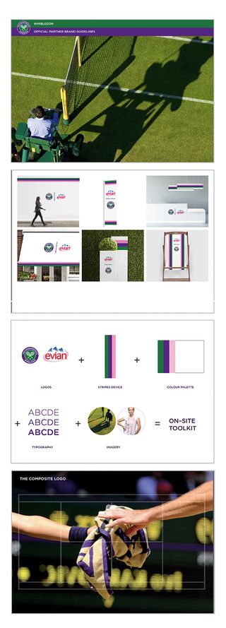
"They've also asked us to help standardise the way that the branding of commercial partners is represented at the Championships, in and around the grounds. The aim is to give everything a really clean, simple approach. And the commercial campaigns are starting to integrate more closely with the Wimbledon ethos – like the ad for Stella Artois, one of Wimbledon's brand partners, using Rufus, the legendary resident Wimbledon hawk.
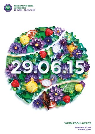
"Another thing we've been doing is designing tickets and posters. One idea that we've put across is the idea of using social media to actually generate content for the tickets. It's all about engaging with the fans, so we're trying to merge the worlds of print and digital a little bit more with that.
Get the Creative Bloq Newsletter
Daily design news, reviews, how-tos and more, as picked by the editors.
"Developing Wimbledon's visual identity is a very iterative process. From the ticket design to the way the digital platform works, everything's very much in development. It's never radical, but it's very much building over a long period of time. Each year, the whole thing gets more consistent."
This article originally appeared in Computer Arts issue 254; buy it now!

Thank you for reading 5 articles this month* Join now for unlimited access
Enjoy your first month for just £1 / $1 / €1
*Read 5 free articles per month without a subscription

Join now for unlimited access
Try first month for just £1 / $1 / €1
Tom May is an award-winning journalist and editor specialising in design, photography and technology. Author of the Amazon #1 bestseller Great TED Talks: Creativity, published by Pavilion Books, Tom was previously editor of Professional Photography magazine, associate editor at Creative Bloq, and deputy editor at net magazine. Today, he is a regular contributor to Creative Bloq and its sister sites Digital Camera World, T3.com and Tech Radar. He also writes for Creative Boom and works on content marketing projects.


