Refine your logo design workflow
From choosing the right colours to client management, Gareth Hardy guides you through the process of making a winning company motif.
Sign up to Creative Bloq's daily newsletter, which brings you the latest news and inspiration from the worlds of art, design and technology.
You are now subscribed
Your newsletter sign-up was successful
Want to add more newsletters?
Designing a logo for a client is one of the most rewarding tasks a designer can face, but also one of the most challenging.
Get it wrong and it's not just your own reputation that will be tarnished - your client's image will be too. The recent saga with the launch of the new logo for Gap is a prime example of the backlash that can occur.
It's important to keep your concepts simple while retaining creative flair. You can achieve this by taking some time out to think about different solutions, rather than jumping straight onto the computer. The following tutorial guides you through a process that will enable you to get professional results while keeping your client involved in a way that won't restrict your artistic licence.
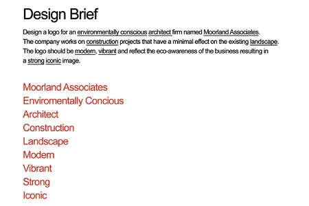
01 It may sound obvious, but read the brief several times to familiarise yourself with the project. Outline the key words, identifying the target audience, nature of the business and any specific requirements relating to the logo. I've followed this process for this fictional brief from an environmentally conscious architectural firm called Moorland Associates.

02 The biggest mistake is to start sketching away without a good, solid idea, so get thinking. Collecting images relating to the aims of the project can help with inspiration. You should also carry out research on the logos of the company's competitors to avoid any similarities.
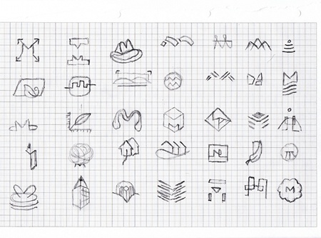
03 With your mind brimming full of creative ideas, start sketching out possible solutions, keeping the aims of the brief in mind at all times. Select your best concepts and discuss them with your client, checking that they haven't been done before. This will help save time and avoid any potential conflict.
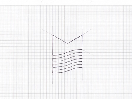
04 If the customer is satisfied with your proposed direction, take one of your thumbnail sketches and refine it. Be more precise with how you envisage the final logo. Drawing on graph paper will help guide you. Keep the lines clean and make sure they're clearly visible.
Sign up to Creative Bloq's daily newsletter, which brings you the latest news and inspiration from the worlds of art, design and technology.
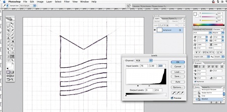
05 Scan your refined sketch into Photoshop as a JPEG or TIFF at 300dpi. Go to Image>Adjustments>Levels to open the Levels window. Drag the left slider to the right slightly, and the right slider to the left. You should now see that the grid lines on your sketch have disappeared. Save the file.
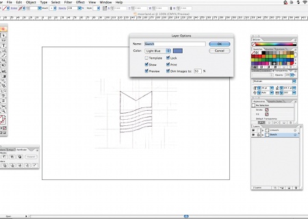
06 Open a new document in Illustrator. Go to File>Place and select your adjusted sketch file. Double-click on the layer in the Layers window. Name it 'Sketch' and check the boxes next to Lock and Dim Images to 50%. Hit OK. Create a new layer above your Sketch layer and name it 'Linework'.
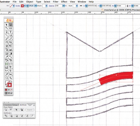
07 Make sure that you're on the new Linework layer, select the Pen tool and start to trace the outlines of your sketch. For curves, click the starting point, then the end or middle points. Drag the cursor to create a B©zier curve. Setting the Stroke colour to red will make it more visible.
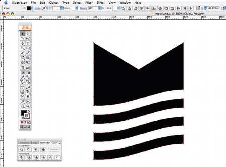
08 Once you've carefully traced your artwork, clean it up by removing any stray points. Make sure that all lines are straight where appropriate. Click each point with the Direct Selection tool to make sure. Give your paths a black fill, and make sure there's no Stroke colour. Hide your Sketch layer.
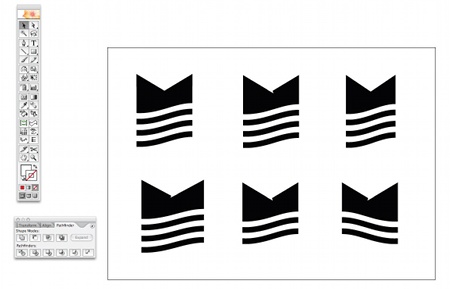
09 It's a good idea to create some variations of your design to make sure you have the best option possible. In this example, I chose to flip the image and remove one of the bottom lines because it made the logo too tall. Always make sure your motif works at small sizes by zooming out.
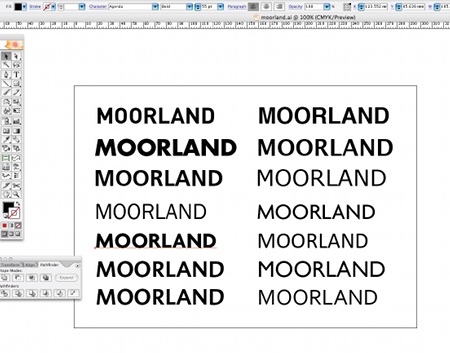
10 Now it's time to choose a typeface (or draw one). Remember that the type should match the aims of the logo, and also the style of the icon. Make sure you've exhausted as many options as possible. I chose a clean sans serif that has sharp edges to help complement the mark.
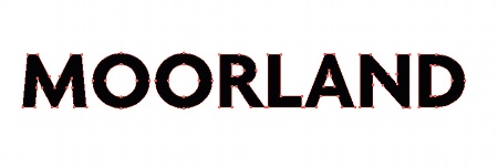
11 Once you've chosen your desired typeface, make a note of its name. Select the type, and go to Type>Create Outlines. Then go to Object>Ungroup. This will now enable you to edit the points of the type. Fix the kerning by selecting each character and moving it accordingly.
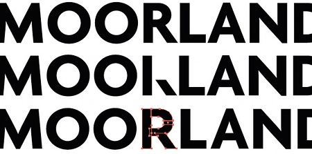
12 To make your logo more distinctive, you could opt to modify the typeface slightly. I chose to change the shape of the original 'R' because I felt it was too narrow. I did this by deleting some of the points, redrawing a new path and expanding the character using the Pathfinder.
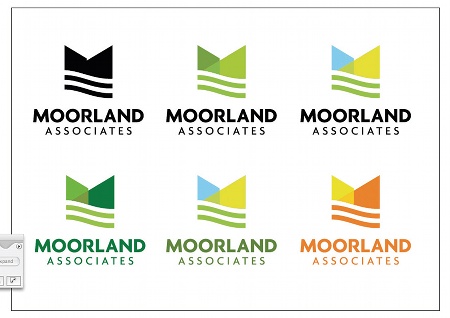
13 Print your artwork at various sizes to check for any errors or problems that might occur. Start to select some suitable colour palettes. Make sure your document is set to CMYK by going to File>Document Color Mode>CMYK Color.
14 This example is for an eco-friendly company, so using bright pink wouldn't be the best choice. Discuss the colour options with your client, and advise on what you think would be appropriate. Primarily, the logo should work on a white background, but you can also test to see how it would look against a coloured one.
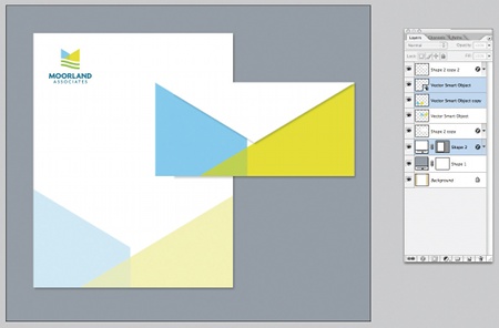
15 If you have time, design some dummy materials to show your customer how the logo will be used. This will help them to imagine it representing their company. Apply it to any collaterals they might use, such as letterheads and business cards. Repeat this process depending on how many concepts you're presenting.
Gareth Hardy
Working under the moniker of Down With Design, Gareth is a freelance graphic designer specialising in brand identity. To see more of his work, visit: www.downwithdesign.com

The Creative Bloq team is made up of a group of art and design enthusiasts, and has changed and evolved since Creative Bloq began back in 2012. The current website team consists of eight full-time members of staff: Editor Georgia Coggan, Deputy Editor Rosie Hilder, Ecommerce Editor Beren Neale, Senior News Editor Daniel Piper, Editor, Digital Art and 3D Ian Dean, Tech Reviews Editor Erlingur Einarsson, Ecommerce Writer Beth Nicholls and Staff Writer Natalie Fear, as well as a roster of freelancers from around the world. The ImagineFX magazine team also pitch in, ensuring that content from leading digital art publication ImagineFX is represented on Creative Bloq.
