Design distinctive monotone layouts
David Gibson explains how to create striking layouts in InDesign using one or two colours – and save cash too
Sign up to Creative Bloq's daily newsletter, which brings you the latest news and inspiration from the worlds of art, design and technology.
You are now subscribed
Your newsletter sign-up was successful
Want to add more newsletters?
Designing for print with one or two colours can create a beautiful, pared-back effect, giving a project a refined feel, and saving money in the process. Limiting your colour choice can also leave you to focus on layout, and the relationship between the type and images – it’s a good way to learn the basics.
Over the following steps I’ll show you how to create a one or two-colour document featuring type and images, with some helpful tips for making monotone images stand out. We’ll be using a section from The Final Word, a publication that I created with designers Livia Lima and Susanne Stahl, but you can apply all the techniques covered here to your own projects.
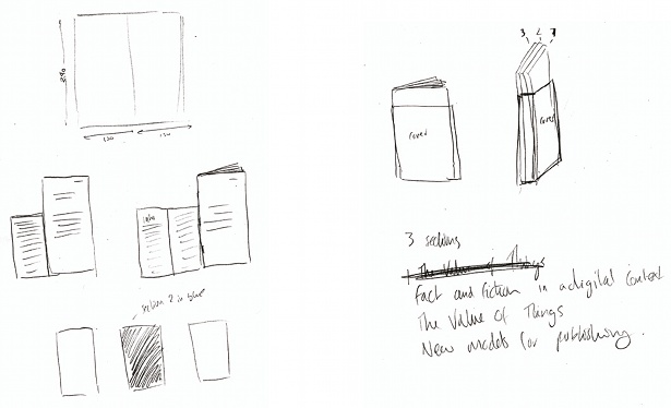
01 First, gather your content and figure out what you want to achieve. Whether you’re designing a one-page newsletter or a 100-page book, you need to know the size, structure, binding (if any), the paper stock you might use and so on. Sketch your ideas out and make mock-ups of the sizes and binding. Start thinking about how you might lay the content out: is there an idea in there that could lead to a visual solution? We split our content into three sections, which are bound separately and then bound together.
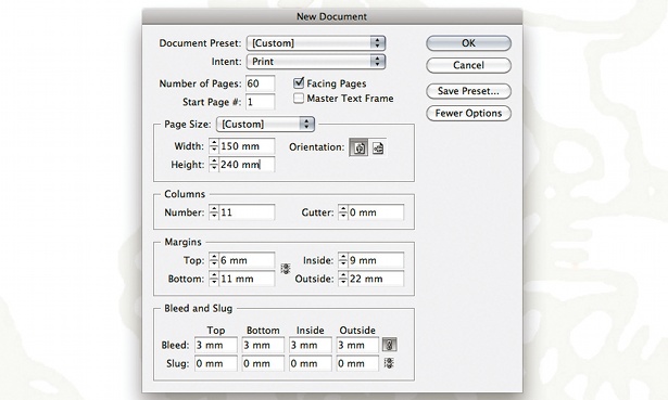
02 Create a new document in InDesign. Enter your chosen page size, the number of pages and the margin you want. Margins can dramatically change the look and feel of a layout – do you want the content to appear as though it’s falling off the edges of the page, or do you want to leave lots of space around the content? I find symmetrical margins can lead to boring, stuffy layouts. Choose the number of columns you want to use – we decided on 11 columns and no gutter.
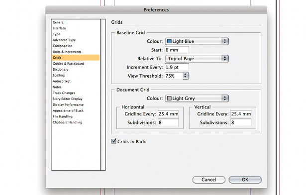
03 Set up a baseline grid by selecting InDesign> Preferences>Grids. Start the grid at the top of your margin. For flexibility, I like to use quite a small baseline grid, so I set Increment Every to 1.9pt. Experiment on your document until you’re happy with the results.
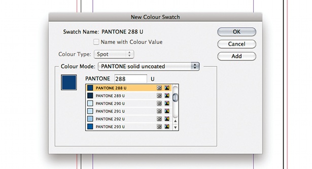
04 Choose one or two colours to work with. The best way to do this is using a Pantone book, but you can get by with InDesign. Go to Swatches>New Colour Swatch, and set Colour Type to Spot. Then choose a Pantone colour mode. Choose a colour, or enter the Pantone number in the box. Click OK, and repeat if you want to use two colours. We opted for just one – Pantone 288 U.
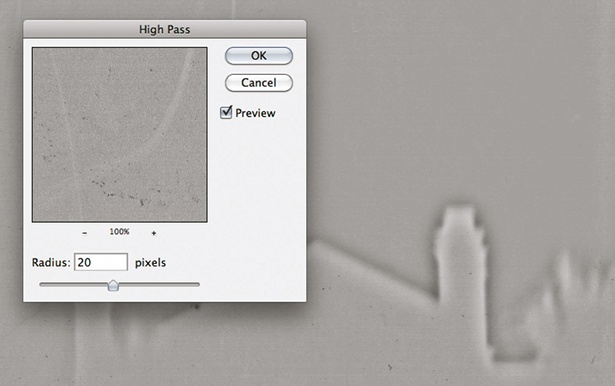
05 To set up your images, open them in Photoshop and convert them to grayscale. They might lose some of their vibrancy and clarity, so a good method to fix this – and make them stand out – is to duplicate the layer so you have a copy of your image sitting on top of the original. Then, with this new layer selected, go to Filter>Other>High Pass. You’ll need to play with the Radius slider to get the best results, but for now choose 20 pixels and click OK.
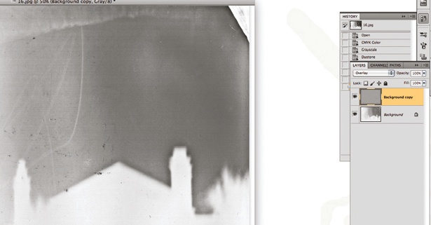
06 Now change the blending mode of the duplicated layer to Overlay – you’ll notice that the image comes back to life. Save it and repeat the process on all your other images. Next, place the image in your InDesign document, select it and apply your chosen colour by selecting it from the Swatches panel. You could create a design where the images are one colour and the type is another, for example. (If you keep repeating this effect to the same image you can achieve a useful photocopied effect.)
Sign up to Creative Bloq's daily newsletter, which brings you the latest news and inspiration from the worlds of art, design and technology.
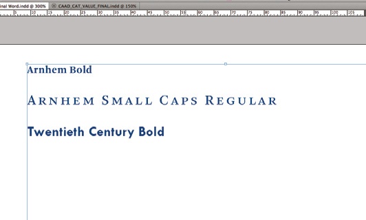
07 I like to use two different typefaces and experiment with how they interact with each other – one for the headers and folios, and one for the body copy, for example. Experiment and choose a typeface that’s appropriate for your project.
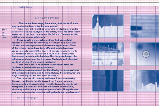
08 It can be beneficial to roughly lay out all the content before worrying about how the design will look – this can help with deciding on the flow. You’ll know how much you have to fit on each page then and you can start to see how different images work together. Remember that when working with type it’s very useful to see how your designs look when they’ve been printed.
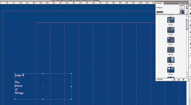
09 After creating your templates, start refining your documents. Create page numbers and folios in the master pages. And don’t forget to use paragraph styles and character styles so that you can make changes at a later date easily. Keep experimenting with how you use the space – you could try leaving a lot around an image, or overlapping the edges of images with text. If a certain page isn’t working, change it around or ask someone else to have a look at it. To create variation we decided to inverse one section of the book out of blue.
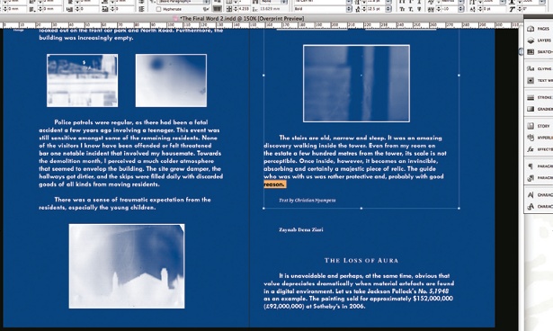
10 Attention to detail makes a huge difference. Once you’ve finished experimenting and laying everything out, you need to go through your document carefully. Ensure your design elements are consistent, such as the space between images and captions, or paragraphs, headers and so on. Check your line-ends and make sure you don’t have any widows or orphans.

The Creative Bloq team is made up of a group of art and design enthusiasts, and has changed and evolved since Creative Bloq began back in 2012. The current website team consists of eight full-time members of staff: Editor Georgia Coggan, Deputy Editor Rosie Hilder, Ecommerce Editor Beren Neale, Senior News Editor Daniel Piper, Editor, Digital Art and 3D Ian Dean, Tech Reviews Editor Erlingur Einarsson, Ecommerce Writer Beth Nicholls and Staff Writer Natalie Fear, as well as a roster of freelancers from around the world. The ImagineFX magazine team also pitch in, ensuring that content from leading digital art publication ImagineFX is represented on Creative Bloq.
