Use CSS blend modes for dramatic effects
Blend modes are now part of an official CSS specification. Dudley Storey explains how to use them to achieve cutting-edge website designs.
Sign up to Creative Bloq's daily newsletter, which brings you the latest news and inspiration from the worlds of art, design and technology.
You are now subscribed
Your newsletter sign-up was successful
Want to add more newsletters?
You may be familiar with blend modes from Photoshop CC or other parts of the Adobe suite: they're the curiously-named options in the Layers palette that can create dramatic differences in how layers of pixels interact with each other.
What you may not have been aware of is that Adobe, in combination with contributors from all over the world, has been quietly moving much of its innovative work in layout, typography and imagery into the CSS specification.
Blend modes revisited
Features such as flowing text around (and within) shapes, true drop-caps and blend modes have been making their way into browsers for years. In this article, I'm going to show you how to use blend modes to solve some of the biggest colour and workflow problems that web designers face today.
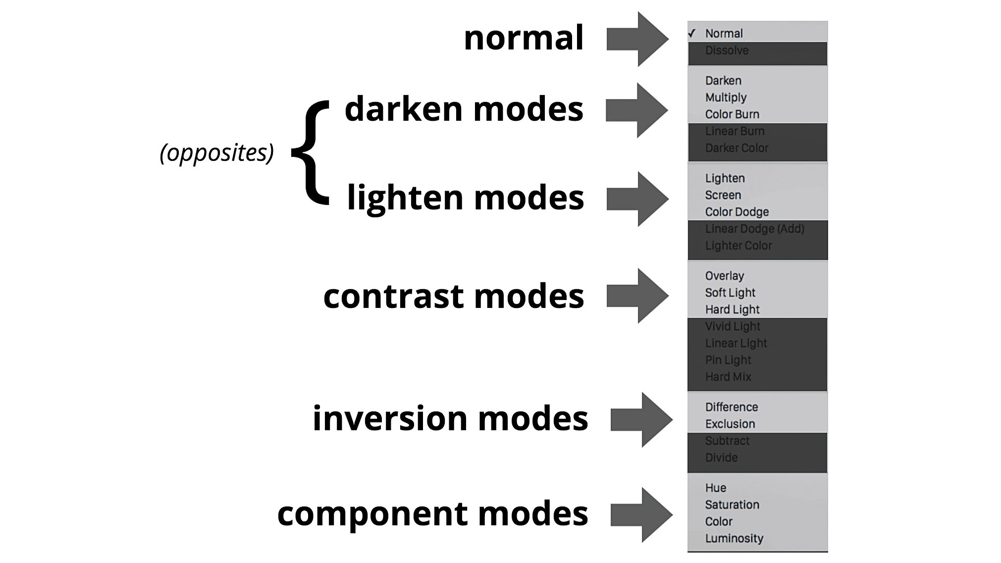
Article continues belowYour list of available blend modes will contain various names, depending on the version of Photoshop you're using. Although this list can be lengthy, you need to know just four things:
- Not every blend mode has been moved from Photoshop into CSS. I've highlighted only those that appear in the current spec in fig 1
- Aside from normal (the default), each of the modes specifies how the pixels of a layer influence the perceived colour of the pixels immediately above it (previously our control was limited to CSS properties like opacity, or colour values with alpha components; blend modes provide us with a far greater degree of influence)
- The blend modes are collected into groups (see fig 1). While these aren't directly referenced in CSS, remember that all the darken modes have a similar effect, just to different degrees. The same goes for lighten modes
- Modes in the darken and lighten groups are opposite in effect to each other In my experience most designers play around with blend modes in Photoshop until the result looks 'right'. Rather than explaining each of the modes in depth, I'm going to use examples to demonstrate how they can be used today.
CSS support for blend modes is shared between two properties: mix-blend-mode and background-blend-mode. Not surprisingly, background-blend-mode only affects CSS background layers, whereas mix-blend-mode affects arbitrary HTML elements. Both have full access to the entire range of blend modes.
Faces in circles
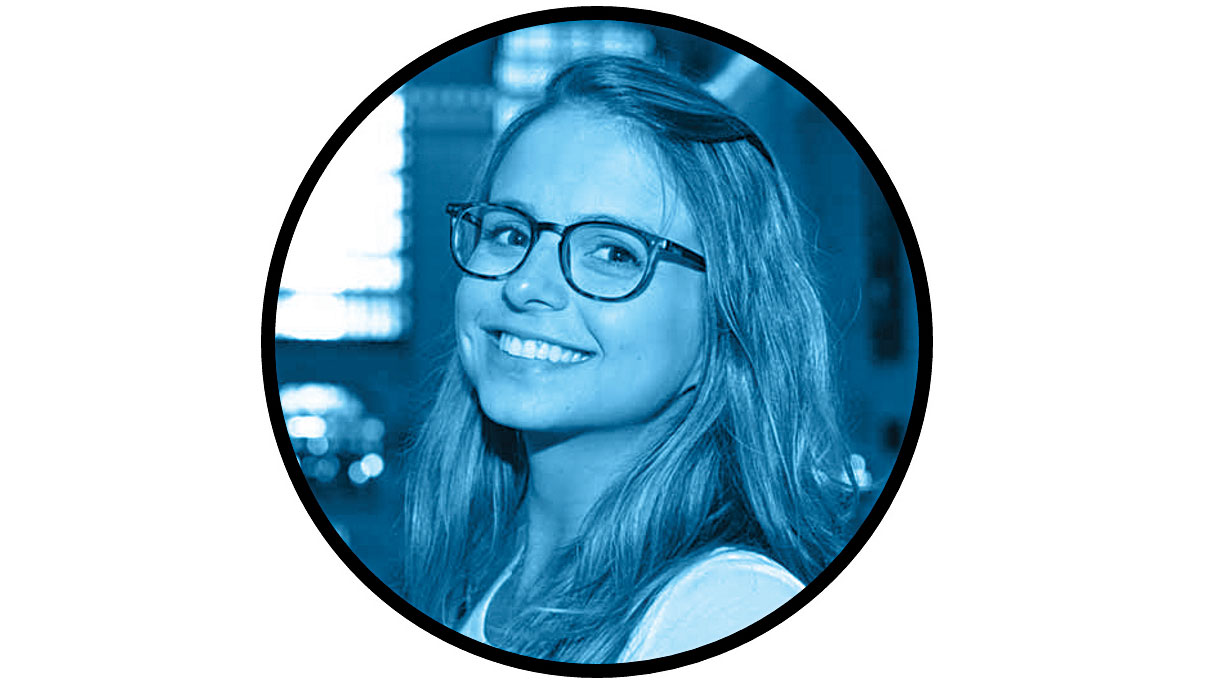
Almost everyone is familiar with the 'faces in circles' design motif (see fig 2). Very frequently those faces are also monochromatic, containing all the degrees of colour from a single hue, in order to create visual consistency and cohesion.
Traditionally this process is done in Photoshop, meaning that any change to the image must be reprocessed and exported using the same tool. But with blend modes, we can do all that natively inside CSS.
Sign up to Creative Bloq's daily newsletter, which brings you the latest news and inspiration from the worlds of art, design and technology.
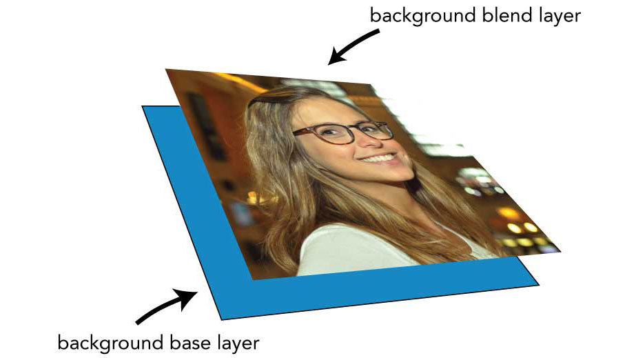
To demonstrate this, we'll take an image (fig 3, from facebox.io), make it a background, and add a colour behind it. The HTML will be a simple link:
<a href="#"></a>And the CSS:
a {
  border: 5px solid #000;
  border-radius: 50%;
  display: inline-block;
  width: 16rem; height: 16rem;
  overflow: hidden;
  background: url(profile1.jpg) no-repeat center hsl(200,50%,50%);
  background-size: cover;
}
inline-block mode is used so the link may be provided with both a width and a height. Combined with a border-radius of 50% and hidden overflow, it creates a perfect circle. background-size: cover ensures the image completely covers the space; and hsl colour is used behind the image as it is very easy to alter, which will become important later.
The result is still full colour. To change this, we'll add a background-blend-mode:
a {
  background-blend-mode: luminosity;
}
luminosity allows the pixel colour of the background layer to 'soak through' to the upper layer. The result is a monochromatic image that uses the background colour's tonal range. To alter the effect, we can simply change the background colour. If we wanted it to be more green, for example, we could change the hue component:
background: url(profile1.jpg) no-repeat center hsl(120,50%,50%);If the background colour is close to black or white, the blended result is (not surprisingly) black-and-white, aka greyscale.
Transitioning blends
You might reasonably assume you could animate blend modes by adding a transition and setting the blend mode to normal at another state, such as hover:
a {
  transition: 1s;
}
a:hover {
  background-blend-mode: normal;
}
Disappointingly, you'll find that this will not work: blend modes cannot be animated directly. However, with a little parallel thinking, we can animate the background colour and use that to create a transitioned hover effect with blends:
a {
  transition: 1s background;
  will-change: background;
}
a:hover {
  background-color: transparent;
}
If we set the background to transparent, the luminosity blend has no effect.
By explicitly changing the background, we make the animation more efficient, and successfully transition the effect. You can see a variant of this code here.
Alternatives
An alternative for older browser versions could be achieved with a combination of vendor-prefixed CSS filters:
a {
  filter: grayscale(100%)
  sepia() hue-rotate(105deg)
  brightness(90%) saturate(110%)
  contrast(140%);
}
Unfortunately, this won't work in Microsoft Edge either, since it doesn't yet support CSS filters (although support is present in the latest Windows Insider preview). A final alternative would be to create the entire UI in SVG.
Automatic text contrast
A common issue with heavily art-directed pages is text crossing over multicoloured backgrounds, such as images. Ideally, text should always maintain a high contrast ratio, no matter what the background is (see Lea Verou's contrast ratio calculator for more info).
While careful colour considerations and CSS properties like text-shadow can help address these issues, blend modes solve them entirely. Let's use an extreme example: a heading that crosses over a background that moves from white to black:
body {
  background-image: linear-gradient(90deg,#fff 49.9%,#000 50%);
}
With heading text with the content of 'BAD BOY' in its default black, any section of the text that sits on the black part of the background will not be visible.
There have always been solutions for this. You could turn the entire design into an image, or surround a portion of the text with a <span> element in order to alter it with CSS. However, all these methods have significant drawbacks.

With blend modes (specifically mix-blend-mode, since we're dealing with HTML elements) we can provide a solution using just two lines of CSS:
h1 {
  color: #fff;
  mix-blend-mode: difference;
}
Note that this reverses the default colour of the text, meaning if the browser doesn't support blend modes, the first word in our text will be invisible. To address this we can use @supports to check if the browser supports mix-blend-mode:
@supports (mix-blend-mode: difference) {
  body {
    background-image: linear-gradient(90deg,#fff 49.9%,#000 50%);
  }
  h1 {
    color: #fff;
  }
}
This also involves a little parallel thinking: since browsers that don't recognise @supports will ignore anything inside the feature query, we can style the default appearance of the page outside it. We can use the CSS inside @supports to build the background and employ mix-blend-mode.
The result doesn't just work in these extreme examples, but whenever the text layout changes (see fig 4), or when it crosses over a sufficiently dark background image (see fig 5).

Variations on this idea can be useful in all kinds of circumstances. Robin Rendle gave a great example of how it can be used for the label of an animated <meter> element).
Text punch-out
There are many different ways of creating text clipping paths – WebKit has a unique method, and SVG supports a variation of the technique – but by using blend modes we have a way of doing so predictably and across browsers. The essential technique relies on a background hidden by a flood-fill on another element (see fig 6):
<div class="dark">
  <h1>London</h1>
</div>
That containing <div> is filled with a background-image
:
  .dark {
  background-image: url(london.jpg);
  text-align: center;
  background-size: cover;
}
And the heading inside it is styled with a background colour:
.dark h1 {
  margin: 0;
  font-size: 20vw;
  text-transform: uppercase;
  line-height: 1.9;
  color: #fff;
  background: #000;
}
The heading 'sees through' to the hidden background image by using mix-blend-mode:
.dark h1 {
  mix-blend-mode: darken;
}
As with the 'faces in circles' example, this is nicely progressive: IE users will see white text on a black background, and all others will see the blend mode effect. There's also the opposite effect – black text on a white background with a clipping mask – as shown here.

Better borders
Web design has existed in a world of rectangular image borders for a long time, partly because making clipped borders has meant a lot of custom work and processing in a bitmap editor. But by using blend modes we can get similar results, with very little effort required.
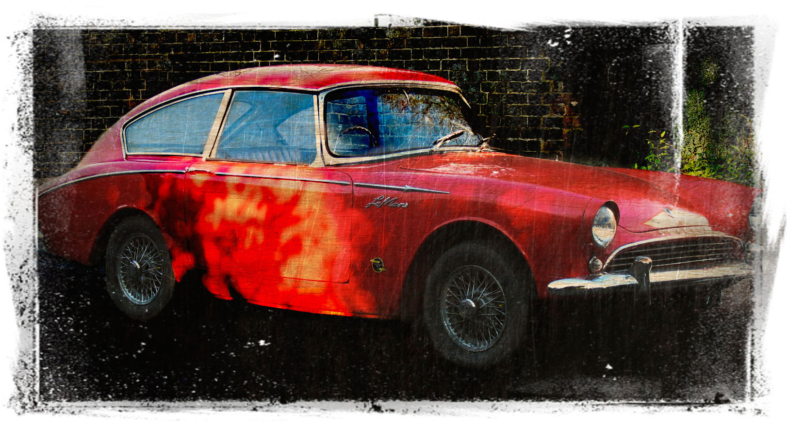
We'll take a suitable image (see figure 7), and combine it with a greyscale, tightly compressed 16 or 32-bit PNG image with a distressed borde. Since the car image is illustrative, it needs to be placed in the page as an <img> tag. This means the distressed PNG can't be added as a background.
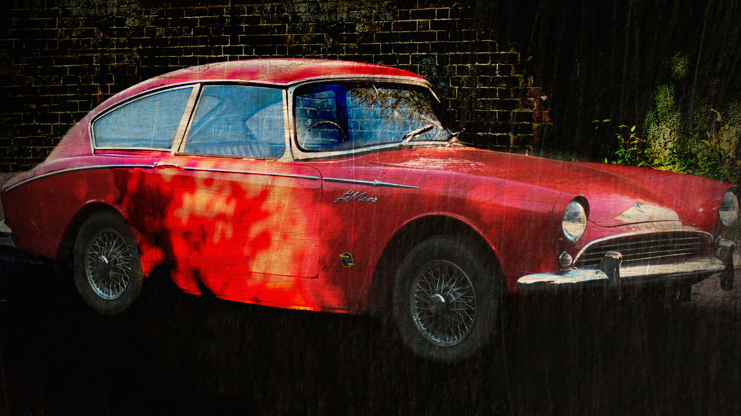
mix-blend-mode interprets a element's background image as being on the same layer as the image itself for compositing purposes, so the background needs to be placed on another element:
<div class="distressedborder">
  <img src="sunbeam.jpg" alt="Photograph of a red Sunbeam Harrington Le Mans sports car">
</div>
The CSS:
div.distressedborder {
  background: url(masque-24.png) #fff;
  background-size: 100% 100%;
  background-repeat: no-repeat;
}
div.distressedborder img {
  width: 100%;
  mix-blend-mode: screen;
}
With an appropriate background image, screen is an excellent mode for creating the impression of a dusty, distressed image, without the need for a lot of processing in Photoshop. You can find a variation of this example here.
Conclusion
There are many, many more uses that blend modes can be set to. You can find a variety of examples on my CSS blend modes web developer reading list.
This article originally appeared in issue 278 of net magazine; buy it here.
