Flavours of the past get a modern makeover in this deliciously retro steakhouse rebrand
Tavern puts a contemporary spin on Sizzler's archived illustration.
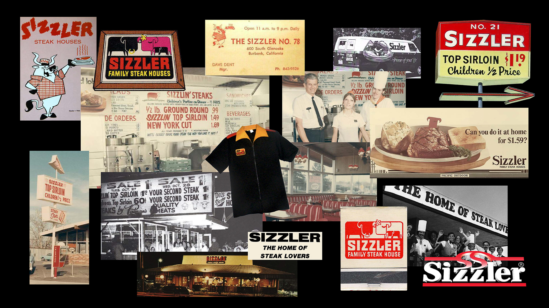
Sizzler Family Steak House is a West Coast eatery icon with a hearty heritage at its core, but after years of feeding into trends the brand began to lose its unique flavour. Reviving its retro roots, the restaurant chain has unveiled a stylish rebrand that spices up its vintage charm with a playful new look.
Even the best rebrands from across the decades face one common hurdle – maintaining a brand's heritage while refreshing its more tired assets. It's no easy task to create a new look that blends contemporary style with a brand's rich history, but Sizzler's new look is a shining example of nostalgia-driven design that feels timeless yet trendy.
Created by branding agency Tavern, the new look was built around Sizzler's rich visual archive, reviving the comforting nostalgia that customers have come to love. "We quickly learned that everyone who grew up in California has their own Sizzler story – a happy childhood memory about enjoying their favourite foods with their favourite people," Tavern's founder and creative director, Mike Perry tells Creative Bloq.
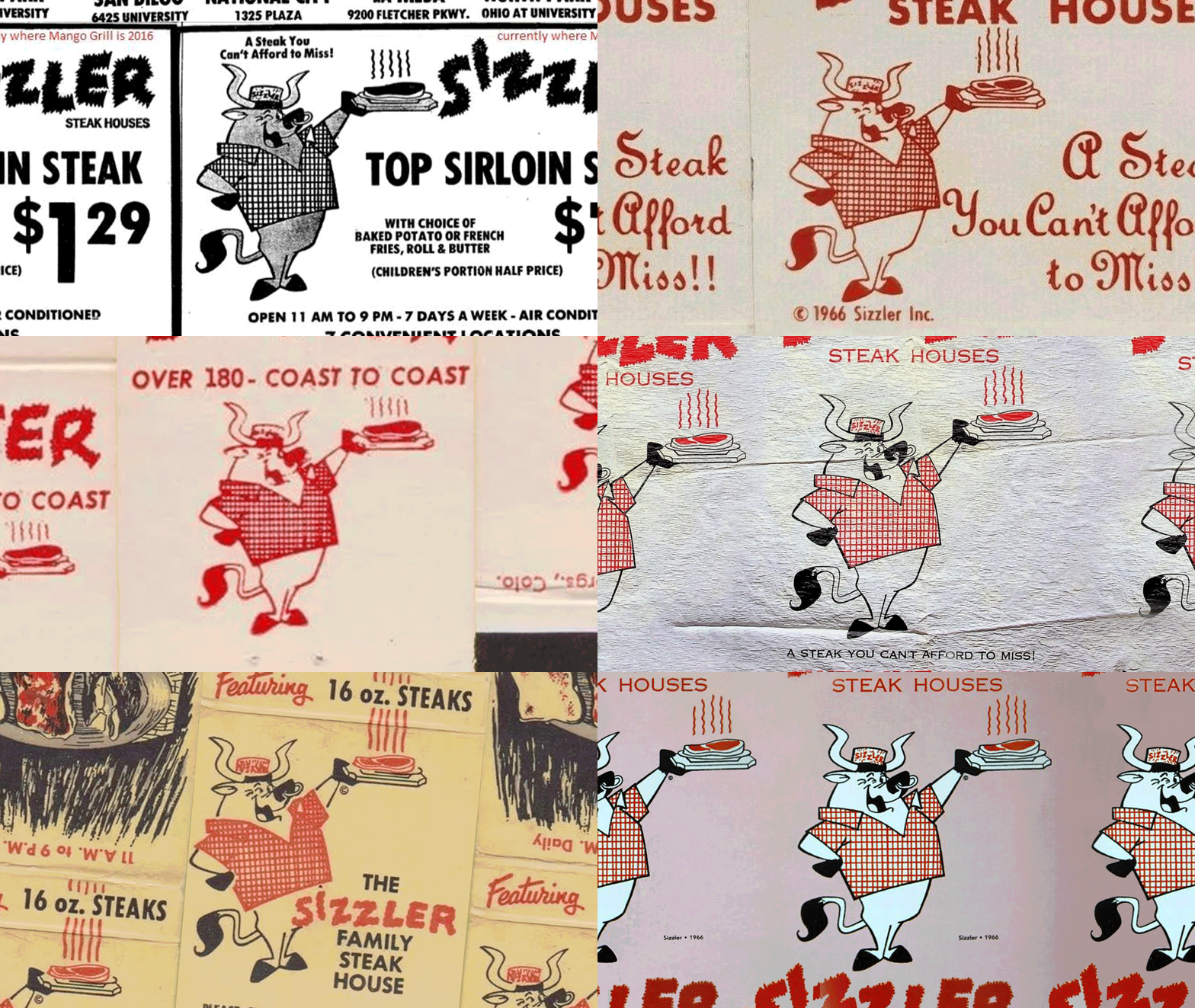
Article continues below"Almost every element of the new visual identity was pulled from Sizzler’s brand archives, inspired by a typeface from an old ad, the brand’s forgotten mascot, and pieces of old logos. We dusted off these exciting finds and tuned them up with a contemporary designer’s eye to strike a more timeless balance between modernity and heritage. We didn’t want the brand to feel old for old’s sake, we wanted it to feel just as delicious and delightful as diners remembered it to be," he adds.
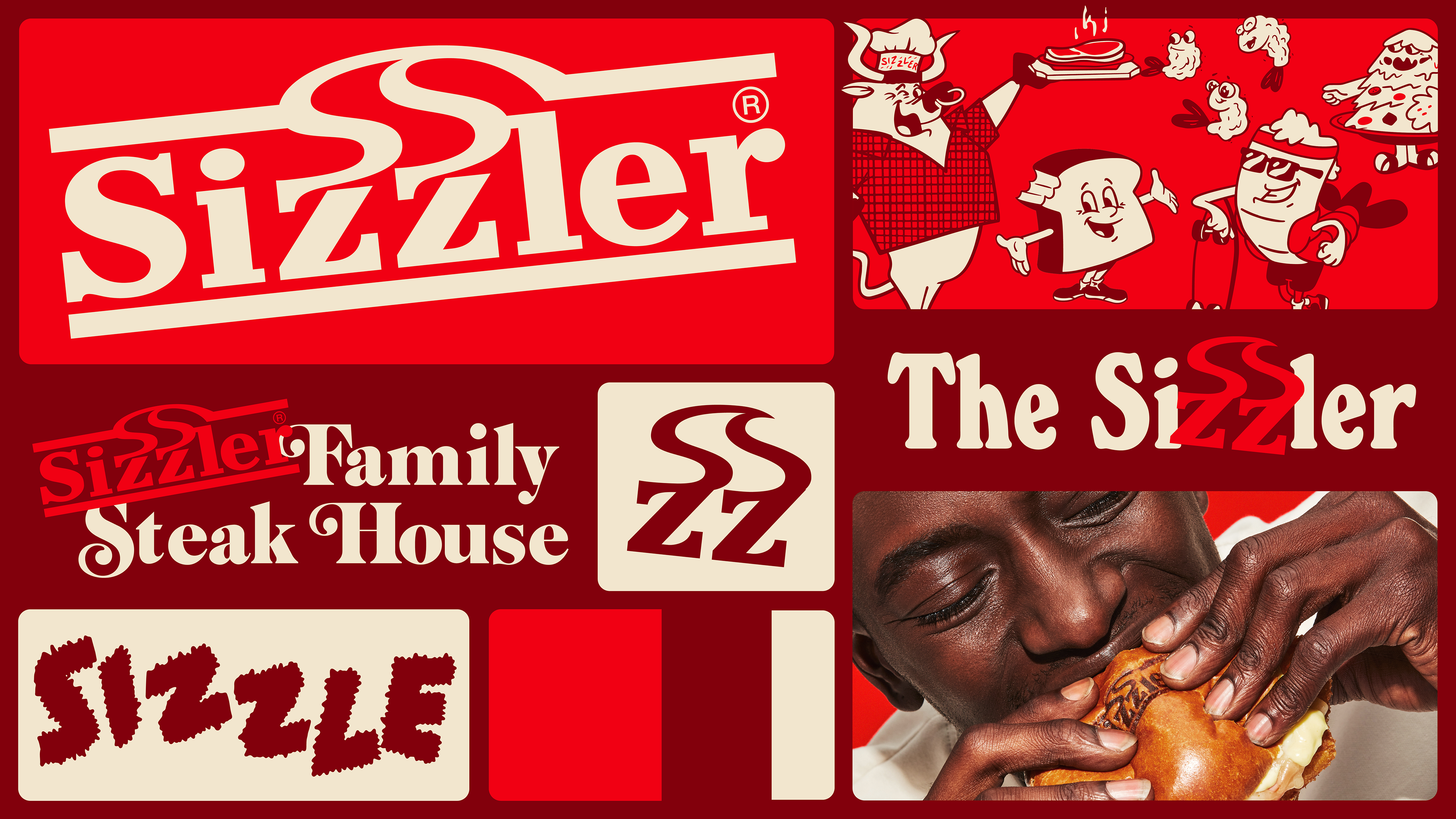
The design was shaped by three core brand principles: “Fresh, Craveable and Delightful.” Informing all aspects of the rebrand, from visuals to voice, these concepts helped to "keep the brand feeling fresh, celebrate the craveability of our food and weave a little delightfulness into every interaction," Mike says.
Cooking up a familiar retro flavour, the rebrand features a host of nostalgic illustrations that tap into the brand's heritage – particularly the revamp of Sizzler's bovine mascot, affectionately renamed Ribby Ribeye. "We rediscovered him while digging through the brand’s archives and knew we needed to bring him back. We gave him a slight contemporary refresh, a name and a new chef's hat, but largely stayed true to his original form," Mike says.
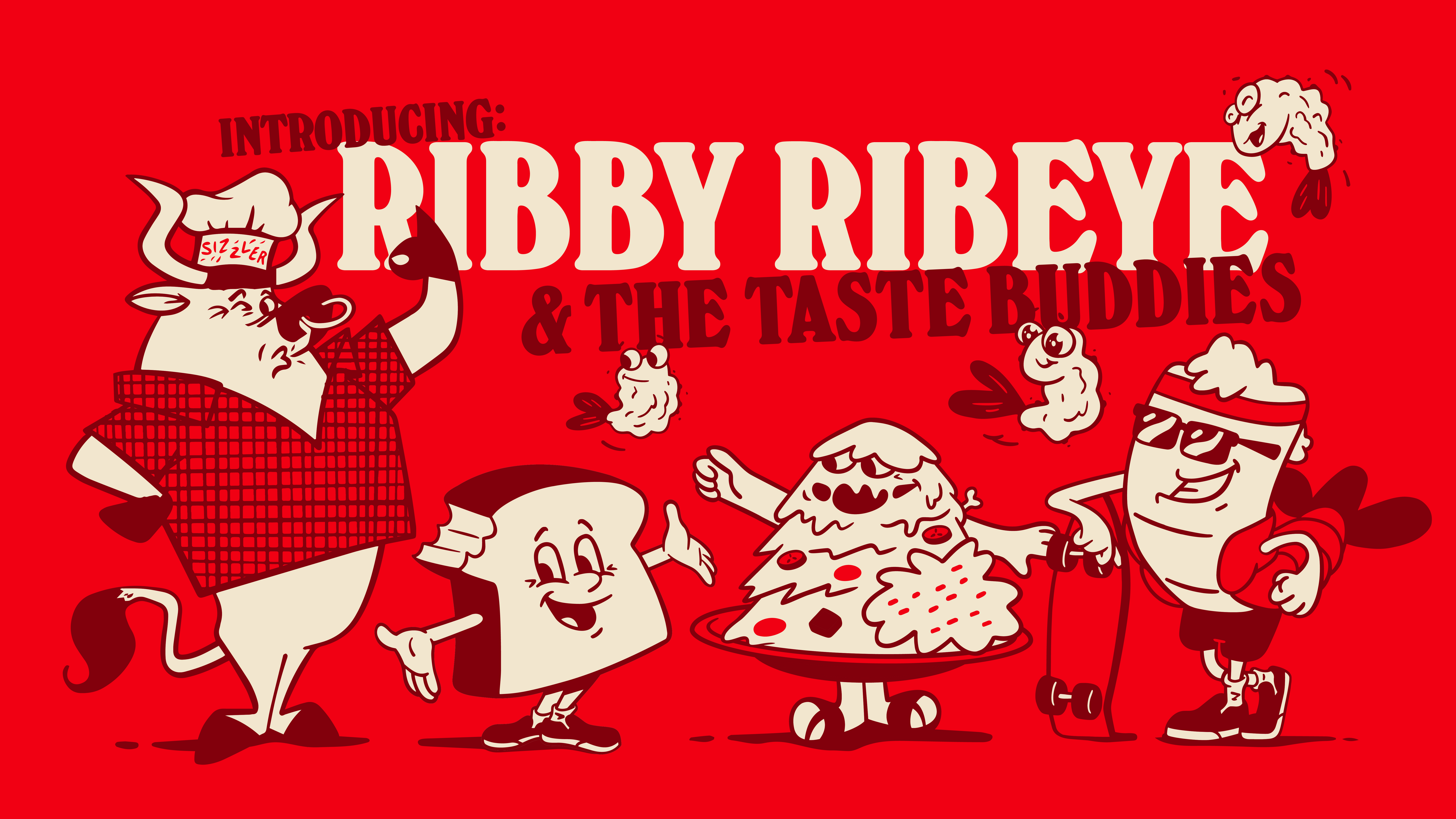
"We also gave him a gang of “Taste Buddies” inspired by Sizzler’s most popular menu items," Mike says. Inspired by "1950s Hanna-Barbera style cartoons and mid-century Southern California," the new family of mascots capture Sizzler's comforting spirit, "We like to joke that they’re a band–Ribby and the Taste Buddies. Ribby’s the lead singer with the Crispies singing backup, Rippy’s on guitar, The Salad Bar-barian is on drums and Toastie plays the bass," he adds.
Sign up to Creative Bloq's daily newsletter, which brings you the latest news and inspiration from the worlds of art, design and technology.
Illustrating these new mascots was a highlight for the team, allowing them to flex their creative muscles. "Everyone on the Tavern design team is now very skilled in this style so expanding positions and animating is a blast," Mike says. "Personally I still love the Salad Bar-barian, my favorite character to animate."
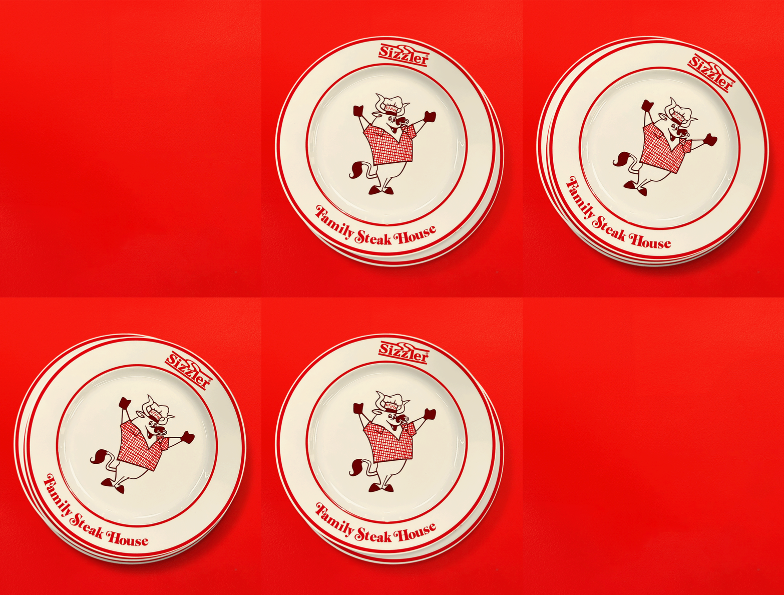
Alongside the nostalgic illustrations is a complementary typographic theme that evokes a familiar retro spirit without feeling overdone or derivative. "We chose a mix of typefaces that would help the brand balance modernity and heritage. Both Emphatic and Windsor echo ads that we found in the brand's archives and Block Berthold complements these heritage-inspired type choices to help us ground the VIS in a sense of timelessness and avoid skewing too retro," Mike says,
It wasn't an entirely seamless rebrand process, as Sizzler was keen to preserve its original logo – something that the Tavern team originally contested. "There was no need for a logo overhaul at all," Mike reflects. "This is in line with Taven’s thinking which is often received as a hot take but–we’re big believers that the big logo overhauls are overhyped. The best brands are built on a robust VIS system that goes beyond a single, corporate stamp."
"With that being said, we’re pretty proud of our subtle refresh of the Sizzler logo mark. Knowing that the logo was just one piece of the puzzle allowed us to take a step back and focus on how it fits into the broader world we were building. We simply stripped out the fluff, put it on a tilt and turned it into a literal cattle-brand that adds a little steak house sizzle to any layout," he adds.
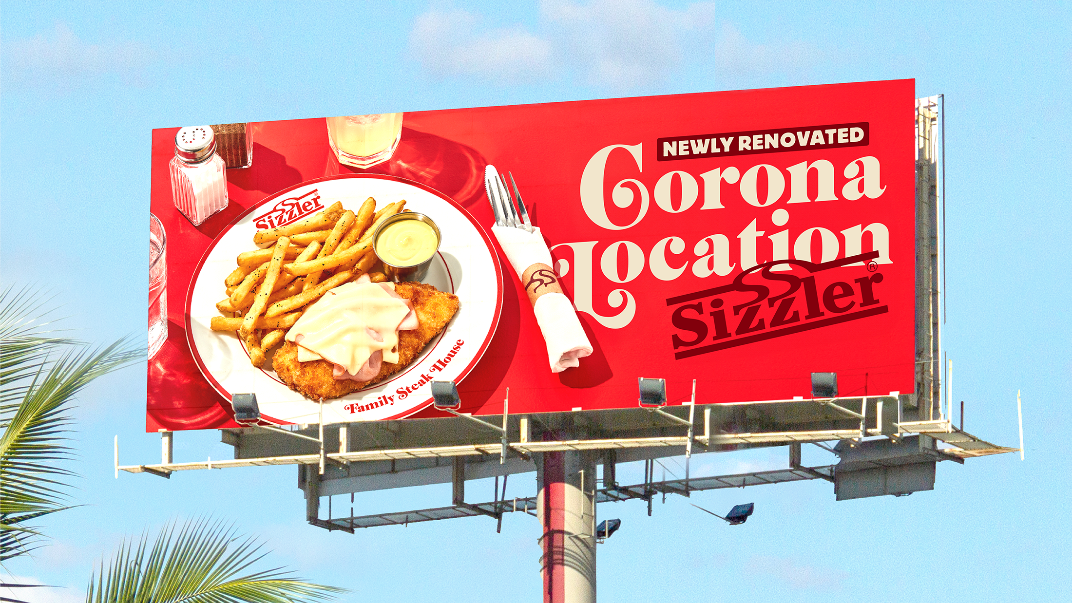
When asked what he was most proud of throughout the project, Mike reflected on the photography elements, stating they're a "crucial pillar" in any new identity. Avoiding the overly polished food photography of rival brands, Tavern took a more rustic approach, "shooting on bold red backgrounds and styling the food and its table setting as if you were in a Sizzler restaurant," Mike says, "We nodded to the heritage of an old school steak house with the table setting and bespoke branded flatware then brought the contemporary sizzle by shooting in a bright, bold, poppy style on red," Mike adds.

Tavern proves time and time again that they're masters of retro design, expertly distilling a brand's heritage to create timeless design with contemporary flair. Check out the Burt’s Bees' retro summer camp campaign for more of Tavern's stylish branding or take a look at the best rebrands of the 2020s (so far) to see the top design trends of the decade.

Natalie Fear is Creative Bloq's staff writer. With an eye for trending topics and a passion for internet culture, she brings you the latest in art and design news. Natalie also runs Creative Bloq’s 5 Questions series, spotlighting diverse talent across the creative industries. Outside of work, she loves all things literature and music (although she’s partial to a spot of TikTok brain rot).
