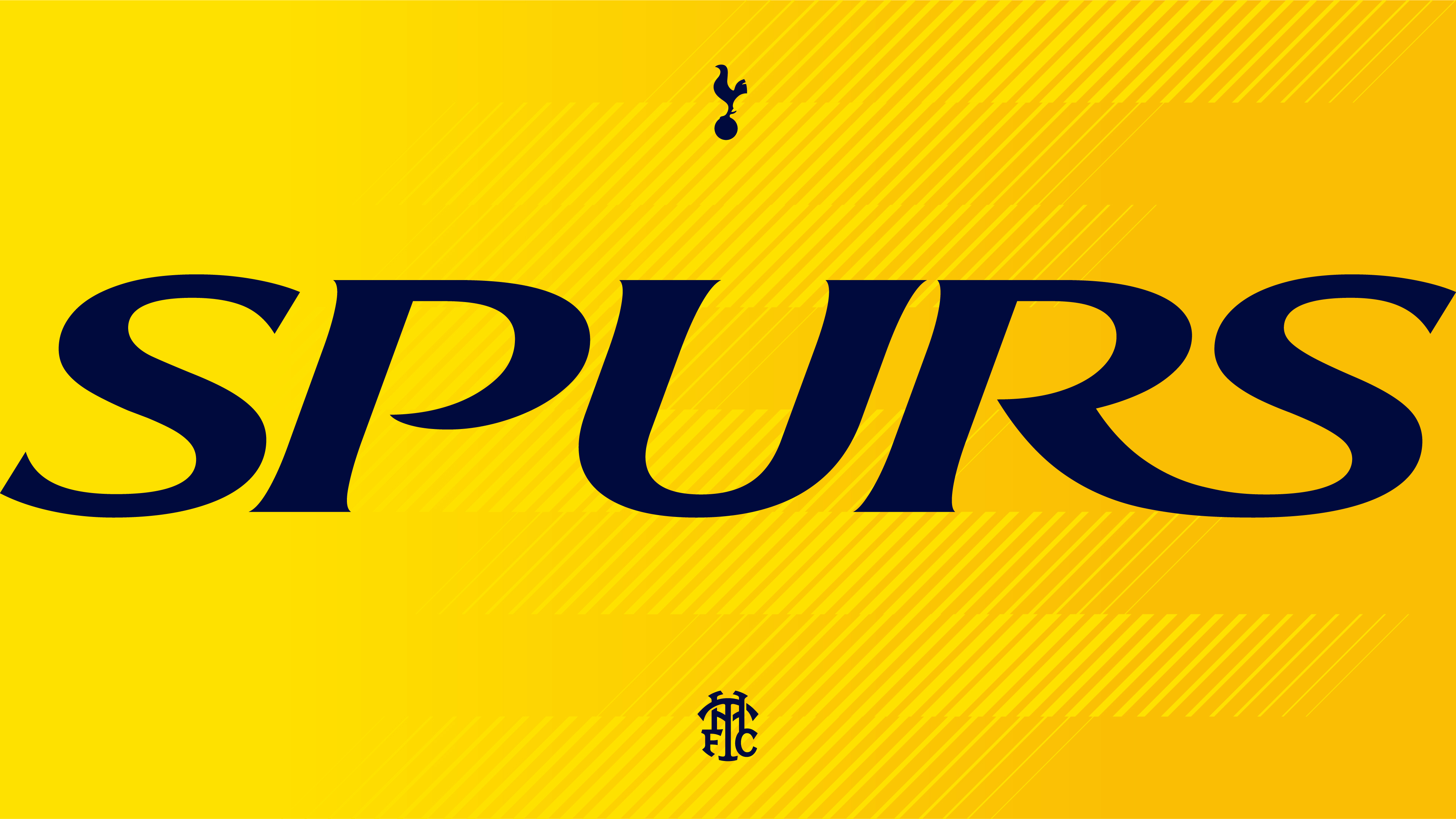
Tottenham Hotspur FC's nostalgic rebrand was a "labour of love"
Heritage design gets a flexible modern twist.

English football club Tottenham Hotspur has unveiled a sleek new brand identity steeped in its rich sporting history. Bolder than ever, the revitalised identity marks a new era for the club in a sleek evolution, celebrating its multigenerational fans and innovative future.
The Spurs logo stands as one of the best sports logos out there, instantly recognisable for its authoritative cockerel design. With refined design tweaks to the classic logo and the reintroduction of Spurs' iconic 1950s monogram, the new branding is a strong remastered identity with heritage at its heart.

Created by sports branding specialists Studio Nomad, the new brand identity was informed by 300 players, staff and fans over an intensive 9-month process. "Designing any sports club brand is a tricky journey (we’ve done a few) – as there are so many stakeholders involved and so many people that feel so incredibly passionate about it," says Terry Stephens, co-founder of Studio Nomad. "We made sure the journey was robust and included a huge cross section of players, employees and fans to gather insight and steer," he adds.
Article continues belowAt the core of the remastered visual identity is the new brand logo created to support the existing club badge that will remain pride of place on players' shirts. "The brand logo is a more robust version, able to scale smaller and be more legible across digital touchpoints," Terry says. "We worked with icon specialist, Chris Mitchell, to draw the new version – the same illustrator that created the original 18 years ago," he continues.
In keeping with the heritage themes of the new identity, Nomad revived Spurs' fan-favourite 1950s THFC monogram. "As I kid I absolutely loved the version used throughout the 80s, so it was a labour of love to redraw it and a great feeling to be able to reintroduce it to the fans. COYS!" Terry says. Working with Miles Newlyn, the reimagined monogram is designed to work as a secondary piece of IP. "It reduces the strain on the core logos and offers a wealth of opportunity in merchandise – a vital revenue stream for the Club," Terry adds.

Working with F37 Foundry, Nomad transformed Spurs' iconic single-weight capital letter display font into a variable family of fonts with a dynamic appeal. "The new type is based on the custom face created in 2007 by Dalton Maag. Edgier and more dynamic, it’s been specifically redrawn to home (and away) harder," Terry explains. Nods to iconic elements of the Club's past appear in the colours and patterns of the new visual identity while hallmarks like "the Seven Sisters Trees, Bruce Castle and 1882 – the Club’s founding year" draw on its rich heritage.
For Terry, "loosening up the reigns a bit on the corporate idea of ‘brand’ and being playful with different executions of the Brand Logo," was a highlight of the project. "Thinking of different ways to bring the iconic shape to life that can help the Club appeal to different audiences" was a rewarding process, resulting in a heritage-rooted design with the flexibility to serve future generations of fans.
Sign up to Creative Bloq's daily newsletter, which brings you the latest news and inspiration from the worlds of art, design and technology.

For more creative inspiration, check out the National Football Museum's stylish new logo that embraces simplicity and sleek design. If you're after more sporting news, check out the history of the UEFA Euro logo from 1960 to Germany's Euro 2024.

Natalie Fear is Creative Bloq's staff writer. With an eye for trending topics and a passion for internet culture, she brings you the latest in art and design news. Natalie also runs Creative Bloq’s 5 Questions series, spotlighting diverse talent across the creative industries. Outside of work, she loves all things literature and music (although she’s partial to a spot of TikTok brain rot).
